
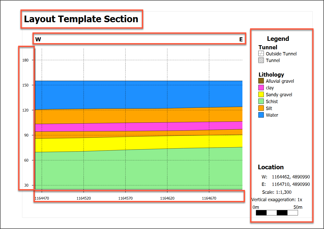
Organising Section Layout Pages
This topic describes how to set up the supporting page properties for section layouts.
To learn how to set up the section layout to show objects evaluated onto the section, see Organising Models and Other Objects on the Section.
This topic is divided into:
- Setting Page Size and Other Page Properties
- Setting the Section Extents and Position
- Setting Up the Legend Group
- Plan Views and Strip Views
- Adding and Organising Comments
Setting Page Size and Other Page Properties
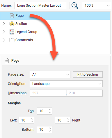
In the layout tree, click on Page to change the Page Size, Orientation and Margins.
If you wish to use a specific Scale, select the Orientation required, then click Fit to Section to choose the best page size.
Setting the Section Extents and Position
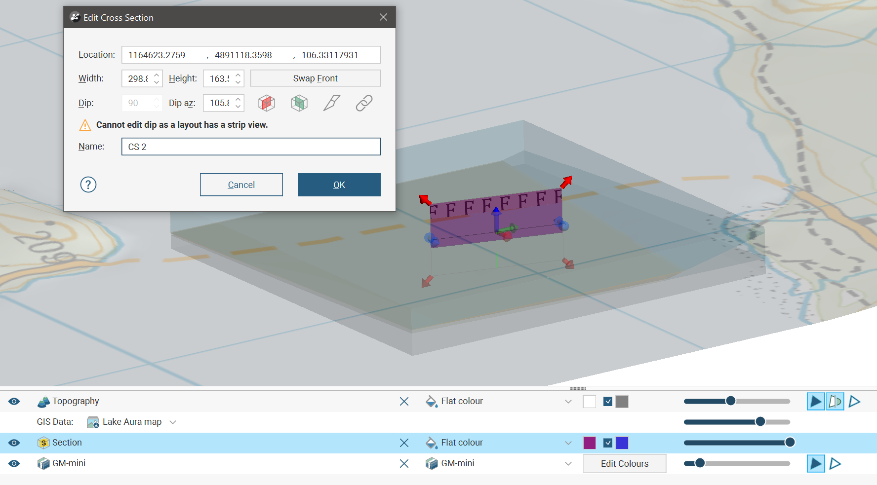
To change the layout’s section properties, click on the Section object in the layout tree. In the Section tab, you can change the scale and units used in the layout and the amount of Vertical Exaggeration:
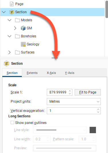
For the Scale, you can enter a specific value to use in displaying the section on the page, or, if you want a specific page size, select Fit to Page to set a scale that best fits the page width.
If you want to change the page size and the margins used, click on the Page object.
In this tab. long sections add further options with a tickbox to Show panel outlines with controls for the Line style, Line width and Pattern scale. Click the colour chip to open a colour picker window. A preview of the panel outline style specified using these fields is displayed below them.
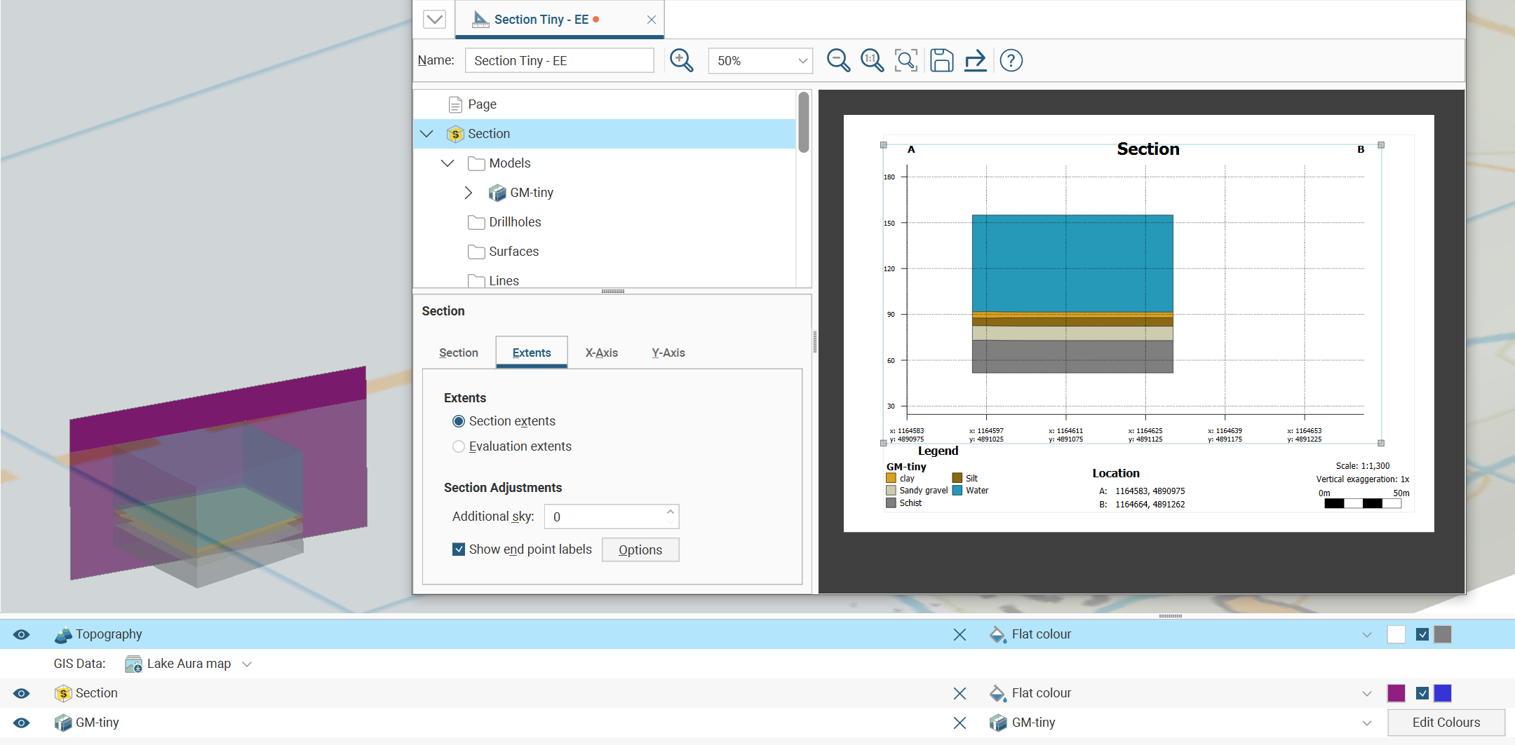
The Extents tab controls some of the details around the section on the section layout, as well as providing section extent constraint options.
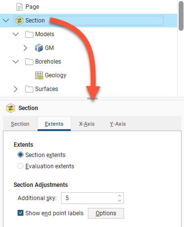
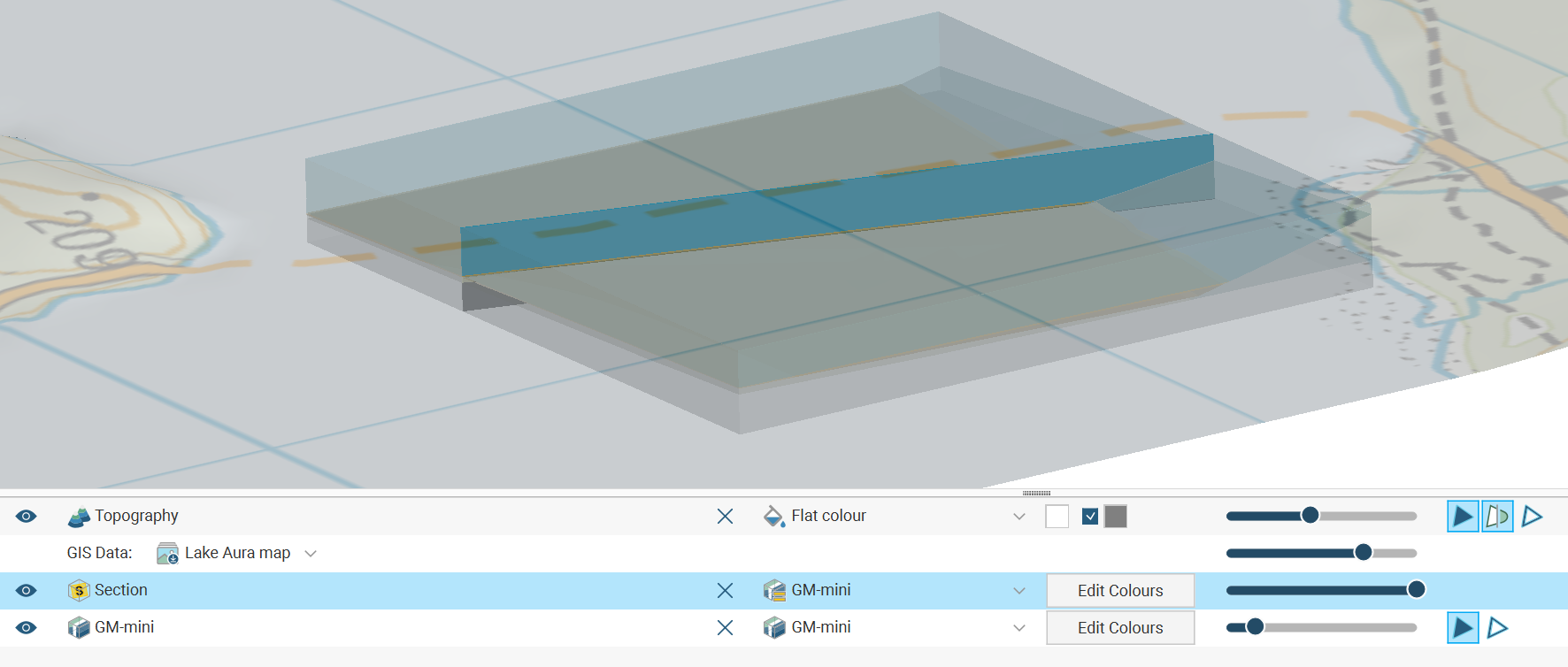
When choosing Section extents, the resulting section will reflect the size of the section extents defined when the section was created:
The resulting section displayed on the section layout will match the defined extents for the section.
When choosing Evaluation extents, the section will expand out in the plane of the defined section as far as the evaluated objects projected onto the section go. Here the section is stretching out as far as the limits of the geological model allow:
As a result, the section layout, for what is actually the same section definition, needs to be quite different, mostly due to the different size and proportions of the section depending on the Section extents or Evaluation extents selection. Often each option will require the use of a different section layout to cater for the differences.
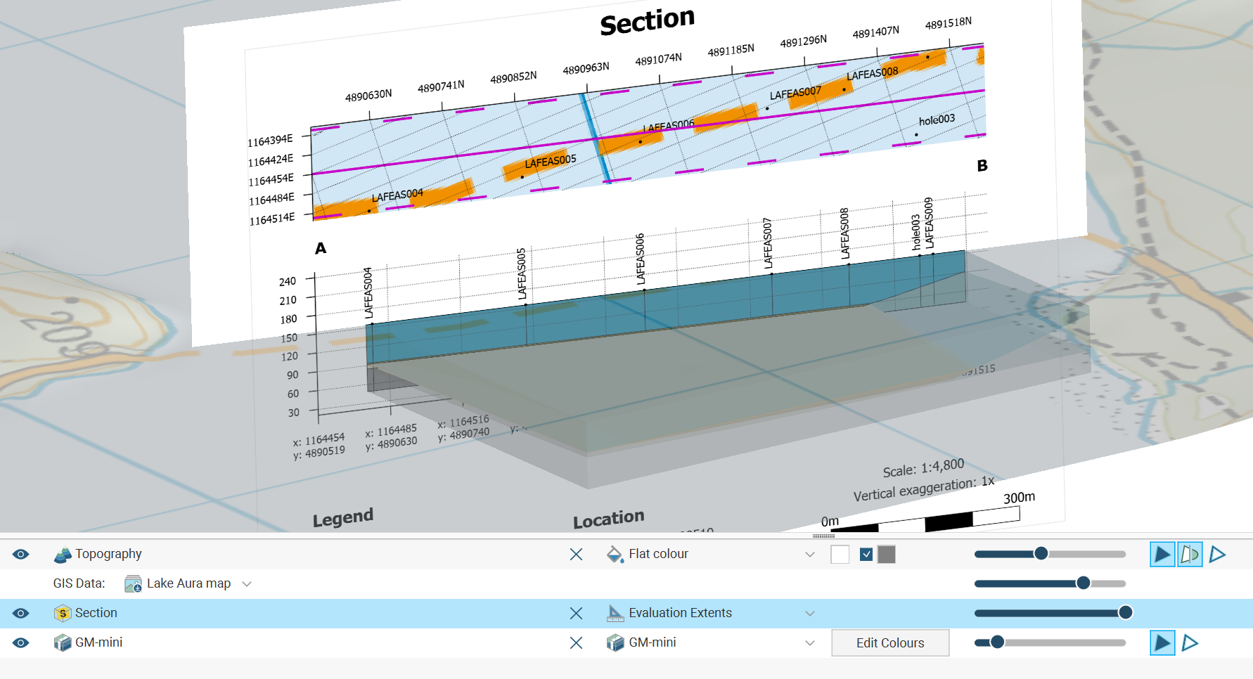
When the evaluations span a region smaller than the defined section extents, the section displayed on the layout is constrained to the smaller area when Evaluation extents is selected:
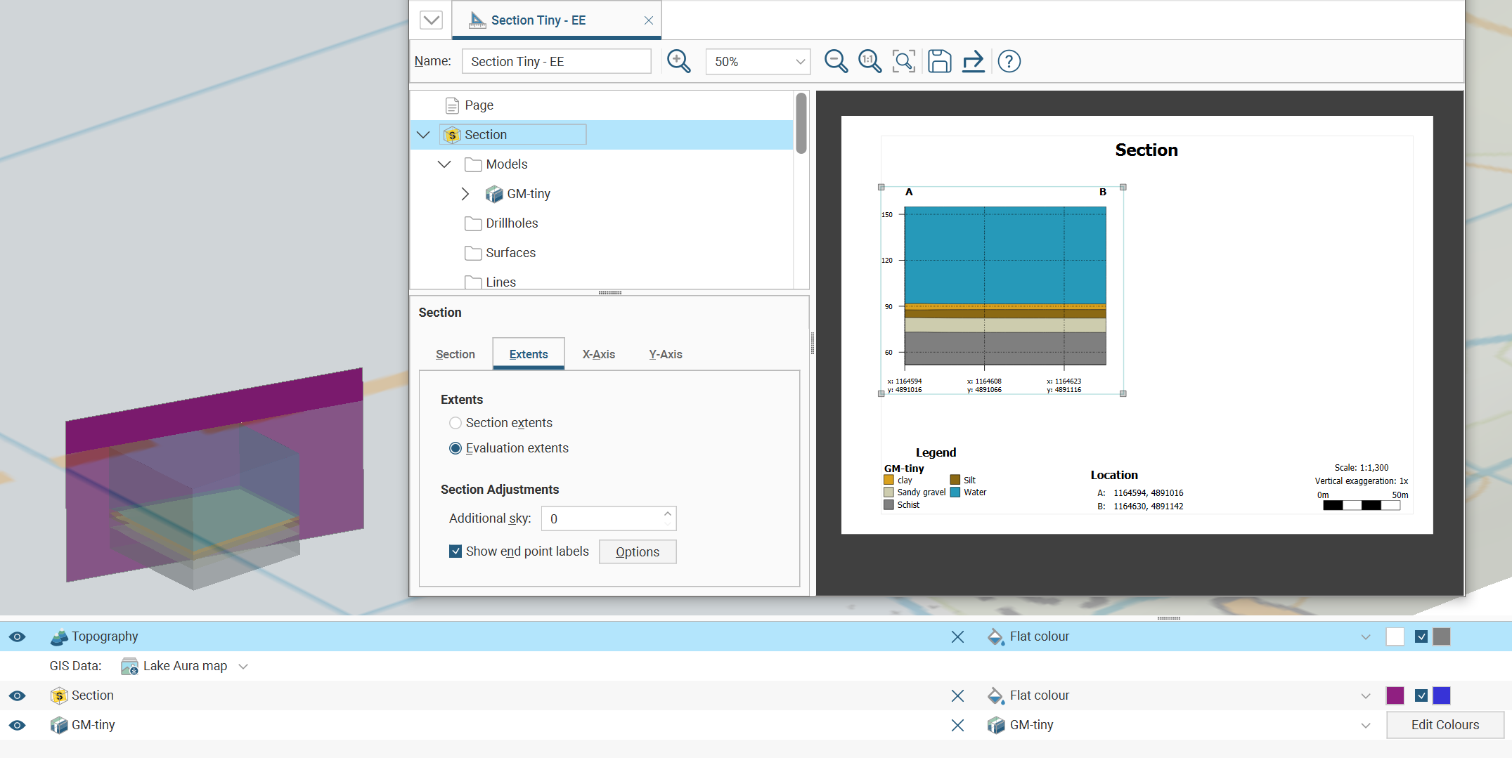
However, if Section extents is selected, the whole section is displayed on the layout, even if the evaluations do not fill the entire section:
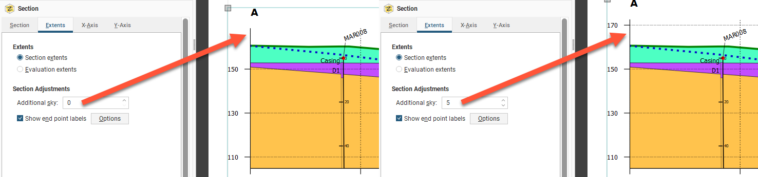
You may wish to add more space above the section, especially if you will be adding wells to the section and need extra space for the collar labels. To do this, change the Additional sky setting. These images show the effects of two different Additional sky settings:
Enable Show end point labels to display the section’s end points as text:
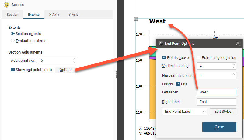
Click Options to change how the end points are displayed relative to the section’s axes.
Edit the text used to display the end points by enabling the Edit box and then changing the text. You can edit the style used for displaying the labels by clicking Edit Styles to change the style or by selecting a different style from the dropdown list.
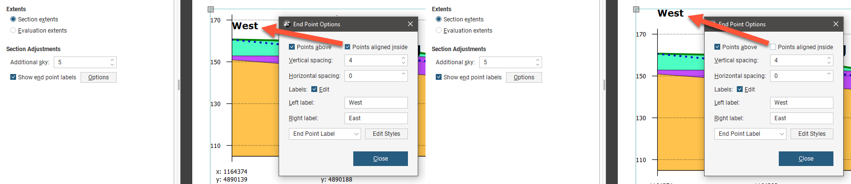
There are two options that control where the end points are displayed, Points above and Points aligned inside. The Points above setting determines whether the end points are displayed above or beneath the axes. Note here the difference between Points above being disabled and enabled:
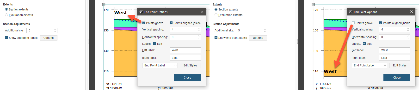
The Points aligned inside setting determines whether the end points are displayed inside or outside the section’s axes:
You can also change the spacing between the end point labels and the section axes.
To change how the axes are displayed, click on the either the X-Axis tab or the Y-Axis tab.
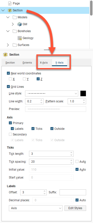
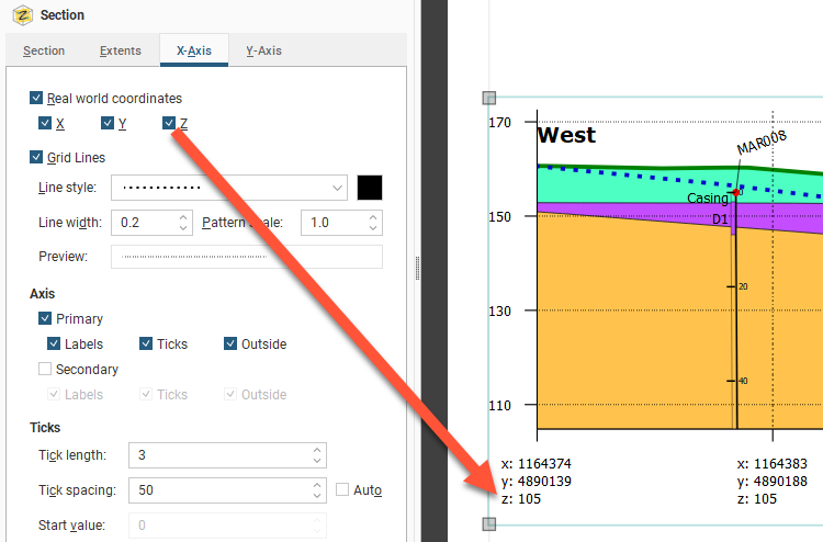
One of the options available for the axes is how much information is displayed for the Real World Coordinates on each axis:
You can also change how Grid Lines are displayed, including the Line style, Line width, Pattern scale and colour. A Preview is displayed and the grid lines are updated in the section preview.
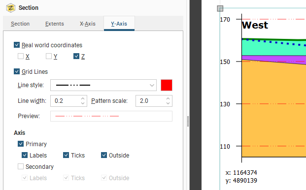
By default, the axes are displayed only on the left-hand side and along the bottom of the section. To display axes along the right-hand side and above the section, tick the Secondary option.
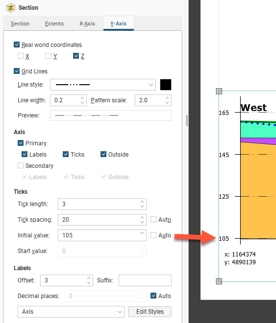
For the Ticks, the Tick length and Tick spacing can be customised. The Y-Axis also has an Initial value with a default that Leapfrog Energy automatically calculates. If you wish to change this, disable Auto and enter the required value.
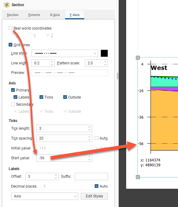
If you wish to set a Start Value specific value for X-axis, you must first disable the Real World Coordinates option:
Edit the text style used for the axis labels by clicking Edit Styles to change the style or by selecting a different style from the dropdown list.
See Organising Models and Other Objects on the Section for details on how to select and style objects to appear on the section.
Setting Up the Legend Group
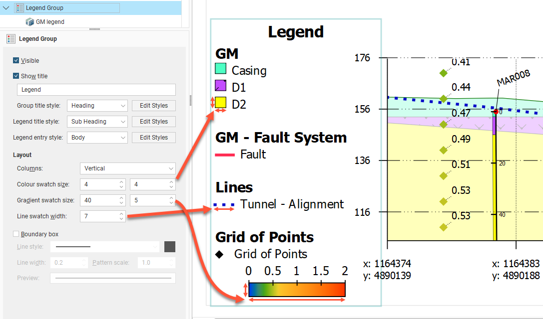
The Legend Group and the individual legends underneath it control how the legend is displayed on the page. Click on the Legend Group object to change the layout of the legend as a whole. The Visible tick box is used to show or hide the whole legend. Show title is used to show or hide the title, which can be customised from "Legend" to something else as required. Three sets of style controls set the appearance of the Group title style, Legend title style and the Legend entry style for different parts of the legend as indicated . Use the Edit Styles buttons to customise the styles used.
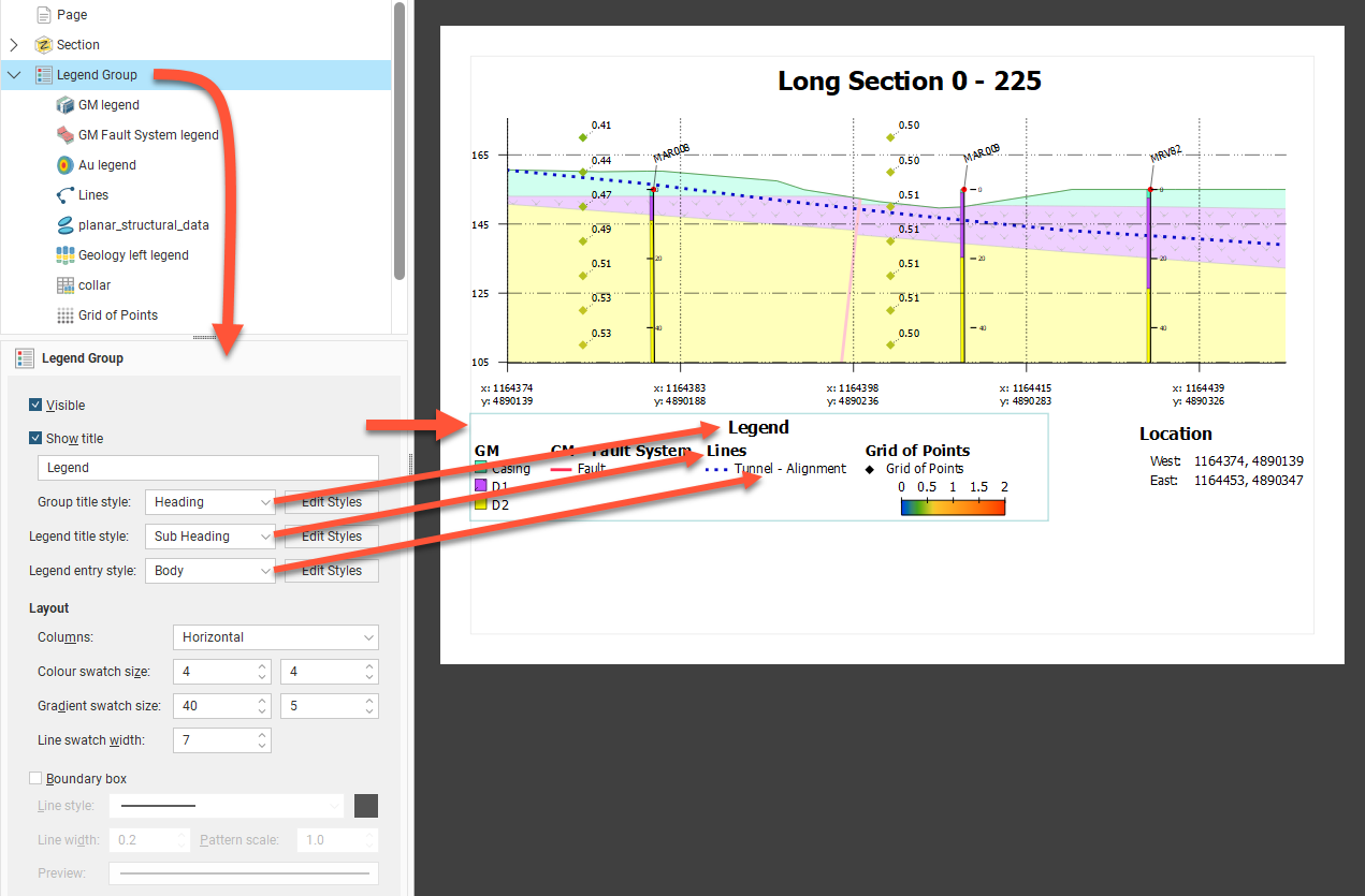
The legend has a series of legend elements for different objects. Under Layout, these can be arranged as Horizontal (as above) or Vertical (as below) Columns. Each of the component legend elements will also inherit the same Colour swatch size, Gradient swatch size and Line swatch width for overall consistency of appearance.
The legend may optionally be surrounded by a Boundary box, and the line style for that box can be set using the Line style, Line width, Pattern scale and colour tile controls.
When you have multiple models, surfaces, lines and wells on the section layout, you can end up with a large number of entries in the Legend Group. You can control which legend entries are included in the Legend Group.
Depending on the object type, there are different ways for objects to be managed in the legend:
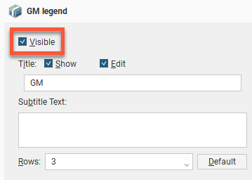
- Each entry under the Legend Group in the layout tree has a Visible tickbox. You can also Show or hide the Title for the object type, and the title can be customised by clicking the Edit tickbox and changing the title text. Enter text in the Subtitle Text box to add more to explain the entry, as required. Change the number of Rows to rearrange how multiple swatches are organised.
- Instead of there being a single Well entry in the Layout Group, each data column colouring for each Well object is automatically added to the Layout Group. Each can be customised as above.
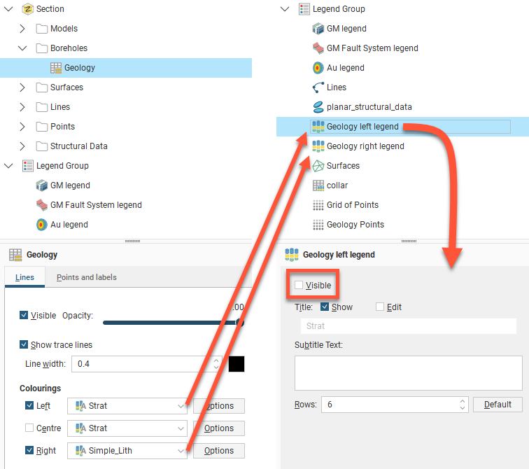
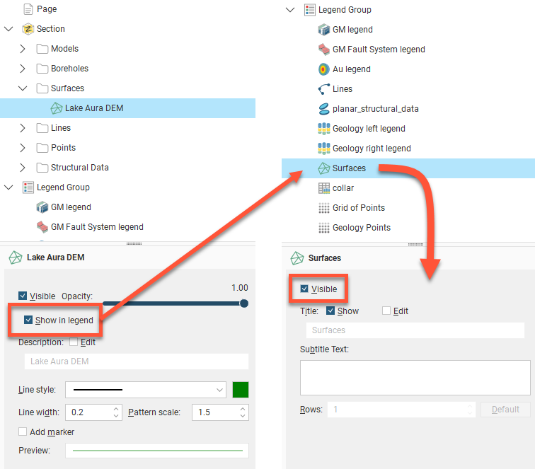
- Model surfaces, surfaces, and lines each have a Show in legend tickbox that needs to be enabled before an item will appear in the Legend Group. Once ticked, it can still be optionally hidden or shown in the legend by changing the Visible tickbox for the entry that will have appeared in the Legend Group.
- Planned wells do not appear in the legend. This is not customised from within the Legend Group.
The order in which legends appear in the Legend Group is the order in which they appear in the layout tree. To change the order in which the legends appear, right-click on them and select a Move option.
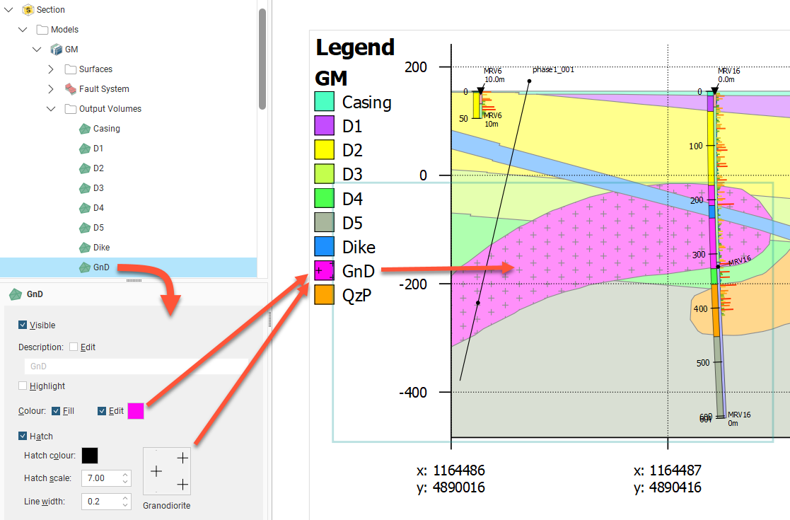
The colours, line widths, fills and hatches displayed in the Legend Group are controlled by the objects themselves.
For example, to change how a volume for a model is displayed, click on the output volume under the Models object:
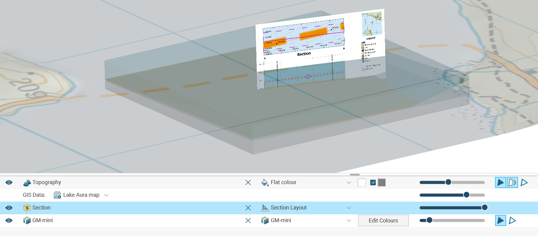
Plan Views and Strip Views
Plan views and strip views provide context for the positioning of the section and objects projected onto the section.
- Plan views provide a wide contextual overview. Plan views need to be created in the Sections, Plans and Contours folder in the project tree. Then create a plan view layout, which can be applied to a section layout in the section editor. You can define more than one plan layout for each plan view, as you may wish to use the plan view in different ways on different section layouts.
- Strip views provide context for the region immediately around a specific section. Strip views can be added to a section layout directly, using the section layout editor.
Before a plan view is added to a section layout, you first need to create a plan view and a plan view layout. See Creating Plan View Layouts for Plan Views.
When editing a section layout, you can add a plan view to a section layout by right-clicking on the Plan View folder in the layout tree and selecting Add Plan View. The Add Plan View window will appear, listing the plan views available in the project. Select one and click OK. Resize and reposition the plan view on the section layout.
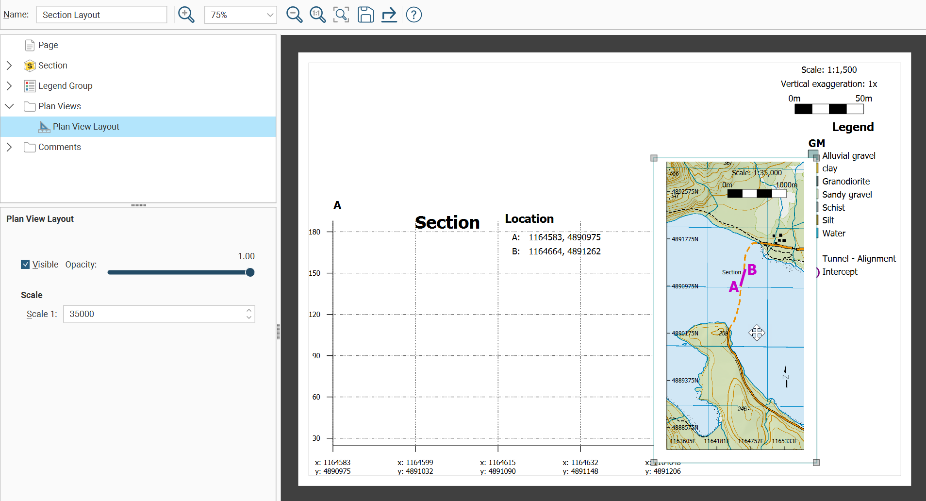
When adding a plan view layout that has a section line depicted, select Section Line from within the plan view layout and choose Visible from the options panel if you want to highlight the section line of the current section layout depicted on the plan view .
When the section layout is rendered, the section depicted on the section layout is highlighted on the plan view with a 1.5 wide thick black line as shown here:
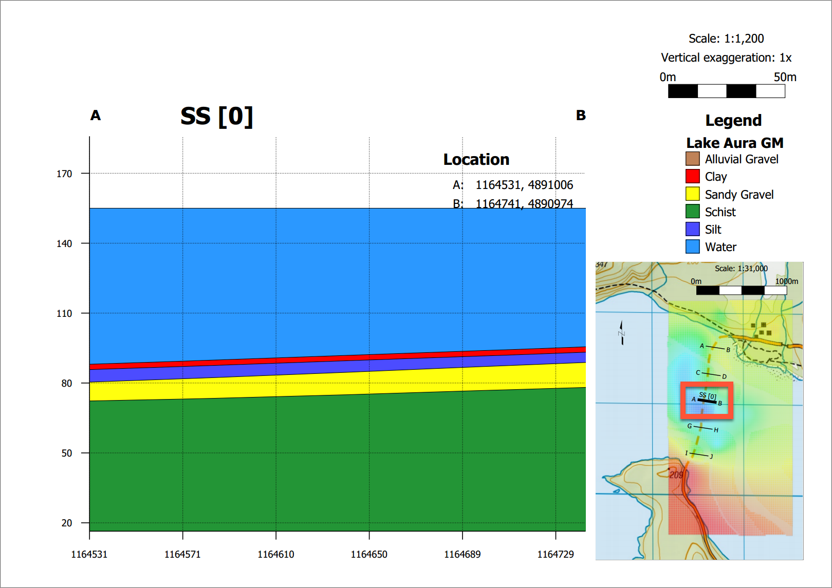
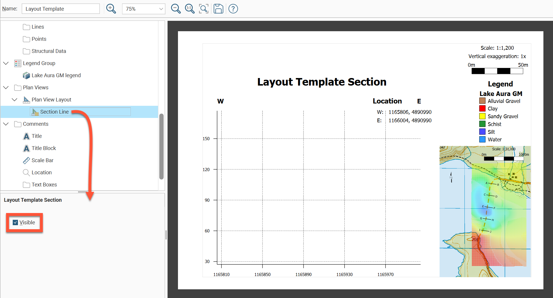
You can add a strip view to a layout by right-clicking on the Plan View folder in the layout tree and selecting Add Strip View. The section on the section layout will shrink to fit a strip view above the section. Resize and reposition the combined section and strip view on the layout to suit.
Strip views can only be added to vertical sections and cannot be added to section layouts or long sections.
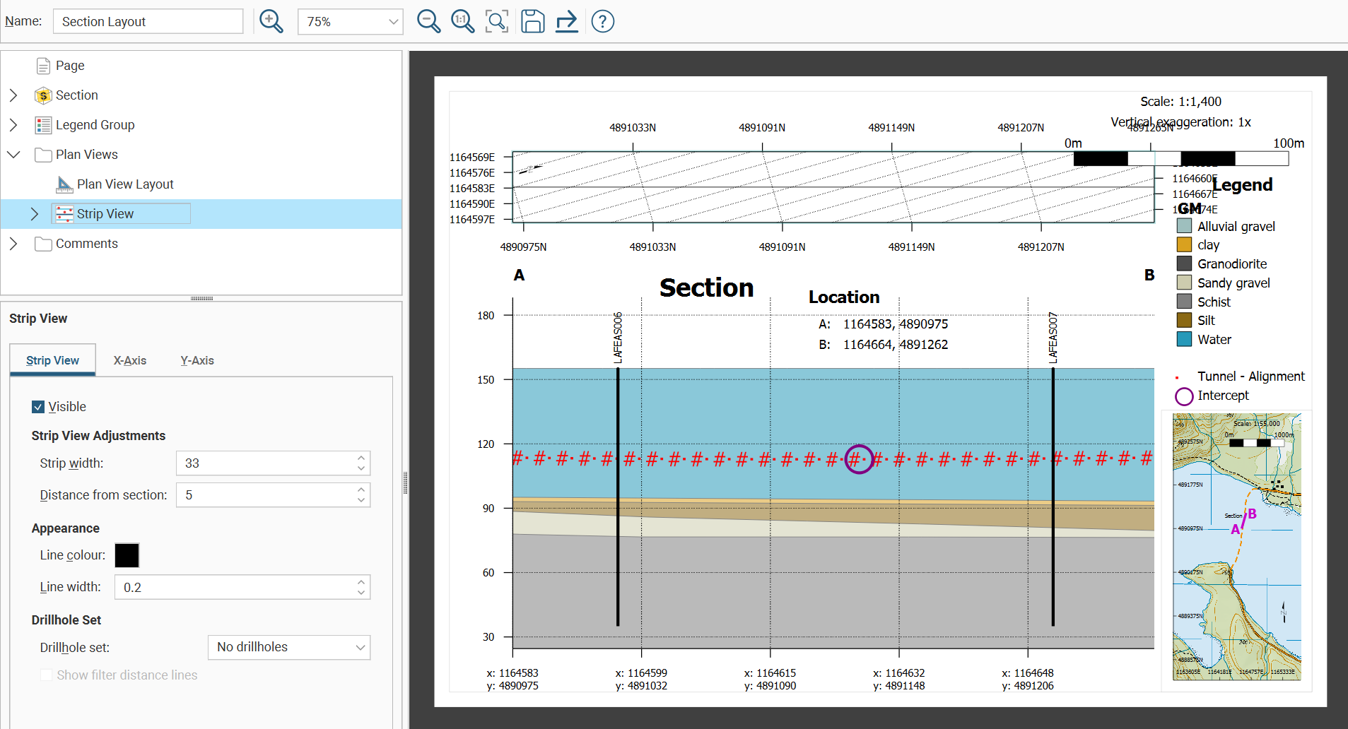
In the Strip View settings, there are three tabs for modifying the strip view: Strip View, X-Axis and Y-Axis.
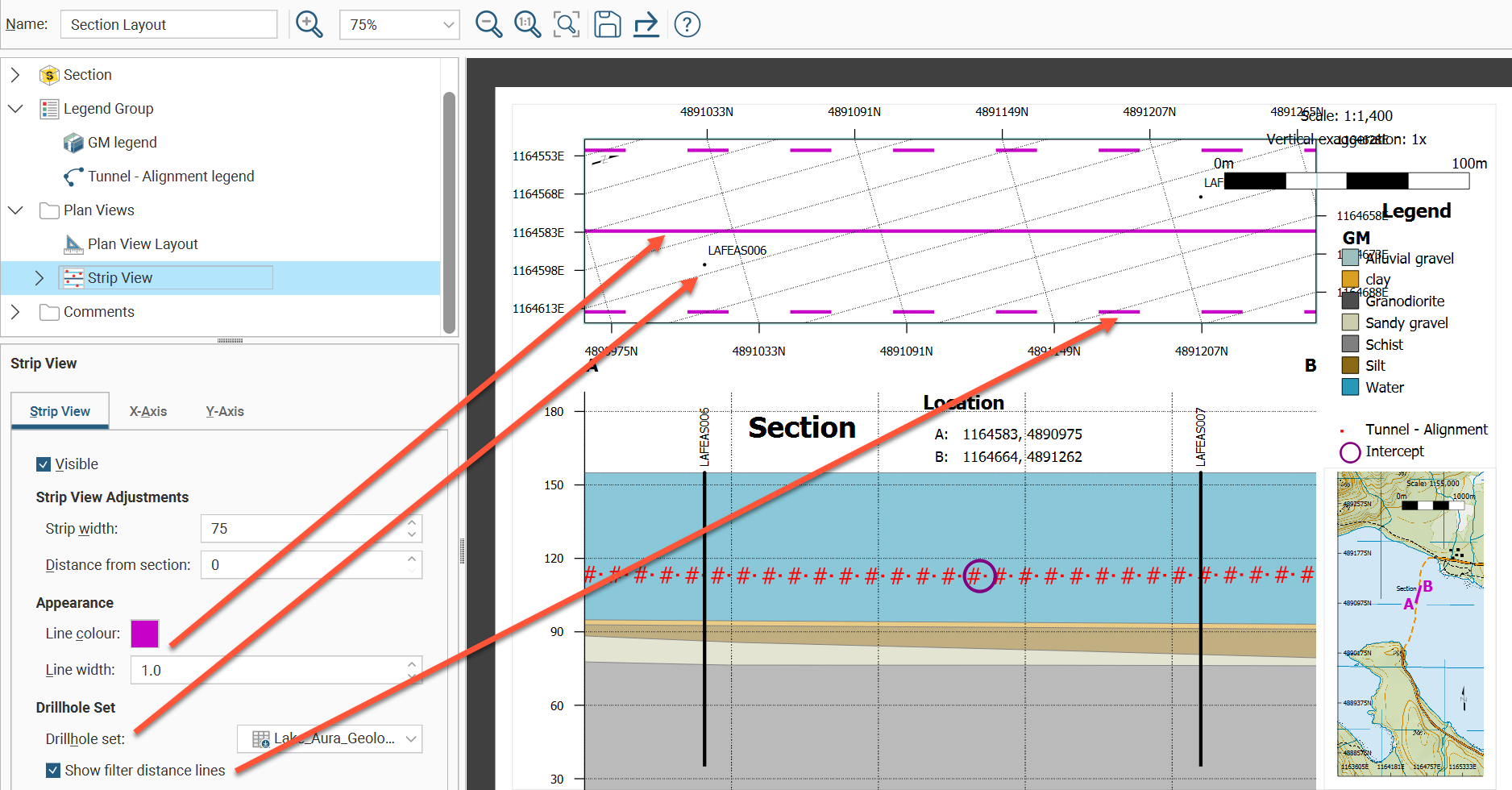
Strip View Adjustments is the first group of fields in the Strip View tab. Strip width specifies the width of the strip in model units. Distance from section can be used to increase or decrease the gap separating the strip view from the section on the layout.
The Line colour and Line width settings under Appearance change the colour and size of the central line in the strip view that identifies the location of the section.
Under Drillhole Set, a Drillhole set can be selected from the dropdown list to display drillhole collar points on the strip view. The Show filter distance lines tick box is used to show or hide the dotted lines either side of the central section line that shows the Filter by minimum distance to section plane value set when adding drillholes to the section in Section > Drillholes. If the dotted lines do not show up when the Show filter distance lines box is ticked, you may need to increase the Strip width value so the strip is wide enough.
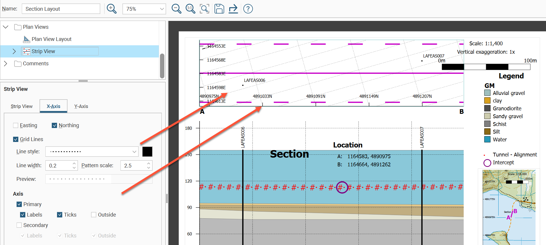
The X-Axis and Y-Axis tabs are identical, other than controlling the appearance of each axis on the strip view.
Easting and Northing tick boxes can be used to select which grid coordinates are keyed to the axis.
Grid Lines can be turned on and off and the appearance of the lines altered using the Line style, Line width and Pattern scale settings. The Preview box provides a handy way to see the effect of the selections.
The Axis group of fields can be used to show or hide the Primary (left or bottom) and Secondary (right or top) axes. You also have individual visibility controls for axis coordinate Labels and Ticks marking the referenced coordinate points along the axis. Tick Outside to position axis labelling outside the strip, or untick it to place the labels inside the strip to reduce whitespace around the strip.
You can also adjust the Tick length, Tick spacing and the Initial value marked on the axis. Alternatively, Tick spacing and Initial value can be set automatically by ticking their Auto tick boxes.
The coordinate Labels can also be customised. The Offset is the gap between the end of the tick and the label. The label’s Decimal places can be set to Auto adjust, or Auto can be unticked and the number of Decimal places specified. The label styling can be selected from the style options available in the dropdown list or it can be customised with the Edit Styles button.
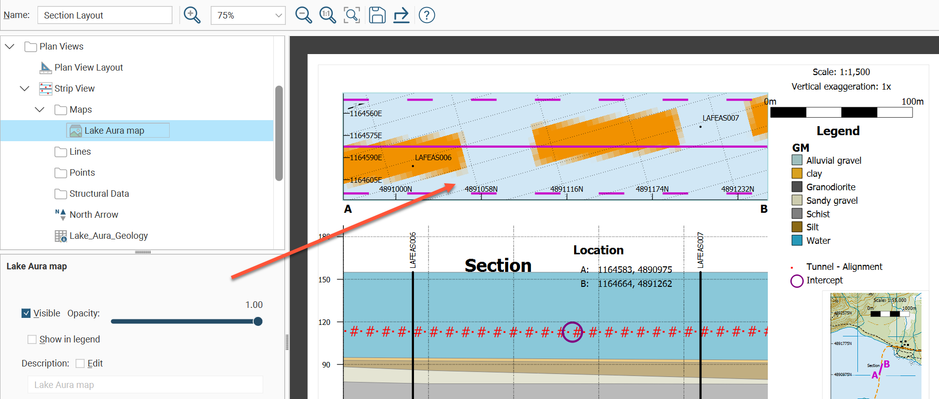
While models and meshes cannot be evaluated onto a strip view, maps, lines, points and structural data can be added to the strip view. Expand Strip view in the layout tree to see the folders for these objects.
To add a map to a strip view, right-click the Maps folder in the layout tree under Strip View then click Add Maps. The Add Maps Evaluations window will appear with a list of the maps that can be used. Select a map and click OK. Multiple maps can be added, with the maps settings providing the ability to adjust the Opacity to make map combinations visible. Change the layer order of the maps by right-clicking a map in the layout tree and selecting Move Forward, Move Backward, Move to Front or Move to Back. Tick the Edit field to customise the map Description label. Tick Show in legend to add options in the Legend folder in the layout tree to control the map details for the legend. There the map legend visibility can be set, the legend Title for the maps enabled and edited, with the option to add Subtitle Text.
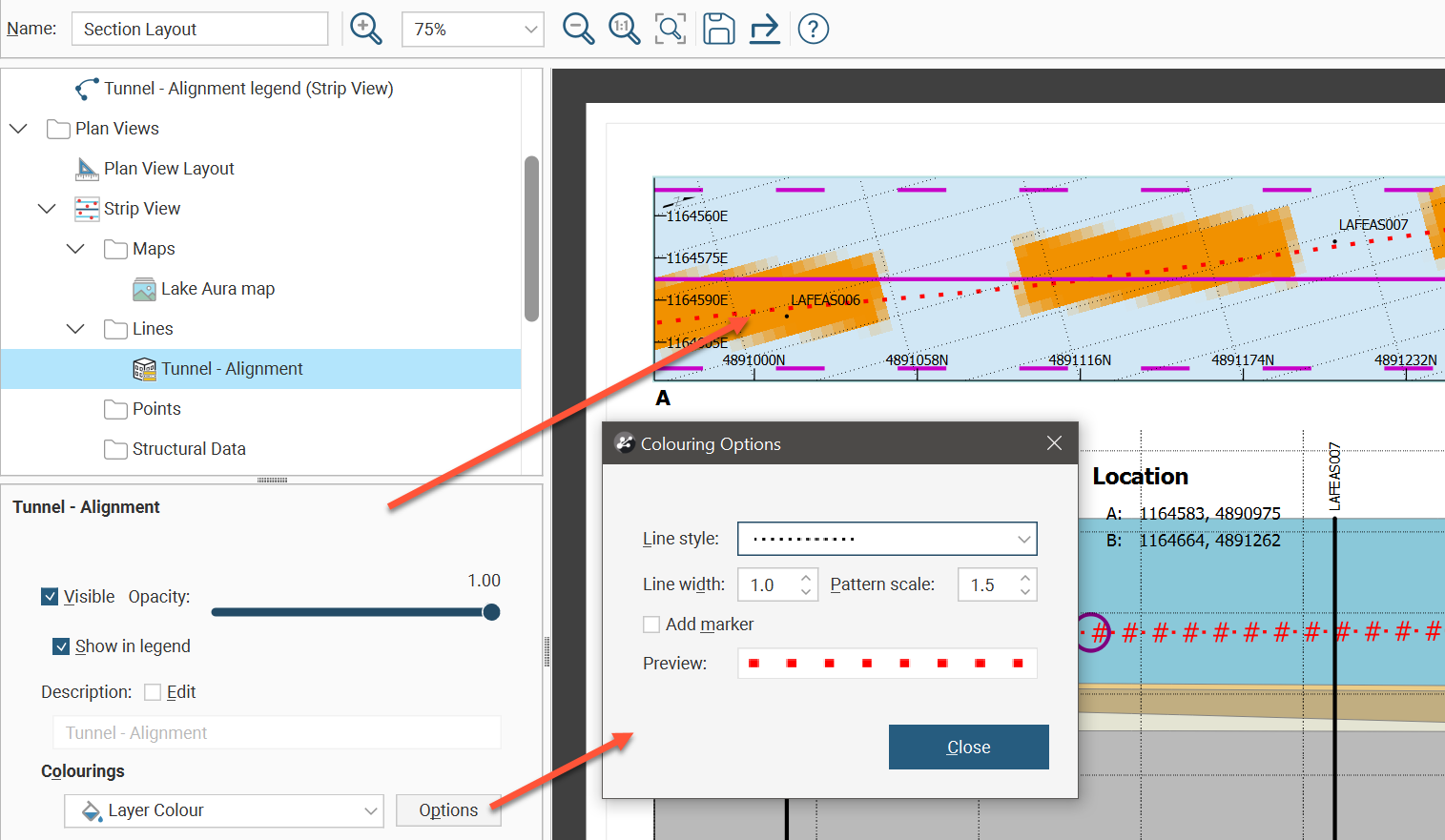
To add lines to a strip view, right-click the Lines folder in the layout tree under Strip View then click Add Line.The Add Line Evaluations window will appear with a list of lines that can be used. Select lines and click OK. The lines settings provide the ability to adjust the Opacity to make line combinations visible. Change the layer order of the lines by right-clicking a line in the layout tree and selecting Move Forward, Move Backward, Move to Front or Move to Back. Tick the Edit field to customise the line Description label. Tick Show in legend to add options in the Legend folder in the layout tree to control the line details for the legend. There the line legend visibility can be set, the legend Title for the lines enabled and edited, with the option to add Subtitle Text. Besides the Flat colour option in Colourings, the dropdown list also provides the Layer Colour option. Select layer colour when you want the colouring of the line to match the line in the 3D scene, changing when the line colouring is changed in the shape list. To specify the line colour when Flat colour is selected, click Options, then in the Colouring Options window, click the colour tile and use the colour picker to select a new colour. The Colouring Options window also allows both Flat colour and Layer Colour options to customise the Line style, Line weight, Pattern scale, and provides the Add marker option to insert symbols along the line pattern.
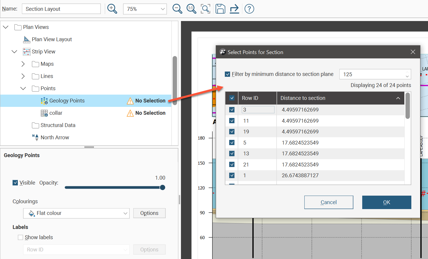
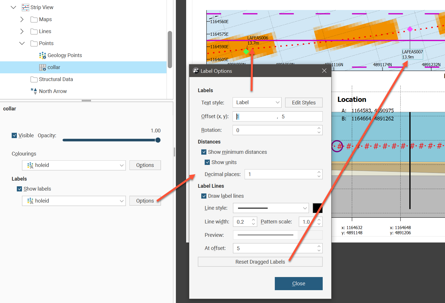
To add points to a strip view, right-click the Points folder in the layout tree under Strip View then click Add Points.The Add Points window will appear with a list of points tables that can be used. Select points tables and click OK. Each will likely be flagged with a No Selection warning. Double-click the points table in the layout tree to see the Select Points for Section window. Use the table to select individual points to display, or tick the tickbox in the table header to select all the points. Use the Filter by minimum distance to section plane tickbox to filter and show only points within the specified distance to the section plane.
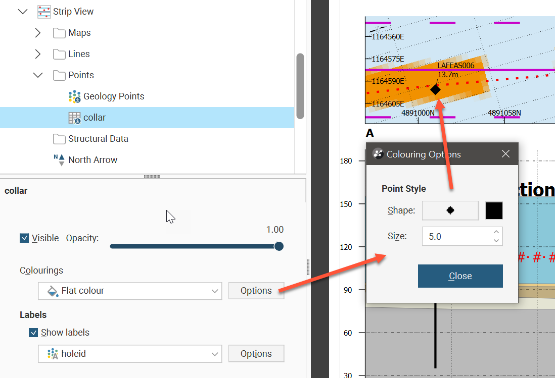
The points settings provides the ability to adjust the Opacity to make points visible. Change the layer order of the points by right-clicking a points object in the layout tree and selecting Move Forward, Move Backward, Move to Front or Move to Back. The Colourings dropdown list has Flat colour and points table column options. Click the Options button to see the Colouring Options window. If Flat colour is selected, you can adjust the Shape, colour and Size of the points in the strip view.
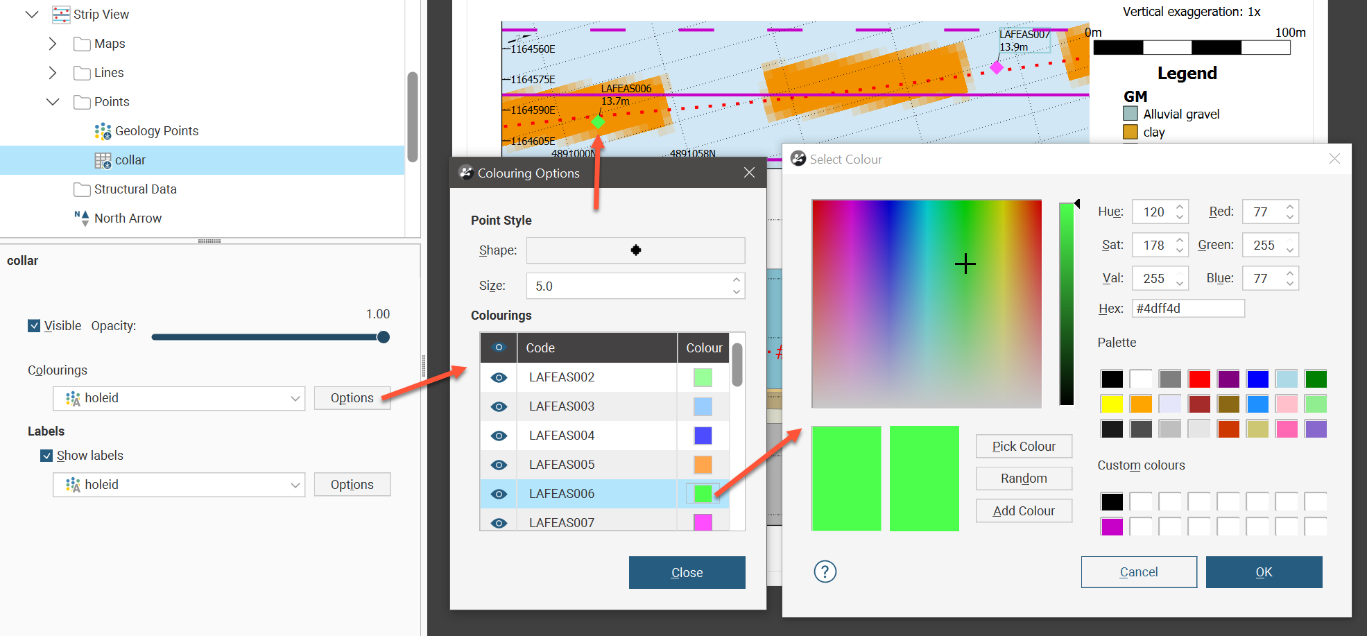
If a points table column has been selected as the colouring, the colouring will match the colours in the 3D scene as set from the shapes list. Clicking the colour tile in the Colouring Options window will open the colour picker, and the colour change will also be reflected back in the 3D scene as well.
Points labels can also be customised. The Text style can be set to one of the existing style definitions, or the Edit Styles button can be used to customise the label. Offset (x,y) places the label relative to the point displayed in the strip view, and Rotation will tilt the text away from horizontal.
This example uses a collar table to illustrate what can be done using points. It is not necessary to add a collar table as points to get well locations on the strip view. Select Strip View and choose the appropriate option from the Drillhole Set list. The collar location points and the labels can then be customised. The Points folder could be used to add additional collar locations outside of the selected drillhole set table.
There is an option to Show minimum distances for each point. You can also choose to Show units and to specify the number of Decimal places displayed.
Label lines connect the label to a point using a customisable line. Tick Draw label lines to use these to clearly associate a label with a point. You can set the Line style, the line colour, the Line width and the Pattern scale. At offset sets a minimum distance for the label line to appear. If you have ticked Draw label lines but you are not seeing any label lines, you may need to increase the distance of the label from the point using Offset (x,y) or you may need to decrease At offset. Because labels can be dragged on the split view to reposition the label so the text does not interfere with other visual elements, there is also a Reset Dragged Labels button to quickly revert any such label repositioning to the default positions.
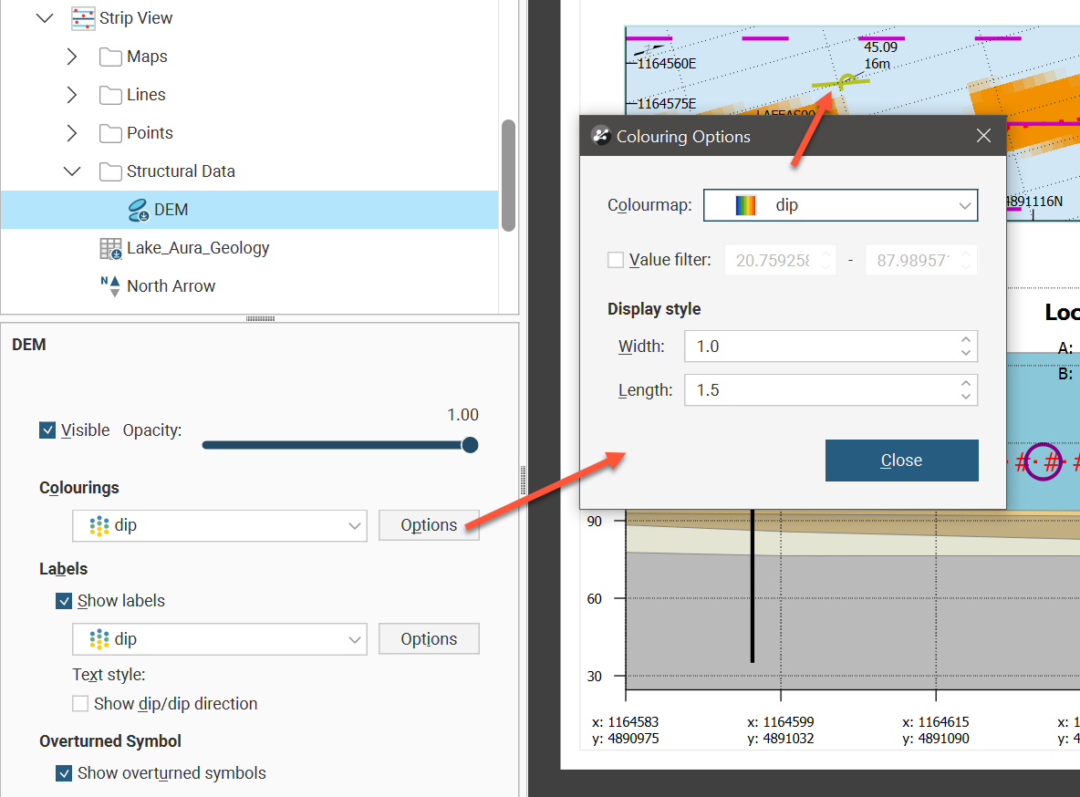
To add structural data to a strip view, right-click the Structural Data folder in the layout tree under Strip View then click Add Structural Data.The Add Structural Data window will appear with a list of structural data tables that can be used. Select structural data tables and click OK. Each will likely be flagged with a No Selection warning. Double-click the structural data table in the layout tree to see the Select Structural Data for Section window. Use the table to select individual rows to display, or tick the tickbox in the table header to select all the rows. Use the Filter by minimum distance to section plane tickbox to filter and show only structural data within the specified distance to the section plane.
The structural data settings provide the ability to adjust the Opacity to make structural data combinations visible. Change the layer order of the structural data by right-clicking a table in the layout tree and selecting Move Forward, Move Backward, Move to Front or Move to Back. The Colourings dropdown list has Flat colour and structural data table column options. Click the colourings Options button to see the Colouring Options window. If Flat colour is selected, you can adjust the Width, colour and Length of the structural data in the strip view. If a structural data table column has been selected as the colouring, the colourmap used in the 3D scene as set from the shapes list will be used. A Value filter can be set and the structural data symbol Width and Length can be set.
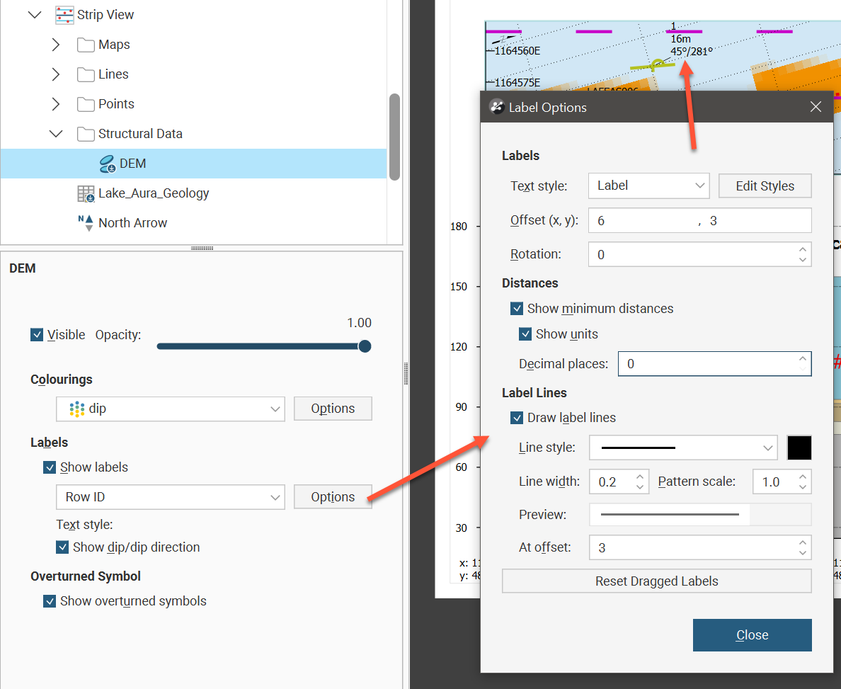
The structural data labels shown in the strip view can also be customised. Show labels will specify whether or not they should appear. Besides no label and the Row ID, each of the structural data columns can be selected to be displayed as the label. Additionally, you can choose to Show dip/dip direction as part of the label. Click the Options button for more label settings. The Text style can be set to one of the existing style definitions, or the Edit Styles button can be used to customise the label. Offset (x,y) places the label relative to the structural data symbol displayed in the strip view, and Rotation will tilt the text away from horizontal.
There is an option to Show minimum distances for each symbol. You can also choose to Show units and to specify the number of Decimal places displayed.
Label lines connect the label to a symbol using a customisable line. Tick Draw label lines to use these to clearly associate a label with a structural data symbol. You can set the Line style, the line colour, the Line width and the Pattern scale. At offset sets a minimum distance for the label line to appear. If you have ticked Draw label lines but you are not seeing any label lines, you may need to increase the distance of the label from the symbol using Offset (x,y) or you may need to decrease At offset. Because labels can be dragged on the split view to reposition the label so the text does not interfere with other visual elements, there is also a Reset Dragged Labels button to quickly revert any such label repositioning to the default positions.
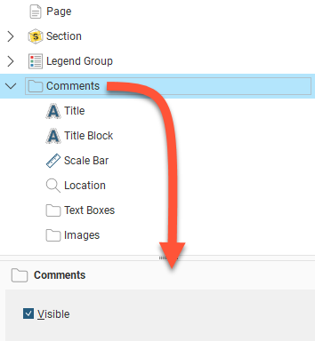
Adding and Organising Comments
Once you have laid out the main Section object and organised the Legend Group, you can add a number of different types of comment annotations to the layout, including a title, a title block, location information and a scale bar, text boxes and imported images. A master Visible tickbox is used to show or hide all the comment types.
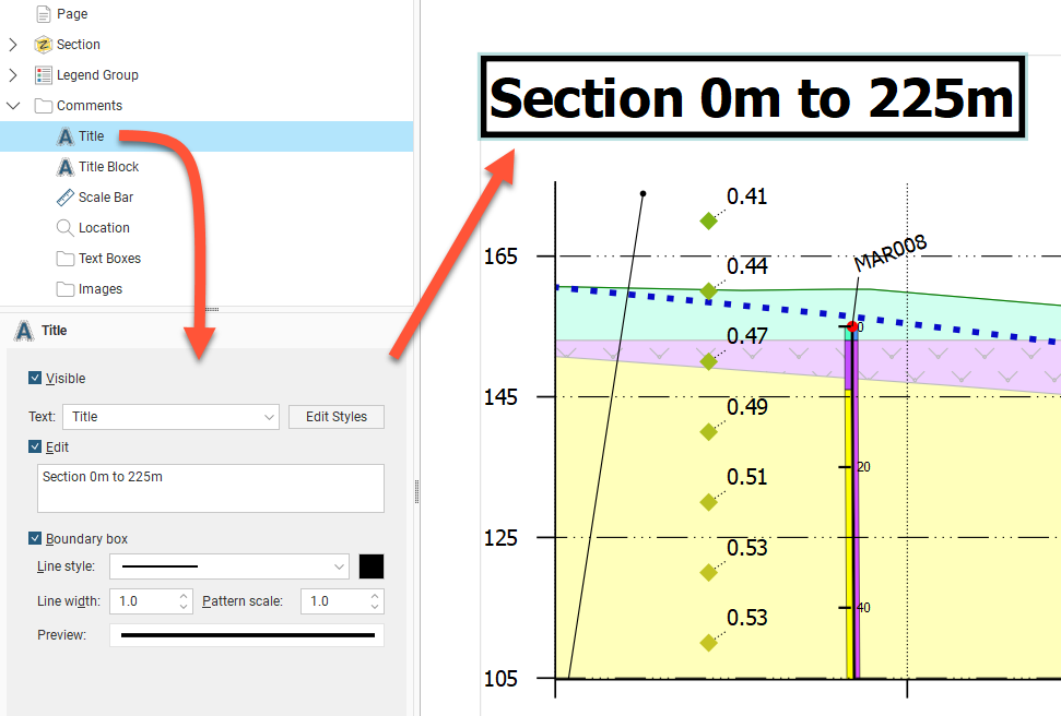
Displaying a Title
The Title object formats the title displayed on the section. To move the title, click on it in the layout preview and drag it to the preferred location. The text used for the Title is the name for the section in the project tree, but this can be changed in the properties panel. Enable the Edit option, then edit the text in the box. You can display a line around the Title by enabling the Boundary box option. You can customise the Line style, Line width, Pattern scale and colour of the box. A Preview is displayed and the boundary is updated in the section preview.
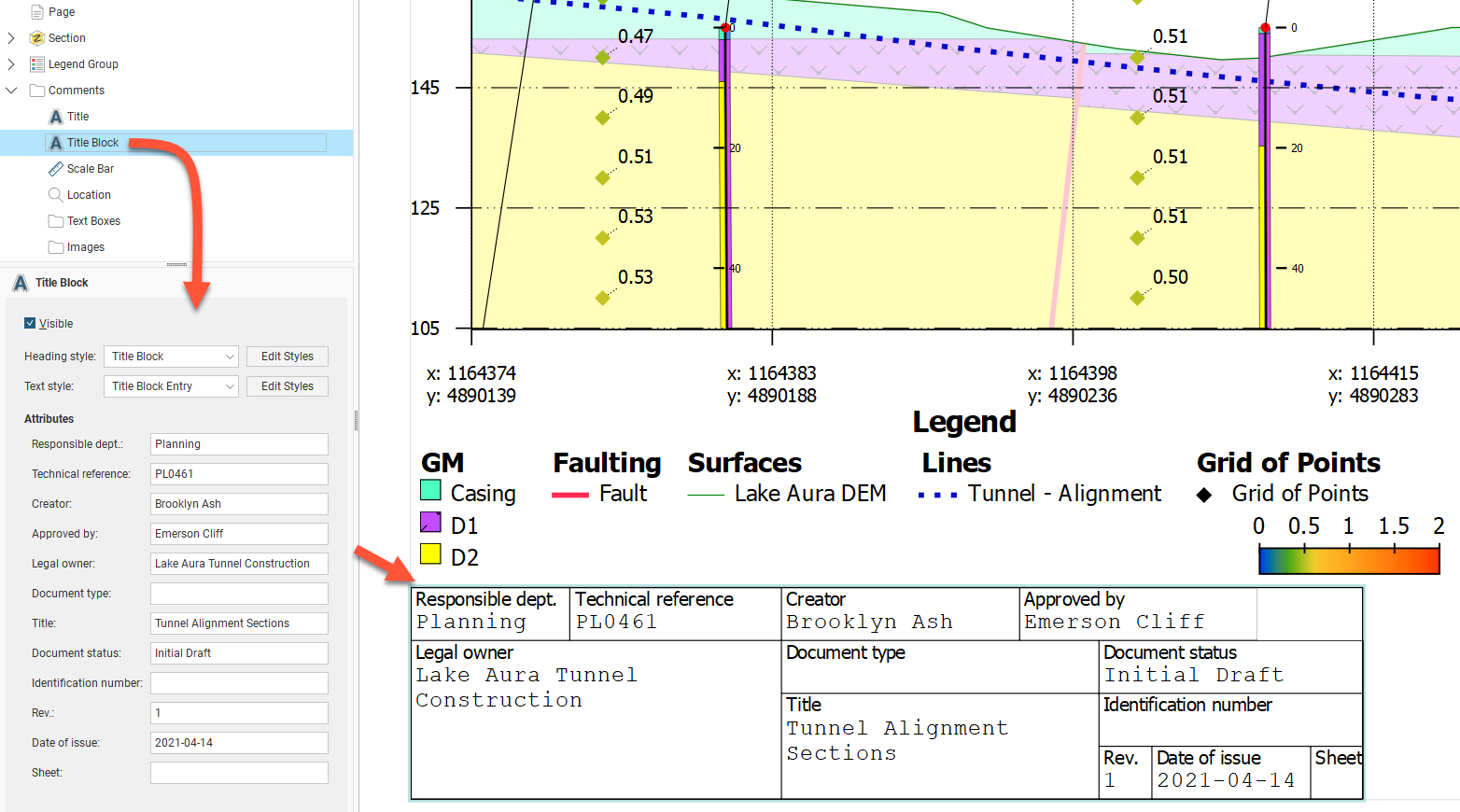
Displaying a Title Block
When the Title Block is made Visible, a title block based on ISO 7200 is displayed on the layout. Click and drag the title block into the desired position. You can select from the available styles for the title block Heading style and the Text style, and you can modify the styles used by clicking the Edit Styles buttons.
Text can be entered for each of the title block fields:
- Responsible dept
- Technical reference
- Creator
- Approved by
- Legal owner
- Document type
- Title
- Document status
- Identification number
- Rev
- Date of issue
- Sheet
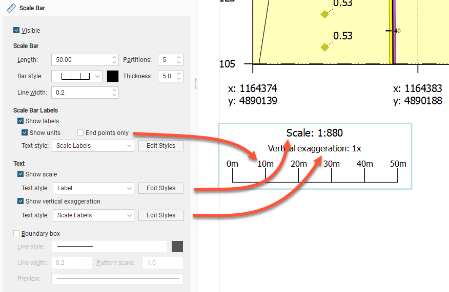
Displaying a Scale Bar Information
As for other section elements, the Scale Bar has an option to make the scale bar Visible. Click and drag the scale bar to reposition it on the section. There are a number of different styles available for the Scale Bar, and you can control its Length, Partitions, Bar style, Thickness and Line width:
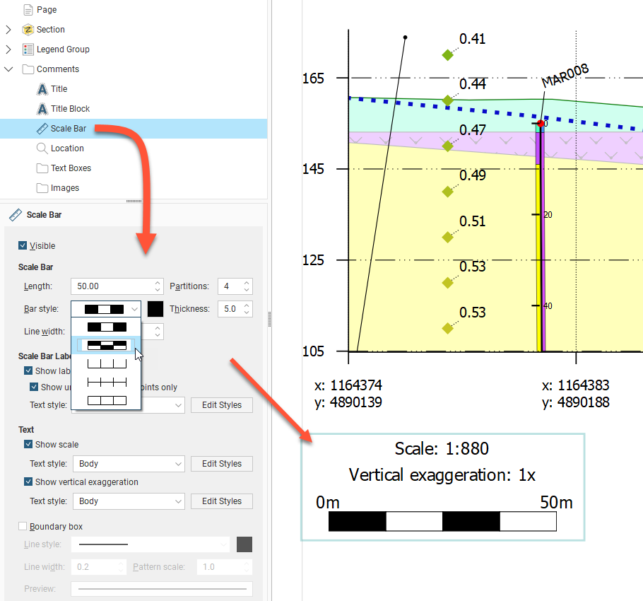
You can show the Scale Bar with or without labels, and labels can be shown all along the bar by disabling the End Points Only option. There is also a Show scale tickbox to show or hide the scale of the section, and an option to Show vertical exaggeration or hide it. As for other section elements, the scale bar box can be defined with a Boundary box with a customisable line style.
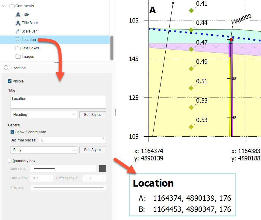
Displaying Location Information
The Location object controls how location information is displayed. It van be made Visible or hidden. Click and drag the location box to reposition it on the section. You can choose to include the Z coordinate and change the number of decimal places used to display coordinates.
The two points referenced in the Location are the top-left and top-right points of the section. The labels for these two points is editable and can be set by navigating in the layout tree to Section > Extents tab > Show end point labels Options button where Left label and Right label can be edited. These labels are used for the Location box even if the section extents Show end point labels tickbox is unticked.
There is a Boundary box option for the Location box. You can customise the Line style, Line width, Pattern scale and colour of the box. A Preview is displayed and the boundary is updated in the section preview.
Text Boxes
With the Text Boxes object, you can add text boxes and arrows to highlight information and details on the section:
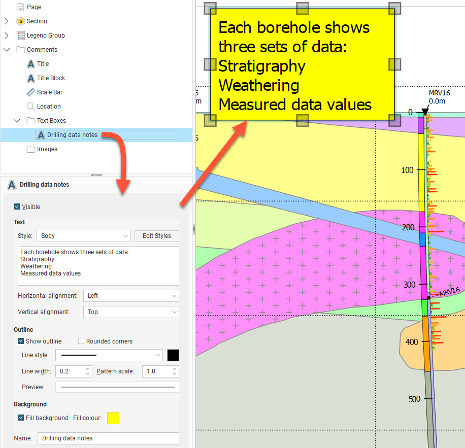
Besides the usual Visible tickbox, the Style of the text can be chosen from the styles available, and can be customised by clicking the Edit Styles button. The text is edited using the box provided. Both the Horizontal alignment and Vertical alignment can be set for the text inside the text box.
There is also a Show Outline option for the text box, and corners can be square or rounded. You can customise the Line style, Line width, Pattern scale and colour of the outline. A Preview is displayed and the text box is updated in the section preview.
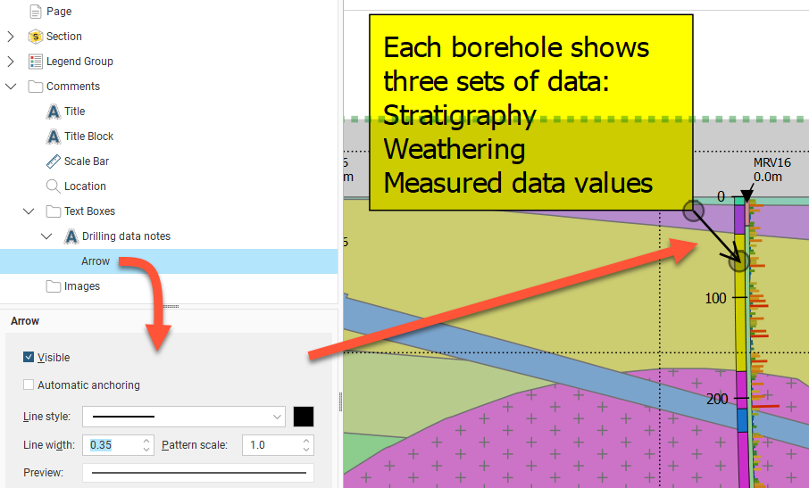
Once a text box has been created, an arrow can be added to connect the text box to a relevant part of the section. Right-click the text box in the layout tree and select Add Arrow. The arrow Line style, Line width, Pattern scale and colour can be customised. The arrow head scales with the line width. The arrow head style is not customisable. Each end of the arrow can be repositioned. When the Automatic anchoring option is enabled for an arrow, the arrow’s anchor will move when its associated text box is moved. If this option is disabled, the arrow will move when you move the text box, but you will have to place its anchor manually.
Images
If you wish to import an image such as a logo or map, right-click on the Images object and select Add Image. Navigate to the folder that contains the image file and select the file. Click Open to import the file, which will automatically be added to the section layout. Move the image by clicking on it in the preview and dragging it. You can resize the image by dragging the corners of the image. Visible will show or hide the image, and Opacity will control the transparency of the image.
Got a question? Visit the Seequent forums or Seequent support
© 2023 Seequent, The Bentley Subsurface Company
Privacy | Terms of Use