Swath Plots
The features described in this topic are only available if you have the Leapfrog Edge extension.
Swath plots are an important validation tool for providing comparisons between sample points (composited or uncomposited) and estimated values to identify any bias towards under-estimation or over-estimation or any smoothing in the results. The effect of different estimation methods and parameters can also be compared.
The swath plot is a one-dimensional graph in a specific direction of interest. A swath is a sectional slice through the block model with a specified thickness. The swath plot shows the average values for the blocks in the swath, along with the averaged sample values in the swath.
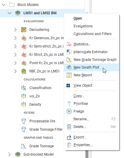
To create a swath plot, right-click on a block model and select New Swath Plot:
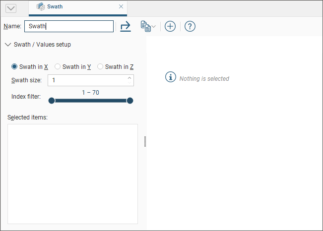
A new Swath window will open:
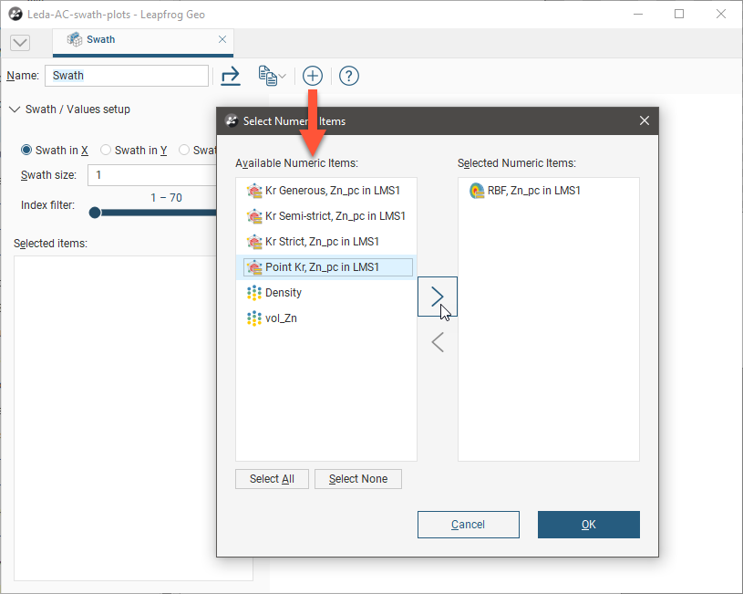
Click the add button (![]() ) to add data sets to the plot. You can select individual items from the list of Available Numeric Items or you can select a parent object to select all the child items within it. Click the right arrow button to move the selected items into the Selected Numeric Items list:
) to add data sets to the plot. You can select individual items from the list of Available Numeric Items or you can select a parent object to select all the child items within it. Click the right arrow button to move the selected items into the Selected Numeric Items list:
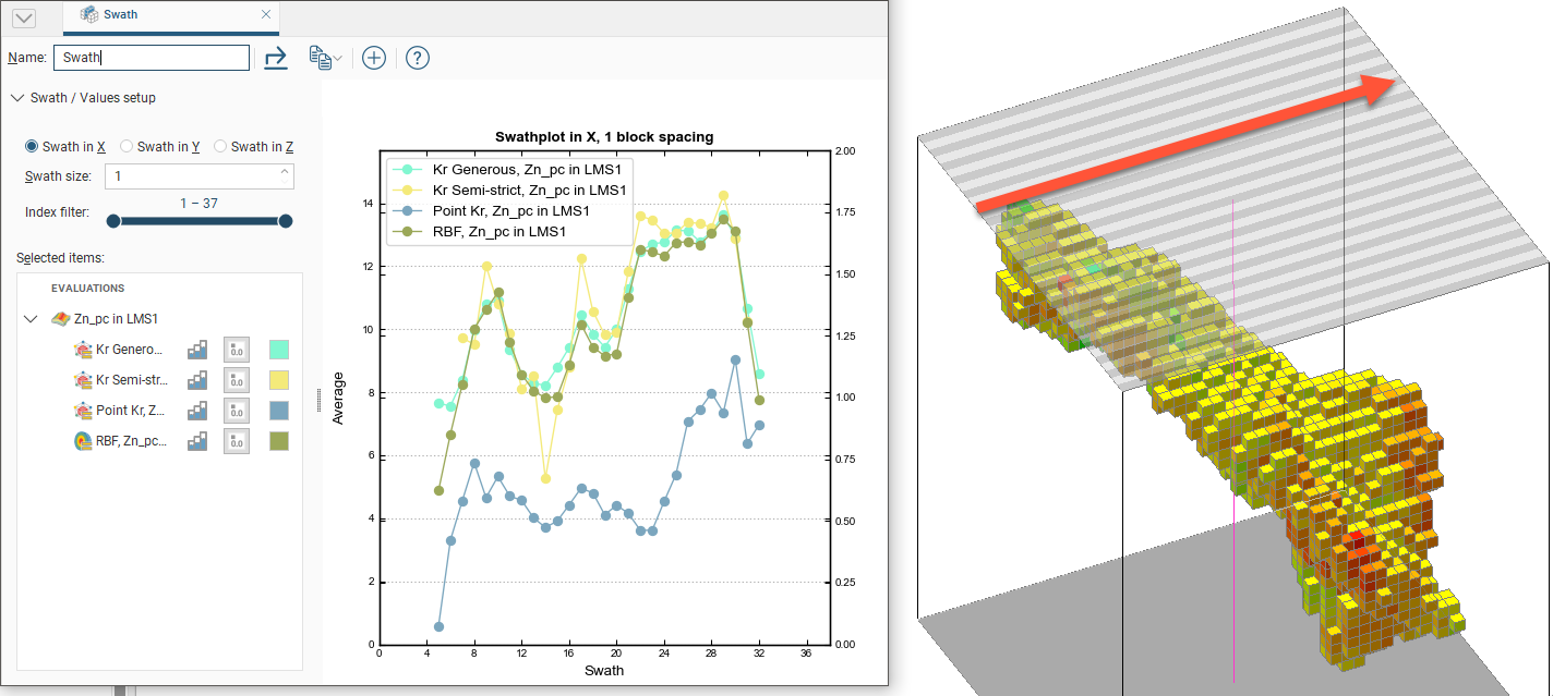
The graph plots the averaged sampled values against the averaged block values for a series of swaths slicing through the block model in a selected direction. The Swath size can be altered for finer or more coarse slices. The Scene view overlays a bounding cuboid that shows the Swath size and direction:
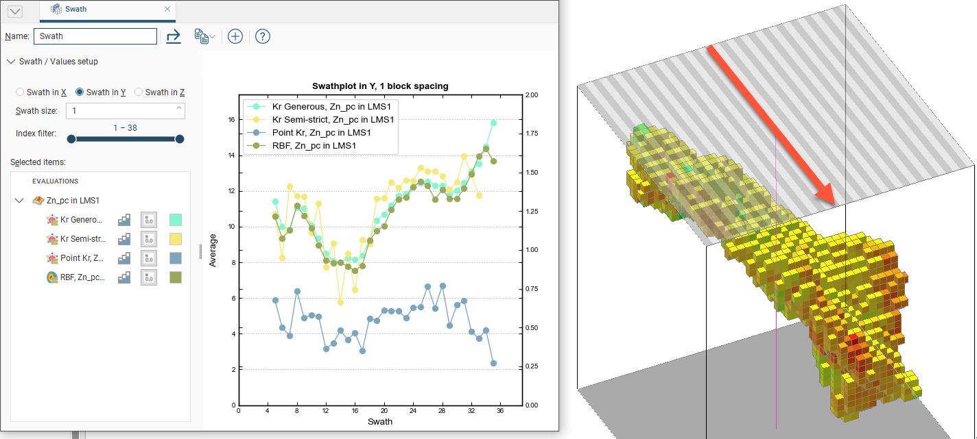
Changing the swath direction to Swath in Y is reflected in the scene:
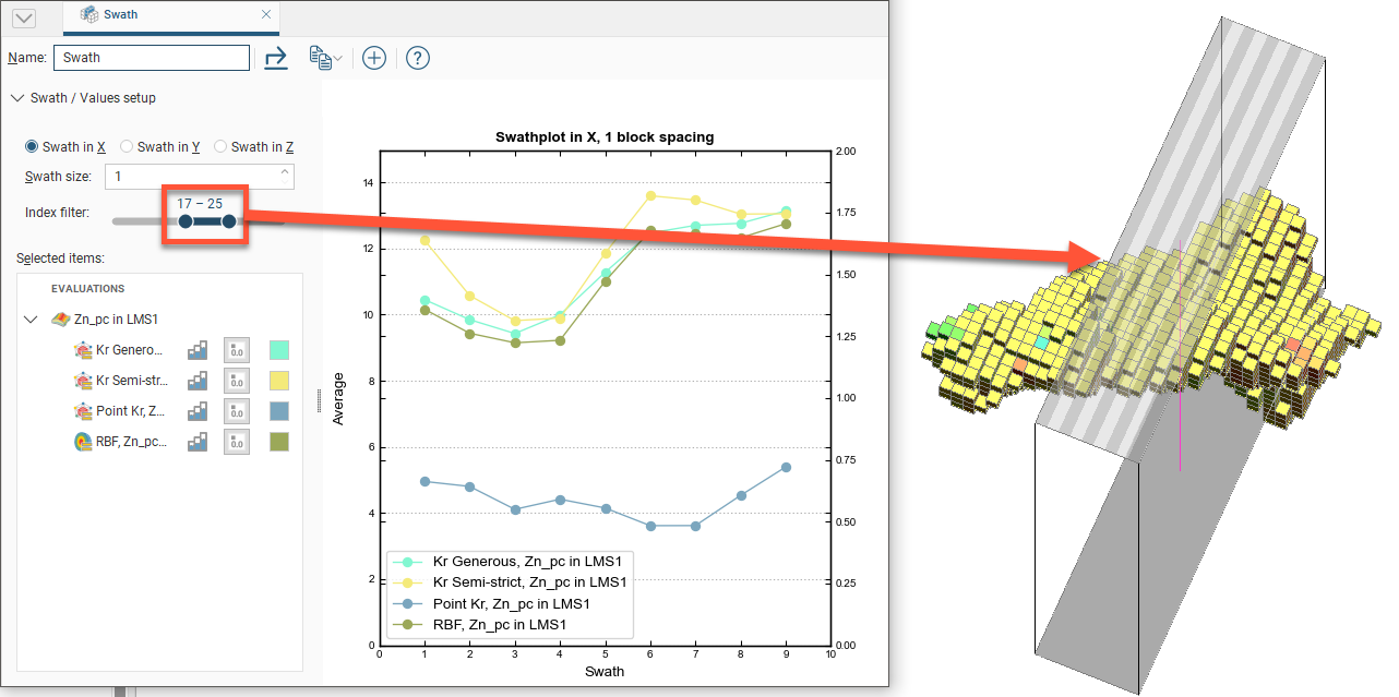
The Index filter can be used to graph a reduced set of the swaths. Either the minimum or maximum threshold for the Index filter can be dragged to change the width of the filter, and the selected portion can be changed by sliding the inner bar. The swath indicator widget in the Scene is updated to show what the Swath plot is depicting:
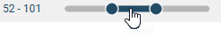
The range slider has two modes: coarse control and fine control. Here an index filter is used for a set of values that ranges from 1 to 160; it is displayed in dark blue, to show the full range of values in coarse control mode:

You can restrict the data displayed by dragging on the handles. Here the range of values is restricted to 1 to 50:

You can click and drag on the selected range to change the values displayed:
To switch to fine control, double-click anywhere along the range slider. Here the range of 52-101 has been expanded along the whole slider, giving you more control over the position of the range end points:
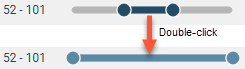
The slider is displayed in light blue in fine control mode.
Now you can use the handles to further restrict the range displayed:
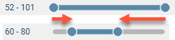
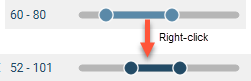
Right-click on the slider to return to coarse control and the full range of values. Here, right-clicking reverts to coarse control, with the range restricted to the original range of 52-101:
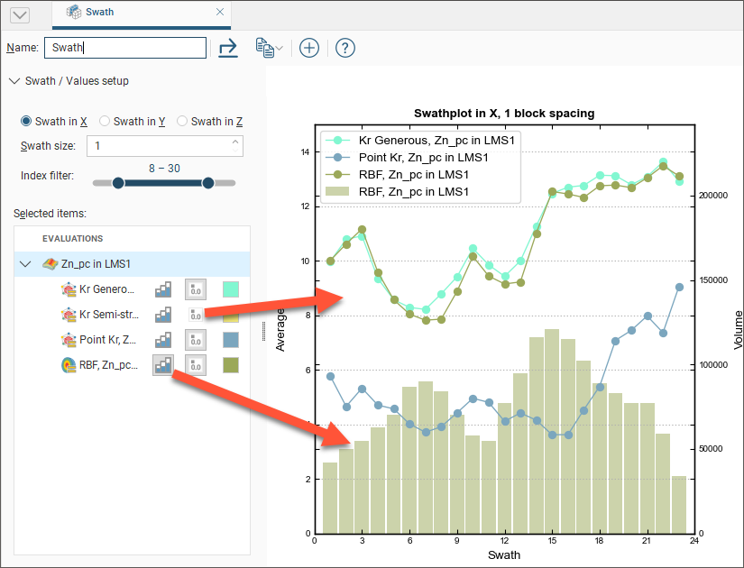
Selected data sets in the chart can be hidden or revealed by clicking the line segment visibility button (![]() ) next to the data set. The histogram visibility button (
) next to the data set. The histogram visibility button (![]() ) will reveal or hide a histogram showing the volume of blocks used in the swath calculation. The block volume may not be identical for all estimators.
) will reveal or hide a histogram showing the volume of blocks used in the swath calculation. The block volume may not be identical for all estimators.
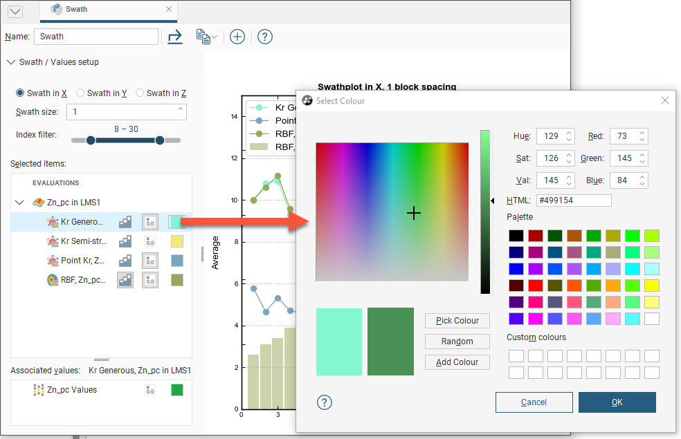
The colour for the line segment plots and histograms can be changed for each data set by clicking the colour chip, and selecting a new colour from the colour picker:
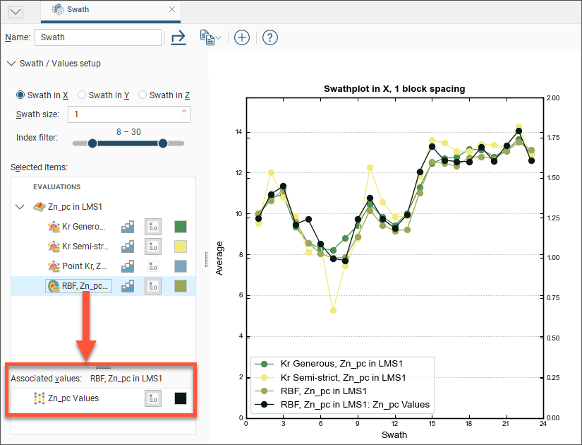
Selecting an evaluation will show an Associated Values panel. This provides options to set the visibility and colour preference for the evaluation's raw data values and declustered values for the evaluation's input data. Declustered values will only be shown as an associated value if a declustering object has been added to the domained estimation.
Changes you make to swath plots are preserved. Multiple swath plots can be created to show different points for analysis and reference.
You can export the graph for use in external reports and other documents. There are three options:
- The Export button saves a PDF, SVG or PNG file of the graph.
- The Copy button opens a menu to offer the options of copying a image of the graph to the Windows clipboard, or copying the graph data as CSV data to the Windows clipboard, where they can be pasted into another application. It also allows you to select the resolution of a copied image: a low resolution Screen Image, a Medium Quality, 300 dpi image, or a High Quality, 600 dpi image. Choose your preferred resolution before selecting Copy Graph Image.
Got a question? Visit the Seequent forums or Seequent support