
Numeric Colourmaps
When numeric data is displayed in the 3D scene, Leapfrog Geo automatically generates a colourmap based on the data. Adjusting these colourmaps and creating new ones can be useful in gaining a better understanding of the data. In addition, numeric colourmaps can be imported into and exported from a Leapfrog Geo project, and can be shared among objects in a project. Being able to import, export and share numeric colourmaps is important for organisations that use standard colourmaps across multiple projects.
Leapfrog Geo supports two types of numeric colourmaps: continuous and discrete. With a continuous colourmap, the colours in a colour gradient are stretched across a range of values:

With a discrete colourmap, you can define intervals across the range of values and select which colours are used to display each interval:
In a project, numeric colourmaps can be local or shared:
- A shared colourmap can be used by multiple objects in a project. Shared colourmaps are stored in the Colourings > Shared Colourmaps folder. You can see what objects are using any given colourmap by right-clicking on it in the project tree and selecting Assign. This opens a window that lists wherever the colourmap is used and also allows you to share it to other suitable objects in the project.
- A local colourmap applies only to a single object, such as a numeric data column in a drilling data table. Local colourmaps are not visible in the project tree.
The rest of this topic describes how to manage numeric colourmaps in Leapfrog Geo. It is divided into:
- Importing Colourmaps
- Creating Local Colourmaps
- Sharing Local Colourmaps
- Exporting Colourmaps
- Deleting Numeric Colourmaps
- Editing Shared and Local Colourmaps
- Continuous Colourmaps
- Discrete Colourmaps
Importing Colourmaps
Importing colourmaps allows you to standardise the colours used for displaying data across projects. Leapfrog Geo supports importing colourmaps in *.lfc format.
There are two ways to import colourmaps, and the method you choose will depend on how you wish to use the colourmaps.
- If you want to assign the colourmap to multiple data objects in the project, import it as a shared colourmap into the Colourings > Shared Colourmaps folder. See Importing a Shared Colourmap below.
- If you only want to use the colourmap on a single object, import it as a local colourmap. See Importing a Local Colourmap below.
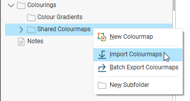
Importing a Shared Colourmap
To import one or more colourmaps into the Colourings > Shared Colourmaps folder, right-click on the Shared Colourmaps folder in the project tree and select Import Colourmaps.
In the window that appears, select the file you wish to import, then click Open.
You can select multiple files, if you wish to import more than one colourmap.
The colourmap will be added to the Shared Colourmaps folder.
Importing a Local Colourmap
To import a local colourmap for use with a single object in the project, expand that object in the project tree. Right-click on the column you wish to use the colourmap on and select Colours > Import.

In the window that appears, select the file you wish to import, then click Open. The colourmap will be added to the object and you can select it as an option when displaying the data object in the scene.
Creating Local Colourmaps
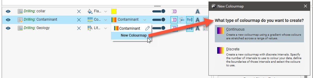
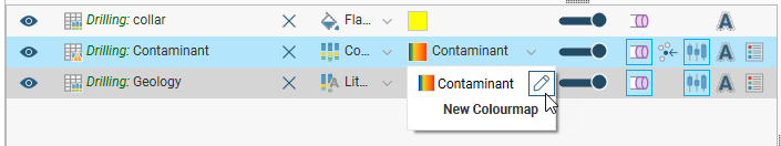
To create a new local colourmap for a specific object, first add a data object to the scene and display it by a numeric data column. Next, click on the colouring option in the shape list and select New Colourmap. You will be prompted to select the kind of colourmap you want to create:
Once you have selected the colourmap type, a window will open in which you can define the colourmap, as described in Continuous Colourmaps and Discrete Colourmaps later in this topic.
Sharing Local Colourmaps
Sharing a local colourmap saves the colourmap into the Colourings > Shared Colourmaps folder, making it available to other data objects in the project. Sharing a local colourmap also links the parent data object to the shared colourmap in the Colourings > Shared Colourmaps folder.
To share a local colourmap, right-click on its parent object in the project tree and select Colours > Share. In the window that appears, select which colourmaps you wish to share, then click OK.

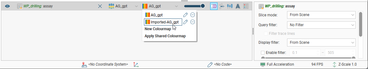
Here, the AG_gpt column has two colourmaps, the first one local and the second one shared. For the shared colourmap, there is a link to the project tree:
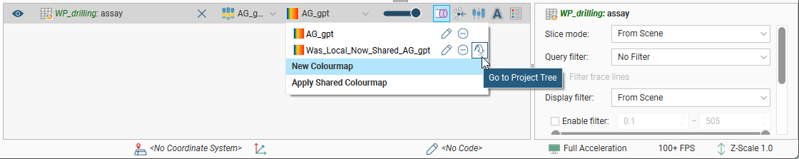
A newly-shared colourmap has only one data column assigned to it, but you can assign more columns to it. To do this, right-click on the colourmap in the project tree and select Assign:

In the Edit Colourmap window, you can then choose which assigned column to use in adjusting the colourmap:

Exporting Colourmaps
How you export colourmaps depends on whether the colourmaps are local or shared.
Exporting Shared Colourmaps
To export a single shared colourmap, right-click on it in the Colourings > Shared Colourmaps folder and select Export. In the window that appears, navigate to the folder where you wish to save the colourmap. Enter a filename and click Save. The colourmap will be saved in *.lfc format.
To export more than one shared colourmap, right-click on the Shared Colourmaps folder in the project tree and select Batch Export Colourmaps. In the window that appears, select the colourmaps you wish to export and change their names, if required:
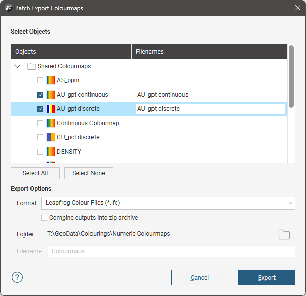
Choose where you wish to save the file, then click Export.
Exporting a Local Colourmap
To export a local colourmap, expand the data object in the project tree. Right-click on the column whose colourmap you wish to export and select Colours > Export.

If the object has more than one colourmap associated with it, you will be prompted to choose which one to export.
In the window that appears, navigate to the folder where you wish to save the colourmap. Enter a filename and click Save. The colourmap will be saved in *.lfc format.
Deleting Numeric Colourmaps
To delete a shared colourmap, right-click on it in the project tree and select Delete. You will be prompted to confirm your choice.
When you delete a shared colourmap from the project, local copies of that colourmap will be retained. If you do not wish to retain local copies of a colourmap, first unshare the colourmap. Do this by right-clicking on it in the project tree and selecting Assign. You can then remove the colourmap from the objects that are using it.
To delete a local colourmap, add the data object to the scene. Click on the colourmap in the shape list and click the remove button (![]() ):
):

You will be prompted to confirm your choice.
Editing Shared and Local Colourmaps
To edit a shared colourmap, double-click on it in the project tree.
To edit a local colourmap, add the data object to the scene. Click on the colourmap in the shape list and click the pencil (![]() ).
).
In both cases, an Edit Colourmap window will display the colourmap that is currently being used to display the data; this window will be different for continuous and discrete colourmaps. Any changes you make in the Edit Colourmap window will be reflected in the scene. To save the currently displayed colourmap, click Close.
Continuous Colourmaps
A continuous colourmap uses a gradient whose colours are stretched across a range of values. In the Edit Colourmap window, the Gradient list includes all inbuilt gradients and any that have been imported into the Colourings > Colour Gradients folder.
See the Colour Gradients topic for information on importing and managing colour gradients in Leapfrog Geo.
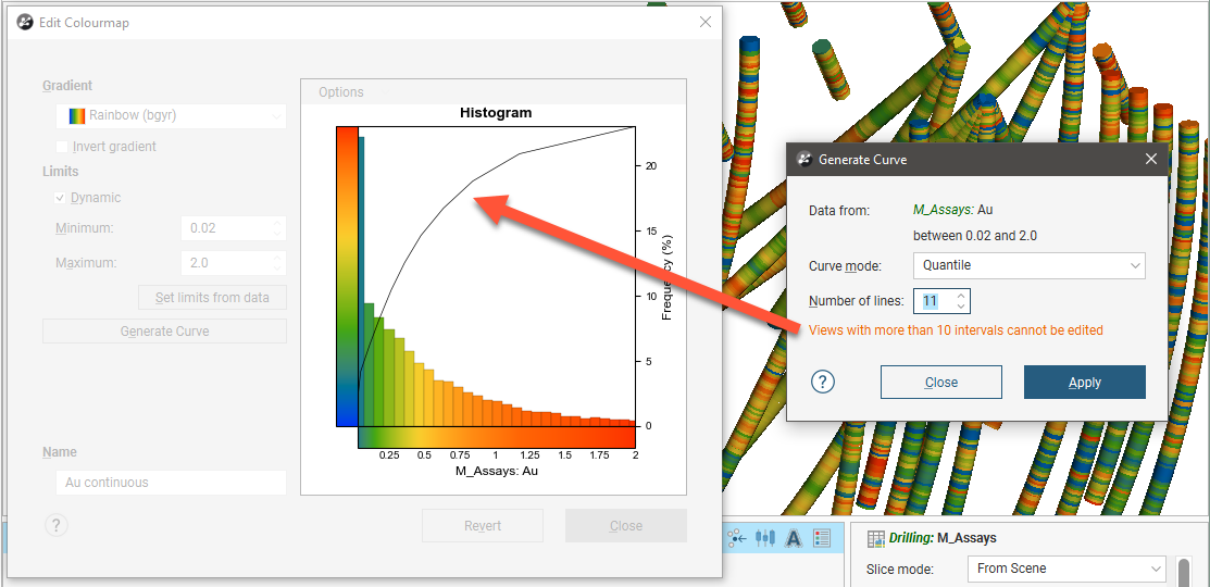
Click the Generate Curve button to change the Curve mode used and the Number of lines on the histogram:

You can limit the range of values used back in the Edit Colourmap window by disabling Dynamic and then setting the minimum and maximum values.
The curve modes all stretch the colourmap so that each line groups the histogram bars by colour. The available curve modes are:
- Quantile. The sum of the histogram bars between each pair of lines is equal.
- Progressive. The sum of the histogram bars between each pair of lines is progressively smaller, covering a smaller percentage of values towards the end of the curve.
- Progressive Double. This is similar to Progressive, but the effect is emphasised by increasing the percentage difference between lines.
- Logarithmic Intervals. This stretches the colours using a logarithmic transform, which may be preferred for data with a wide range of values.
Experiment with the different settings and click Apply to see the effects of changes. To edit the curve points on the histogram, close the Generate Curve window.

Note that if you use more than 10 lines in generating the curve, you will not be able to edit the curve points on the histogram:
You can change the Bin Width in the Options menu:

Enable Histogram of the Log to see the value distribution with a log scale X-axis. You can also view a Cumulative distribution function for the values, with or without a log scale X-axis.
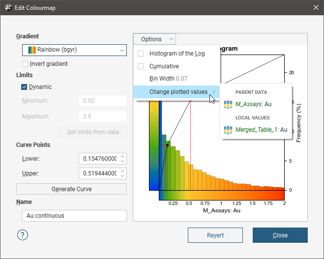
If the numeric data column for which the colourmap is defined has been produced from other data sources in the project, you will be able to select whether to display the Local Values or the values from the Parent Data. For example, for a numeric data column that is part of a merged table, you can display the values from only the merged table or from the parent table:
If the Dynamic option is enabled, the gradient will be updated when the data is updated, such as when drilling data is appended. If the option is disabled, the values manually set for the Minimum and Maximum limits will control the lower and upper bounds of the colourmap. Reducing the range of the upper and lower bounds is useful if the bulk of the data points have values in a range much smaller than the overall range of the data. This is common in skewed data.
The Set limits from data button automatically adjusts the Minimum and Maximum Limit values so that the colourmap would follow the actual data distribution of the input data. The values that lie outside the Limits are coloured with the last colour at the relevant end of the colourmap.
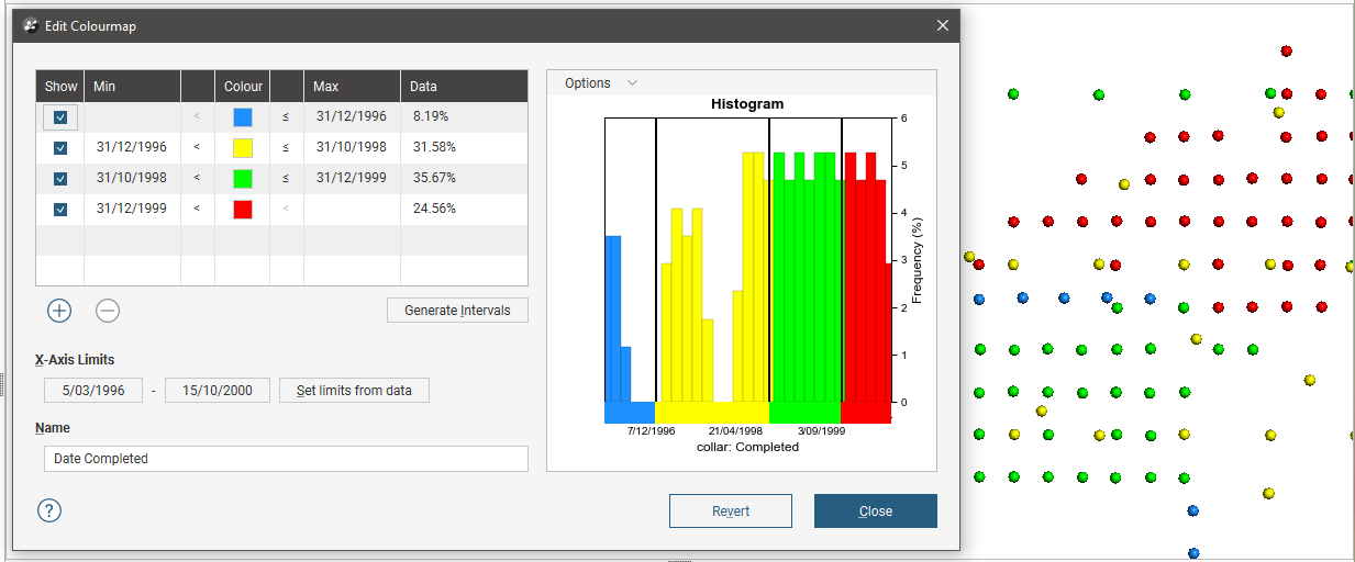
Both continuous and discrete colourmaps can be used to display date information. If a date is displayed using a continuous colourmap, the curve points represent the start and end dates:

When you click Revert, all changes you have made in the window are discarded.
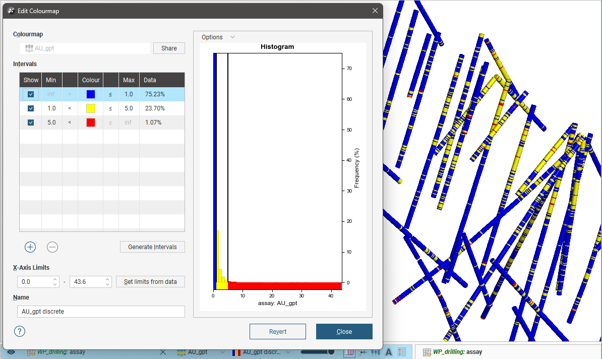
Discrete Colourmaps
With a discrete colourmap, you can define intervals and select which colours are used to display each interval:
Click the Generate Intervals button to generate intervals based on various statistical methods:
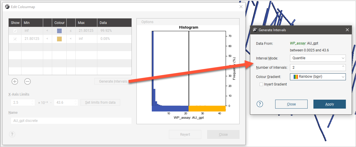
Select an Interval Mode. The options are:
- Quantile. This attempts to create the specified number of intervals so that each interval contains the same number of values.
- Progressive. This attempts to create intervals that enclose progressively smaller percentages of values. For example, 1000 unique values organised into 5 intervals would have the following percentiles: ~33%, ~27%, ~20%, ~13%, ~6%.
- Progressive Double. This is similar to Progressive, but is “steeper”. For example, 1000 values organised into 5 intervals would have the following percentiles: ~50%, ~25%, ~12.5%, ~6.25%, ~3%.
- Equal Intervals. This creates intervals at equal spacing across the range of the values.
- Logarithmic Intervals. This creates intervals at equal spacing, in log-space, across the range of values.
- K Means Clustering. This is an iterative algorithm that sorts values into clusters in which each value belongs to the cluster with the nearest mean. This option can take some time, especially with large data sets and a large number of intervals.
Set the Number of Intervals and the Colour Gradient to be used as the basis for the interval colourings. The first interval is assigned the first colour of the selected Colour Gradient and the last interval is assigned the gradient’s last colour; selecting Invert Gradient swaps this around.
You can change the Bin Width in the Options menu:

Enable Histogram of the Log to see the value distribution with a log scale X-axis. You can also view a Cumulative distribution function for the values, with or without a log scale X-axis.
If the numeric data column for which the colourmap is defined has been produced from other data sources in the project, you will be able to select whether to display the Local Values or the values from the Parent Data. For example, for a numeric data column that is part of a merged table, you can display the values from only the merged table or from the parent table:

The Set limits from data button automatically adjusts the X-Axis Limits so that the colourmap would follow the actual data distribution of the input data.
Experiment with the different settings and click Apply to see the effects of changes.
You can also add intervals manually by clicking the Add button. For example, if you create a discrete colourmap to show the different stages of a drilling campaign, the initial colourmap contains only two intervals:

Click the Add button to add new intervals and use the Min and Max entries in the table to set the start and end points of each interval:
When you click Revert, all changes you have made in the window are discarded.
Got a question? Visit the Seequent forums or Seequent support
© 2023 Seequent, The Bentley Subsurface Company