
Statistics
Leapfrog Geo has a number of tools that help you to statistically analyse your data. This topic describes the different statistics visualisations available in Leapfrog Geo. It also describes the Statistics object, which collates and organises charts and tables you have defined for data in the project.
This topic is divided into:
- Managing Saved Statistics Reports
- Creating a Statistics Report
- Table of Statistics
- Scatter Plots
- Q-Q Plots
- Box Plots
- Univariate Graphs
- Comparison Histograms
Leapfrog Geo uses fixed 25%/75% quartiles.
Managing Saved Statistics Reports
The Statistics object at the bottom of the project tree is for collating and organising charts and tables you have defined for data in the project. Double-click on it to open a new detachable tab where saved statistics reports can be managed.
For more information on working with detachable tabs, see Organising Your Screen Space.
The Statistics tab lists saved statistics reports. Initially the window will be empty:
![]()
To learn how to add statistics reports to the statistics tab, see Creating a Statistics Report below.
Once you have statistics reports in the list, select a report and click the Delete button (![]() ) to remove an item from the list.
) to remove an item from the list.
You can change the size of different elements of graphs, such as the sizes of different labels. To do this, click the Graph settings button (![]() ):
):
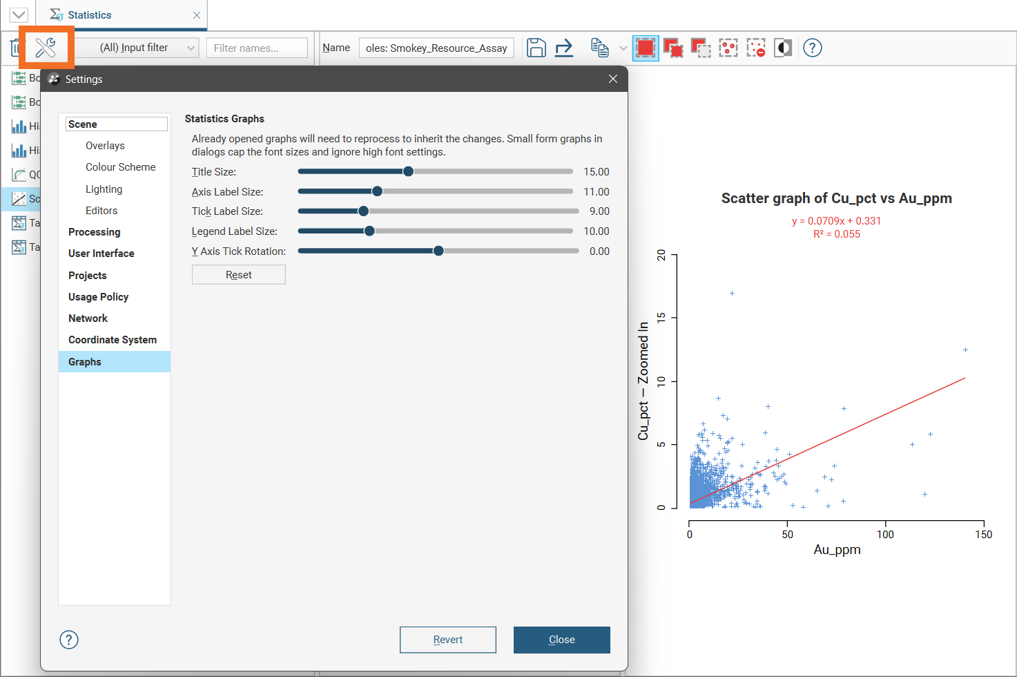
To see the changes made to the visual elements in this dialog, position the dialog over a chart so you can see display parameters for the chart, then make a change to the display parameters in the chart, such as turning an option on and off. This will refresh the chart so you can see the effect of the visual element adjustments made in the dialog.
When the project contains many different statistics reports, it can be difficult to locate the one you need. There are two ways to filter existing reports:
- Use the Input filter list to select reports by data type.
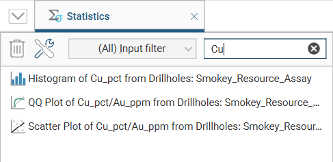
- Use the Filter names box to search for reports by name.
The input filter is a dropdown list selector with the source inputs for the statistics reports arranged according to input type:
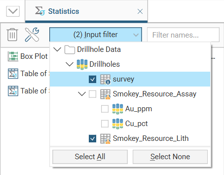
Tick the boxes next to any source input you want included in the filtered list of statistics reports. Use the Select All or Select None buttons to create a preferred starting point for specific input selections.
To filter the list based on the names of the statistics reports, enter any characters that must appear as sub-strings in the name:
Select any report from the list on the left, and the statistics report will be displayed in the Statistics tab, along with all the settings and options for that statistics view:
Any changes you make to the statistics options will automatically be preserved. If you click the Save button (![]() ) in the toolbar, a new standalone object will be created in the list of statistics reports.
) in the toolbar, a new standalone object will be created in the list of statistics reports.
The options and settings for each type of statistics report are detailed below.
Creating a Statistics Report
For many of the data tables, charts and tables of statistics present statistical information about the data set. To create one of these statistics reports, right-click on a data table, and if the data type has associated statistics options, the menu will include a Statistics option.
When that Statistics option is selected, a window will appear where the statistics type can be chosen:
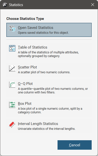
The button at the top of the window is Open Saved Statistics, a link to saved statistics for the current data object, if any have already been saved. Otherwise the button will be greyed out. See Managing Saved Statistics Reports for more information.
The options available for creating statistics reports will depend on the current data type. Selecting an option opens a new statistics window. Each of the different types of statistics windows are described below.
When you have customised the statistics report to you liking, click the Save button (![]() ) to add the report to the list of statistics reports in the statistics tab.
) to add the report to the list of statistics reports in the statistics tab.
Table of Statistics
For many data tables, you can view a table of statistics for multiple attributes. If the table has one or more category columns, data can, optionally, be grouped by category. To open a table of statistics, right-click on a data table then select Statistics. In the window that appears, select the Table of Statistics option.
In this example, we have the initial table of statistics for a merged table with both category and numeric columns. However, nothing is displayed in the table because data columns have not yet been selected.
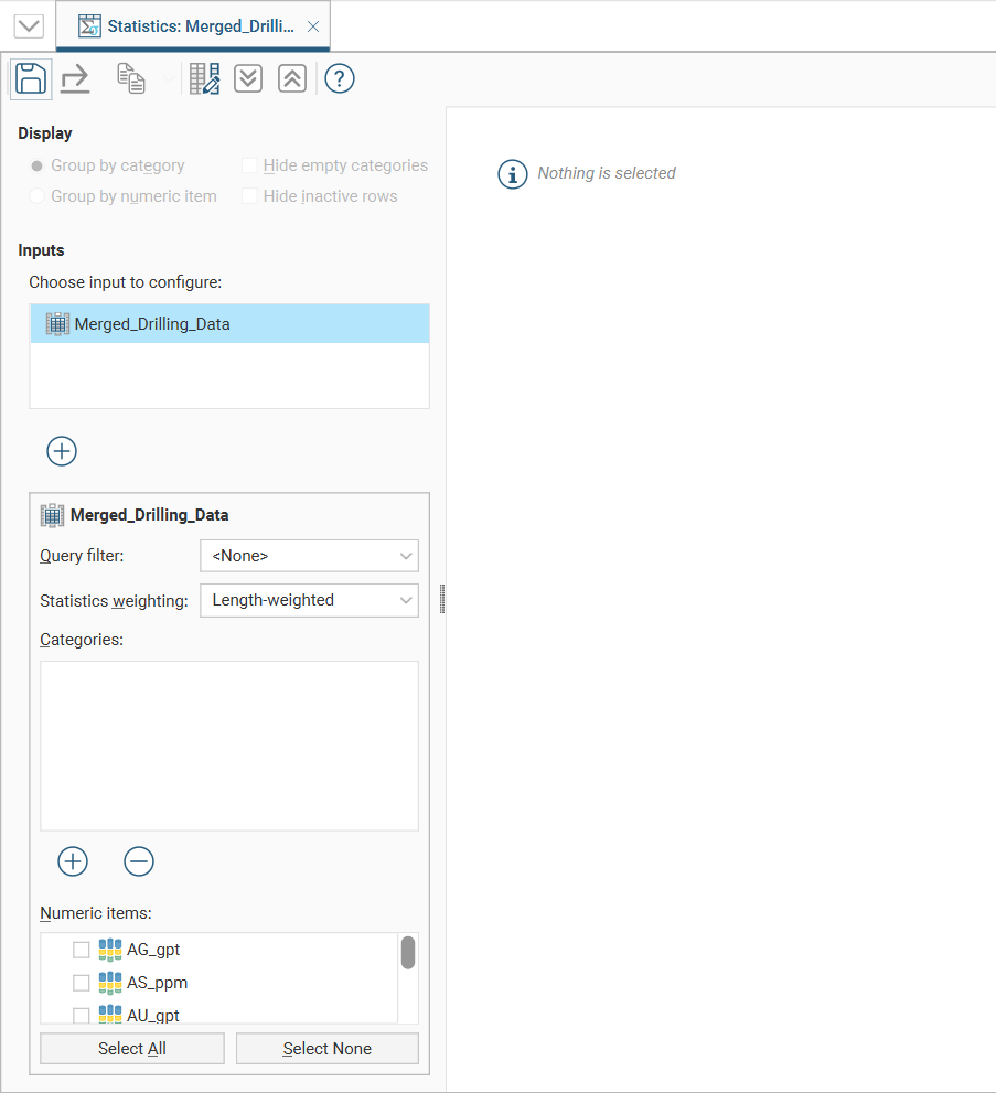
The input data selected in the project tree is already present in the Inputs list, and additional inputs can be added by clicking the Add button (![]() ) below the Inputs list, then moving inputs from Available Inputs to Selected Inputs.
) below the Inputs list, then moving inputs from Available Inputs to Selected Inputs.
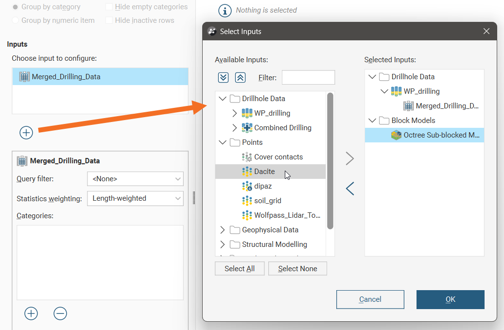
If you wish to remove an input from the Inputs list, click the Add button (![]() ) below the Inputs list and move inputs from Selected Inputs to Available Inputs.
) below the Inputs list and move inputs from Selected Inputs to Available Inputs.
The input selected in the input list will affect the category and numeric data shown below the input list.
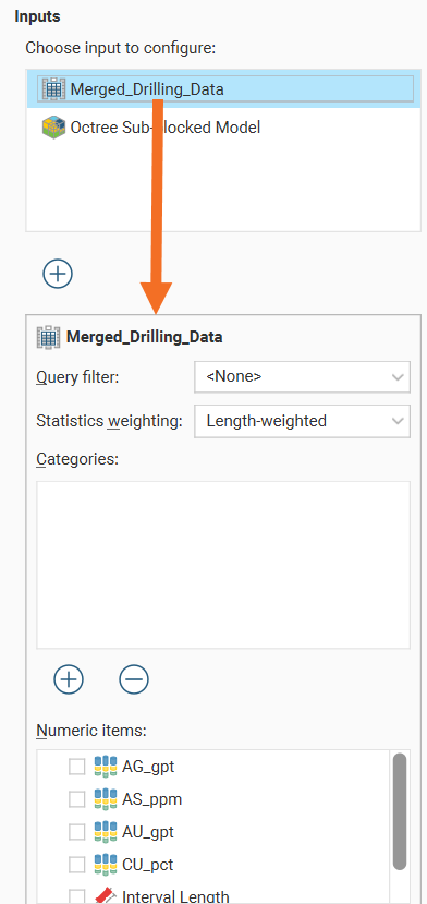
The input data used in the table of statistics can be filtered using a Query filter. See the topic Creating a Query Filter for information on creating query filters.
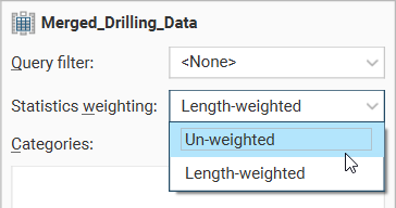
The Statistics weighting dropdown list will contain different options depending on the object being inspected. For this merged table example, the options are Un-weighted and Length-weighted.
For a block model, the options are Un-weighted, Volume-weighted and Mass-weighted. When Mass-weighted is selected, you can also specify the Density as a constant number or by referencing a data column that contains density information. There is also an Additional weighting column which allows the selection of another numeric column to use for scaling. This is especially useful for selecting a stored proportion as illustrated here:
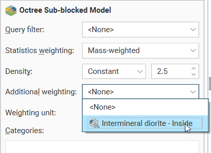
For columns other than stored proportions, you will need to specify the Weighting unit as Decimal or Percentage depending on the content of the data column.
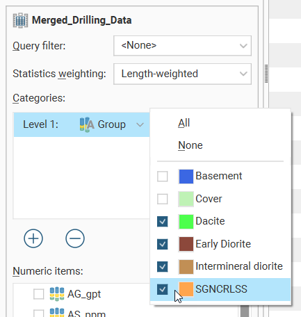
Click the Add button below the Categories list to select from the category columns available in the input table. An entry will be added to the Categories list. Open the dropdown list to select from the available category columns:
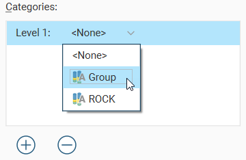
An additional dropdown list will be added, where individual categories of interest can be selected. There are All and None options to provide alternate starting points for category selection.
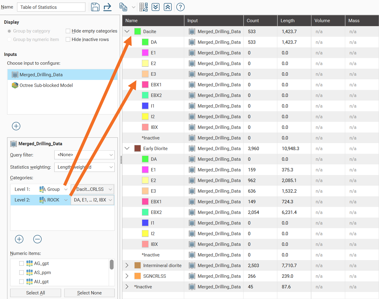
When additional category columns are added to the Categories list, the Level 2 category column will be nested below the Level 1 category column in the table of statistics.
To reorder the levels for the category columns, it is necessary to delete and re-add the category columns in the preferred order.
Select from the Numeric items available for the table.
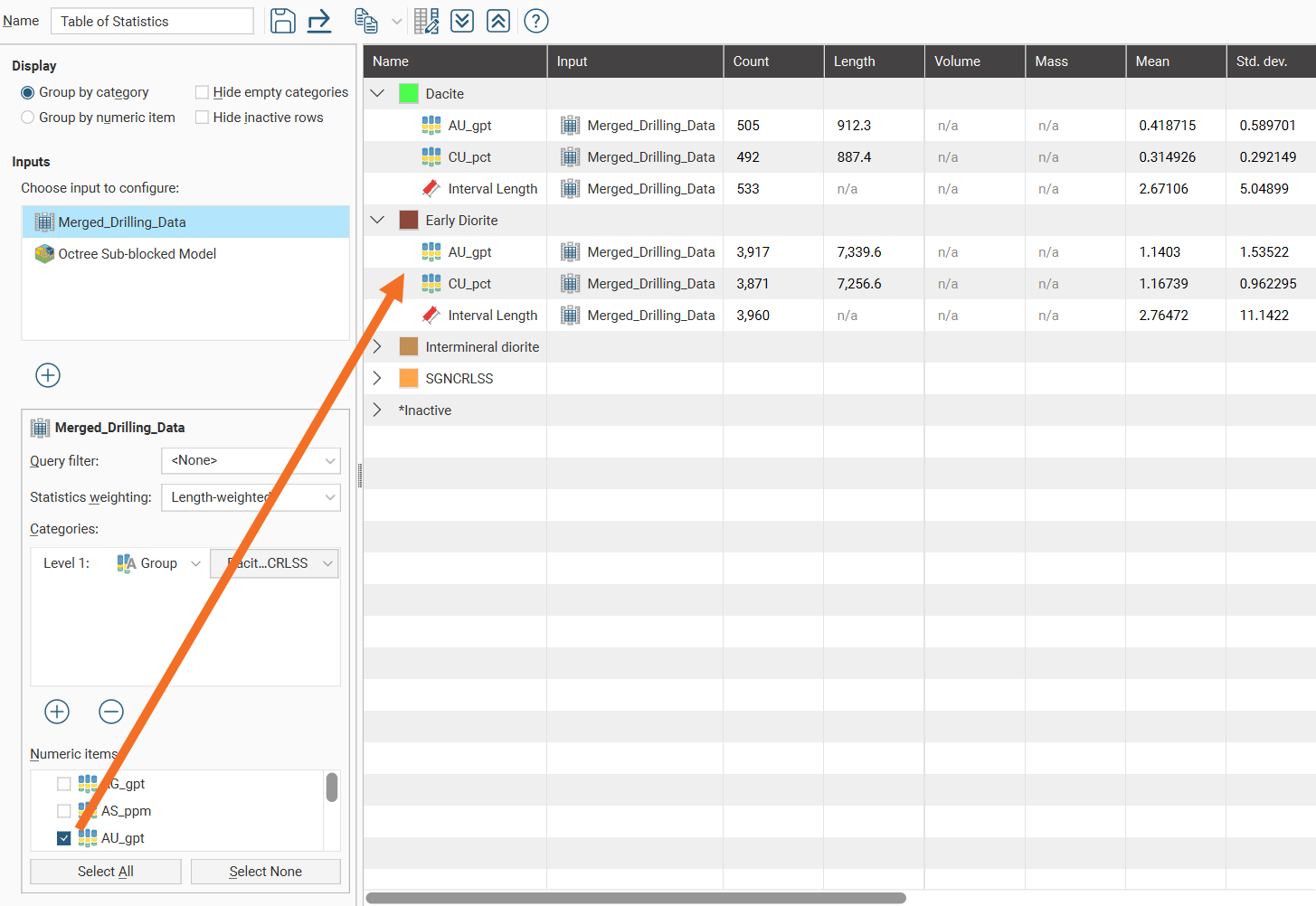
Once Numeric items have been selected, a complete table of statistics will be available:
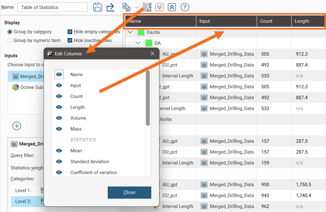
Change the columns displayed in the table by clicking on the Edit table columns button (![]() ):
):
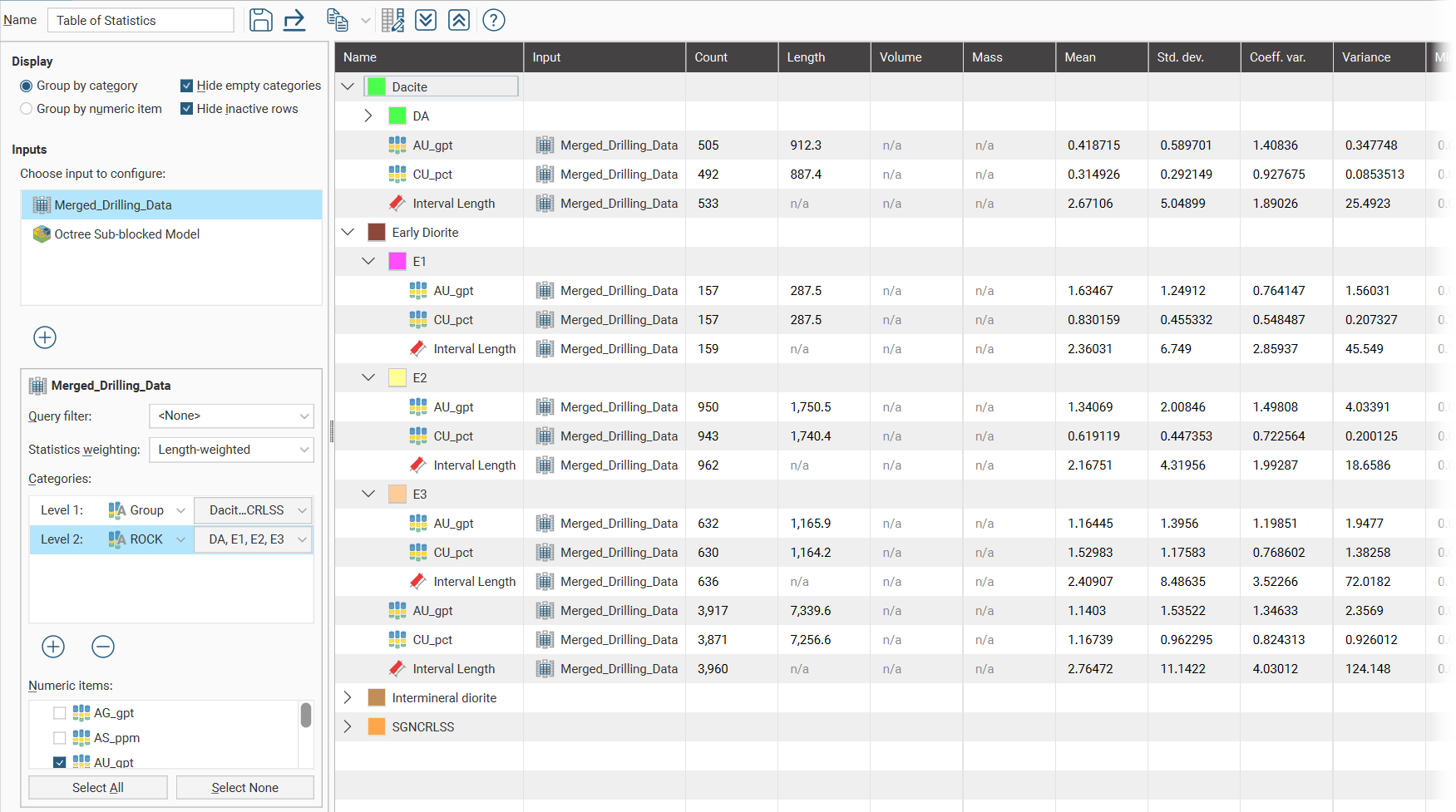
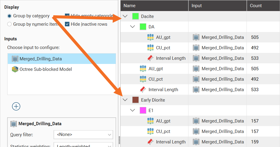
Group by category and Group by numeric item provide further options for the table organisation. Here the Group by category option has been selected, resulting in the numeric rows appearing for each category:
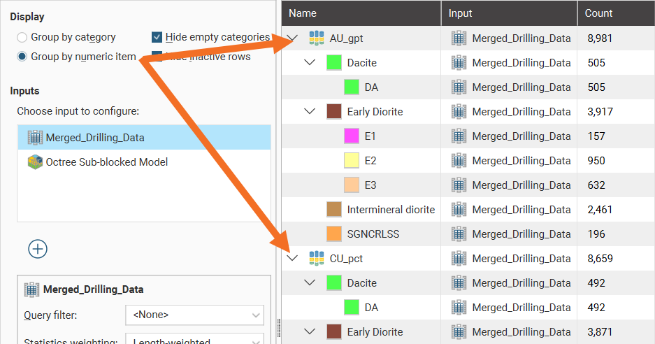
When Group by numeric item is selected, category rows appear for each numeric data column:
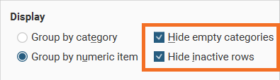
You can also hide empty categories (those with a count of zero) and inactive rows:
Click the Save icon (![]() ) to add the current table of statistics to the Statistics tab using the Name in the toolbar.
) to add the current table of statistics to the Statistics tab using the Name in the toolbar.
To export the table in CSV format, click on the Export button in the toolbar (![]() ).
).
Click rows to select them, and select multiple rows by holding down the Shift or Ctrl key while clicking rows. You can then copy rows by clicking the Copy button (![]() ), which allows you to copy the selected row(s) or all rows in the table.
), which allows you to copy the selected row(s) or all rows in the table.
The arrow buttons quickly expand (![]() ) or collapse (
) or collapse (![]() ) rows.
) rows.
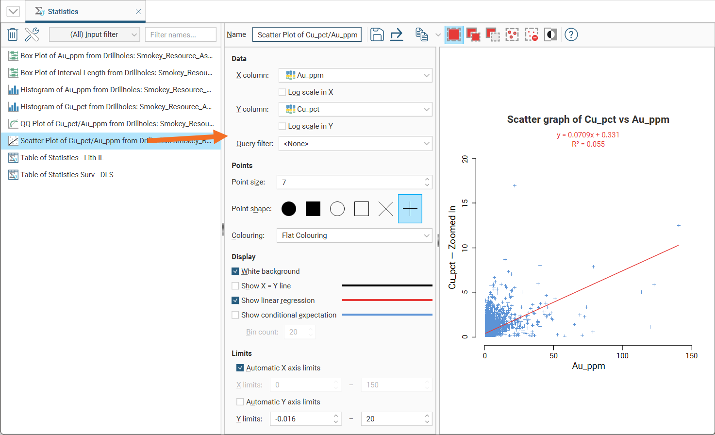
Scatter Plots
Scatter plots also appear when selecting Decluster Weights Comparison from the Statistics options.
Scatter plots are useful for understanding relationships between two variables. An additional variable can be introduced by setting the Colouring option to a data column. The example below plots the two variables lead and zinc against each other, with gold being indicated by the colouring. You can make either axis a log scale with the Log scale in X and Log scale in Y options. A Query filter may also be applied.
The appearance of the chart can be modified by adjusting the Point size, Point shape, and White background settings.
Enable Show X = Y line to aid in assessing how far off equal the distributions are.
When you select Show linear regression, a regression line is added to the chart and a function equation is added below the chart title.
Show conditional expectation plots a line that attempts to find the expected value of one variable given the other. The X axis is divided into a number of bins specified by Bin count, and the data in each bin is used to predict the expected Y value.
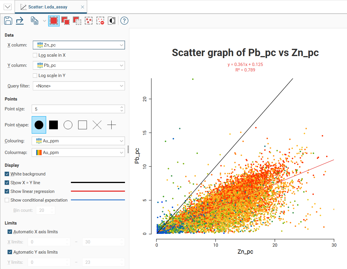
By default, the limits of the chart are automatically set to range between zero and the upper limit of the variable data. You can adjust this by turning off Automatic X axis limits and/or Automatic Y axis limits and specifying preferred minimum and maximum values for each axis.
There are three select tools at the top of the window:
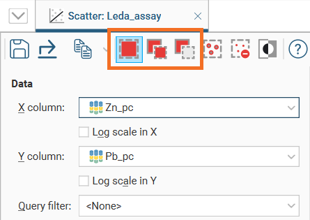
With these tools, you can select or deselect points on the graph.
- Use the Replace button (
 ) to select points. This tool clears any previous selection.
 - Use the Add button (
 ) to add more points to an existing selection.
 - Use the Remove button (
 ) to deselect points.
There are three ways to use each tool:
- Click on individual points to select/deselect them.
- Drag the cursor across points to select/deselect them.
- Draw around a set of points to select/deselect them.
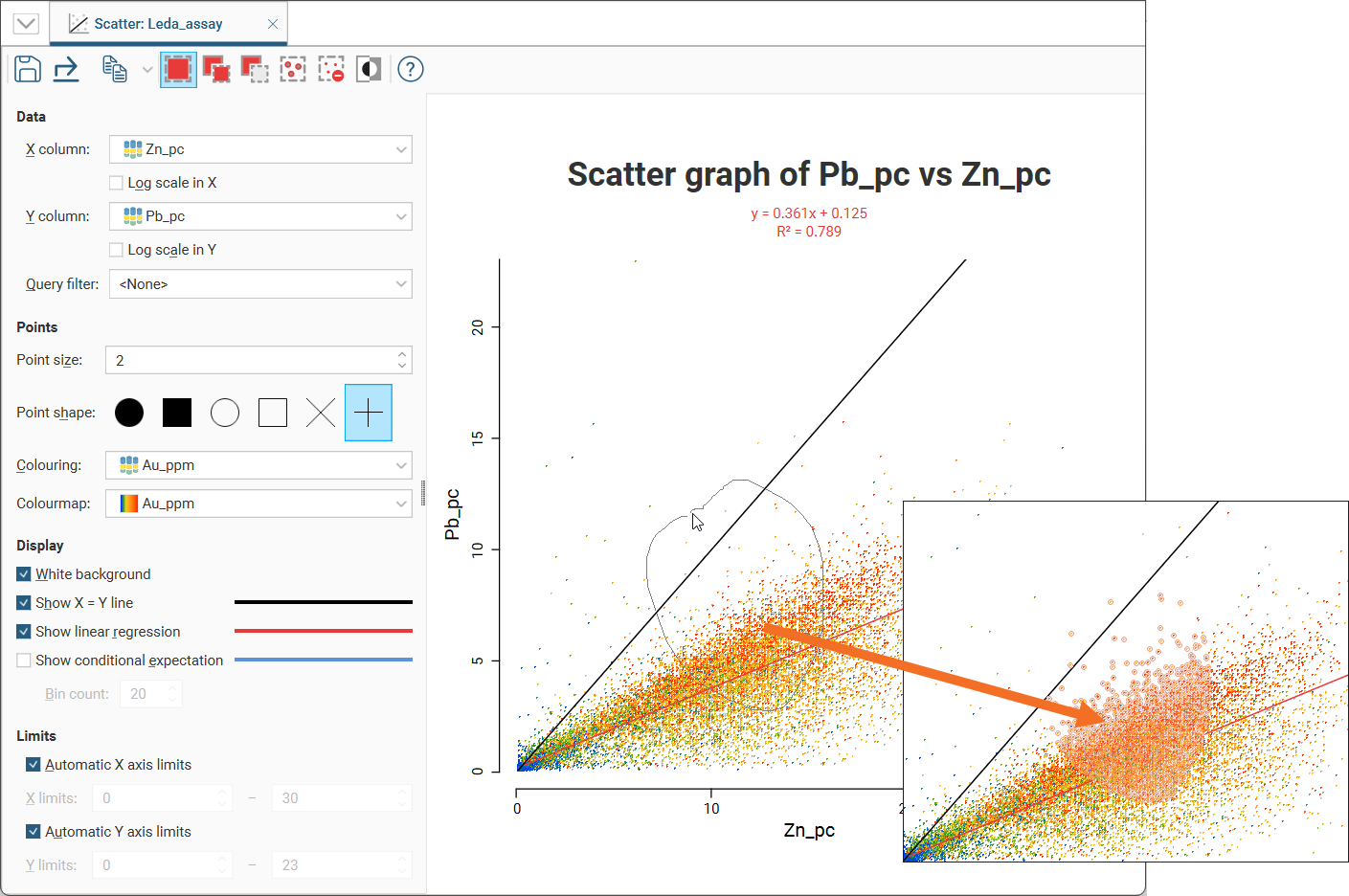
For example, here, using the Replace button (![]() ) to draw a loop around points selects those points:
) to draw a loop around points selects those points:
You can also:
- Select all visible points by clicking on the Select All button (
 ) or by pressing Ctrl+A.
 - Clear all selected points by clicking on the Clear Selection button (
 ) or by pressing Ctrl+Shift+A.
 - Swap the selected points for the unselected points by clicking on the Invert Selection button (
 ) or by pressing Ctrl+I.
Click the Save icon (![]() ) to add the scatter plot to the Statistics tab.
) to add the scatter plot to the Statistics tab.
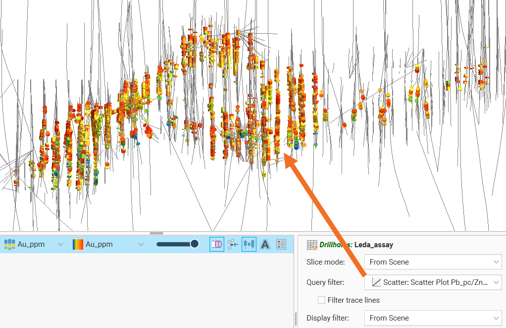
Once saved to the Statistics tab, selected points can be filtered in the scene by selecting the scatter plot from the Query filter options in the shape properties panel.
Q-Q Plots
Quantile-Quantile plots are useful for validating your assumptions about the nature of distributions of data. Select the data columns to show on the X Axis and Y Axis (which can optionally be set as log scales). You can also select an X filter and/or Y filter to limit the values used from the data columns.
Enable Show X = Y line to plot the mirror line for the chart, which may not always be obvious when the X and Y axis have different scales.
Show quartile line draws a line through two points on the chart, the lower quartiles and the upper quartiles for each of the axes.
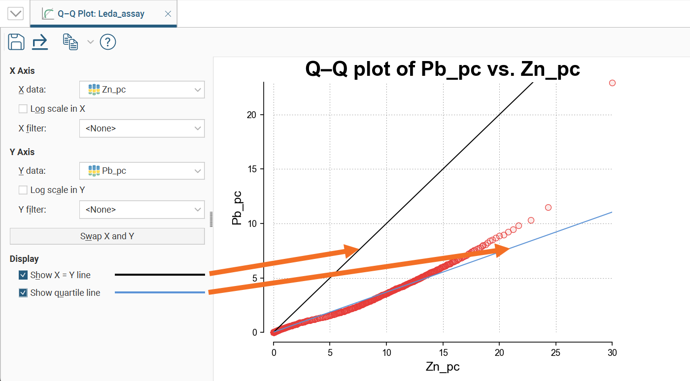
Click the Save icon (![]() ) to add the Q-Q plot to the Statistics tab.
) to add the Q-Q plot to the Statistics tab.
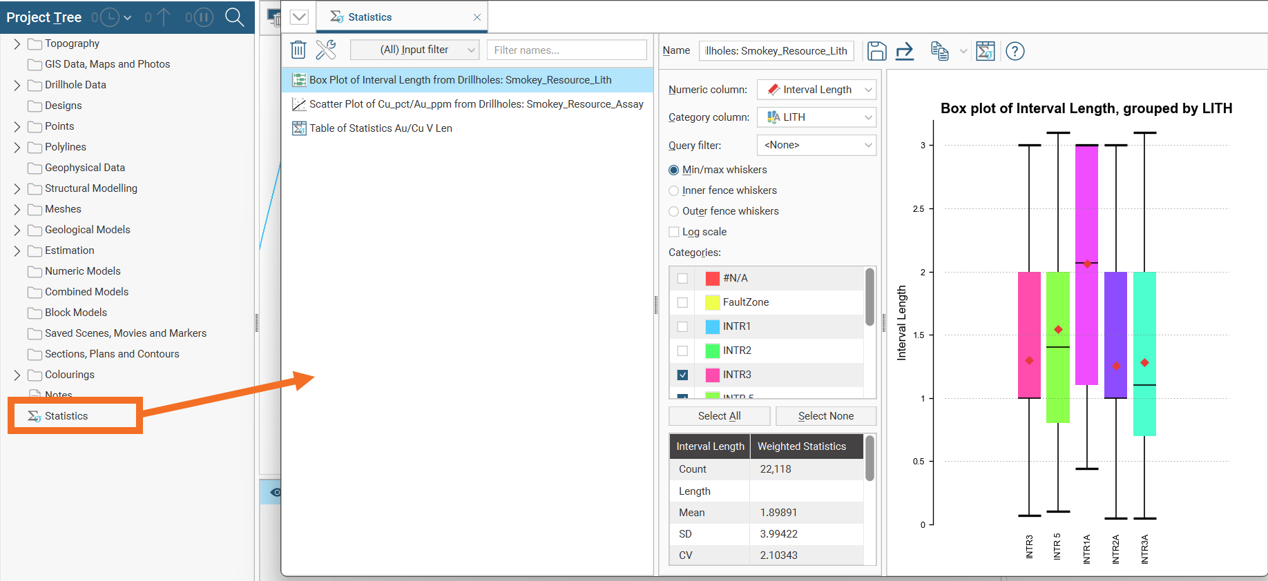
Box Plots
The box plot (or box-and-whisker plot) provides a visualisation of the key statistics for a dataset in one diagram.
Select a Numeric column to display, enabling Log scale if it helps to visualise the data more clearly.
If the table includes category data, you can also set the Category column to one of the available category columns to help visualise the data grouped by category. Select which categories to include in the box plot using the Categories list.
You can also use a pre-defined Query filter to limit the data included in the chart.
Note these features of the plot:
- The mean is indicated by the red diamond.
- The median is indicated by the line that crosses the inside of the box.
- The box encloses the interquartile range around the median.
- The whiskers extend out to lines that mark the extents you select, which can be the Min/Max whiskers, the Outer fence whiskers or the Inner fence whiskers. Outer and inner values are defined as being three times the interquartile range and 1.5 times the interquartile range respectively.
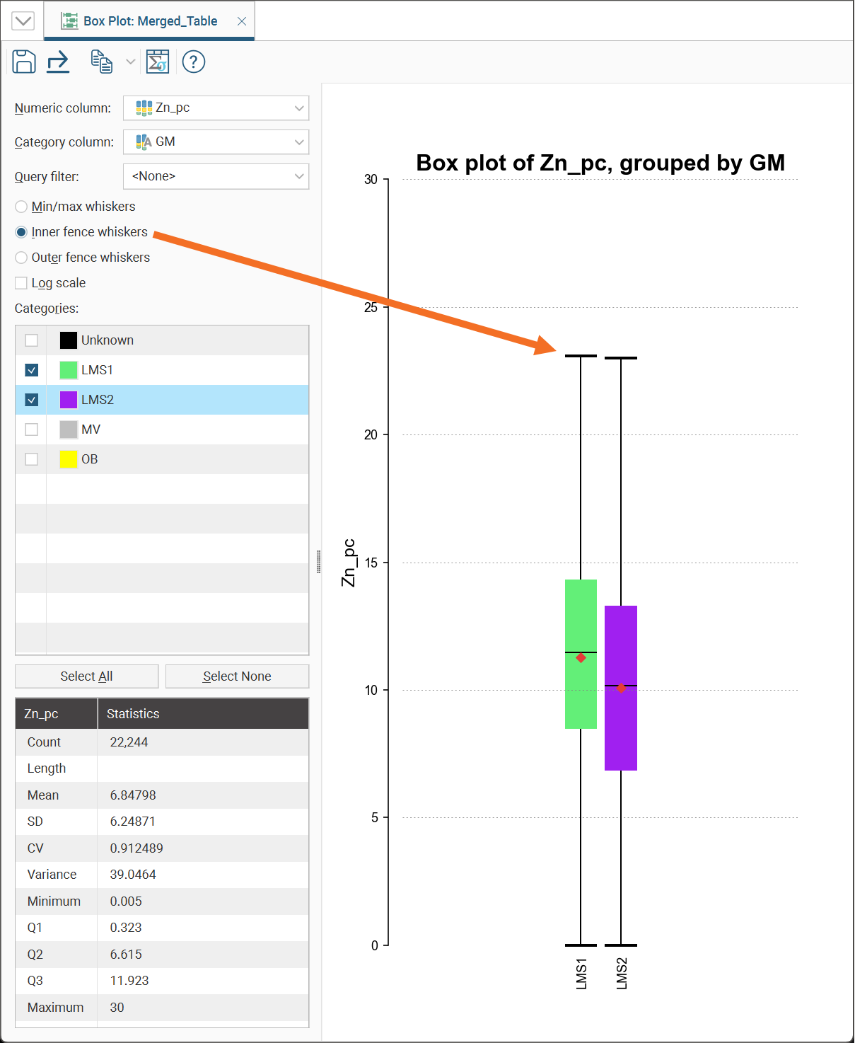
Note that a reminder of the reference for the Outer fence whiskers and Inner fence whiskers can be found by holding your mouse cursor over these fields to see the tooltip.
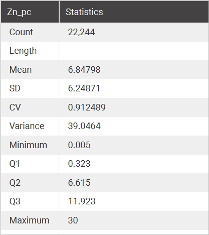
For convenience, there is a statistics table provided in the corner of the box plot window.
A box plot window for a block model has some additional fields at the top not present on the box plot statistics window for other objects. There is a Statistics weighting option that can be set to Un-weighted, Volume-weighted or Mass-weighted, and a Density option that can be set to Constant or a data column containing density data. There is also an Additional weighting field which allows the selection of another numeric column to use for scaling, such as declustering weights or stored proportions. If the numeric column selected is not a stored proportion, set the Weighting unit column to Decimal or Percentage as appropriate for the selected data.
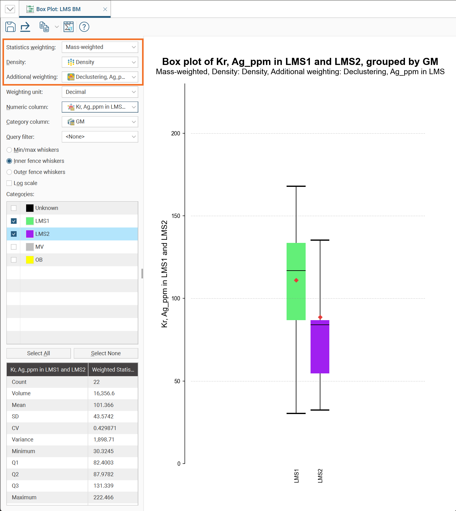
Click the Save icon (![]() ) to add the box plot to the Statistics tab.
) to add the box plot to the Statistics tab.
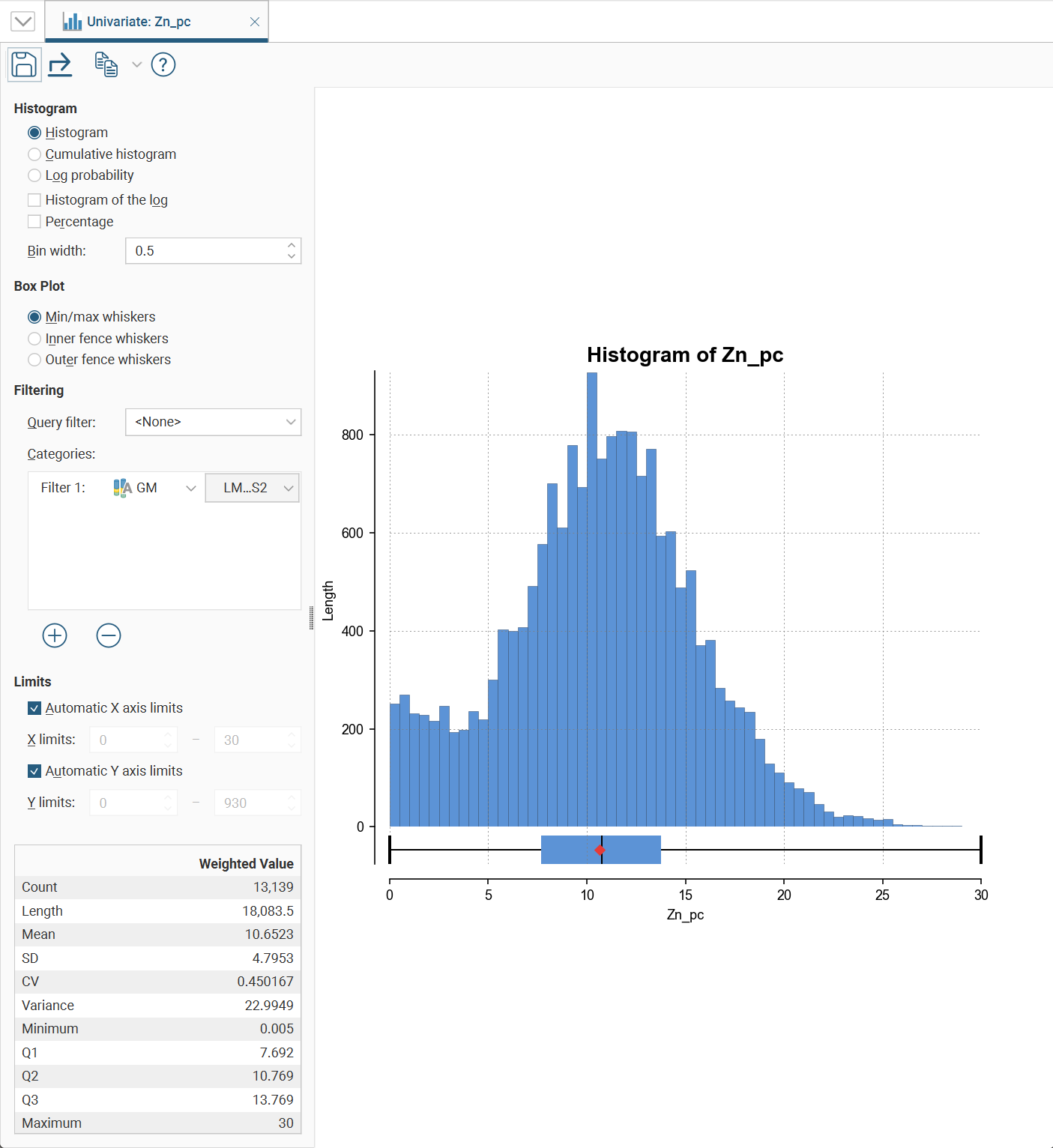
Univariate Graphs
Univariate graphs plot a single data series.
This type of chart option will also appear in the Statistics options as Interval Length Statistics, Compositing Interval Lengths, Estimation Values Univariate, Decluster Weights Univariate or Decluster Values Univariate, some with an additional Input Values section.
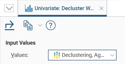
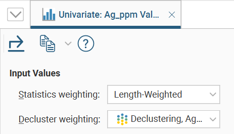
Where a Values dropdown is available, select from the data input values in the dropdown list.
If there is a Statistics weighting field, choose <None> or an available weighting type from the dropdown list.
If there is a Decluster weighting fields, choose <None> or one of the declustering weight options available in the dropdown list.
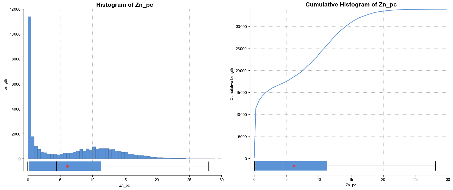
There are several different visualisation options. Histogram shows a probability density function for the values, and Cumulative Histogram shows a cumulative distribution function for the values as a line graph.
There are three options that show the charts with a log scale in the X-axis:
- Select Histogram and enable Histogram of the log to see the value distribution with a log scale X-axis.
- Select Cumulative histogram and enable Histogram of the log to see a cumulative distribution function for the values with a log scale X-axis.
- Log probability is a log-log weighted cumulative probability distribution line chart.
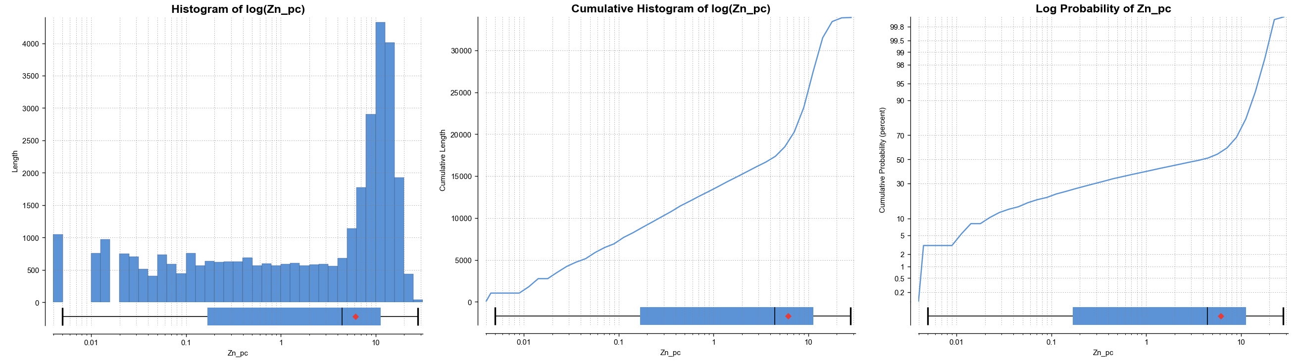
Percentage is used to change the Y-axis scale from a length-weighted scale to a percentage scale.
Bin width changes the size of the histogram bins used in the plot.
The Box Plot options control the appearance of the box plot drawn under the primary chart. The whiskers extend out to lines that mark the extents you select, which can be the Min/max whiskers, the Inner fence whiskers or the Outer fence whiskers. Inner and outer values are defined as being 1.5 times the interquartile range and 3 times the interquartile range respectively.
Some univariate graphs may include a Filtering section. Here is where a Query filter defined for the dataset can be selected.
There may also be a Categories list where category columns can be added by clicking the Add button (![]() ), then selecting a category data column from the left dropdown list, and choosing specific category values from the right dropdown list.
), then selecting a category data column from the left dropdown list, and choosing specific category values from the right dropdown list.
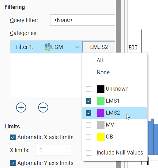
There is also an Include Null Values option, which allows you to include values in a chart even though there are missing values in a certain category data column, instead of filtering the data row out.
The Limits fields control the ranges for the X-axis and Y-axis. Select Automatic X axis limits and/or Automatic Y axis limits to get the full range required for the chart display. Untick these and manually adjust the X limits and/or Y limits to constrain the chart to a particular region of interest. This can effectively be used to zoom the chart.
The bottom left corner of the chart displays a table with a comprehensive set of statistical measures for the dataset.
Some of the univariate charts have a Save icon (![]() ) that adds the chart to the Statistics tab.
) that adds the chart to the Statistics tab.
Comparison Histograms
Comparison histograms are used for compositing and declustering statistics, with the options Compositing Comparison and Declustering Comparison respectively. They feature a double histogram, one displaying the distribution of the raw data and one displaying the distribution of the data after processing. This enables comparison of the two distributions of the same element before and after the data transformation. Impacts on the symmetry of distributions will be evident.
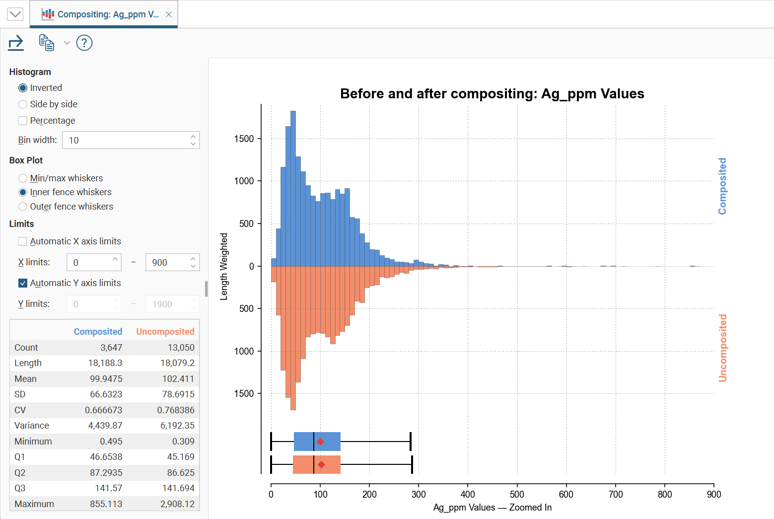
In the Histogram settings, you can choose between Inverted graphs, as shown in the image above, or Side by side graphs where the data for each histogram bin is shown in the traditional histogram style.Bin width changes the size of the histogram bins used in the plot.Percentage is used to change the Y-axis scale from a length-weighted scale to a percentage scale.
The Box Plot options control the appearance of the box plot drawn under the primary chart. The whiskers extend out to lines that mark the extents you select, which can be the Min/max whiskers, the Inner fence whiskers or the Outer fence whiskers. Inner and outer values are defined as being 1.5 times the interquartile range and 3 times the interquartile range respectively.
The Limits fields control the ranges for the X-axis and Y-axis. Select Automatic X axis limits and/or Automatic Y axis limits to get the full range required for the chart display. Untick these and manually adjust the X limits and/or Y limits to constrain the chart to a particular region of interest. This can effectively be used to zoom the chart.
The declustering comparison chart will also have Input Values options where the Declustered values and Statistic weighting options can be selected from the dropdown lists:
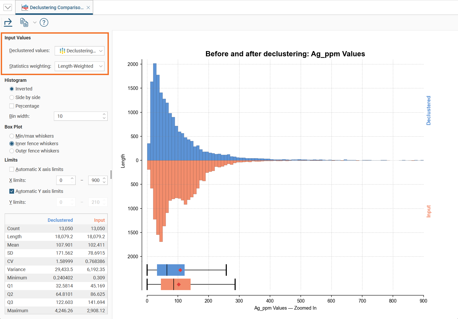
The bottom left corner of the chart displays a table with a comprehensive set of statistical measures for the dataset.