Analysing Data
Leapfrog Geo has a number of tools that help you to analyse your data.
- The most basic information about an object is contained in the object’s Properties window, which is specific to the type of object. Right-click on the object in the project tree and select Properties. See Object Properties in the The Project Tree topic for more information.
- Viewing statistical information about objects helps you to analyse your data. This is described further below.
- Visualising data using the shape list and the shape properties panel is an important part of interpreting and refining data and making modelling decisions. The tools available depend on the type of object being displayed, and many objects can be displayed evaluated on other objects.
- Stereonets are useful for visualising structural data and identifying trends in 2D. Errors in categorisation of structural data can also become apparent when the data is viewed on a stereonet.
- Form interpolants are useful for visualising structural data and identifying broad trends in 3D. The form interpolant’s meshes can then be used to control other surfaces in the project.
- With the drillhole correlation tool, you can view and compare selected drillholes in a 2D view. You can then create interpretation tables in which you can assign and adjust intervals and create new intervals. Interpretation tables are like any other interval table in a project and can be used to create models.
- You can plan drillholes, view prognoses for models in the project and export planned drillholes in .csv format.
The rest of this topic describes the different statistics visualisations available in Leapfrog Geo.
Statistics
The statistics options available in Leapfrog Geo depend on the type of object. Common statistics visualisations are described below:
Variations of these are described relative to the data objects for which they are relevant.
Leapfrog Geo uses fixed 25%/75% quartiles.
Table of Statistics
For many data tables, you can view a table of statistics for multiple attributes. If the table has one or more category columns, data can, optionally, be grouped by category. To open a table of statistics, right-click on a data table then select Statistics. In the window that appears, select the Table of Statistics option.
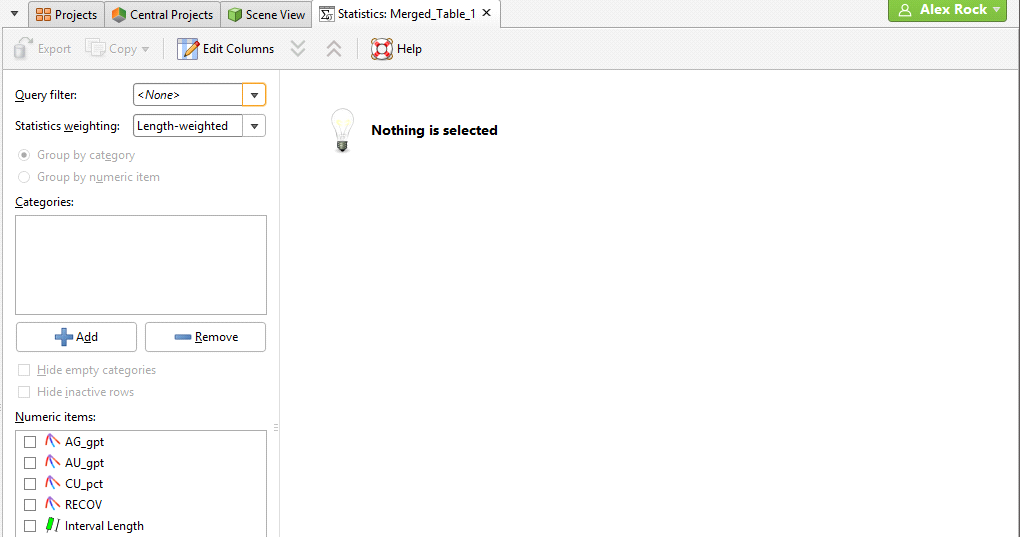
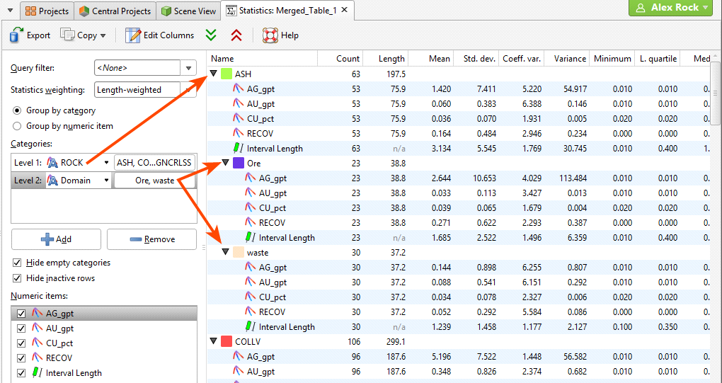
In this example, we have the initial table of statistics for a merged table that has two category columns and four numeric columns, plus an Interval Length column. However, nothing is displayed in the table because data columns have not yet been selected.
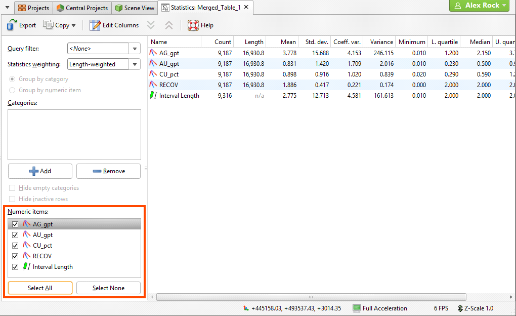
Select from the Numeric items available for the table. In this case, all columns have been selected, including the Interval Length column:
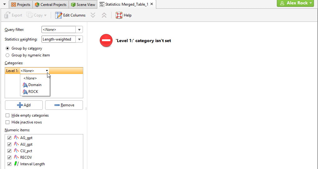
Click the Add button to select from the category columns available in the table. An entry will be added to the Categories list. Click on the arrow to select from the available category columns:
Statistics for the selected category column will be displayed in the table. You can change what categories are displayed by clicking on the second button and enabling or disabling categories:
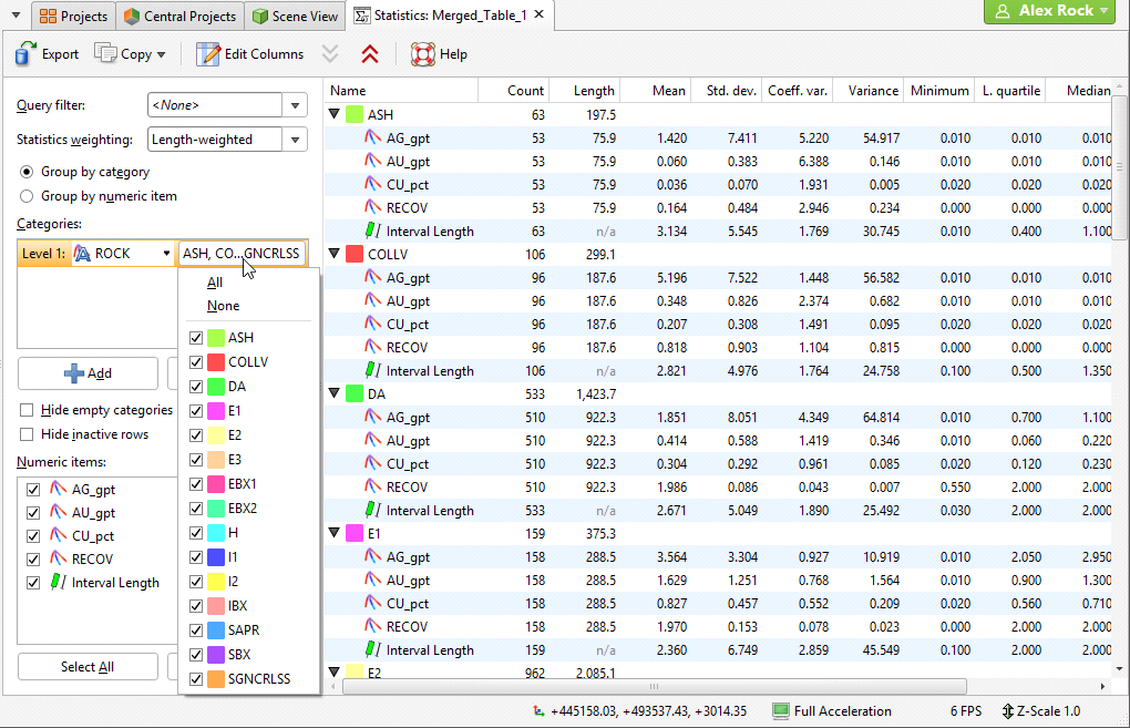
If there is more than one category column, you can set lower levels. Here there are two category columns displayed in the table, “ROCK” and “Domain”:
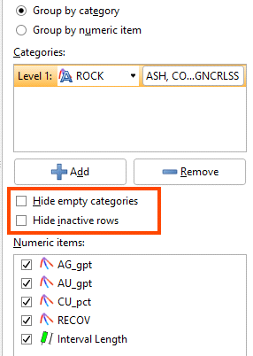
You can hide empty categories (those with a count of zero) and inactive rows using the options below the Categories list:
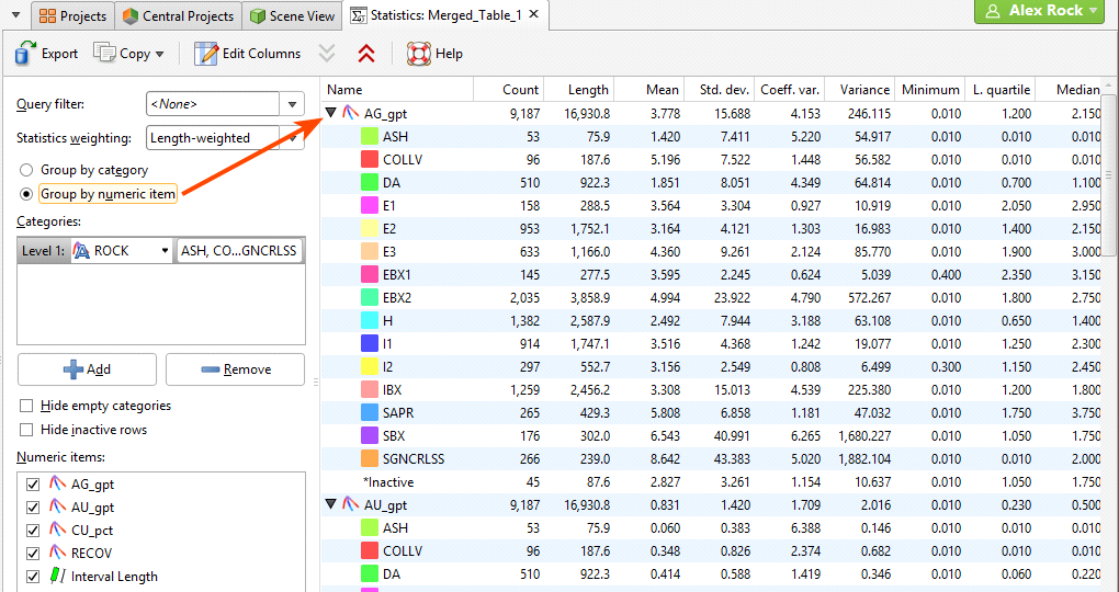
Group by category and Group by numeric item provide further options for the table organisation. Here the Group by numeric item option has been selected:
You can filter the data using any Query filter defined for the data table. Statistics for interval tables can be unweighted or weighted by interval length.
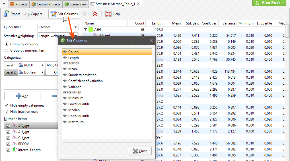
Change the columns displayed in the table by clicking on the Edit Columns button:
Once you have set up a table of statistics on a particular table, its settings will be saved so you can easily review the statistics and export the table using the same settings.
To export the table in CSV format, click on the Export button in the toolbar (![]() ).
).
Other controls in this window are as follows:
- The arrow buttons at the top of the window (
 and
and  ) allow you to quickly expand or collapse the rows.
 - Click rows to select them.
- Select multiple rows by holding down the Shift or Ctrl key while clicking rows.
- The Copy button (
 ) copies the selected rows to the clipboard so you can paste them into another application.
Scatter Plots
Scatter plots are useful for understanding relationships between two variables. An additional variable can be introduced by setting the Colouring option to a data column. The example below plots the two variables lead and zinc against each other, with gold being indicated by the colouring. You can make either axis a log scale with the Log scale in X and Log scale in Y options. A Query filter may be applied also.
The appearance of the chart can be modified by adjusting the Point size, Point shape, and White background settings.
Enable Show X = Y line to aid in assessing how far off equal the distributions are.
When you select Show linear regression, a regression line is added to the chart and a function equation is added below the chart title.
Show conditional expectation plots a line that attempts to find the expected value of one variable given the other. The X axis is divided into a number of bins specified by Bin count, and the data in each bin is used to predict the expected Y value.
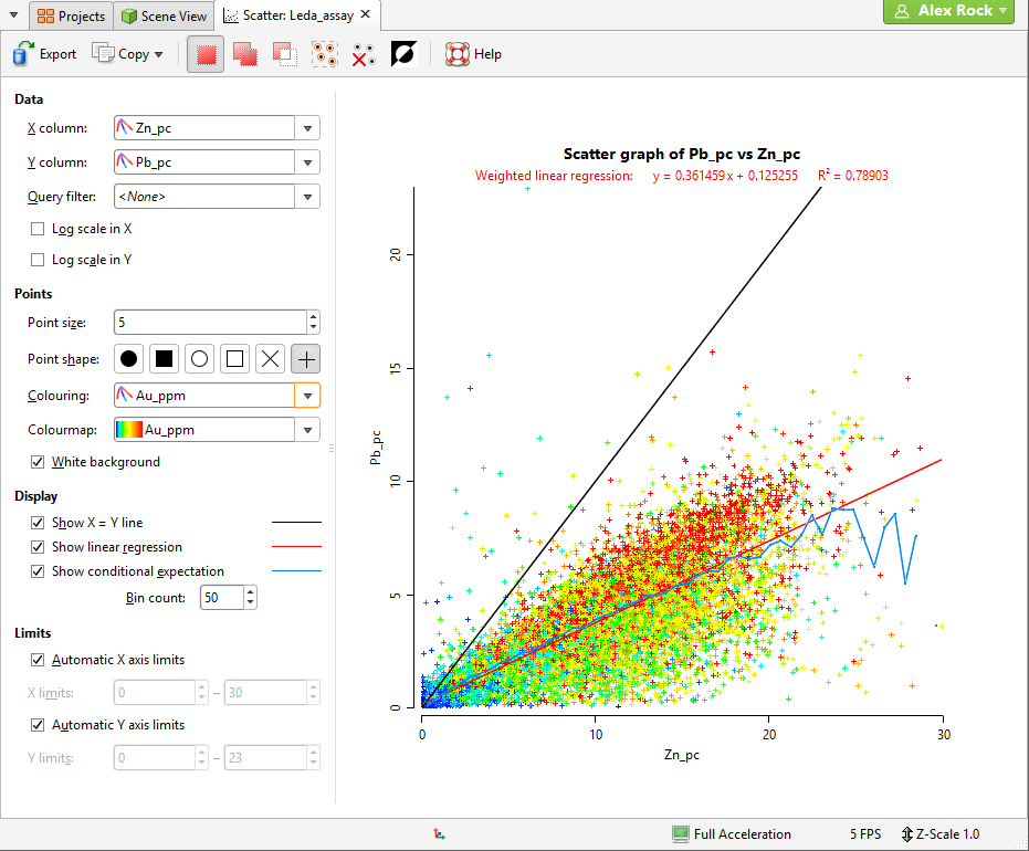
By default, the limits of the chart are automatically set to range between zero and the upper limit of the variable data. You can adjust this by turning off Automatic X axis limits and/or Automatic Y axis limits and specifying preferred minimum and maximum values for each axis.
Select points in the scatter plot by clicking and dragging your mouse pointer to draw freehand around the points.
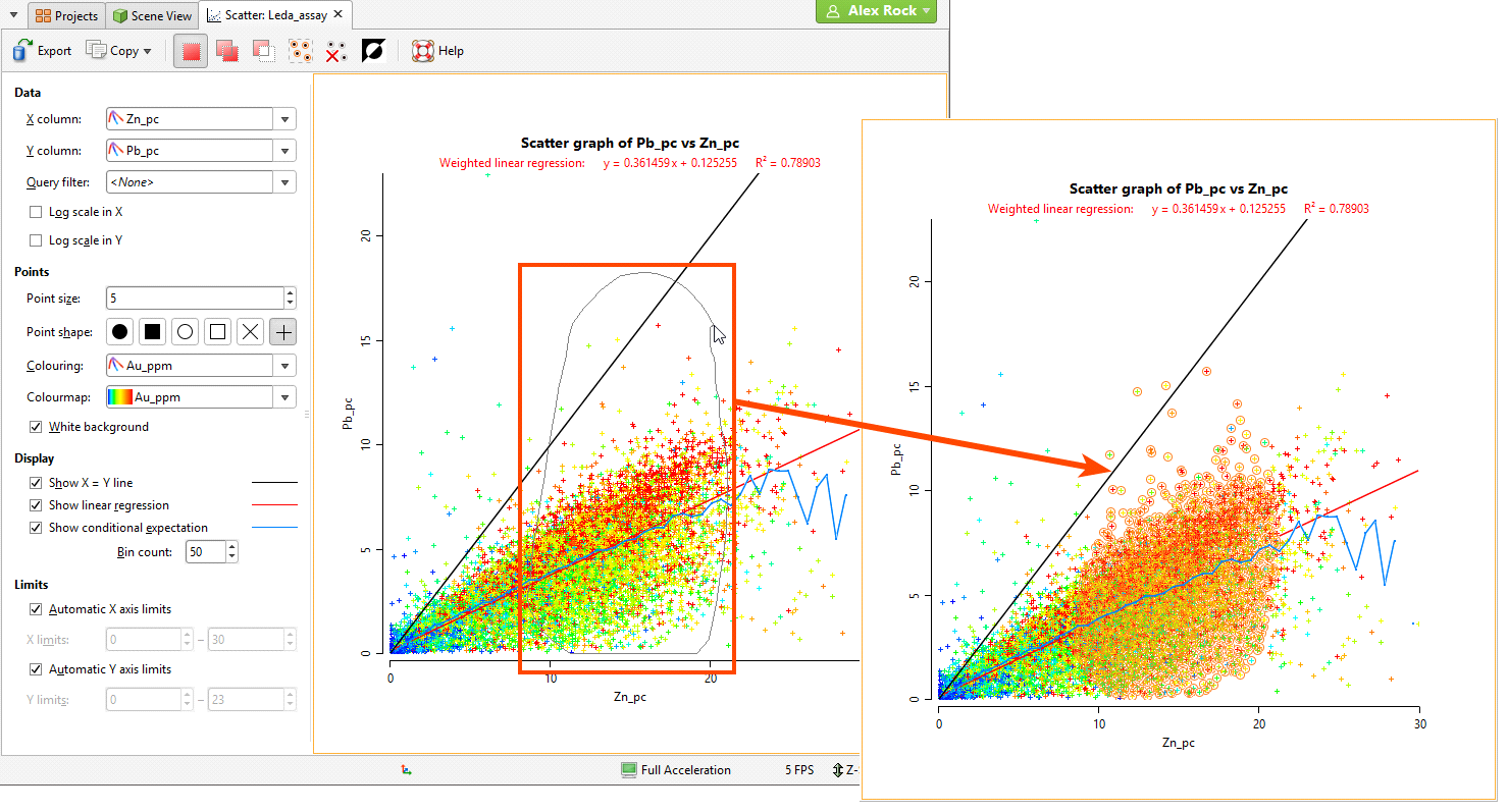
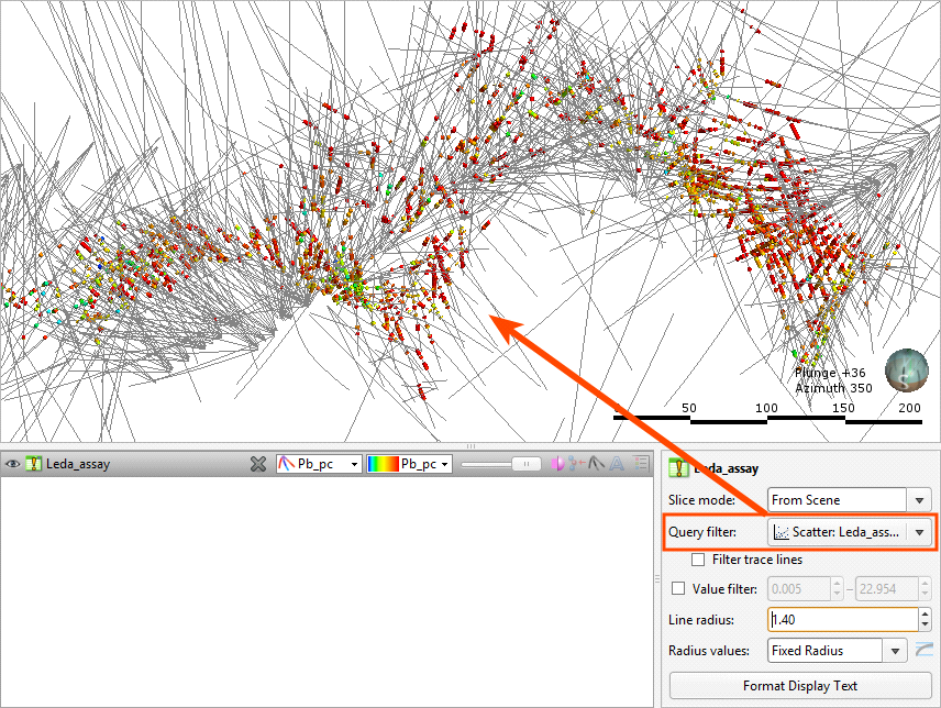
Selected points can be filtered in the scene by selecting the scatter plot from the Query filter options in the shape properties panel.
The Add button (![]() ) and the Remove button (
) and the Remove button (![]() ) determine whether selected points are being added to or removed from the selection. For example, if you draw a polygon around a set of points with the Add button enabled, the points will be added to the selection.
) determine whether selected points are being added to or removed from the selection. For example, if you draw a polygon around a set of points with the Add button enabled, the points will be added to the selection.
You can also:
- Remove points from a selection while the Add button (
 ) is enabled by holding down the Ctrl key and selecting points.
 - Select all visible points by clicking on the Select All button (
 ) or by pressing Ctrl+A.
 - Clear all selected points by clicking on the Clear Selection button (
 ) or by pressing Ctrl+Shift+A.
 - Swap the selected points for the unselected points by clicking on the Invert Selection button (
 ) or by pressing Ctrl+I.
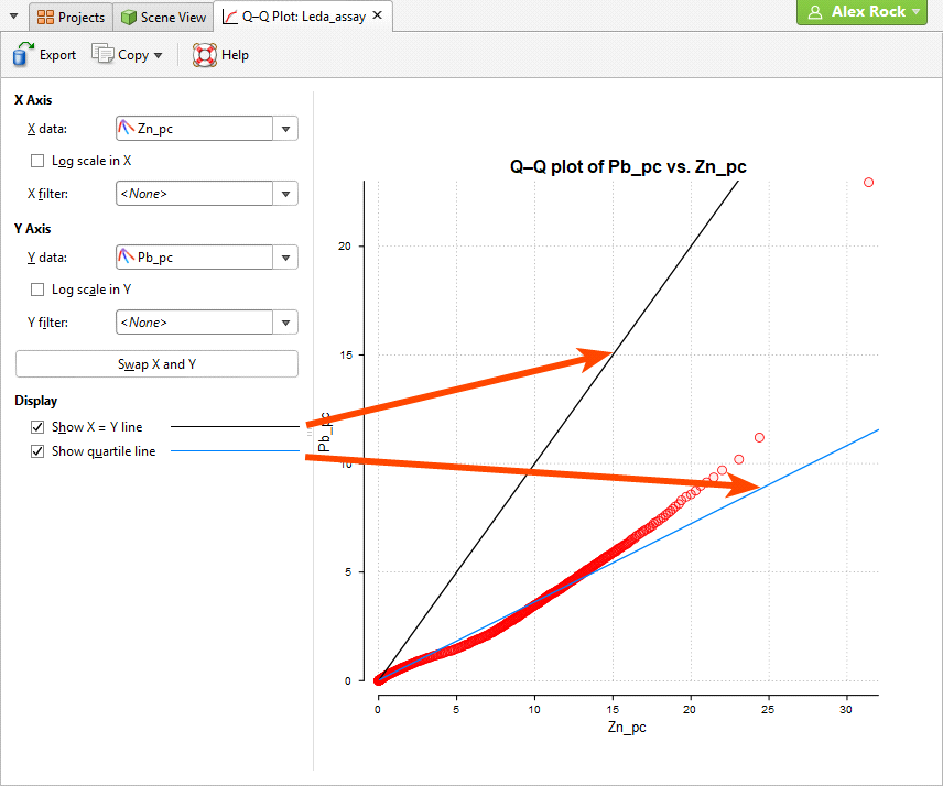
Q-Q Plots
Quantile-Quantile plots are useful for validating your assumptions about the nature of distributions of data. Select the data columns to show on the X Axis and Y Axis (which can optionally be set as log scales). You can also select an X filter and/or Y filter to limit the values used from the data columns.
Enable Show X = Y line to plot the mirror line for the chart, which may not always be obvious when the X and Y axis have different scales.
Show quartile line draws a line through two points on the chart, the lower quartiles and the upper quartiles for each of the axes.
Box Plots
The box plot (or box-and-whisker plot) provides a visualisation of the key statistics for a data set in one diagram.
Select a Numeric column to display, enabling Log scale if it helps to visualise the data more clearly. If the table includes category data, set the Category column to one of the category columns to help visualise the data. Select which categories to include from the Categories list.
You can also use a pre-defined Query filter to limit the data included in the chart.
Note these features of the plot:
- The mean is indicated by the red diamond.
- The median is indicated by the line that crosses the inside of the box.
- The box encloses the interquartile range around the median.
- The whiskers extend out to lines that mark the extents you select, which can be the Minimum/Maximum, the Outer fence or the Inner fence. Outer and inner values are defined as being three times the interquartile range and 1.5 times the interquartile range respectively.
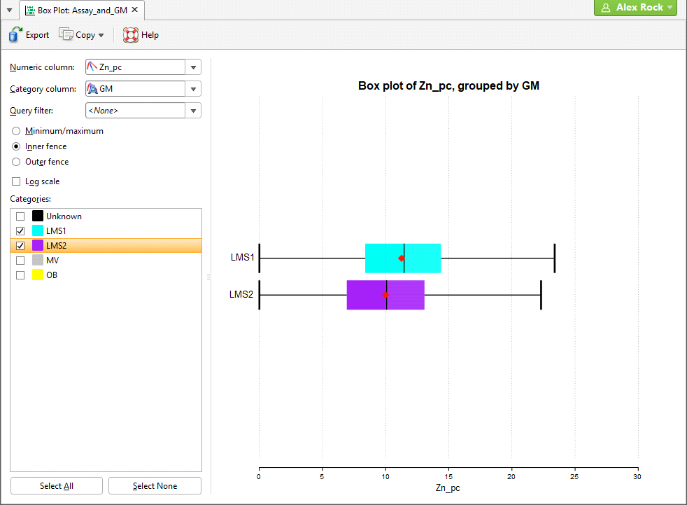
Note that a reminder of the reference for the Outer fence and Inner fence can be found by holding your mouse cursor over these fields to see the tooltip.
Univariate Graphs
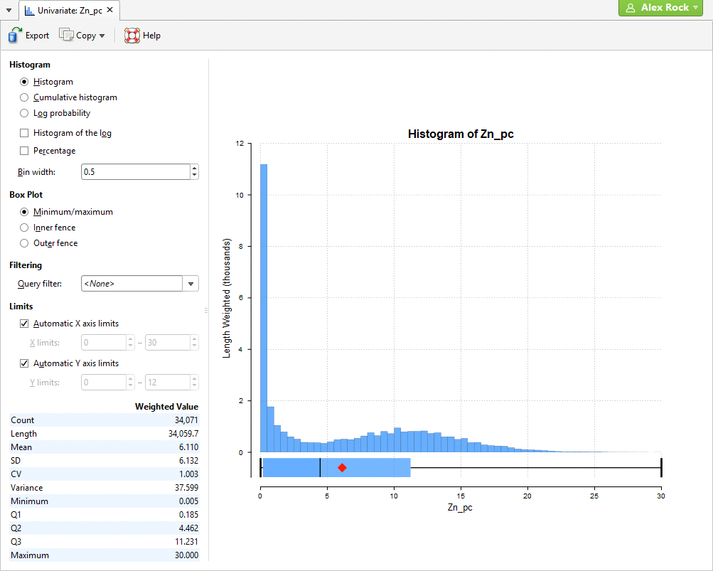
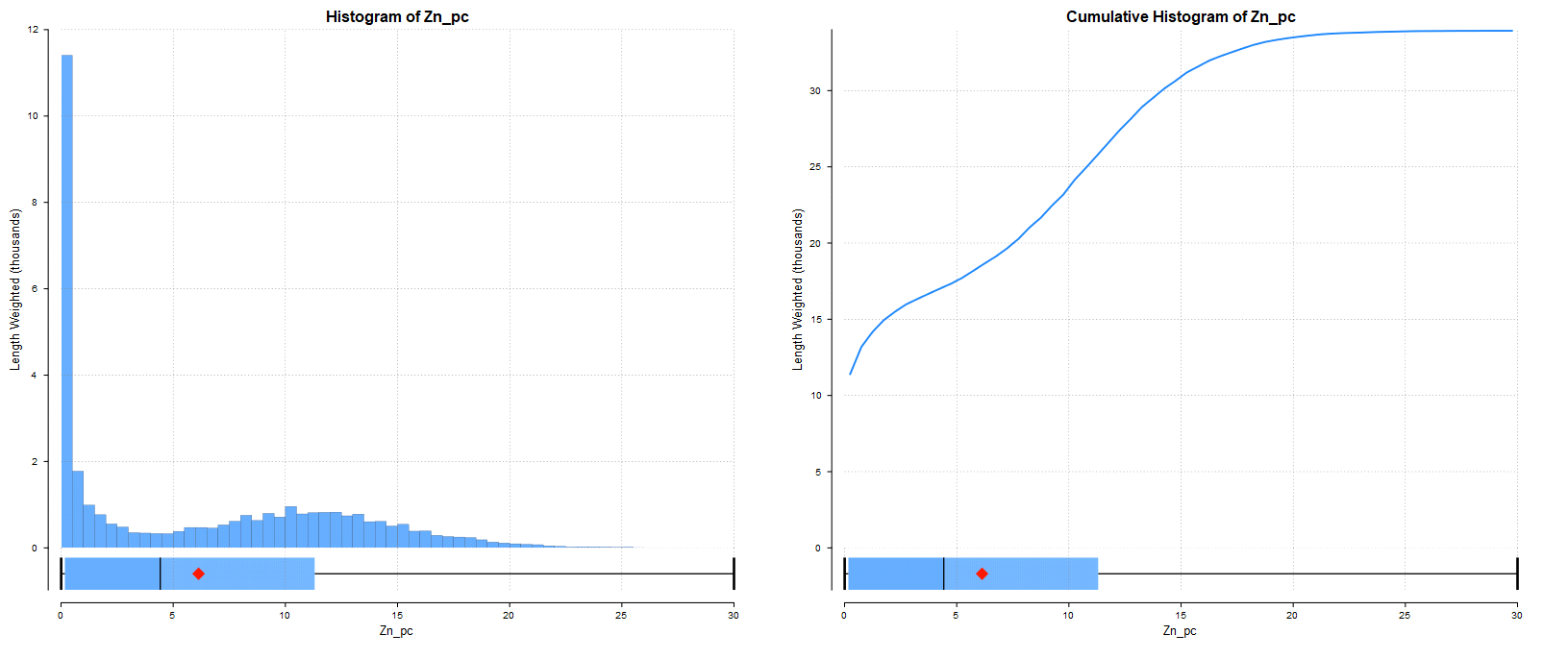
There are several different visualisation options. Histogram shows a probability density function for the values, and Cumulative Histogram shows a cumulative distribution function for the values as a line graph:
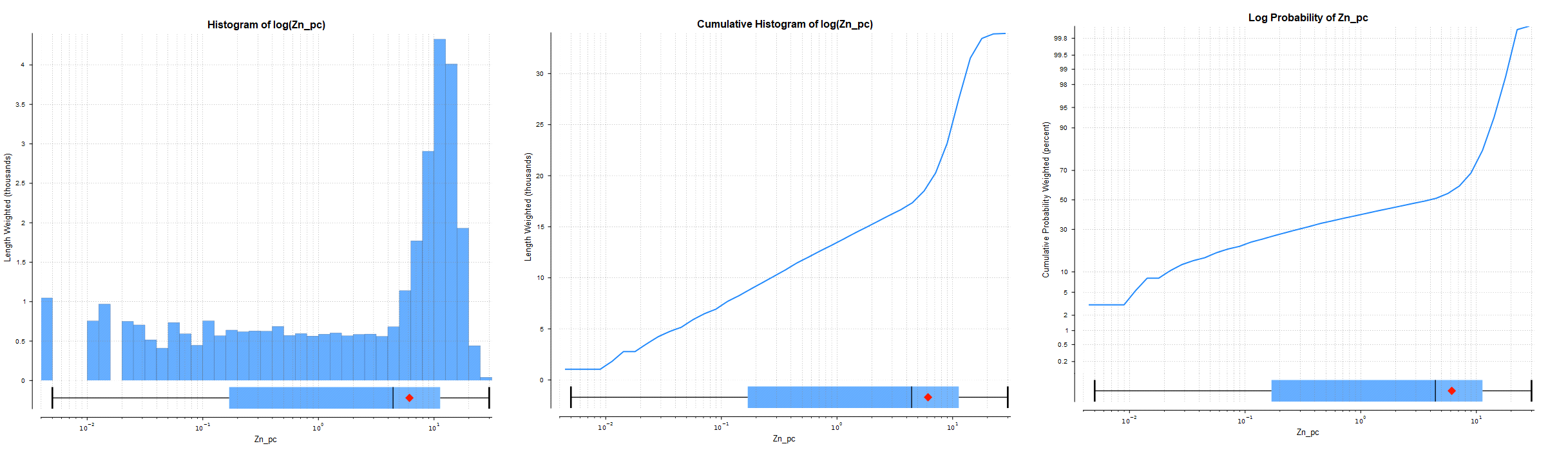
There are three options that show the charts with a log scale in the X-axis:
- Select Histogram and enable Histogram of the log to see the value distribution with a log scale X-axis.
- Select Cumulative Histogram and enable Histogram of the log to see a cumulative distribution function for the values with a log scale X-axis.
- Log Probability is a log-log weighted cumulative probability distribution line chart.
Percentage is used to change the Y-axis scale from a length-weighted scale to a percentage scale.
Bin width changes the size of the histogram bins used in the plot.
The Box Plot options control the appearance of the box plot drawn under the primary chart. The whiskers extend out to lines that mark the extents you select, which can be the Minimum/maximum, the Inner fence or the Outer fence. Inner and outer values are defined as being 1.5 times the interquartile range and 3 times the interquartile range respectively.
Some univariate graphs may include a Filtering option containing where a Query filter defined for the data set can be selected.
The Limits fields control the ranges for the X-axis and Y-axis. Select Automatic X axis limits and/or Automatic Y axis limits to get the full range required for the chart display. Untick these and manually adjust the X limits and/or Y limits to constrain the chart to a particular region of interest. This can effectively be used to zoom the chart.
The bottom left corner of the chart displays a table with a comprehensive set of statistical measures for the data set.
Got a question? Visit the Seequent forums or Seequent support