Organising Section Layout Pages
This topic describes how to set up the supporting page properties for section layouts.
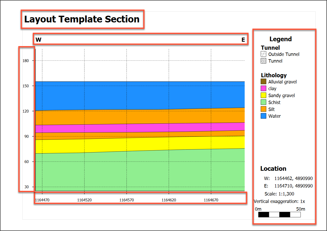
To learn how to set up the section layout to show objects evaluated onto the section, see Organising Models and Other Objects on the Section.
This topic is divided into:
- Setting Page Size and Other Page Properties
- Setting the Section Extents and Position
- Setting Up the Legend Group
- Adding and Organising Comments
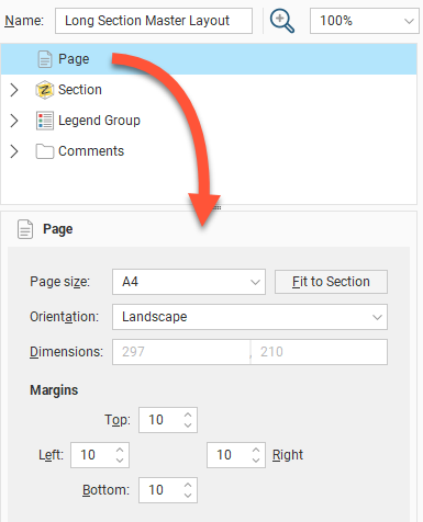
Setting Page Size and Other Page Properties
In the layout tree, click on Page to change the Page Size, Orientation and Margins.
If you wish to use a specific Scale, select the Orientation required, then click Fit to Section to choose the best page size.
Setting the Section Extents and Position
To change the layout’s section properties, click on the Section object in the layout tree. In the Section tab, you can change the scale and units used in the layout and the amount of Vertical Exaggeration:
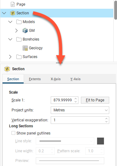
For the Scale, you can enter a specific value to use in displaying the section on the page, or, if you want a specific page size, select Fit to Page to set a scale that best fits the page width.
If you want to change the page size and the margins used, click on the Page object.
In this tab. long sections add further options with a tickbox to Show panel outlines with controls for the Line style, Line width and Pattern scale. Click the colour chip to open a colour picker window. A preview of the panel outline style specified using these fields is displayed below them.
To change the size of the section contents (models, wells, surfaces and lines) on the page, click on the Extents tab.
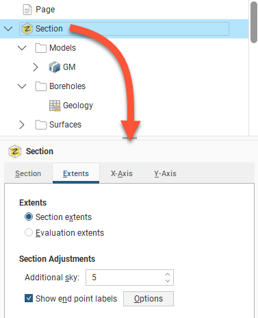
For Extents, choose whether to use the Section Extents or Evaluation Extents.
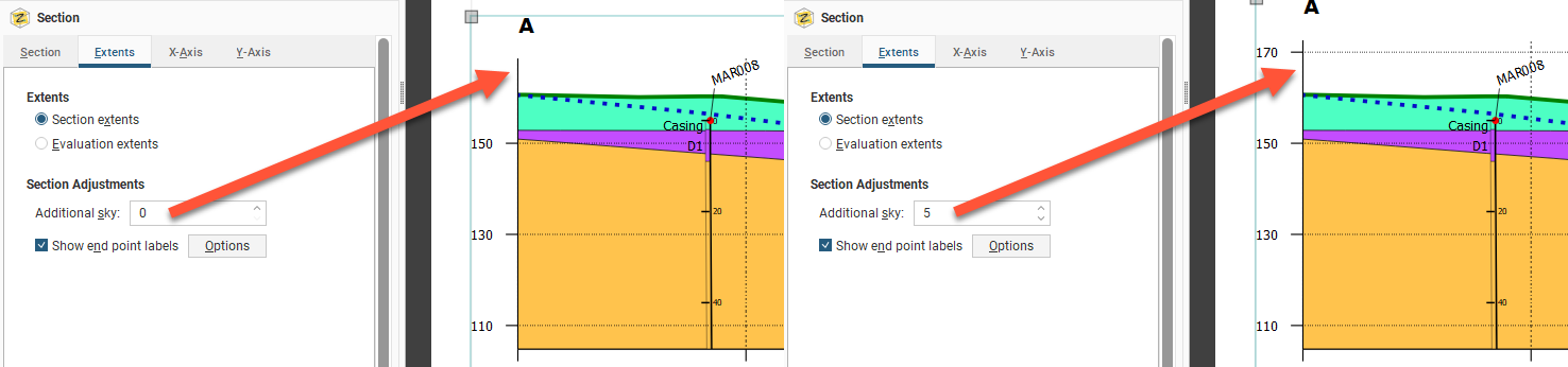
You may wish to add more space above the section, especially if you will be adding wells to the section and need extra space for the collar labels. To do this, change the Additional sky setting. These images show the effects of two different Additional sky settings:
Enable Show end point labels to display the section’s end points as text:
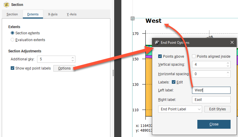
Click Options to change how the end points are displayed relative to the section’s axes.
Edit the text used to display the end points by enabling the Edit box and then changing the text. You can edit the style used for displaying the labels by clicking Edit Styles to change the style or by selecting a different style from the dropdown list.
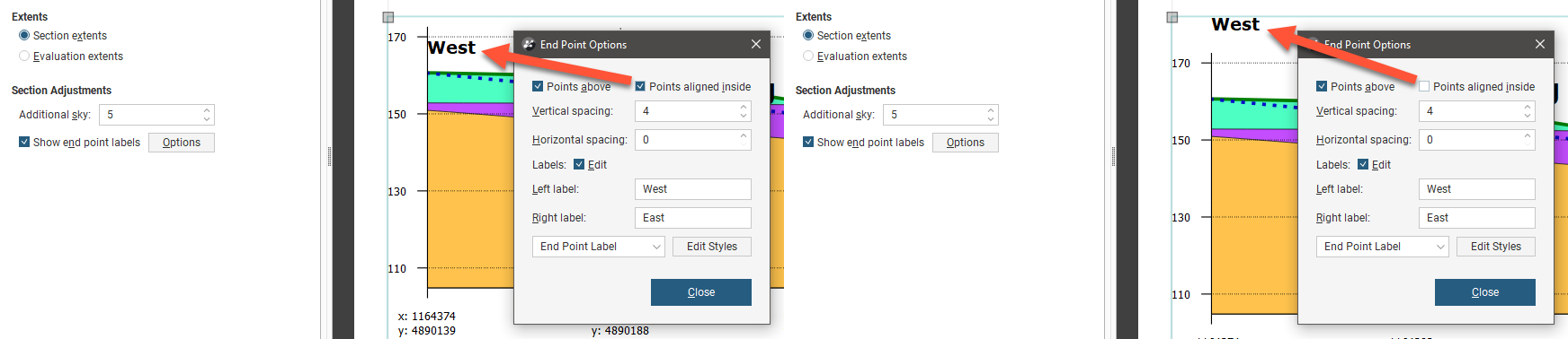
There are two options that control where the end points are displayed, Points above and Points aligned inside. The Points above setting determines whether the end points are displayed above or beneath the axes. Note here the difference between Points above being disabled and enabled:
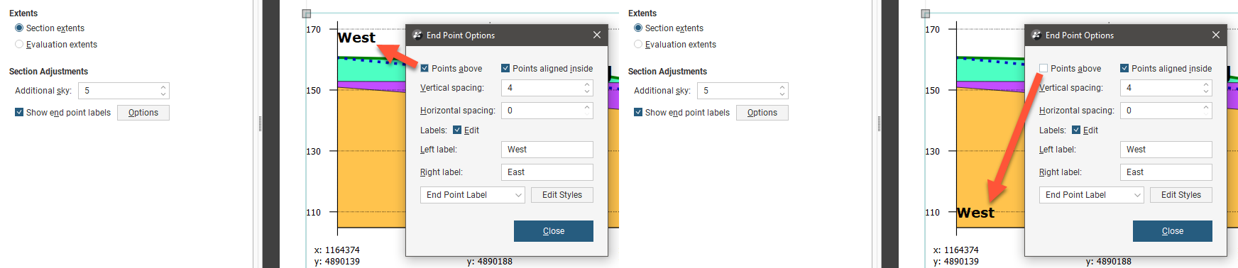
The Points aligned inside setting determines whether the end points are displayed inside or outside the section’s axes:
You can also change the spacing between the end point labels and the section axes.
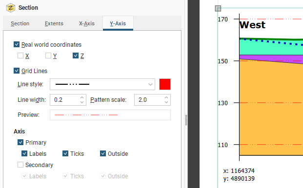
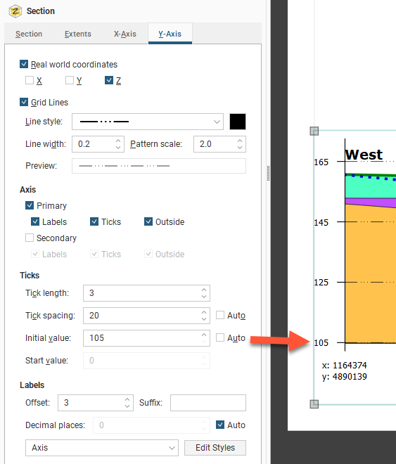
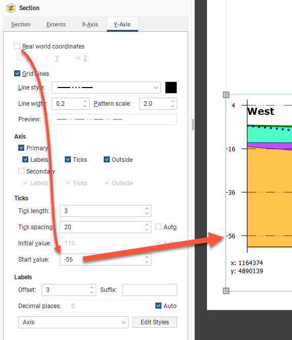
To change how the axes are displayed, click on the either the X-Axis tab or the Y-Axis tab.
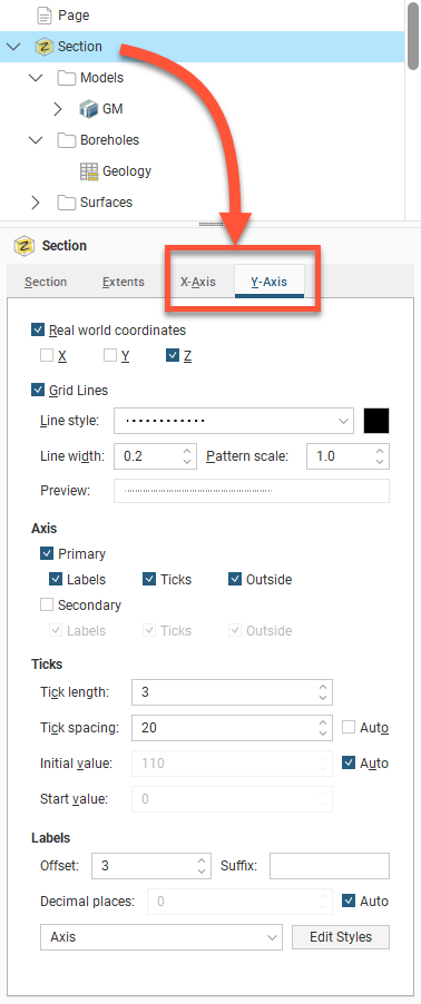
One of the options available for the axes is how much information is displayed for the Real World Coordinates on each axis:
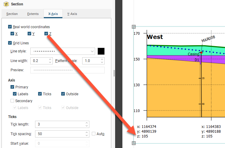
You can also change how Grid Lines are displayed, including the Line style, Line width, Pattern scale and colour. A Preview is displayed and the grid lines are updated in the section preview.
By default, the axes are displayed only on the left-hand side and along the bottom of the section. To display axes along the right-hand side and above the section, tick the Secondary option.
For the Ticks, the Tick length and Tick spacing can be customised. The Y-Axis also has an Initial value with a default that Leapfrog Geothermal automatically calculates. If you wish to change this, disable Auto and enter the required value.
If you wish to set a Start Value specific value for X-axis, you must first disable the Real World Coordinates option:
Edit the text style used for the axis labels by clicking Edit Styles to change the style or by selecting a different style from the dropdown list.
See Organising Models and Other Objects on the Section for details on how to select and style objects to appear on the section.
Setting Up the Legend Group
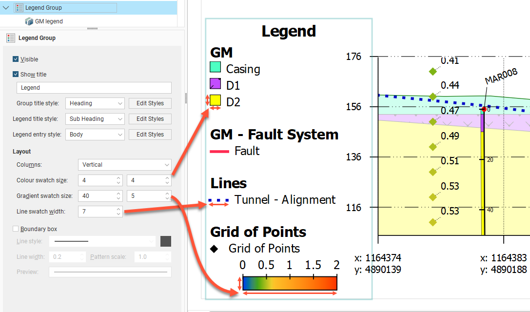
The Legend Group and the individual legends underneath it control how the legend is displayed on the page. Click on the Legend Group object to change the layout of the legend as a whole. The Visible tick box is used to show or hide the whole legend. Show title is used to show or hide the title, which can be customised from "Legend" to something else as required. Three sets of style controls set the appearance of the Group title style, Legend title style and the Legend entry style for different parts of the legend as indicated . Use the Edit Styles buttons to customise the styles used.
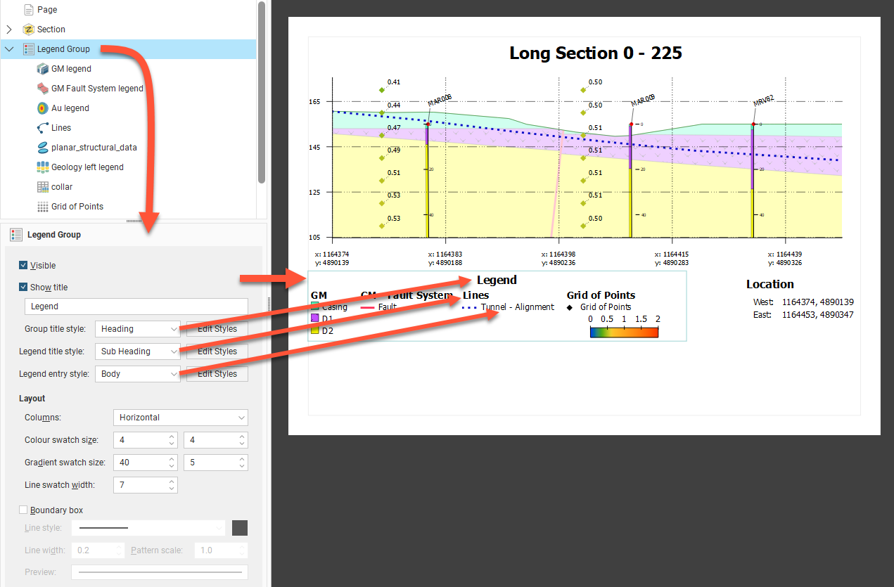
The legend has a series of legend elements for different objects. Under Layout, these can be arranged as Horizontal (as above) or Vertical (as below) Columns. Each of the component legend elements will also inherit the same Colour swatch size, Gradient swatch size and Line swatch width for overall consistency of appearance.
The legend may optionally be surrounded by a Boundary box, and the line style for that box can be set using the Line style, Line width, Pattern scale and colour tile controls.
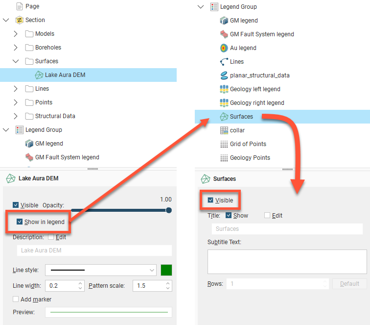
When you have multiple models, surfaces, lines and wells on the section layout, you can end up with a large number of entries in the Legend Group. You can control which legend entries are included in the Legend Group.
Depending on the object type, there are different ways for objects to be managed in the legend:
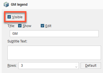
- Each entry under the Legend Group in the layout tree has a Visible tickbox. You can also Show or hide the Title for the object type, and the title can be customised by clicking the Edit tickbox and changing the title text. Enter text in the Subtitle Text box to add more to explain the entry, as required. Change the number of Rows to rearrange how multiple swatches are organised.
- Instead of there being a single Well entry in the Layout Group, each data column colouring for each Well object is automatically added to the Layout Group. Each can be customised as above.
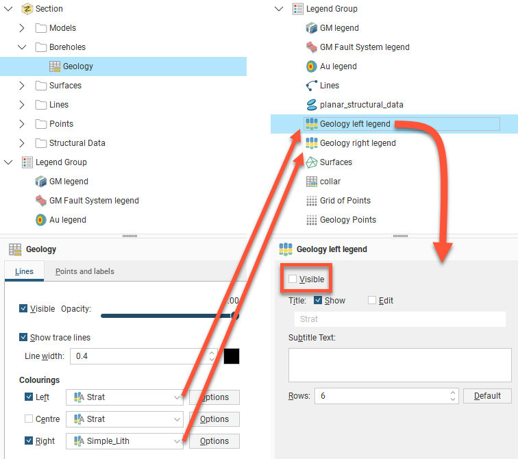
- Model surfaces, surfaces, and lines each have a Show in legend tickbox that needs to be enabled before an item will appear in the Legend Group. Once ticked, it can still be optionally hidden or shown in the legend by changing the Visible tickbox for the entry that will have appeared in the Legend Group.
- Planned wells do not appear in the legend. This is not customised from within the Legend Group.
The order in which legends appear in the Legend Group is the order in which they appear in the layout tree. To change the order in which the legends appear, right-click on them and select a Move option.
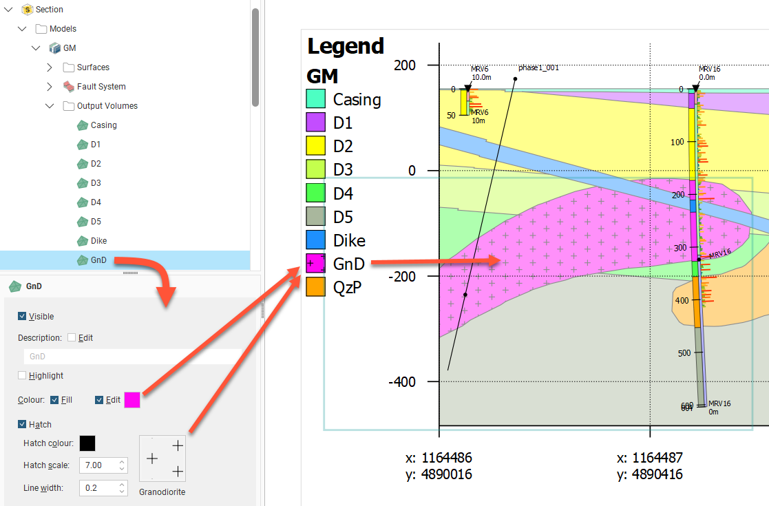
The colours, line widths, fills and hatches displayed in the Legend Group are controlled by the objects themselves.
For example, to change how a volume for a model is displayed, click on the output volume under the Models object:
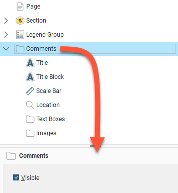
Adding and Organising Comments
Once you have laid out the main Section object and organised the Legend Group, you can add a number of different types of comment annotations to the layout, including a title, a title block, location information and a scale bar, text boxes and imported images. A master Visible tickbox is used to show or hide all the comment types.
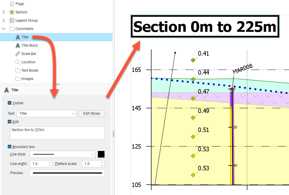
Displaying a Title
The Title object formats the title displayed on the section. To move the title, click on it in the layout preview and drag it to the preferred location. The text used for the Title is the name for the section in the project tree, but this can be changed in the properties panel. Enable the Edit option, then edit the text in the box. You can display a line around the Title by enabling the Boundary box option. You can customise the Line style, Line width, Pattern scale and colour of the box. A Preview is displayed and the boundary is updated in the section preview.
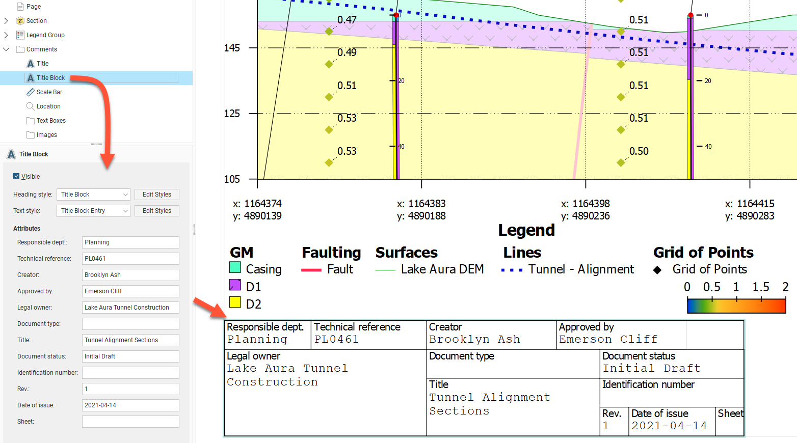
Displaying a Title Block
When the Title Block is made Visible, a title block based on ISO 7200 is displayed on the layout. Click and drag the title block into the desired position. You can select from the available styles for the title block Heading style and the Text style, and you can modify the styles used by clicking the Edit Styles buttons.
Text can be entered for each of the title block fields:
- Responsible dept
- Technical reference
- Creator
- Approved by
- Legal owner
- Document type
- Title
- Document status
- Identification number
- Rev
- Date of issue
- Sheet
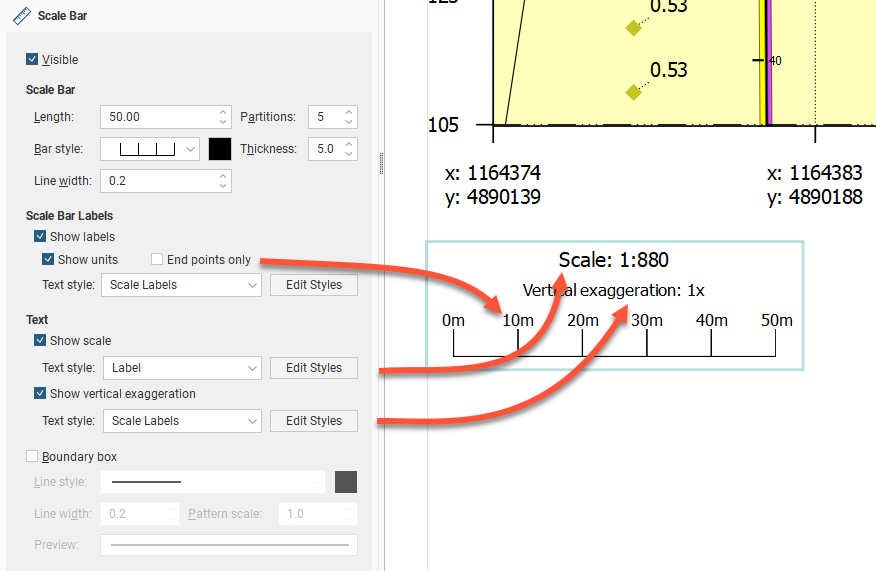
Displaying a Scale Bar Information
As for other section elements, the Scale Bar has an option to make the scale bar Visible. Click and drag the scale bar to reposition it on the section. There are a number of different styles available for the Scale Bar, and you can control its Length, Partitions, Bar style, Thickness and Line width:
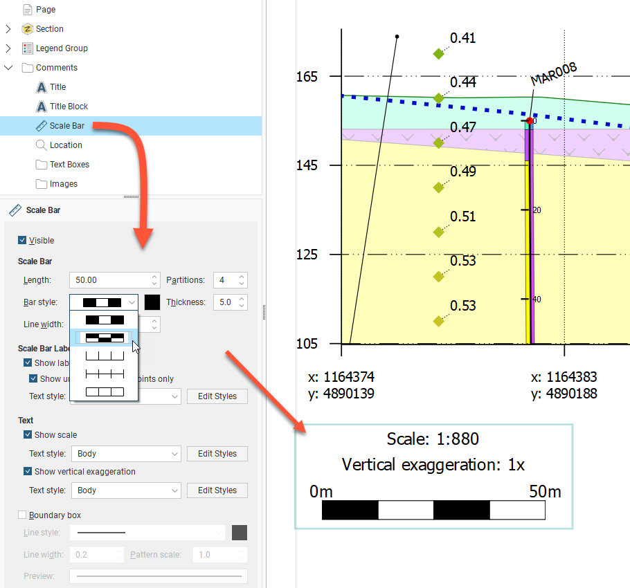
You can show the Scale Bar with or without labels, and labels can be shown all along the bar by disabling the End Points Only option. There is also a Show scale tickbox to show or hide the scale of the section, and an option to Show vertical exaggeration or hide it. As for other section elements, the scale bar box can be defined with a Boundary box with a customisable line style.
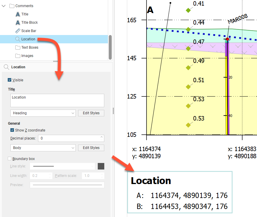
Displaying Location Information
The Location object controls how location information is displayed. It van be made Visible or hidden. Click and drag the location box to reposition it on the section. You can choose to include the Z coordinate and change the number of decimal places used to display coordinates.
The two points referenced in the Location are the top-left and top-right points of the section. The labels for these two points is editable and can be set by navigating in the layout tree to Section > Extents tab > Show end point labels Options button where Left label and Right label can be edited. These labels are used for the Location box even if the section extents Show end point labels tickbox is unticked.
There is a Boundary box option for the Location box. You can customise the Line style, Line width, Pattern scale and colour of the box. A Preview is displayed and the boundary is updated in the section preview.
Text Boxes
With the Text Boxes object, you can add text boxes and arrows to highlight information and details on the section:
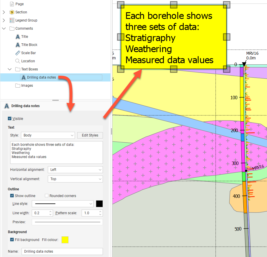
Besides the usual Visible tickbox, the Style of the text can be chosen from the styles available, and can be customised by clicking the Edit Styles button. The text is edited using the box provided. Both the Horizontal alignment and Vertical alignment can be set for the text inside the text box.
There is also a Show Outline option for the text box, and corners can be square or rounded. You can customise the Line style, Line width, Pattern scale and colour of the outline. A Preview is displayed and the text box is updated in the section preview.
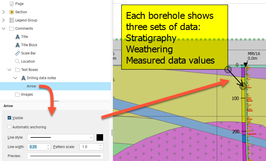
Once a text box has been created, an arrow can be added to connect the text box to a relevant part of the section. Right-click the text box in the layout tree and select Add Arrow. The arrow Line style, Line width, Pattern scale and colour can be customised. The arrow head scales with the line width. The arrow head style is not customisable. Each end of the arrow can be repositioned. When the Automatic anchoring option is enabled for an arrow, the arrow’s anchor will move when its associated text box is moved. If this option is disabled, the arrow will move when you move the text box, but you will have to place its anchor manually.
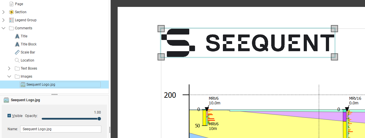
Images
If you wish to import an image such as a logo or map, right-click on the Images object and select Add Image. Navigate to the folder that contains the image file and select the file. Click Open to import the file, which will automatically be added to the section layout. Move the image by clicking on it in the preview and dragging it. You can resize the image by dragging the corners of the image. Visible will show or hide the image, and Opacity will control the transparency of the image.
Got a question? Visit the Seequent forums or Seequent support
© 2022 Bentley Systems, Incorporated