Section Layouts
The section layout editor is used to create and modify section layouts. Some section types also have master section layouts.
- Cross sections created in Leapfrog Works or created from imported images. You can create and edit individual section layouts for these types of section.
- Long sections. You can create a master section layouts for the long section as a whole. You can also create section layouts for each individual section that makes up the long section.
- Serial sections. You can create section layouts for each individual section that makes up the serial section.
- Alignment serial sections. You can create a master section layouts for the long section as a whole. You can also create section layouts for each individual section that makes up the long section.
This topic describes how to use the section layout editor to customise section layouts and master section layouts. It is divided into:
- Creating New Section Layouts
- Creating Layout Templates (long sections and alignment serial sections only)
- Customising the Layout
- Changing Page Properties
- Changing the Section Properties
- Organising Models and Other Objects on the Section
- Setting Up the Legend
- Adding and Organising Comments
- Displaying Section Layouts in the Scene
- Copying Section Layouts
Creating New Section Layouts
To create a section layout, right-click on the section in the project tree and select New Section Layout. A new tab will appear in which you will be able to make changes to the section layout:
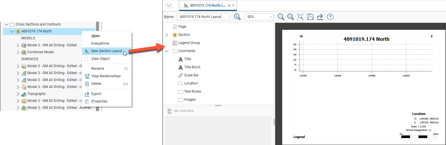
This tab has a layout tree that you can use to change different parts of the section and add data to it. See Customising the Layout below for detailed information on adding information to the section layout.
In the project tree, the section layout is saved as part of the section. Drag the layout into the scene to display it:
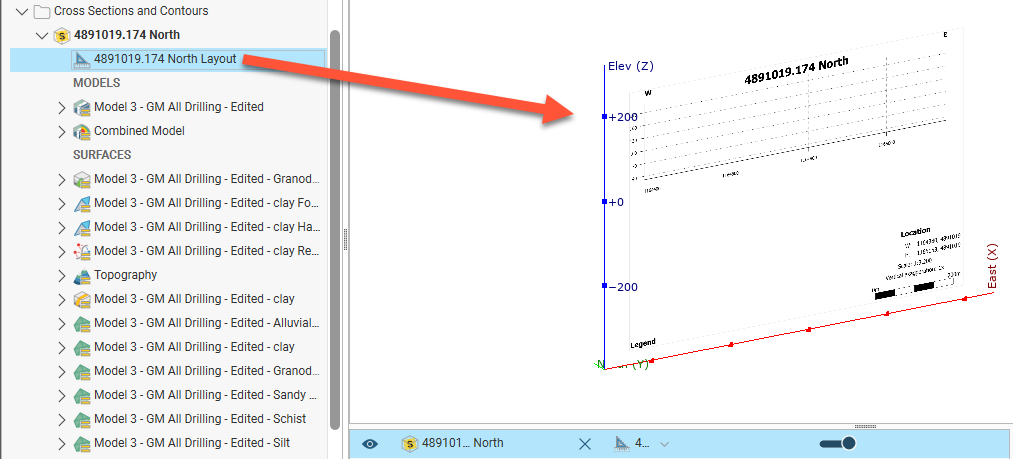
Edit the section layout by double-clicking on it in the project tree.
Creating Layout Templates
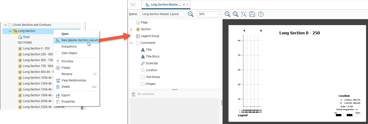
For long sections and alignment serial sections, you can create a master section layout that is applied to the parent section’s sub-sections.
Serial sections only use the section layout editor to customise individual section layouts. There is no master section layout for serial sections.
To create a master section layout, right-click on the section in the project tree and select New Master Section Layout. A new tab will appear in which you will be able to make changes to the master section layout:
In the project tree, the master section layout is saved as part of the section:
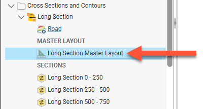
Edit the master section layout by double-clicking on it in the project tree. See Customising the Layout below for detailed information on adding information to the section layout.
Because it is possible to have multiple master layouts, when a new master layout is created it is not automatically applied to all the sections for an object. To assign a master layout to sections, right-click on the master layout and select Copy Master Layout To:
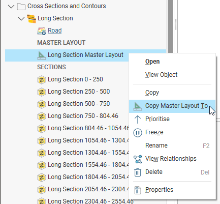
In the window that appears, select the sections that the layout should be applied to from the Available Sections list and click the right arrow button ( ) to move them into the Selected Sections list.
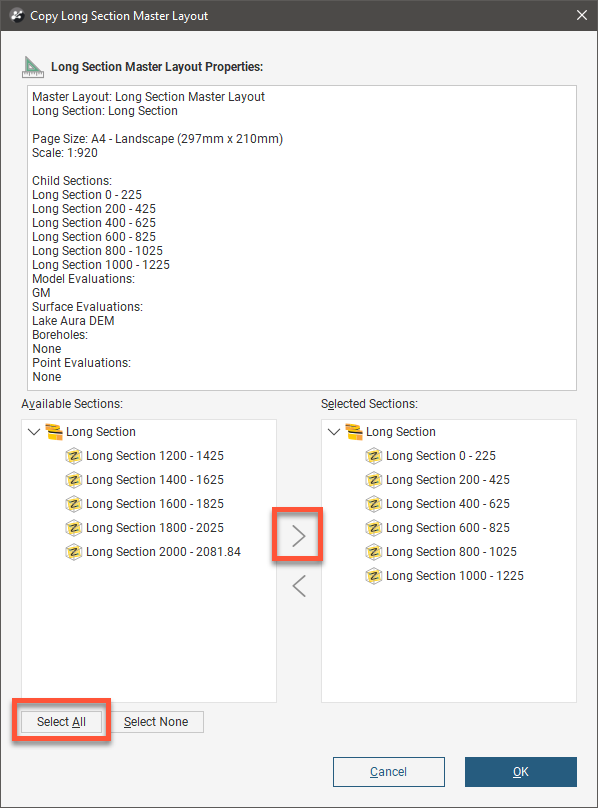
If all the sections are to be selected, click the Select All button. Select None will move all items currently in Selected Sections back to Available Sections.
Search for items in a list by pressing Ctrl-F. A Find window will appear that you can use to search the list. You can choose whether or not to match case in the search and whether or not to match the whole label. You can search forwards or backwards and you can select all list items that match the current search.
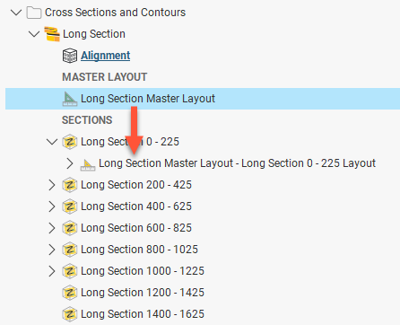
When you click OK, the selected sections will have the master layout applied to them. A layout will appear below each section in the project tree:
Customising the Layout
The section layout editor is used for both master section layouts that serve as templates for sections, and for customising individual section layouts. To open the section layout editor, double-click on a layout or a master layout in the project tree.
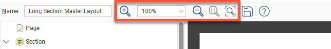
The section layout editor consists of a layout tree panel on the left and on the right a panel with a preview of the layout. The toolbar has zoom controls for the preview allowing you to choose a specific zoom percentage from a list of options, along with Zoom in ( ), Zoom out (
 ), Actual size (
 ) and Fit window (
 ) buttons.
The appearance of all objects can be customised without changing how objects from the project tree are displayed in the scene. You can customise the section layout by:
- Adding models, surfaces, lines, points and structural data
- Adding boreholes and planned boreholes
- Changing the page size, orientation and margins
- Adding a title and title bar, a scale bar, legends, annotations and images, such as a standard form or logo
In the section editor, the layout tree shows the different layers that can be added to the page. The different parts of the layout tree as they relate to the page preview are shown below:
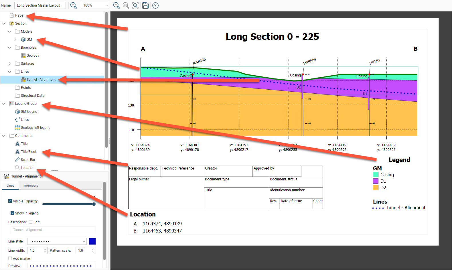
When you select an object in the layout tree, it will be highlighted by a blue line on the page. In the example above, the Lines object Tunnel - Alignment is selected. Click on an object in the page preview to move or resize it. This will also select the object in the layout tree and you can see what properties can be changed. For example, in the preview, click on the Title to view its styling options:
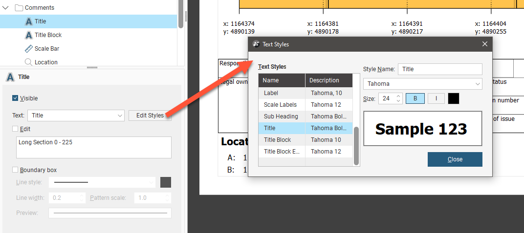
Text displayed in the section layout is controlled by a style sheet that can be accessed whenever you are editing a text object. For example, clicking on Edit Styles for the Title opens the list of Text Styles with the Title selected, but also allows you to change the appearance of styles used for other text objects visible in the preview:
Changing Page Properties
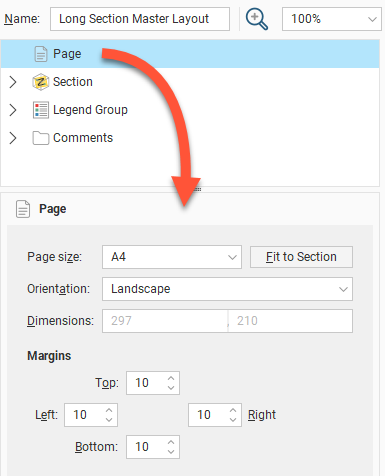
In the layout tree, click on Page to change the Page Size, Orientation and Margins.
If you wish to use a specific Scale, select the Orientation required, then click Fit to Section to choose the best page size.
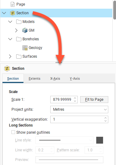
Changing the Section Properties
To change the layout’s section properties, click on the Section object in the layout tree. In the Section tab, you can change the scale and units used in the layout and the amount of Vertical Exaggeration:
For the Scale, you can enter a specific value to use in displaying the section on the page, or, if you want a specific page size, select Fit to Page to set a scale that best fits the page width.
If you want to change the page size and the margins used, click on the Page object.
In this tab. long sections add further options with a tickbox to Show panel outlines with controls for the Line style, Line width and Pattern scale. Click the colour chip to open a colour picker window. A preview of the panel outline style specified using these fields is displayed below them.
To change the size of the section contents (models, boreholes, surfaces and lines) on the page, click on the Extents tab.
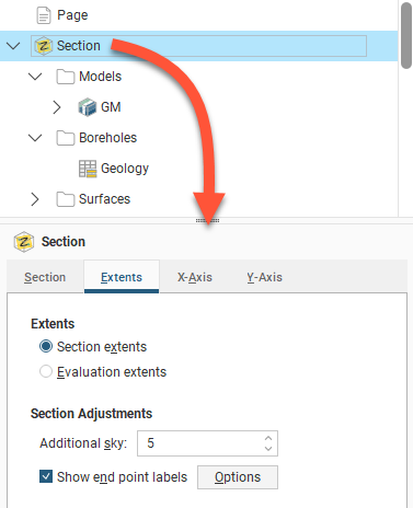
For Extents, choose whether to use the Section Extents or Evaluation Extents.
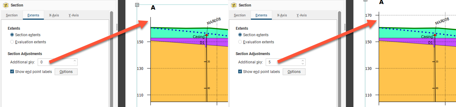
You may wish to add more space above the section, especially if you will be adding boreholes to the section and need extra space for the collar labels. To do this, change the Additional sky setting. These images show the effects of two different Additional sky settings:
Enable Show end point labels to display the section’s end points as text:
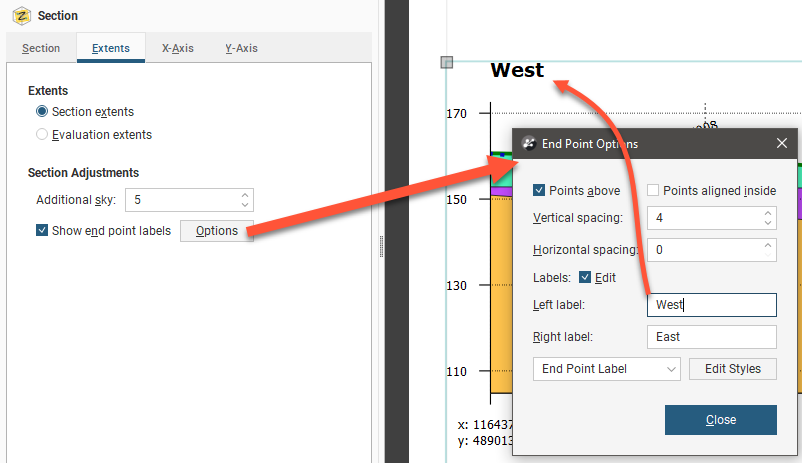
Click Options to change how the end points are displayed relative to the section’s axes.
Edit the text used to display the end points by enabling the Edit box and then changing the text. You can edit the style used for displaying the labels by clicking Edit Styles to change the style or by selecting a different style from the dropdown list.
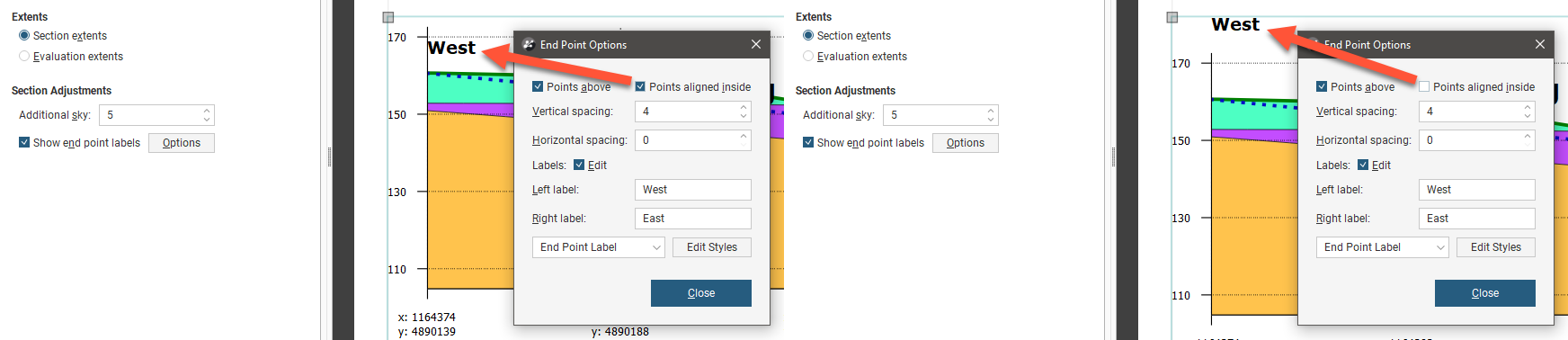
There are two options that control where the end points are displayed, Points above and Points aligned inside. The Points above setting determines whether the end points are displayed above or beneath the axes. Note here the difference between Points above being disabled and enabled:
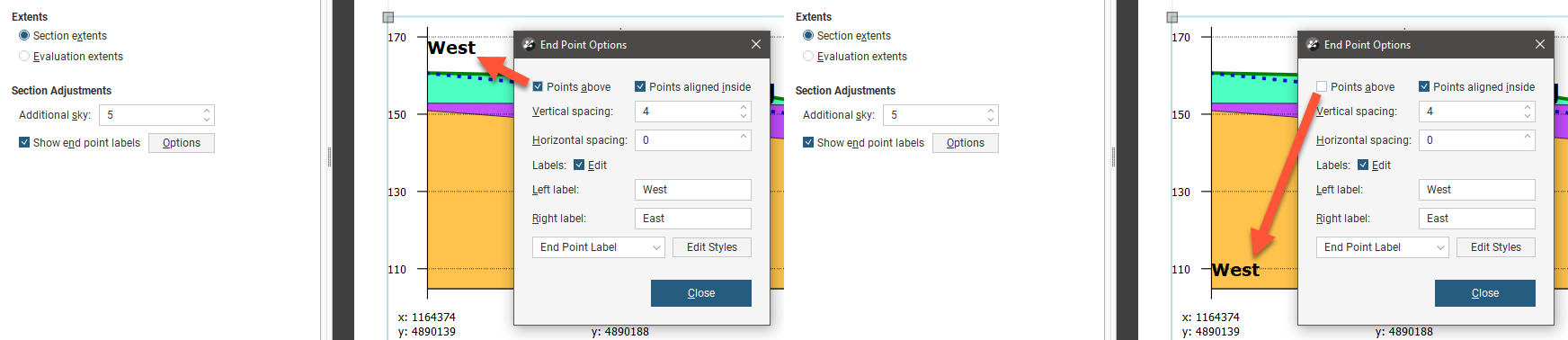
The Points aligned inside setting determines whether the end points are displayed inside or outside the section’s axes:
You can also change the spacing between the end point labels and the section axes.
To change how the axes are displayed, click on the either the X-Axis tab or the Y-Axis tab.
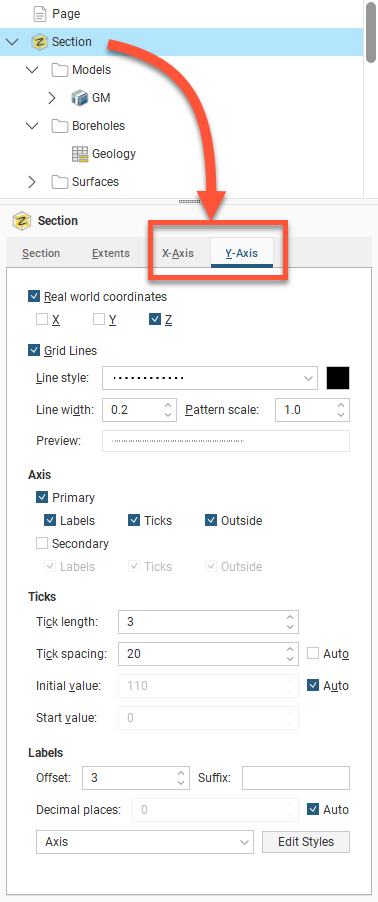
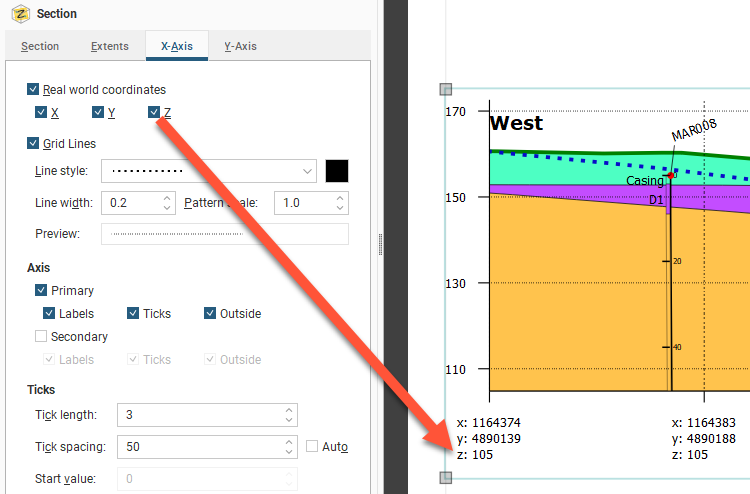
One of the options available for the axes is how much information is displayed for the Real World Coordinates on each axis:
You can also change how Grid Lines are displayed, including the Line style, Line width, Pattern scale and colour. A Preview is displayed and the grid lines are updated in the section preview.
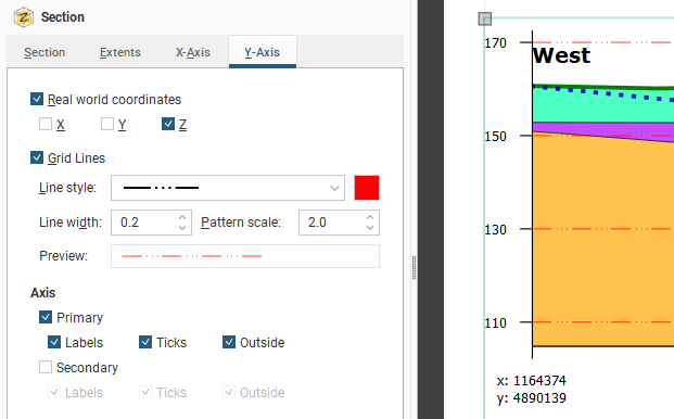
By default, the axes are displayed only on the left-hand side and along the bottom of the section. To display axes along the right-hand side and above the section, tick the Secondary option.
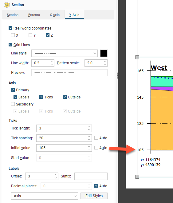
For the Ticks, the Tick length and Tick spacing can be customised. The Y-Axis also has an Initial value with a default that Leapfrog Works automatically calculates. If you wish to change this, disable Auto and enter the required value.
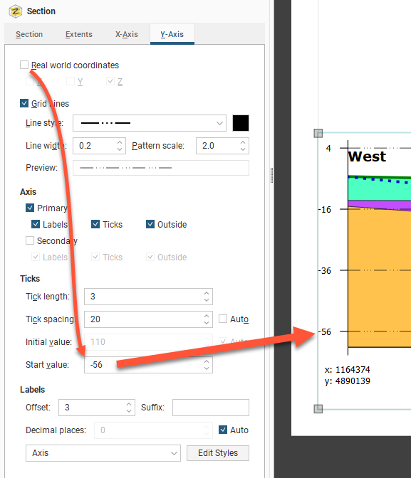
If you wish to set a Start Value specific value for X-axis, you must first disable the Real World Coordinates option:
Edit the text style used for the axis labels by clicking Edit Styles to change the style or by selecting a different style from the dropdown list.
Organising Models and Other Objects on the Section
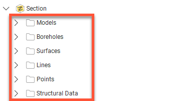
The folders below the Section object are used to add and organise models, boreholes, surfaces, lines, points and structural data and to customise how they are displayed:
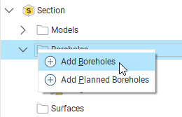
You can add new objects by right-clicking on a folder and selecting an Add option:
- For the Add Model and Add Surface options, you will be able to choose from the models available in the project.
- For the Boreholes folder, there are two options, Add Boreholes and Add Planned Boreholes. For both options, you can choose from the boreholes and planned boreholes available in the project.
- For the lines, points and structural data, the Add options let you choose from lines, points, and structural data available in the project.
It is not necessary to evaluate objects in the project on the section before working in the section layout editor. When you add an object to the layout, Leapfrog Works will automatically evaluate it on the section.
Models, boreholes, surfaces, lines, points and structural data occupy the same space on the section layout, and opacity settings and an object’s position among the layers can be used changed to emphasise relevant information. To change the order of objects on the page, right-click on them and select an option:
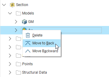
Models will always be among the lower layers, with lines on top of all the other layers.You can remove objects from the layout by right-clicking on them and selecting Delete. To hide it while leaving it available in the section, select the object then untick the Visible tickbox.
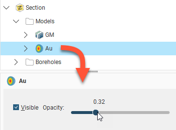
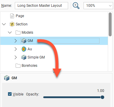
To change the opacity of an object, click on it, then adjust the object’s Opacity using the slider:
Adding and Styling Models
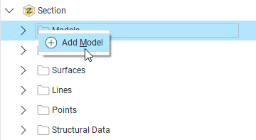
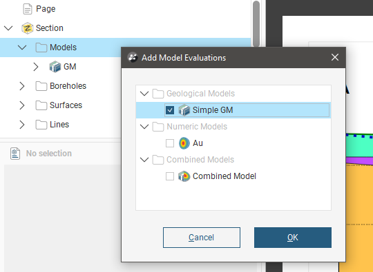
The Models folder contains all models that have been added to the section layout. To add another model, right-click on the Models folder and select Add Model. Select from those available and click OK.
When you display multiple models on the section, you can end up with a large number of objects that obscure the information you want to emphasise. You can:
- Use the Opacity setting for each model to expose and emphasise information.
- Right-click on the models and select an option to move them up or down in the layer hierarchy.
- For geological models, numeric models and combined models, expand the model in the layout tree to change how each output volume is displayed. You can also hide or highlight some of the output volumes. The fill colour and hatching options for each can also be customised.
- For flow models and block models, you can choose the column used to colour the model and filter the values colouring the model or select which categories colour the model.
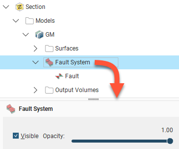
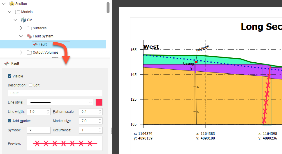
If a geological model with an active fault system is added to the section layout, it will include a Fault System that contains all the active faults in the model. Click on the Fault System to control whether or not it is Visible and to set its Opacity:
Click on the individual faults to control how they are displayed. Edit the fault’s Description by enabling the Edit box and then changing the text. You can also change how the fault is displayed, including the Line style, Line width, Pattern scale and colour. You can also define a marker to display along the line by enabling Add marker and then specifying a Symbol to use. A Preview is displayed and the fault will be updated in the section preview:
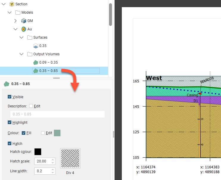
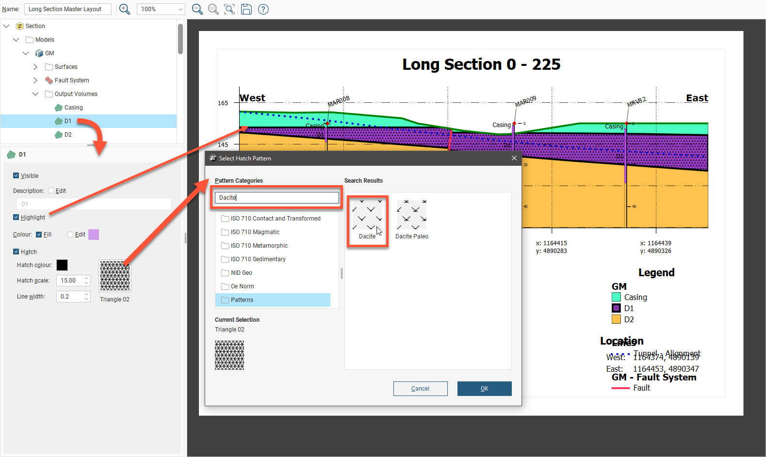
For the volumes in the Output Volumes folder, click on a volume in the layout tree and then change the volume properties. A single line style is used to display a model’s output volumes. There is, however, a Highlight option that can be enabled to make a volume of interest stand out from the other volumes. The swatch colour can be modified by ticking Edit then clicking the colour tile to open the colour picker tool. Swatches for output volumes can also be displayed using a hatch instead of, or in addition to, a colour fill. To do this, enable the Hatch option and click on the sample to select from the available patterns. A search box makes it easy to find hatches intended for specific mineralisations.
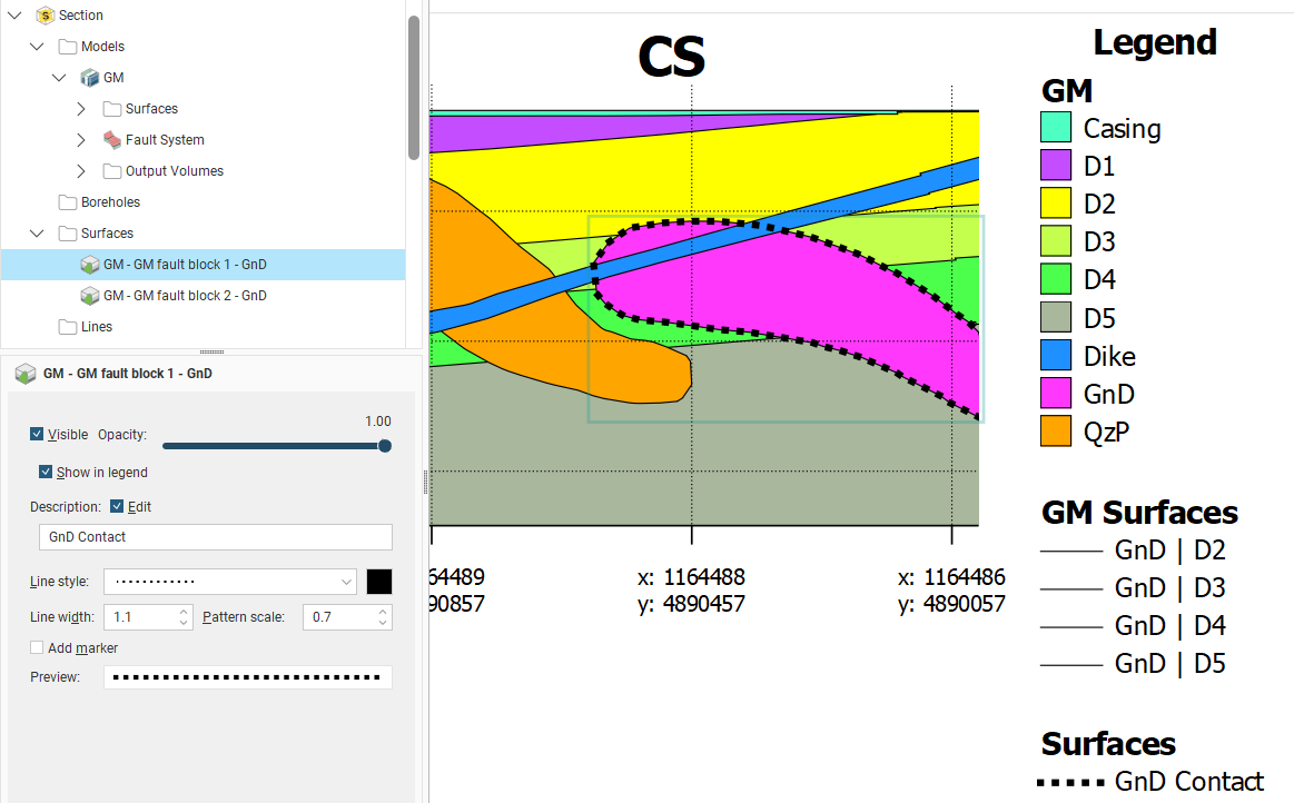
Another way to emphasise a particular volume is to use the surfaces in the model’s Surfaces folder. This folder contains a single surface for every contact with the section, rather than a single surface for each contact surface in the model.
It can result in a large number of surfaces to work with, but does provide you more control over how these surfaces appear on the section layout. For example, here the outline of the GnD volume can be shown in different styles (as with the D2 contact) or not at all (as with the Dike contacts):
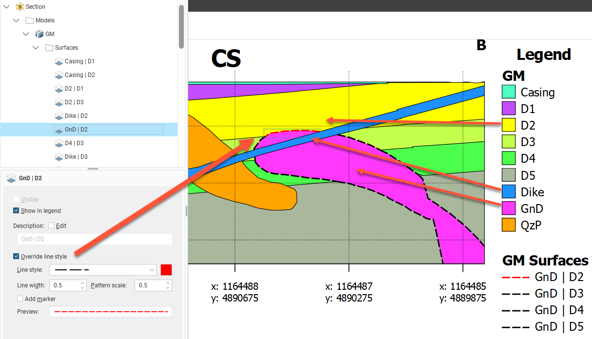
You could alternatively display a contact surface on a section layout as a surface evaluation, but you can have only one line style and you don’t have control over what parts of the surface are displayed. For example, you cannot hide the surface where it is intersected by the dike:
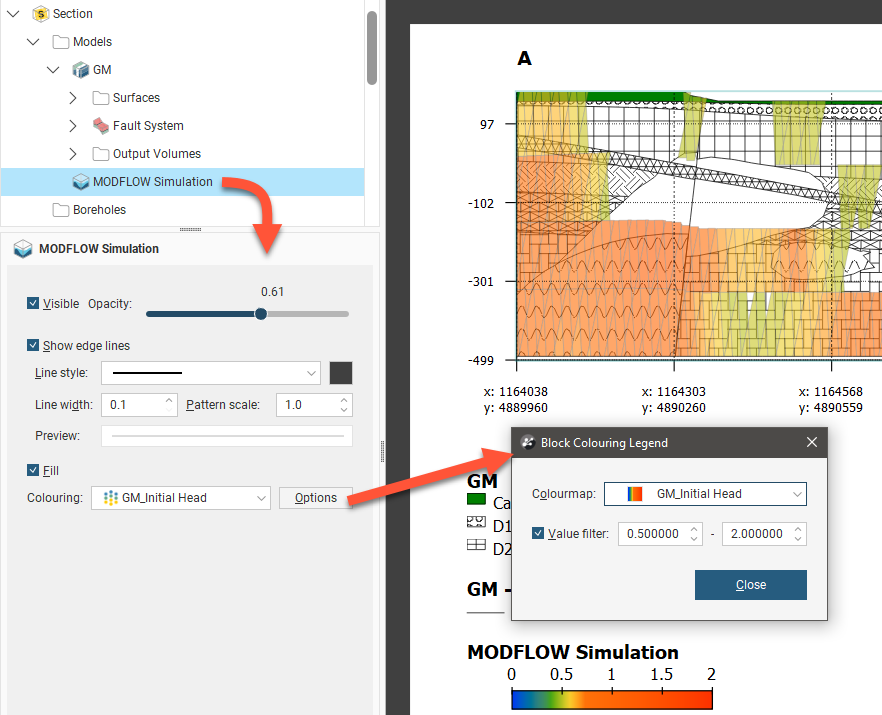
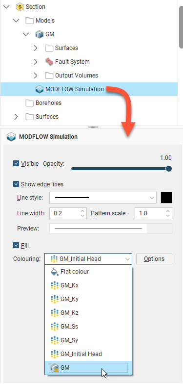
Flow models and block models appear in the Models folder as a single object. The Colouring option is used to display a flat colour or one of the model's hydrological properties, with each of the hydrological categories available for the model being listed, or the geological model from which the model was gridded:
Click Options to change the colours used to display the model:
- For category evaluations, you can change what categories are visible and the colours used to display them.
- For numeric evaluations, you can filter values and use a different colourmap.
For example, here, a MODFLOW model is displayed using the Colouring from an evaluated geological model:
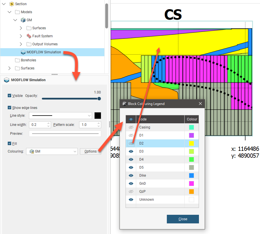
The colours used to display categories cannot be changed in the Block Colouring Legend as they are the colours used by the evaluated model itself. You can, however, hide some categories so they are not displayed on the section layout.
Here, the MODFLOW model is displayed using the Colouring from a hydrological evaluation:
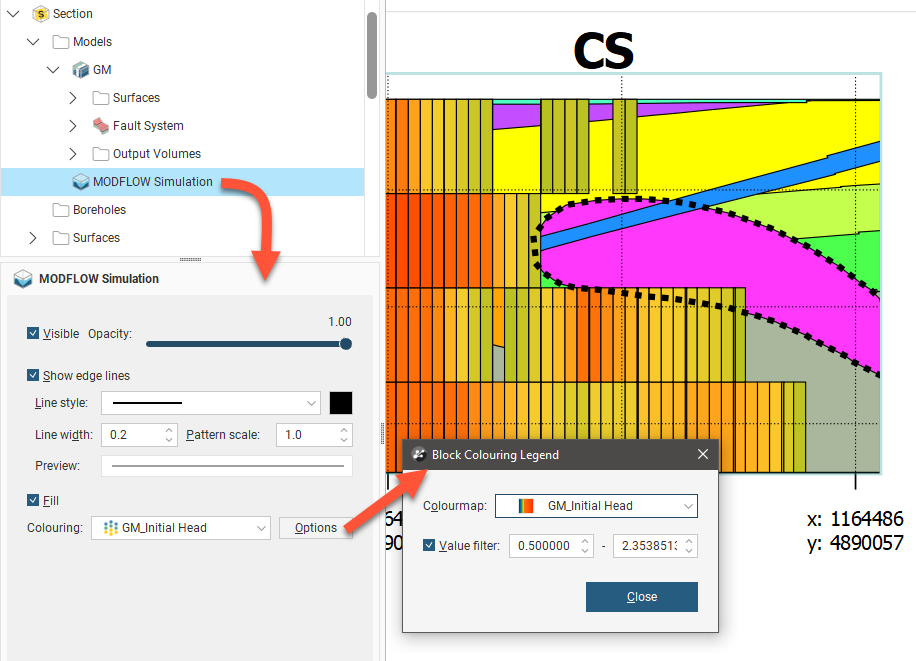
You can change the Colourmap used to display the model on the section and you can filter the values displayed.
If a block model or flow model is too big for the section layout, changing the section extents or the section layout extents will effectively “crop” the model and make it small enough to display on the section layout. There are two ways to do this:
- Change the section layout extents by clicking on Section in the layout tree, then clicking on the Extents tab. If Extents is set to Evaluation Extents, change it to Section Extents.
- Change the size of the section by double-clicking on it in the project tree and then editing its dimensions in the scene.
Adding Styling Boreholes and Planned Boreholes
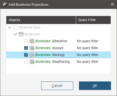
The Boreholes folder contains all boreholes and planned boreholes that have been added to the section layout. To add boreholes to the section, right-click on the Boreholes object and select either Add Boreholes or Add Planned Boreholes.
When adding a borehole projection, you will be prompted for the interval tables to display; more than one can be selected. Each table will be added as a separate item below the Boreholes folder.
When you click OK the borehole is added to the layout tree. It will be flagged with No Selection.
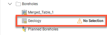
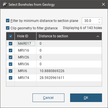
Select the new borehole and double-click it to open a window to select boreholes. Use the filtering options to determine the limits for the projection of the boreholes onto the section based on the minimum distance from any point on the borehole trace to the section plane, and select from the filtered list of boreholes which should be projected.
When adding planned boreholes, you can select from the available planned borehole drilling phases, or select all phases. Then use the filtering options to determine the limits for the projection of the boreholes onto the section based on the minimum distance from any point on the borehole trace to the section plane, and select from the filtered list of boreholes which should be projected.
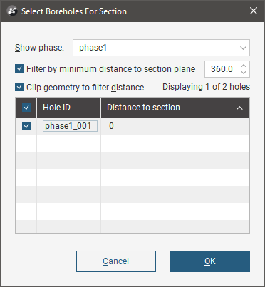
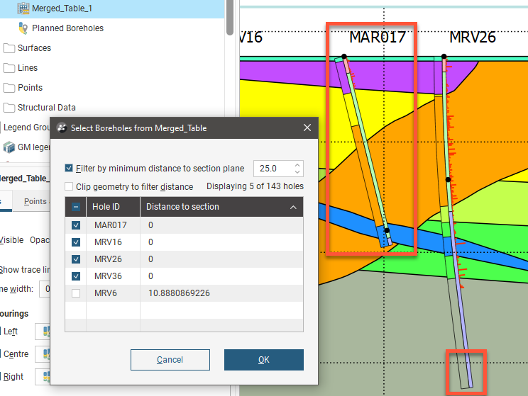
For both the borehole and planned borehole projections, the borehole selection window offers the option to Clip geometry to filter distance. With this selected, only the parts of boreholes that are within the specified minimum distance will be projected onto the section.
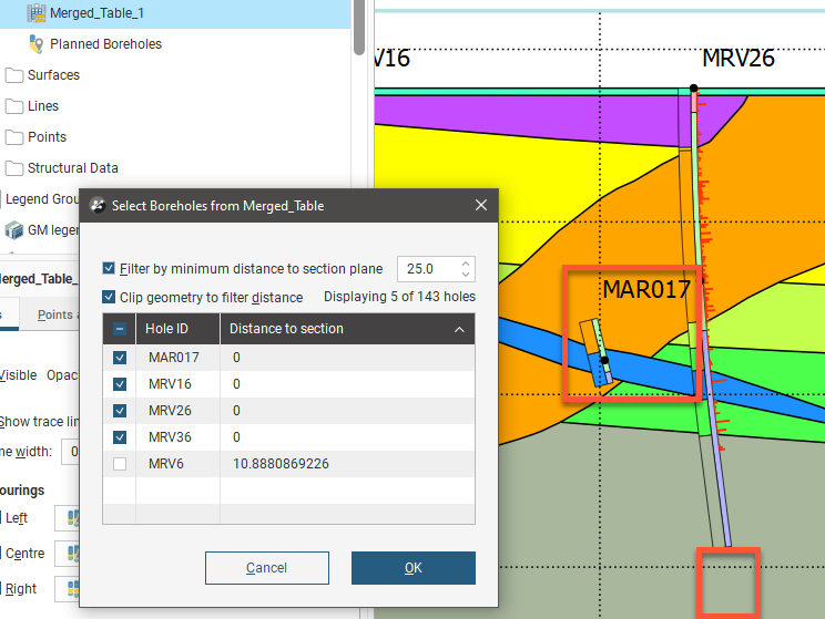
With Clip geometry to filter distance unchecked, if part of a borehole is within the minimum distance specified, the whole borehole will be projected onto the section.
When boreholes and planned boreholes are added to a curved section, a projection is made based on the locations of neighbouring segments of the section, using the bisectors of the angles between each segment and its neighbour. These determine the projection point of origin for a given segment of the section. When boreholes are filtered by the distance to the section plane, the distance is measured at 90 degrees from the section. Some boreholes may report a distance that is greater than the specified minimum distance; if this is the case, it is because the evaluation distance is relative to the projection origin. On the inside of a tight corner, a single borehole may be projected multiple times onto the section. If this is the case, the multiple instances of the borehole will appear in the boreholes list and you can turn individual instances off, if required.
When a long section is updated, borehole evaluations are updated. If there are multiple instances of a borehole evaluation, how they appear on the section may change when the section is updated:
- If all instances of a borehole evaluation have been enabled, then all remain enabled when the section is updated.
- If all instances of a borehole evaluation have been disabled, then all will remain disabled when the section is updated.
- If only some instances of a borehole evaluation have been enabled, then all instances will be enabled when the section is updated.
When a section layout is copied to another section from a long section, borehole evaluations will not be copied with the section layout.
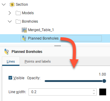
Select an item under the Boreholes in the layout tree to see the properties to make the objects visible and to change their opacity and line width.
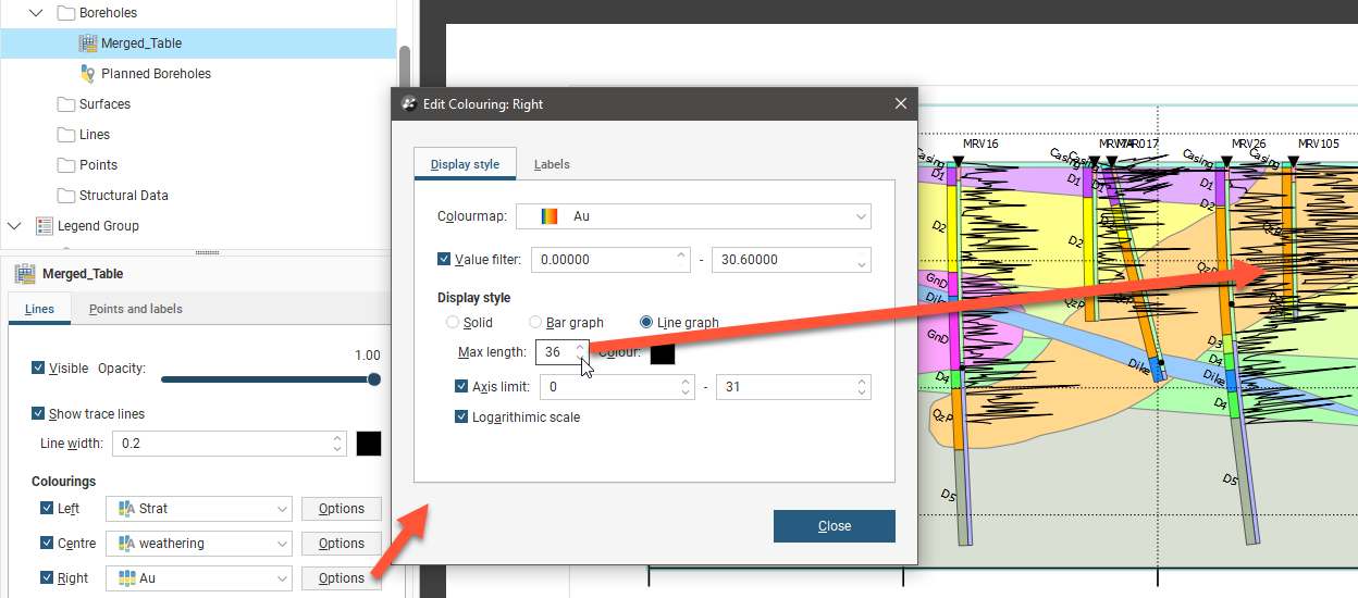
If you select an object with existing drilling data, you will have additional options. Up to three columns of data can be displayed as stripes down the borehole, and numeric data can even be displayed as a graph. Tick either the Left, Centre or Right positions for the boreholes to enable the visualisation and assign a Colouring according to an interval data selection.
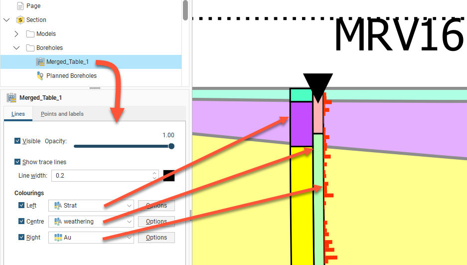
Next to each Colouring, the Options button opens a properties dialog for customisation for each set of interval data. The Line width can be set for each stripe down the borehole.
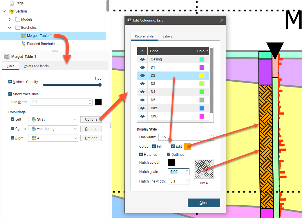
For category data, the visibility of each category can be controlled and the colour fill for each category can be overridden by clicking Edit, clicking the colour tile and selecting a new colour using the colour picker. Hatching can be added to the colour or used instead of colour. Click Hatched then the hatching sample to select a hatch style. There are different categories of hatching, including designs intended for specific mineralisations. A search box is provided to make it easier to find specific hatch styles. Note that the Hatch colour, Hatch scale and Hatch line width can all be customised.
For numeric data, a Value filter can be used to restrict the range of data shown in the borehole stripe.
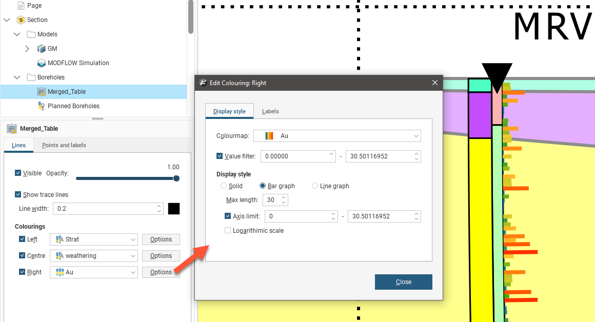
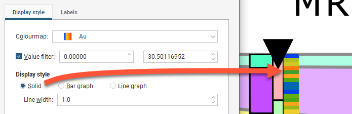
For numeric data, the Display style options are:
- Solid for a fixed Line width stripe with downhole sample values being indicated by the Colourmap colouring:
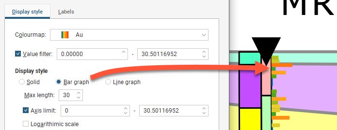
- Bar graph which adds a variable width up to create a bar graph running down the borehole with downhole sample values being indicated by the Colourmap colouring:
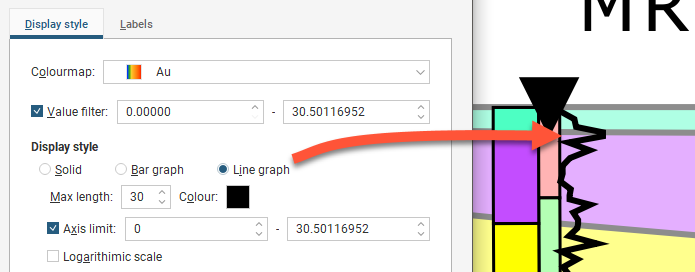
- Line graph which changes the visualisation to a line indicating the sample data values:
The bar and line graph options are not available for the centre of the borehole, although the solid option can be used.
Bar graph and Line graph extend out from the borehole to a specified Max length. Select a Max length that means that displayed data does not interfere with other boreholes or data displayed on the section layout.
This is especially relevant when two graphs are displayed per borehole.
The Axis limit fields clip the chart range to the minimum and maximum values of interest and an option is provided to make the value axis scale a Logarithmic scale. The line graph option provides the ability to specify the Colour of the line. Click the colour tile and select a new colour using the colour picker.
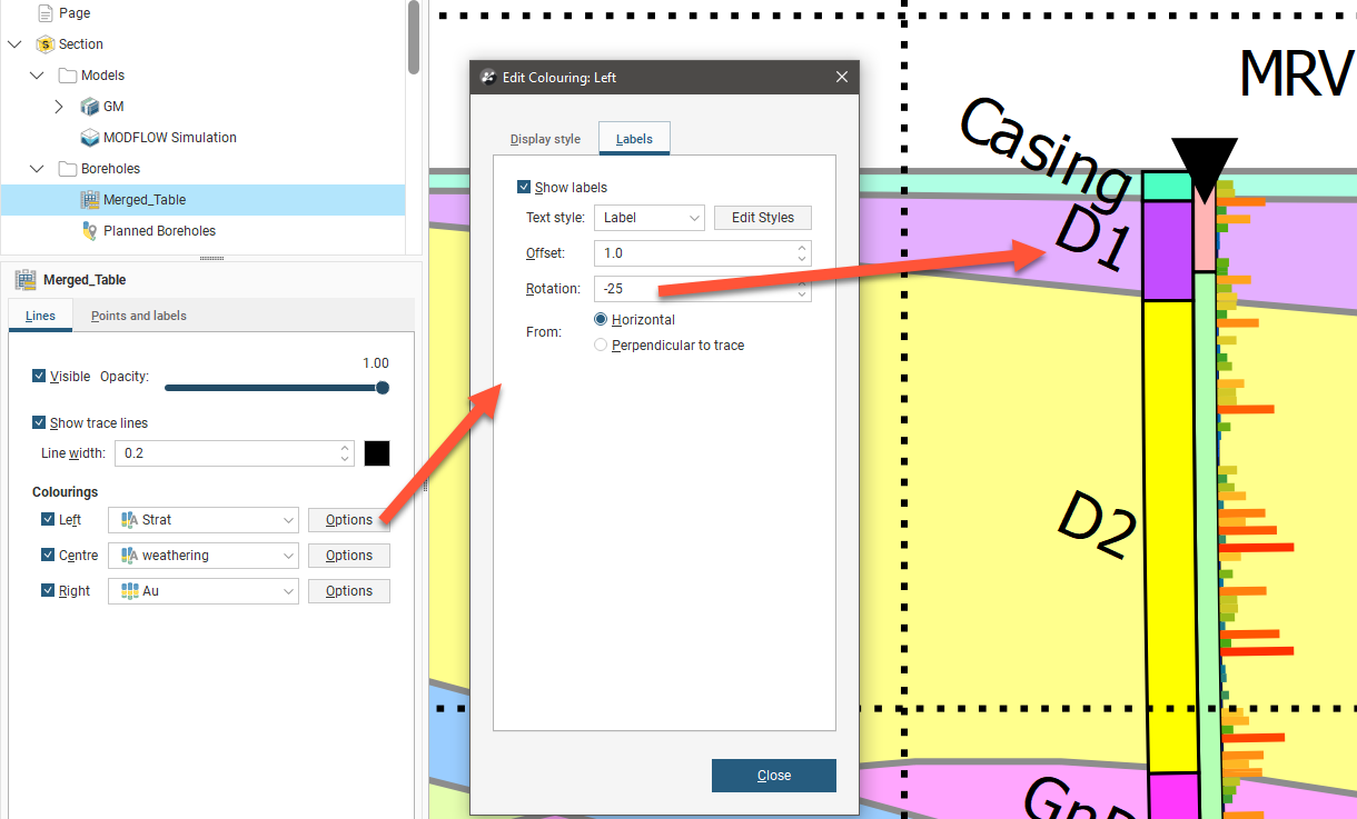
Both category and numeric data Options windows also have a Labels tab. Labels can be shown or hidden using the Show labels tickbox abd the Text style can be selected from one of the text styles provided and modified using the Edit styles button. The Offset specifies the distance from the borehole the label will appear. Numeric data labels also add the option of making this offset a Constant distance or adding the Numeric value to the Offset to stagger the labelling according to the data values. The Rotation of the label can be specified so they appear at a tilted angle from the borehole, and this angle can be specified to be with reference to the Horizontal if the labels should all be parallel, or Perpendicular to trace if the labels should follow the curve of the borehole. Numeric labels also have the option to specify the number of Decimal places in the labels.
Labelling numeric data values works best for numeric data sets with sparse data sampling because when data samples are close together it can lead to cluttered and overlapping labelling, even when reducing the size of the font used for labelling.
Besides the labels associated with interval data described above, you can also have the following type of labels at different points along the borehole trace:
- Top labels
- Intercept labels
- Bottom labels
- Depth markers
Additionally, the following points and markers can be customised:
- Collar points
- Intercept points
- Depth markers
An intercept point is where the borehole intersects the section plane.
Select either a borehole object or planned borehole from the Boreholes folder in the layer tree, then select the Points and labels tab.
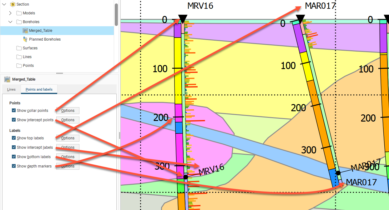
Click Options to change how the labels or points are displayed.
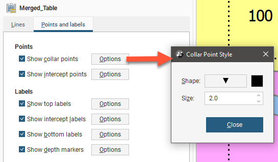
Collar points and intercept points can have the Shape, Size and colour modified. Click the Shape symbol to open a window with 60 different symbol options. Click the colour tile to open a colour picker window.
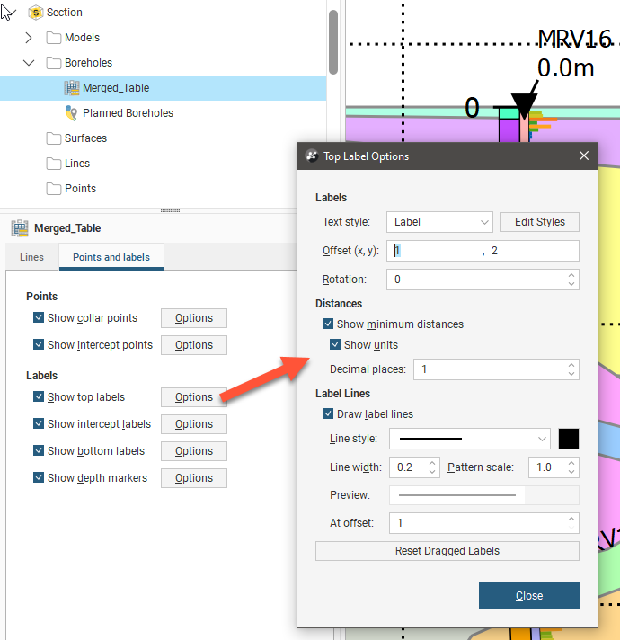
Top, bottom and intercept labels can have the Text style selected from the available styles, or you can click Edit Styles to customise the style. Offset (x, y) positions the label a specified distance away from the point it is referencing. Rotation will put an angle on the label, useful when labels are close together. Top and bottom labels have the option to Show minimum distances for the borehole from the section plane. You can also choose to Show units and specify the number of Decimal places to show. Labels can have a line connecting them to the point they refer to, if Draw label lines is ticked and once the label is more than the At offset length away from the point. The Line style. Line width, Pattern scale and colour can be customised. A Preview shows what the line will look like on the section.
Labels on sections can be selected and dragged into a new position to avoid overlapping with adjacent items on the section. Click the Reset Dragged Labels button to restore them to the default position.
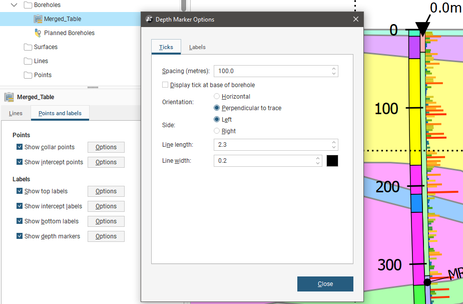
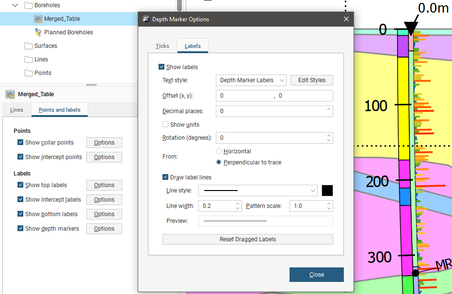
Depth markers display ticks down the length of boreholes with optional distance labels. On the Ticks tab, the tick Spacing can be specified, and you can choose to optionally Display tick at base of borehole. The Orientation of the tick can be Horizontal to display all the ticks in parallel, or Perpendicular to trace to have the tick orientation follow the curve of the boreholes. The Side of the borehole centreline the tick extends from can be specified as Left or Right. The Line length specifies how far from the borehole centreline the tick extends, and the Line width determines how thick the tick is.
On the depth marker Labels tab, the labels can be enabled using the Show labels tickbox and customised in the same way as other labels using the Text style selector and the Edit Styles button. Offset (x, y) positions the label a specified distance away from the tick it is referencing. Rotation will put an angle on the label. You can also choose to Show units and specify the number of Decimal places to show. Labels can have a line connecting them to the point they refer to, if Draw label lines is ticked. The Line style. Line width, Pattern scale and colour can be customised. A Preview shows what the line will look like on the section. Depth marker labels can be selected and dragged into a new position to avoid overlapping with adjacent items on the section. Click the Reset Dragged Labels button to restore them to the default position.
Adding and Styling Surfaces
The Surfaces folder contains all surfaces that have been added to the section layout. To add another surface, first make sure it has been evaluated on the section, then right-click on the Surfaces folder and select Add Surface. Select from those available and click OK.
Click on the surface in the layout tree to view styling options:
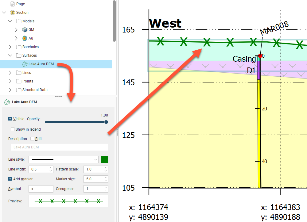
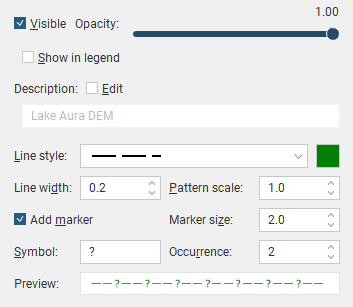
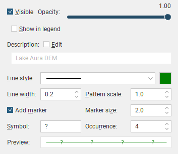
Visibility can be turned on or off and the Opacity of the projection of the surface onto the section can be set. Edit the text used to display the surface by enabling the Edit box and then changing the text. You can change the Line style, Line width, Pattern scale and colour. You can also define a marker to display along the line by enabling Add marker and then specifying a Symbol to use. Increasing the Occurrence number increases the gap between symbols. A Preview is displayed and the surface will be updated in the section preview.
You can see below how changes to the Line style, Symbol and Occurrence can be used to indicate different conditions:

You can set the line style for a volume surface as a surface evaluation, but note that the whole outline is treated the same. If, for example, in the section below you wanted to hide the surface line style where it is intersected by the dike, setting the surface line style as a surface evaluation only provides one line style and you don’t have control over what parts of the surface are displayed. To achieve what is wanted in this case, use the individual contact surface line styles provided in the Models folder. For more information on how to do this, see Adding and Styling Models.
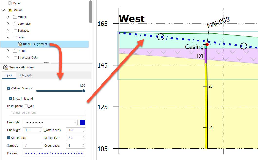
Adding and Styling Lines
The Lines folder contains all lines that have been added to the section layout. To add another line, first make sure it has been evaluated on the section, then right-click on the Lines folder and select Add Line. Select from those available and click OK.
Click on the line in the layout tree to view line styling options. Visibility can be turned on or off and the Opacity of the projection of the line onto the section can be set. Edit the text used to display the line by enabling the Edit box and then changing the text. You can change the Line style, Line width, Pattern scale and colour. You can also define a marker to display along the line by enabling Add marker and then specifying a Symbol to use. Increasing the Occurrence number increases the gap between symbols. A Preview is displayed and the surface will be updated in the section preview.
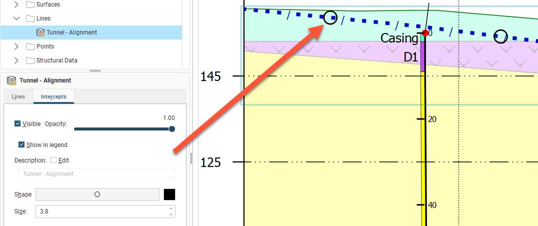
Switch to the Intercepts tab to style the pierce points where the line intersects the section. The point Shape can be selected from a set of 60 options, the Size can be set and the colour changed by clicking the colour tile and selecting a new colour using the colour picker.
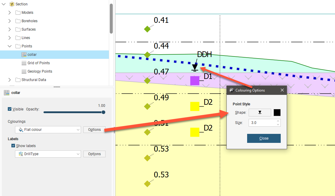
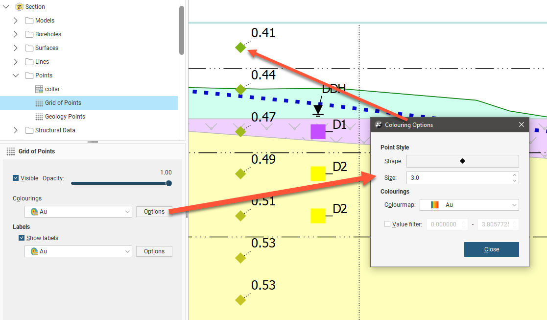
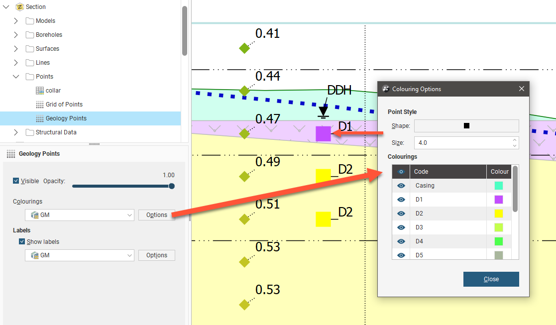
Adding and Styling Points
The Points folder contains all points objects that have been added to the section layout. To add another points object, right-click on the Points folder and select Add Points. Select from those available and click OK.
Click on the points object in the layout tree to view point styling options. Visibility can be turned on or off and the Opacity of the points can be set.
The Colourings selection lets you choose the basis on which the points are coloured. If you choose Flat colour and click Options you can pick a Shape from 60 symbols, set the Size of the points on the section, and click the colour tile to make a new colour selection.
If you choose a numeric value column associated with the points data and click Options you can pick a Shape from 60 symbols and set the Size of the points on the section. You may also be able to select from available Colourmaps if more than one is available, and enable a Value filter to only show points between a specified minimum and maximum value.
If you choose a category column associated with the points data and click Options you can pick a Shape from 60 symbols and set the Size of the points on the section. You can also set the visibility for the points by category. The Code and Colour cannot be customised in this window.
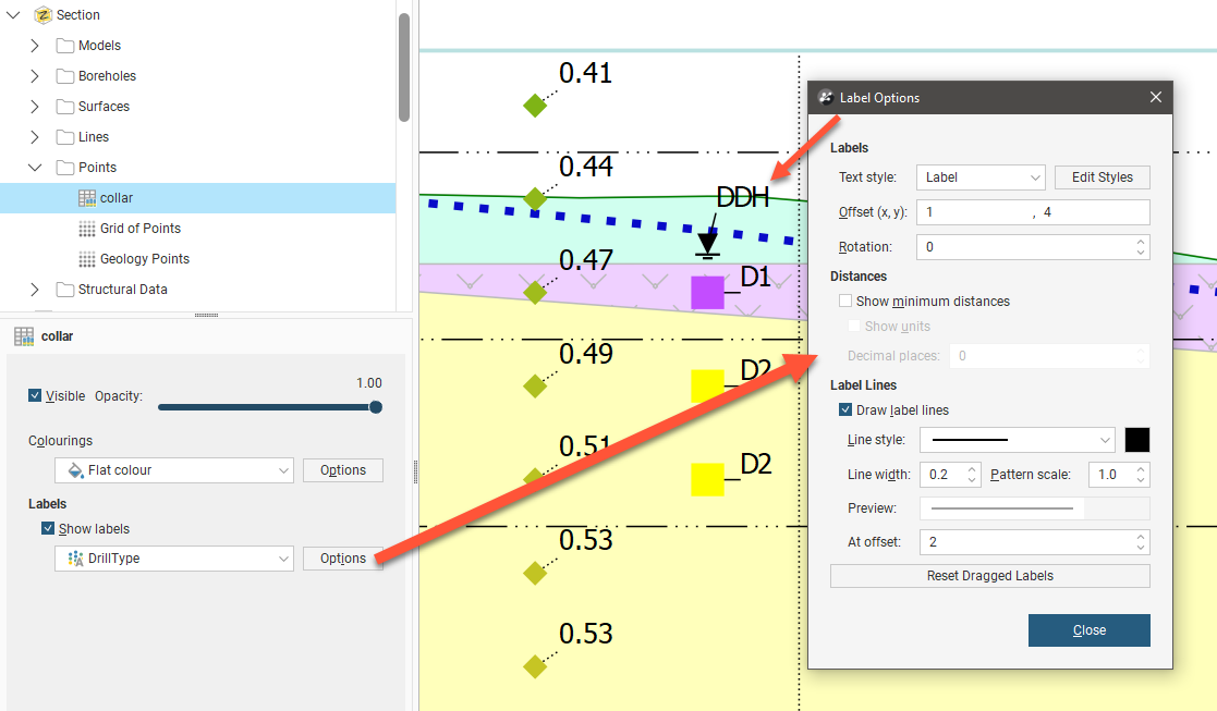
You can choose to Show labels or hide them. From the selector you can choose the same option as used for Colourings or a different option. Click the Options button to customise the labelling. Text style provides a list of available styles, or you can click Edit Styles to customise the style. Offset (x, y) positions the label a specified distance away from the point it is referencing. Rotation will put an angle on the label, useful when labels are close together. You can choose whether or not to Show minimum distances for the borehole from the section plane and you can also choose to Show units and specify the number of Decimal places to show. Labels can have a line connecting them to the point they refer to, if Draw label lines is ticked and once the label is more than the At offset length away from the point. The Line style. Line width, Pattern scale and colour can be customised. A Preview shows what the line will look like on the section.
Labels on sections can be selected and dragged into a new position to avoid overlapping with adjacent items on the section. Click the Reset Dragged Labels button to restore them to the default position.
Adding and Styling Structural Data
The Structural Data folder contains all structural data objects that have been added to the section layout. To add another structural data object, right-click on the Structural Data folder and select Add Structural Data.
Click on the structural data object in the layout tree to view styling options. Visibility can be turned on or off and the Opacity of the structural data can be set.
The Colourings selection lets you choose the basis on which the points are coloured. If you choose Flat colour and click Options you can set the Width of the lines in the symbol and the Length changes the size of the symbol, and you can click the colour tile to make a new colour selection.
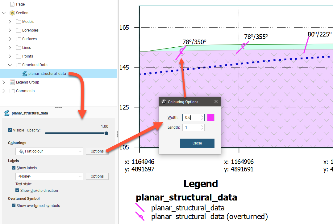
If you pick one of the azimuth, dip or polarity options instead of Flat colour, the symbols will be coloured according to a selected Colourmap. A Value filter can be used to limit the structural data points that are displayed to those within a minimum and maximum range for the selected orientation parameter. The Width and Length settings control the thickness of the lines in the symbol and the size of the symbol, respectively.
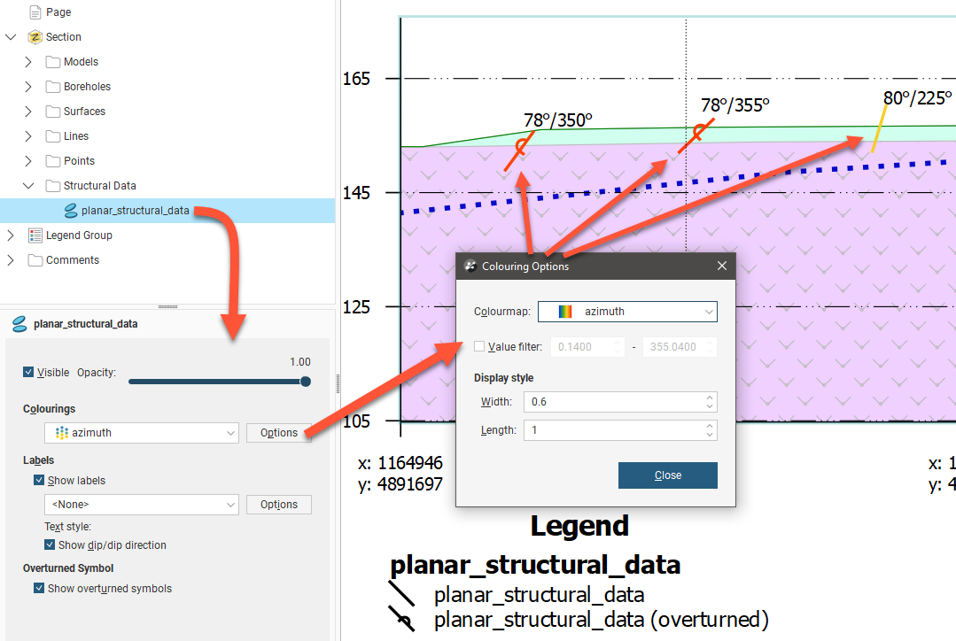
You can choose whether or not to Show labels, and choose from the Row ID, azimuth, dip and polarity options. There is also a <None> option, which is useful in conjunction with the tick box Show dip/dip direction which will add that pair of structural data orientation values. Having that enabled with dip or azimuth selected as the label option will result in redundant information being shown, so this tick box is really intended to supplement the Row ID, polarity, and <None> options.
When the Show overturned symbols tick box is unticked, all the structural data symbols appear as a bar on the section. When ticked, overturned structural data points are indicated with the addition of a swirl in the middle of the bar.
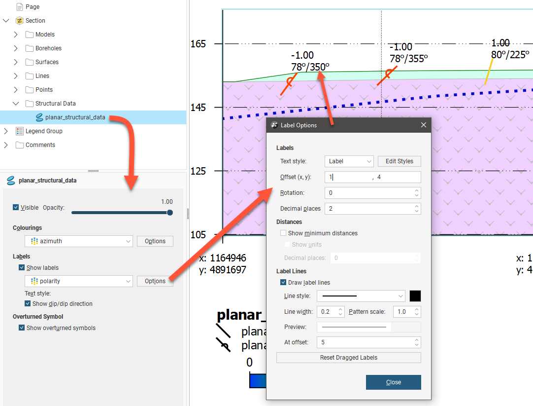
Click the Options button to customise the labelling. Text style provides a list of available styles, or you can click Edit Styles to customise the style. Offset (x, y) positions the label a specified distance away from the point it is referencing. Rotation will put an angle on the label, useful when labels are close together. The Decimal places setting under the Labels heading sets how many decimal places are shown in the label value. You can choose whether or not to Show minimum distances for the borehole from the section plane and you can also choose to Show units. The Decimal places setting under the Distances heading sets how many decimal places are shown in the minimum distance value. Labels can have a line connecting them to the structural data they refer to, if Draw label lines is ticked and once the label is more than the At offset length away from the structural data. The Line style. Line width, Pattern scale and colour can be customised. A Preview shows what the line will look like on the section.
Labels on sections can be selected and dragged into a new position to avoid overlapping with adjacent items on the section. Click the Reset Dragged Labels button to restore them to the default position.
Setting Up the Legend
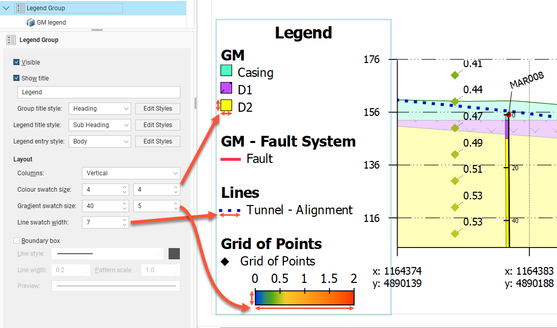
The Legend Group and the individual legends underneath it control how the legend is displayed on the page. Click on the Legend Group object to change the layout of the legend as a whole. The Visible tick box is used to show or hide the whole legend. Show title is used to show or hide the title, which can be customised from "Legend" to something else as required. Three sets of style controls set the appearance of the Group title style, Legend title style and the Legend entry style for different parts of the legend as indicated . Use the Edit Styles buttons to customise the styles used.
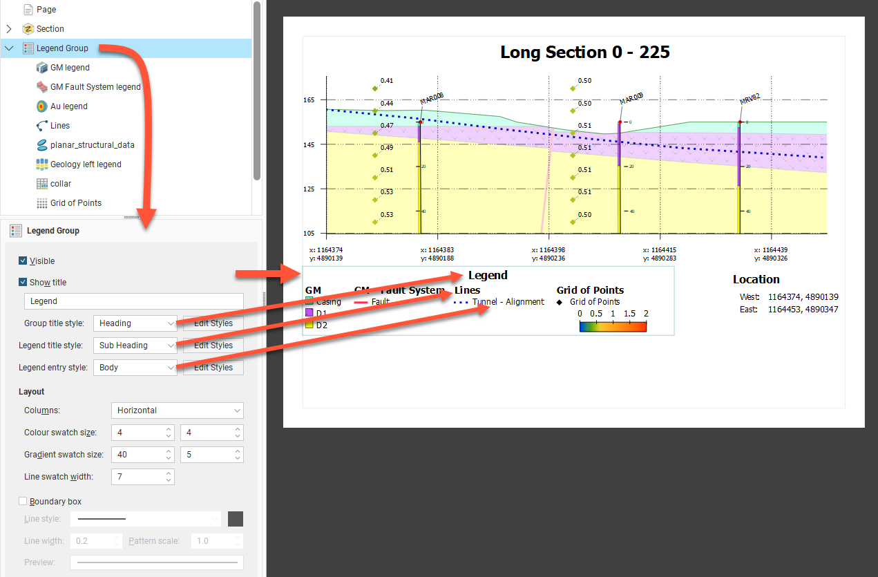
The legend has a series of legend elements for different objects. Under Layout, these can be arranged as Horizontal (as above) or Vertical (as below) Columns. Each of the component legend elements will also inherit the same Colour swatch size, Gradient swatch size and Line swatch width for overall consistency of appearance.
The legend may optionally be surrounded by a Boundary box, and the line style for that box can be set using the Line style, Line width, Pattern scale and colour tile controls.
When you have multiple models, surfaces, lines and boreholes on the section layout, you can end up with a large number of entries in the Legend Group. You can control which legend entries are included in the Legend Group.
Depending on the object type, there are different ways for objects to be managed in the legend:
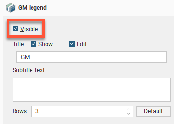
- Each entry under the Legend Group in the layout tree has a Visible tickbox. You can also Show or hide the Title for the object type, and the title can be customised by clicking the Edit tickbox and changing the title text. Enter text in the Subtitle Text box to add more to explain the entry, as required. Change the number of Rows to rearrange how multiple swatches are organised.
- Instead of there being a single Borehole entry in the Layout Group, each data column colouring for each Borehole object is automatically added to the Layout Group. Each can be customised as above.
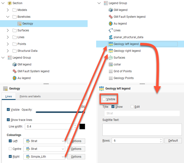
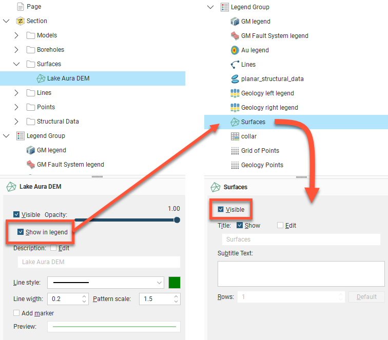
- Model surfaces, surfaces, and lines each have a Show in legend tickbox that needs to be enabled before an item will appear in the Legend Group. Once ticked, it can still be optionally hidden or shown in the legend by changing the Visible tickbox for the entry that will have appeared in the Legend Group.
- Planned boreholes do not appear in the legend. This is not customised from within the Legend Group.
The order in which legends appear in the Legend Group is the order in which they appear in the layout tree. To change the order in which the legends appear, right-click on them and select a Move option.
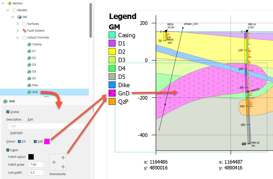
The colours, line widths, fills and hatches displayed in the Legend Group are controlled by the objects themselves.
For example, to change how a volume for a model is displayed, click on the output volume under the Models object:
Adding and Organising Comments
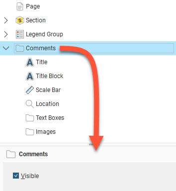
Once you have laid out the main Section object and organised the Legend Group, you can add a number of different types of comment annotations to the layout, including a title, a title block, location information and a scale bar, text boxes and imported images. A master Visible tickbox is used to show or hide all the comment types.
Displaying a Title
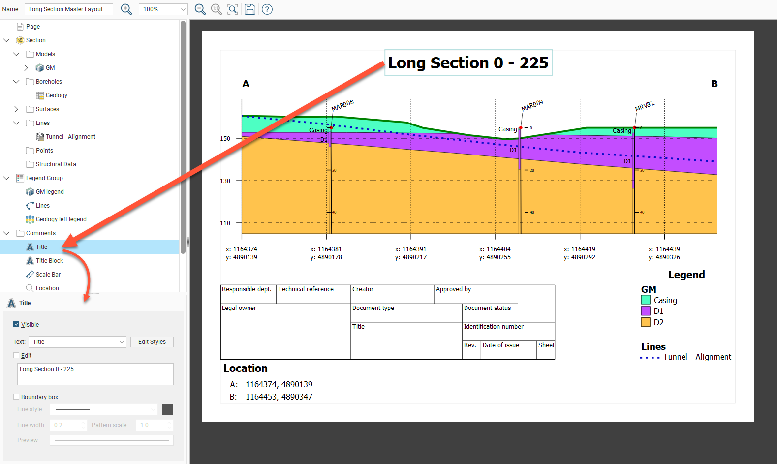
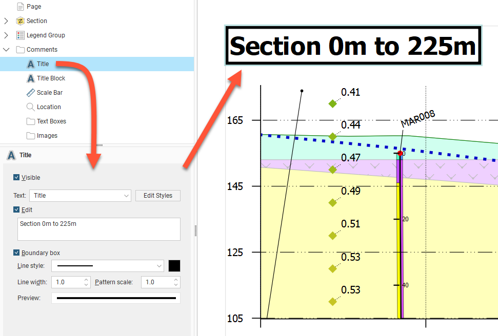
The Title object formats the title displayed on the section. To move the title, click on it in the layout preview and drag it to the preferred location. The text used for the Title is the name for the section in the project tree, but this can be changed in the properties panel. Enable the Edit option, then edit the text in the box. You can display a line around the Title by enabling the Boundary box option. You can customise the Line style, Line width, Pattern scale and colour of the box. A Preview is displayed and the boundary is updated in the section preview.
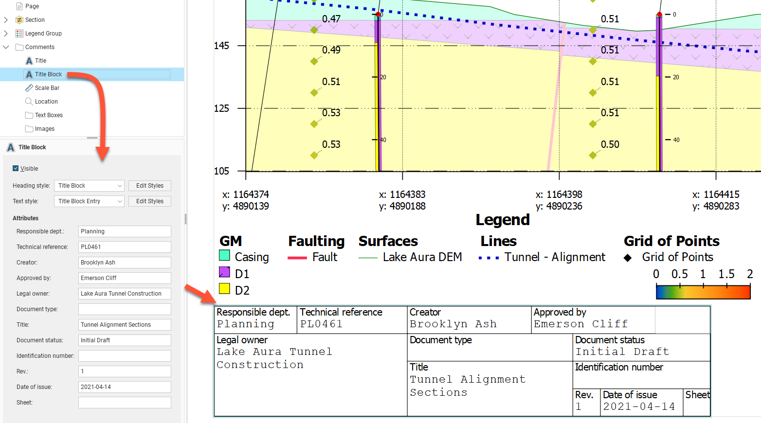
Displaying a Title Block
When the Title Block is made Visible, a title block based on ISO 7200 is displayed on the layout. Click and drag the title block into the desired position. You can select from the available styles for the title block Heading style and the Text style, and you can modify the styles used by clicking the Edit Styles buttons.
Text can be entered for each of the title block fields:
- Responsible dept
- Technical reference
- Creator
- Approved by
- Legal owner
- Document type
- Title
- Document status
- Identification number
- Rev
- Date of issue
- Sheet
Displaying a Scale Bar Information
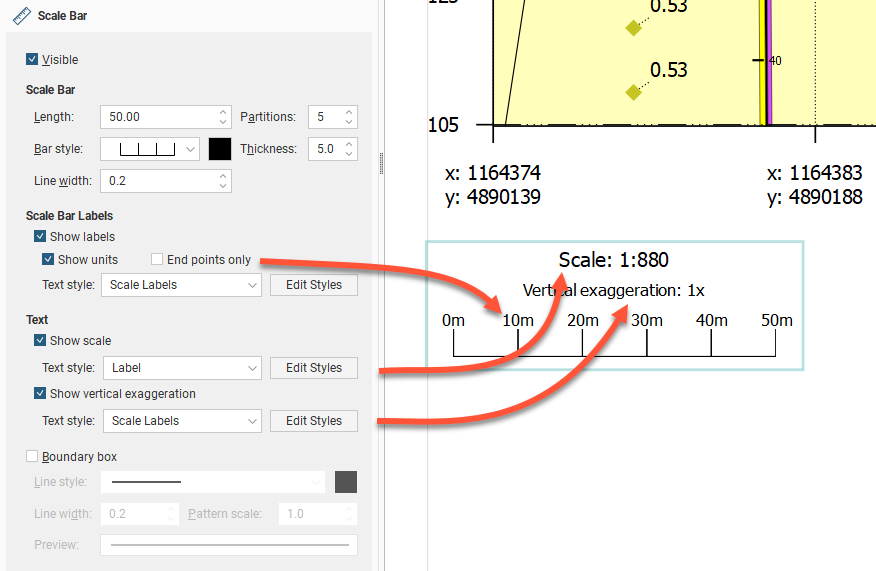
As for other section elements, the Scale Bar has an option to make the scale bar Visible. Click and drag the scale bar to reposition it on the section. There are a number of different styles available for the Scale Bar, and you can control its Length, Partitions, Bar style, Thickness and Line width:
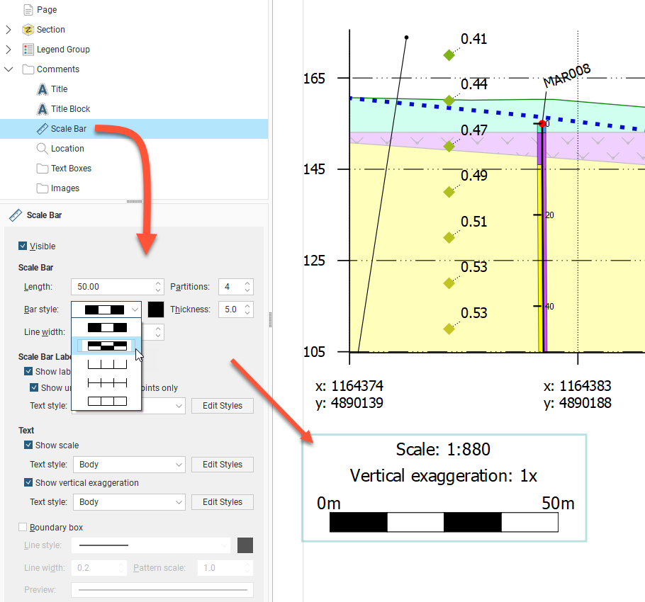
You can show the Scale Bar with or without labels, and labels can be shown all along the bar by disabling the End Points Only option. There is also a Show scale tickbox to show or hide the scale of the section, and an option to Show vertical exaggeration or hide it. As for other section elements, the scale bar box can be defined with a Boundary box with a customisable line style.
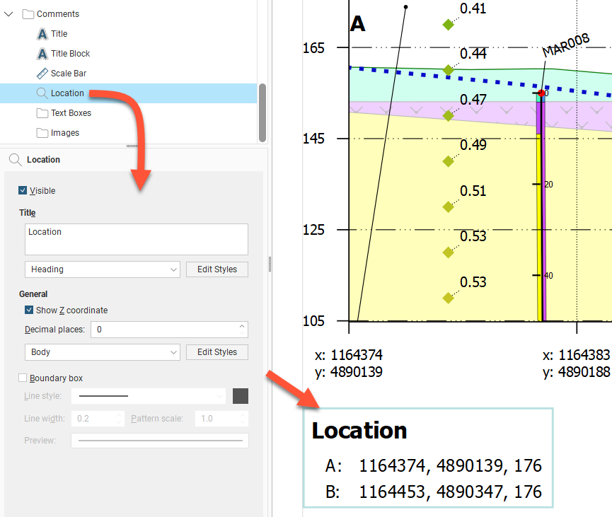
Displaying Location Information
The Location object controls how location information is displayed. It van be made Visible or hidden. Click and drag the location box to reposition it on the section. You can choose to include the Z coordinate and change the number of decimal places used to display coordinates.
The two points referenced in the Location are the top-left and top-right points of the section. The labels for these two points is editable and can be set by navigating in the layout tree to Section > Extents tab > Show end point labels Options button where Left label and Right label can be edited. These labels are used for the Location box even if the section extents Show end point labels tickbox is unticked.
There is a Boundary box option for the Location box. You can customise the Line style, Line width, Pattern scale and colour of the box. A Preview is displayed and the boundary is updated in the section preview.
Text Boxes
With the Text Boxes object, you can add text boxes and arrows to highlight information and details on the section:
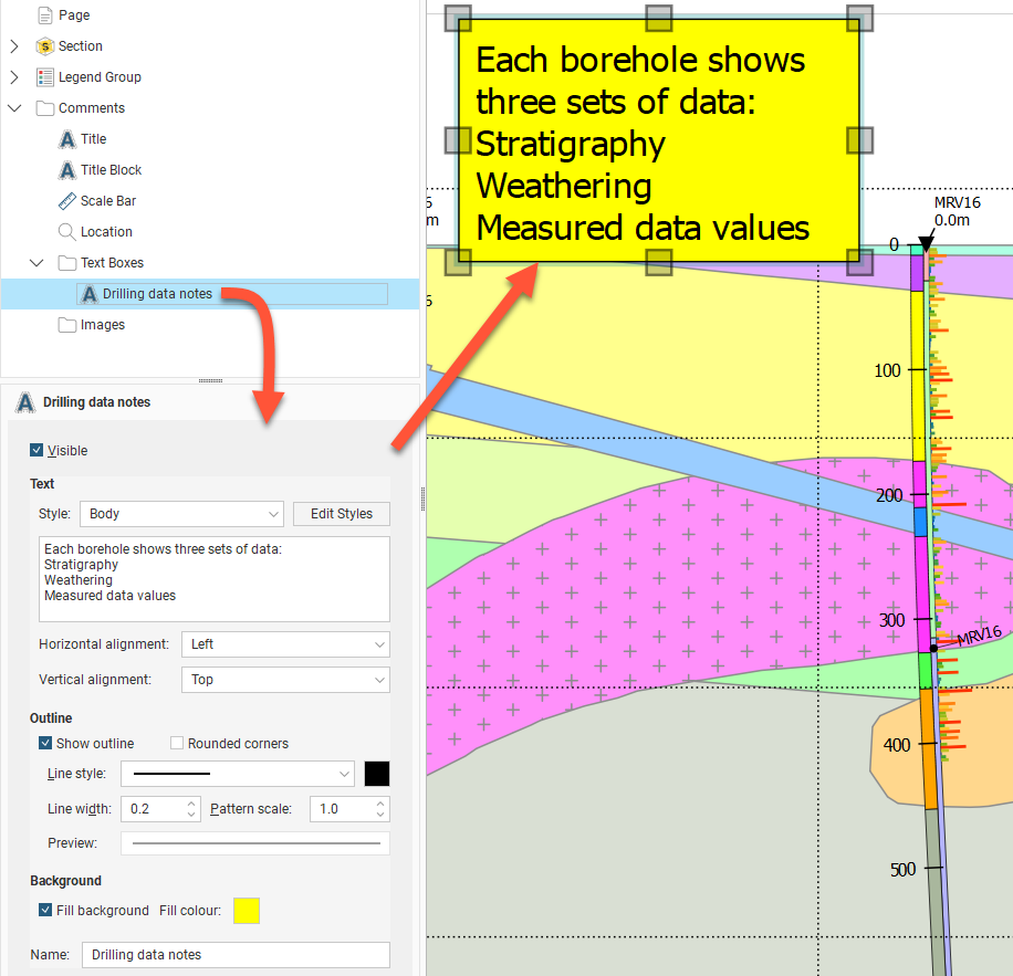
Besides the usual Visible tickbox, the Style of the text can be chosen from the styles available, and can be customised by clicking the Edit Styles button. The text is edited using the box provided. Both the Horizontal alignment and Vertical alignment can be set for the text inside the text box.
There is also a Show Outline option for the text box, and corners can be square or rounded. You can customise the Line style, Line width, Pattern scale and colour of the outline. A Preview is displayed and the text box is updated in the section preview.
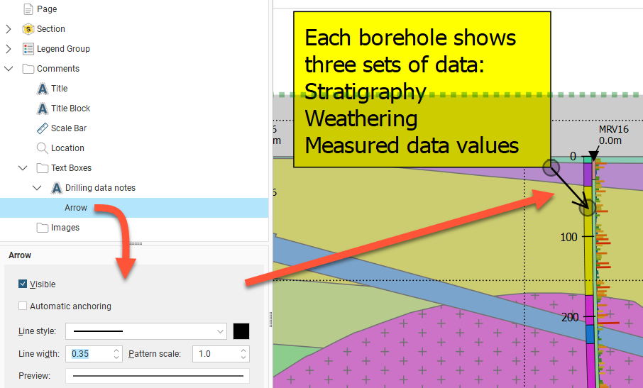
Once a text box has been created, an arrow can be added to connect the text box to a relevant part of the section. Right-click the text box in the layout tree and select Add Arrow. The arrow Line style, Line width, Pattern scale and colour can be customised. The arrow head scales with the line width. The arrow head style is not customisable. Each end of the arrow can be repositioned. When the Automatic anchoring option is enabled for an arrow, the arrow’s anchor will move when its associated text box is moved. If this option is disabled, the arrow will move when you move the text box, but you will have to place its anchor manually.
Images
If you wish to import an image such as a logo or map, right-click on the Images object and select Add Image. Navigate to the folder that contains the image file and select the file. Click Open to import the file, which will automatically be added to the section layout. Move the image by clicking on it in the preview and dragging it. You can resize the image by dragging the corners of the image. Visible will show or hide the image, and Opacity will control the transparency of the image.
Displaying Section Layouts in the Scene
Sections can be displayed in the scene by dragging a layout into the scene to see the section in relation to models in the scene, but the usual way sections will be viewed is by exporting them as files to be imported into other software or as documents to be printed.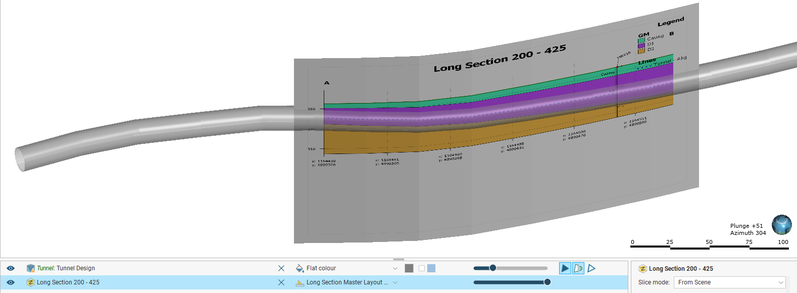
Some sections will be too large to display in the scene, which will be indicated in the section layout editor.
Copying Section Layouts
If you have already created a section layout and wish to reuse it, you can copy it to other sections.
To copy a layout, right-click on the layout you wish to copy and select Copy Layout To. In the window that appears, a summary of the information that will be copied is displayed so you can see what information will be copied to the selected sections. Move the sections you wish to copy the layout to into the Selected Sections list, then click OK.
Search for items in a list by pressing Ctrl-F. A Find window will appear that you can use to search the list. You can choose whether or not to match case in the search and whether or not to match the whole label. You can search forwards or backwards and you can select all list items that match the current search.
A copy of the layout will appear in the project tree under each section you selected. The layout copies are not linked to the original layout and so will not be updated when the original is updated.
Copying section layouts to multiple sections can result in numerous section layouts in a project, which can be difficult to work with. The recommended workflow for creating a section layout that you intend to make multiple copies of is to first get the layout right on one section before copying it to other sections.
Copying a section layout copies the evaluations used in the original section layout, together with the page size and orientation and the position of the layout tree objects on the page. How models, surfaces and boreholes are copied depends on the section to which the layout is being copied:
- All models, surfaces. lines, points and structural data objects that can be displayed on the section will be copied.
- The boreholes copied to the layout will depend on the type of section the layout is being copied from and whether or not a filter is set for the layout:
- If no distance filter was set for the original layout, all boreholes selected for the original layout will be copied.
- If a distance filter was applied to the original section, the filter will be applied and boreholes selected that are within that distance of the section to which the layout is being copied.
- When the original layout is from an alignment serial section or a long section, borehole evaluations will not be copied with the section layout.
Got a question? Visit the Seequent forums or Seequent support
© 2022 Bentley Systems, Incorporated