
Visualising Data
Visualising data is an important part of interpreting and refining data and making modelling decisions. This topic describes the tools available for changing how data objects are displayed in the scene. It is divided into:
- Colour Options
- Opacity
- Property Buttons
- Legends
- Text Formatting
- Slice Mode
- Filtering Data Using Queries
- Using the Display Filter
Tools for visualising data are accessed via the shape list and the shape properties panel:
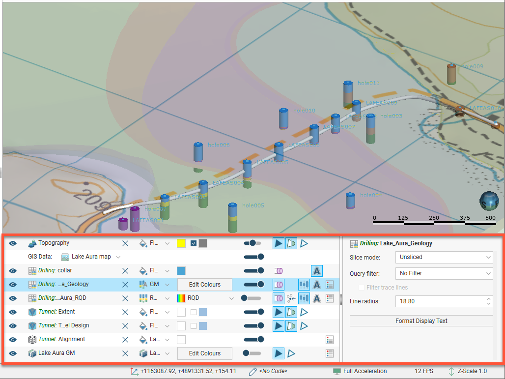
The tools available depend on the type of object being displayed.
Changing how you view objects in the scene window does not change those objects in the project tree.
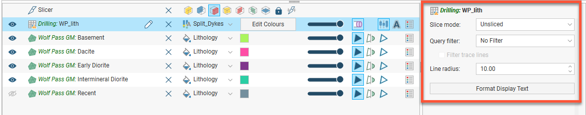
The view list is available for objects that can be displayed in different ways. For example, a lithology data table may contain several columns and the column displayed can be selected from the view list:
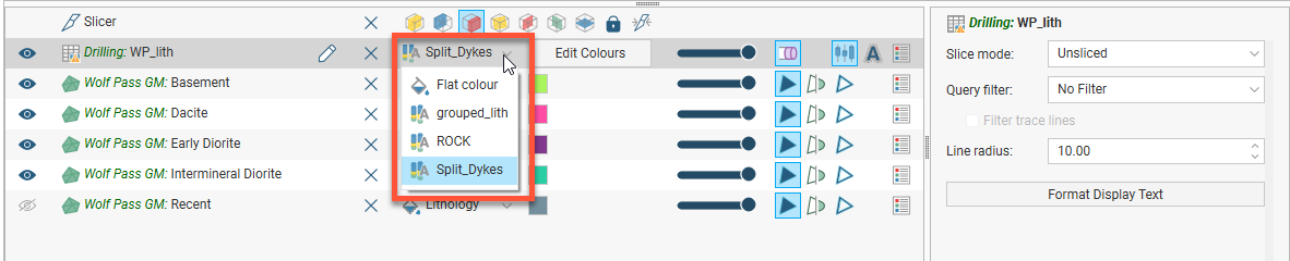
Geological and numeric model evaluations are also selected from the view list. See Evaluations.
The shape properties panel adjacent to the shape list provides more detailed control of the appearance of the selected object:
You can select multiple objects in the shape list and change their display properties using the shape properties panel. To do this, hold down the Shift or Ctrl key while clicking each object you wish to change:

Only controls common to the selected objects are available.
Colour Options
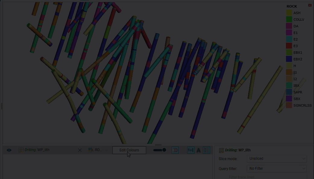
The colour options for an object can be changed via the shape list, and the options available depend on the type of object. Three different colour display options are shown below:
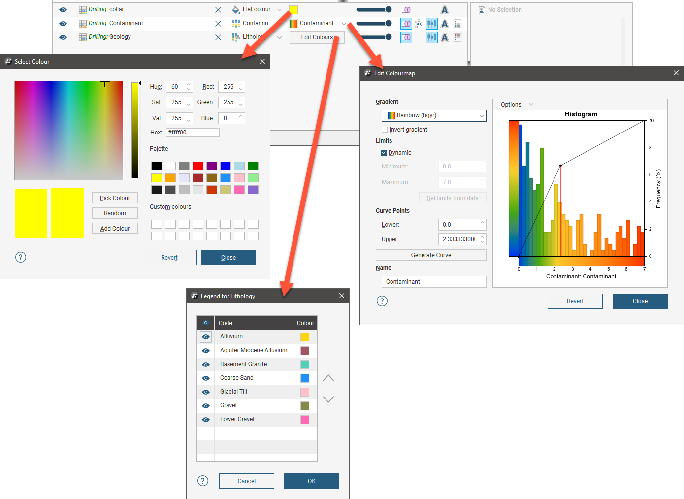
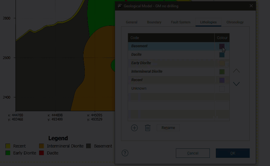
- The collar table is displayed using a single colour. Click the colour chip to change the colour. See Single Colour Display below.
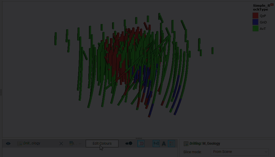
- The Geology table is displayed according to a colourmap of the categories in the table. These colours can be changed by clicking on the Edit Colours button, then clicking on each colour chip in the Legend window. See Category Colourmaps below.
- The Contaminant table uses a numeric colourmap to display the numeric data. Numeric data coloumaps are automatically generated based on the data, and manually changing a colourmap can often help in understanding the data. You can also use Leapfrog’s in-built colour gradients or imported colour gradients to customise numeric colourmaps. See the Colour Gradients and Numeric Colourmaps topics for more information on creating and managing numeric colourmaps.
In the animations that follow, there is some banding due to the limitations of animated GIFs. In Leapfrog Works, the Select Colour window displays a wider range of colours.
Single Colour Display
Many objects viewed in the scene are displayed using a single colour. To change the colour, add the object to the scene window, then click on the colour chip in the shape list. A window will appear in which you can change the colour.
In the Select Colour window, you can:
- Click and drag the crosshair to pick a colour, then select the darkness or lightness of the colour using the slider.

- Click on the Pick Colour button, then click on something elsewhere on the screen to select the colour of that part of the screen.
- Select a colour chip from the palette.
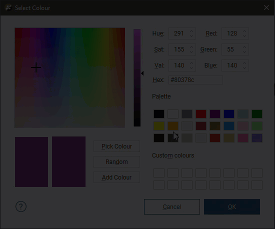
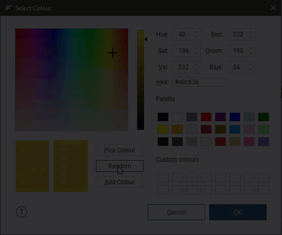
- Click on the Random button to set a random colour.
You can also enter specific values for the colour to use.
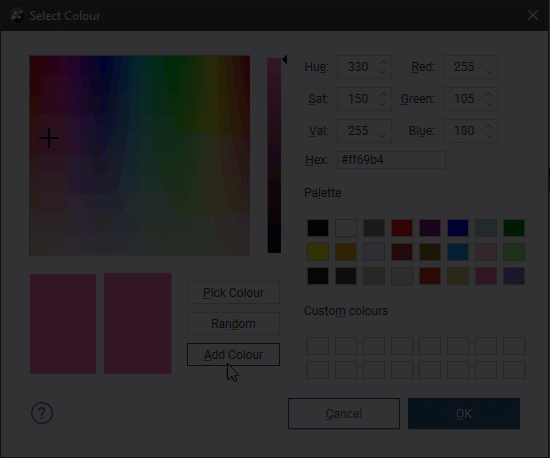
The Add Colour option adds the currently set colour to the Custom colours list:
To remove a colour from the Custom colours list, drag another colour onto it.
Changes made are automatically applied to the scene. The Revert button changes back to the colour assigned when the window was first opened.
Category Colourmaps
Category data colourmaps can be edited by adding the data column to the scene, then clicking on the Edit Colours button in the shape list:
To change the colour used for a category, click on its colour chip in the Legend window.
Category colourmaps can easily be shared between projects on a column-by-column basis, which is useful if your organisation uses standard category colourmaps. To import or export a colourmap, expand the data table in the project tree and right-click on a column. The Import and Export options are available from the Colours menu:
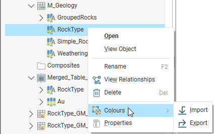
Exporting a Category Colourmap
To export a category colourmap, select the Colours > Export option. In the window that appears, navigate to the folder where you wish to save the colourmap. Enter a filename and click Save. The colourmap will be saved in *.lfc format.
Importing a Category Colourmap
Leapfrog Works supports importing colourmaps in *.lfc format.
To import a colourmap, right-click on the data object and select Colours > Import. Navigate to the folder containing the colourmap file and click Open.
When you import a category colourmap, the existing colourmap will be overwritten.
Leapfrog Works will map the information in the file to the information in the selected data column.
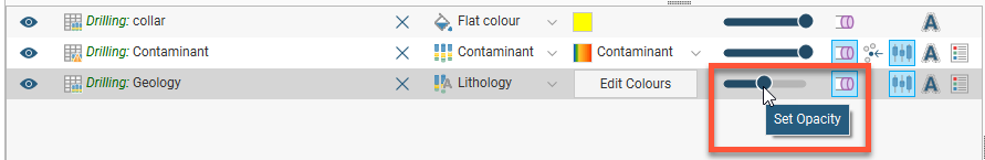
Opacity
The opacity slider in the shape list controls the transparency of objects in the scene:
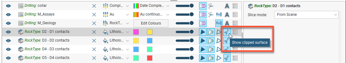
Property Buttons
The property buttons available in the shape list vary according to the type of object selected. For example, property buttons can show or hide the triangles on a mesh, render points as spheres or display a surface clipped to a model boundary. You can always find out what a button does by holding the cursor over the button:
Legends
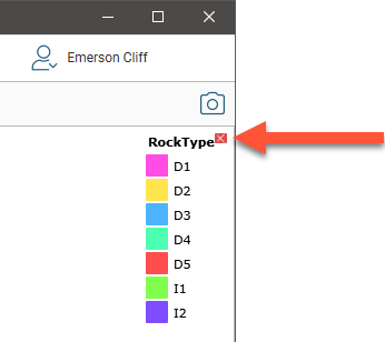
You can display a legend for many objects, including lithologies. To do this, click the legend button in the shape list:
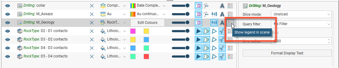
To remove the legend from the scene, either click the legend button again or click the red X in the scene window:
To reorder the legend, click the Edit Colours button in the shape list to open the Legend window. Click on an item in the list, then use the arrows to move it up or down. The legend shown in the scene will be updated when you close the Legend window.
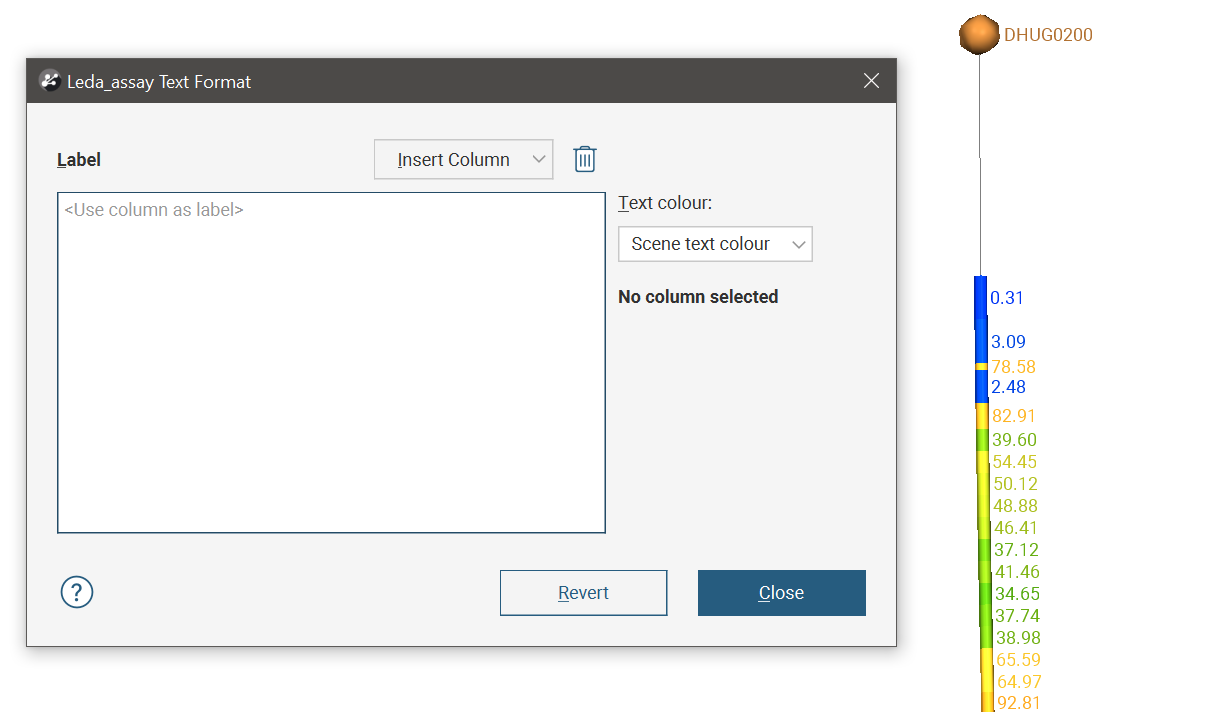
Text Formatting
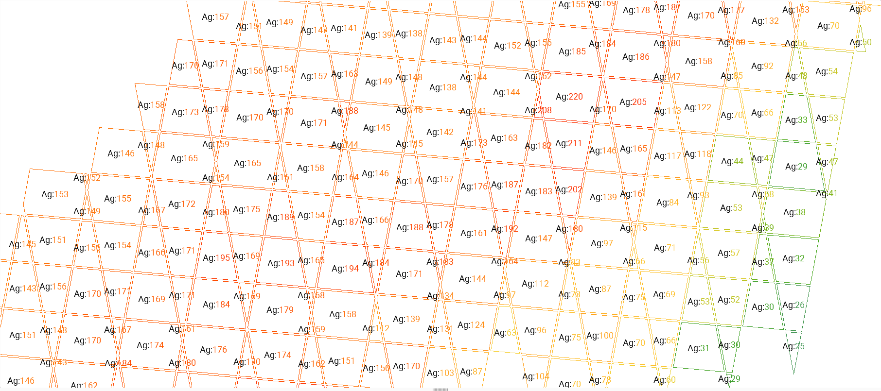
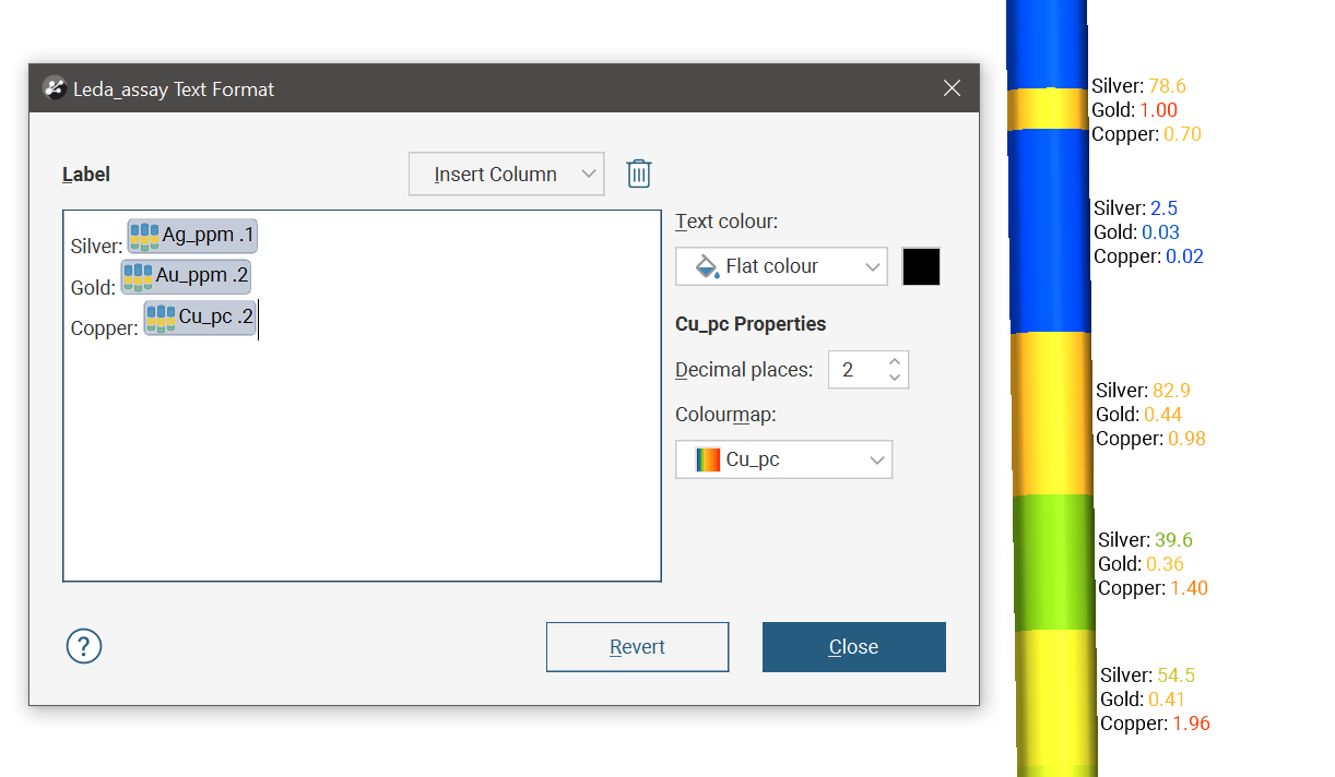
Some elements in the scene can have text labels that can be customised, such as collar labels, borehole interval labels, and block models on 2D slices and cross-section layouts. Here are two examples of displaying formatted labels. The first image shows collars and boreholes with customised text labels on the collars and intervals. The second image shows a sliced block model with text labels on the 2D slice.
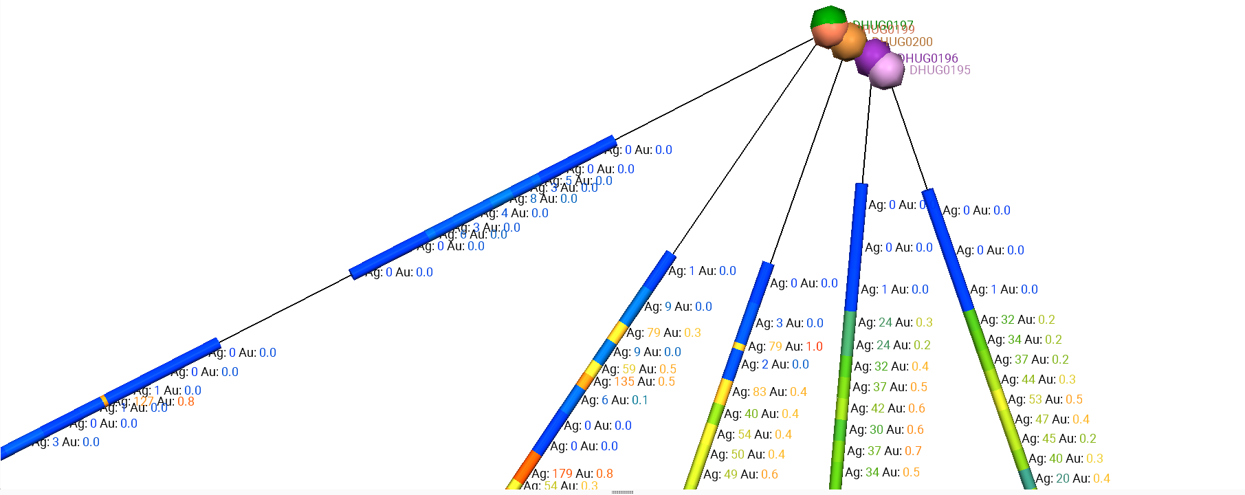
The appearance of these labels is modified using the Format Text dialog.
By default, the item’s value is displayed using the scene list colouring selected.
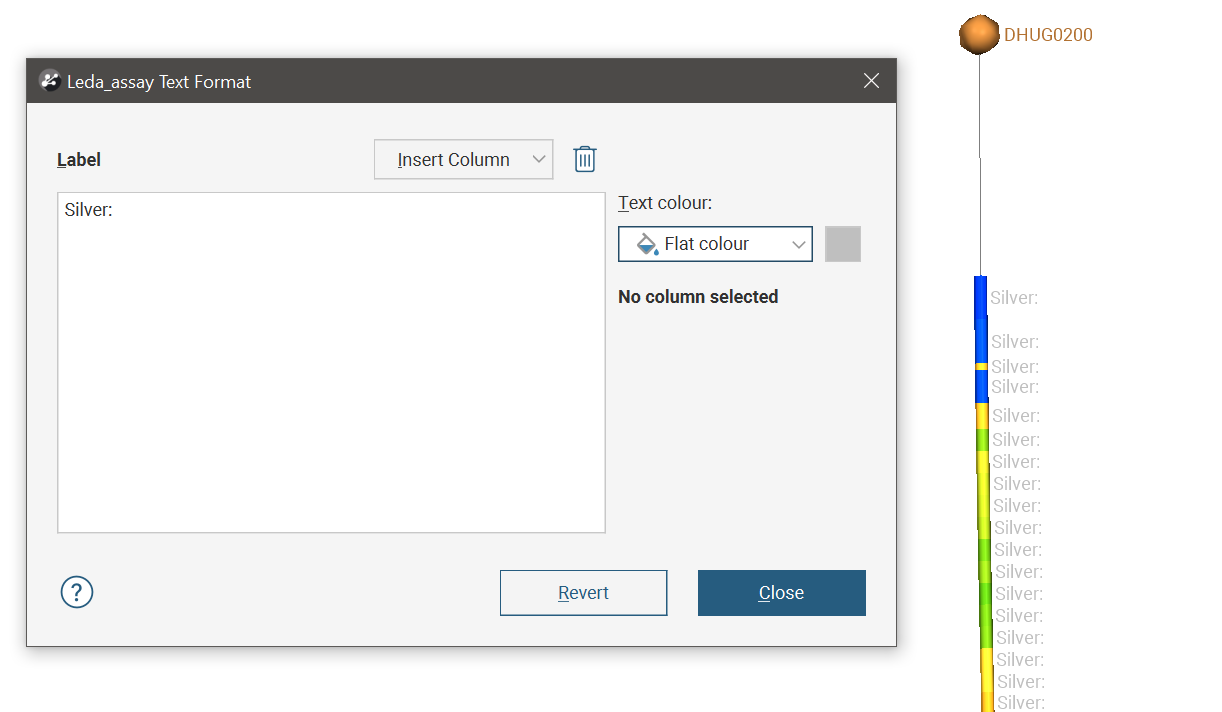
Non-variable text can be entered directly into the Label editor. The colour of this non-variable text can be changed by selecting from the Text colour options. The Flat colour option shows a colour chip that can be clicked to select from the colour picker.
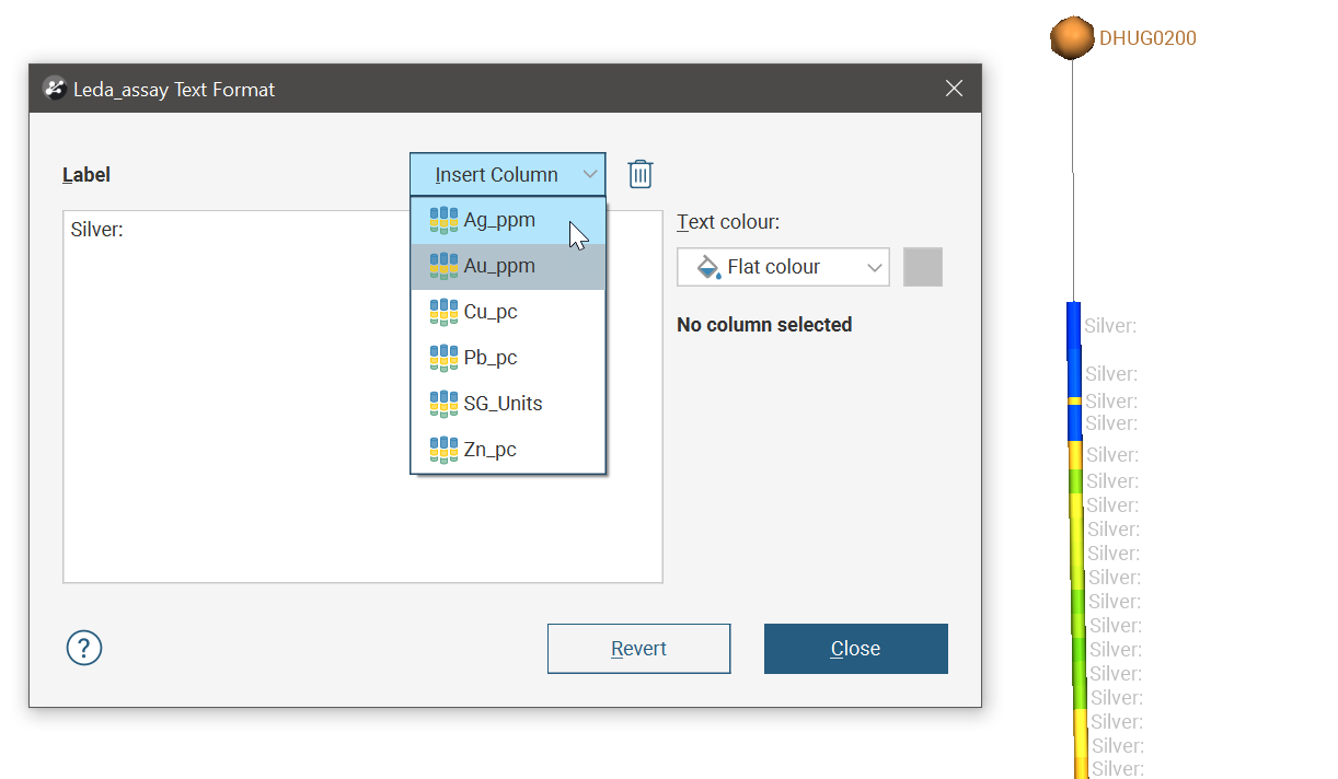
Click the Insert Column button to select from available data columns. This variable value will be inserted at the current text insertion point.
Selecting a variable placeholder box will reveal additional text formatting properties for the selected variable, such as number of decimal places and colouring specific to the variable.
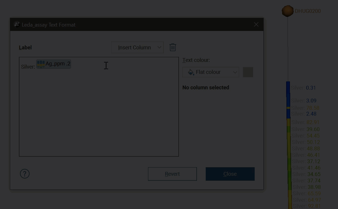
It is possible to add carriage returns and make a multi-line label, but this will only suit sparse scenes where the labels will have enough room to be distinct and legible:
Slice Mode
When an object is selected in the shape list, a Slice mode property is available in the properties panel. See Object Slice Mode for more information.
Filtering Data Using Queries
When a data table is selected in the shape list, you can use the controls in the shape properties panel to apply filters to the data in the scene. If query filters are available for the selected object, they will be listed in the Query filter list:

Using the Display Filter
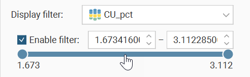
In the shape properties panel, you can also filter the range of values displayed. In the Display filter field, select the column to use as the value range filter. It does not need to be the same column as that selected in the shape list. Tick the Enable filter box to apply the filter or untick the box to stop using the display filter without discarding your filter selection settings. This allows you to turn the filter on and off easily, without having to redefine the filter each time.
If the column you select for the Display filter is a numeric column, the options for selecting the values to filter will look like this:
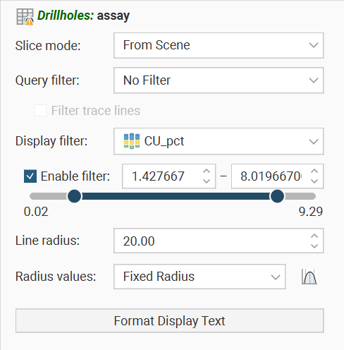
The lower and upper value bounds can be set by dragging the handles at each end of the range slider, or by entering values into the boxes above the range slider.
If the column you select for Display filter is a category column, the options for selecting the values to filter will look like this:

Click the Select Categories button to open a dialog that will allow each individual category to be shown or hidden.
If the column you select for Display filter is a date/time column, the options for selecting the values to filter will look like this:

The lower and upper value bounds can be set by dragging the handles at each end of the range slider, or by clicking the date buttons above the range slider, which will open a date-picker dialog.
When the range slider is set to a portion of the whole value range, it can be clicked and dragged to move both the lower and upper limits by the same amount. This is handy when specifying a particular window which you can then drag across the whole range to observe the effect in the scene.
These range sliders have a feature that helps with fine refinement of the value range selection. Double-click on the range slider:

The slider will change to a pale blue and while the lower and upper limits remain the same, the slider has changed to fill the whole width of the shape properties panel.

You can then manipulate the lower and upper end points, and because the range has been restricted, you have finer-grained control as you move the range slider handles.
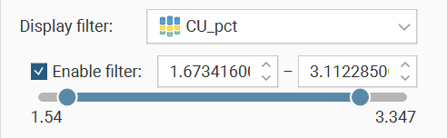
You can double-click the range slider to zoom in even further for higher resolution control.

To return to the previous level of range selection, right-click the range slider.
Repeat the right-click on the range slider again to go back another level.
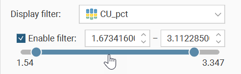
When you get back to the original range selection zoom level , the range slider will change back to dark blue.

Right-clicking the range slider at this point will revert the range selection to the full value range.

Got a question? Visit the Seequent forums or Seequent support
© 2023 Seequent, The Bentley Subsurface Company