
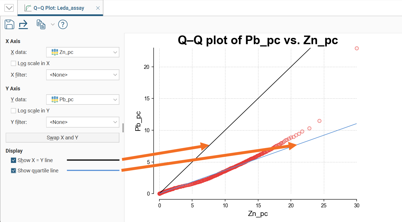
Q-Q Plots
Quantile-Quantile plots are useful for validating your assumptions about the nature of distributions of data. Select the data columns to show on the X Axis and Y Axis (which can optionally be set as log scales). You can also select an X filter and/or Y filter to limit the values used from the data columns.
Enable Show X = Y line to plot the mirror line for the chart, which may not always be obvious when the X and Y axis have different scales.
Show quartile line draws a line through two points on the chart, the lower quartiles and the upper quartiles for each of the axes.
Saving a Q-Q Plot
Click the Save button (![]() ) to add the Q-Q plot to the Saved Statistics folder.
) to add the Q-Q plot to the Saved Statistics folder.
This will create a copy of the Q-Q plot with a default name. You can then modify the name of the plot so you can more easily find it in the Saved Statistics folder. You can also switch back to the original Q-Q plot and make further changes, then save additional versions of the plot to the Saved Statistics folder.
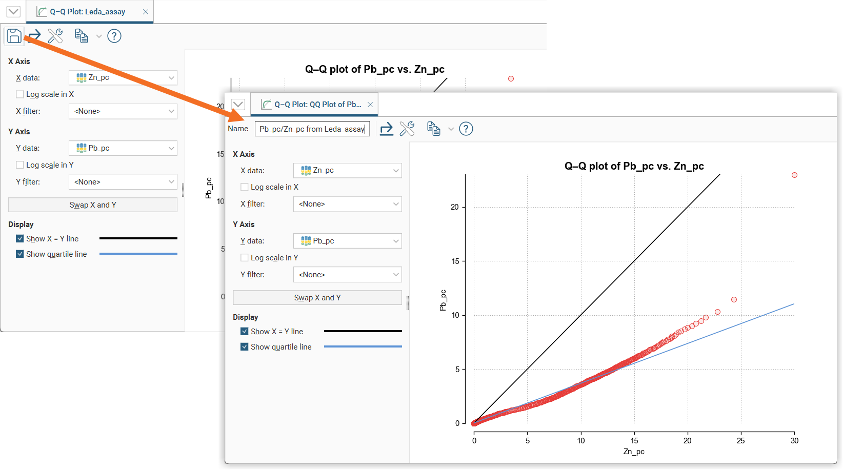
Once saved to the Saved Statistics folder, subsequent changes to the plot are automatically saved.
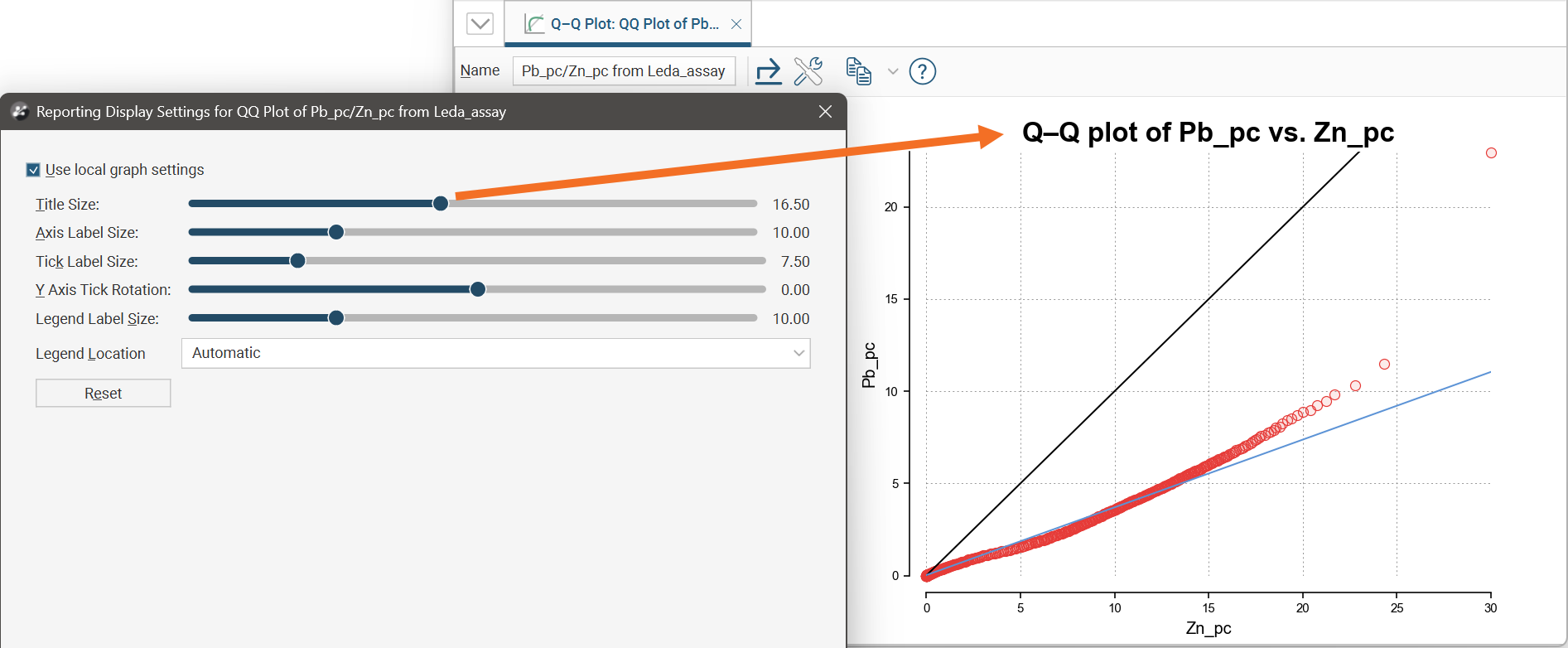
Styling Elements in a Q-Q Plot
You can change the size of various elements of the Q-Q plot, such as the sizes of different labels. To do this, click the Edit reporting display settings button (![]() ):
):
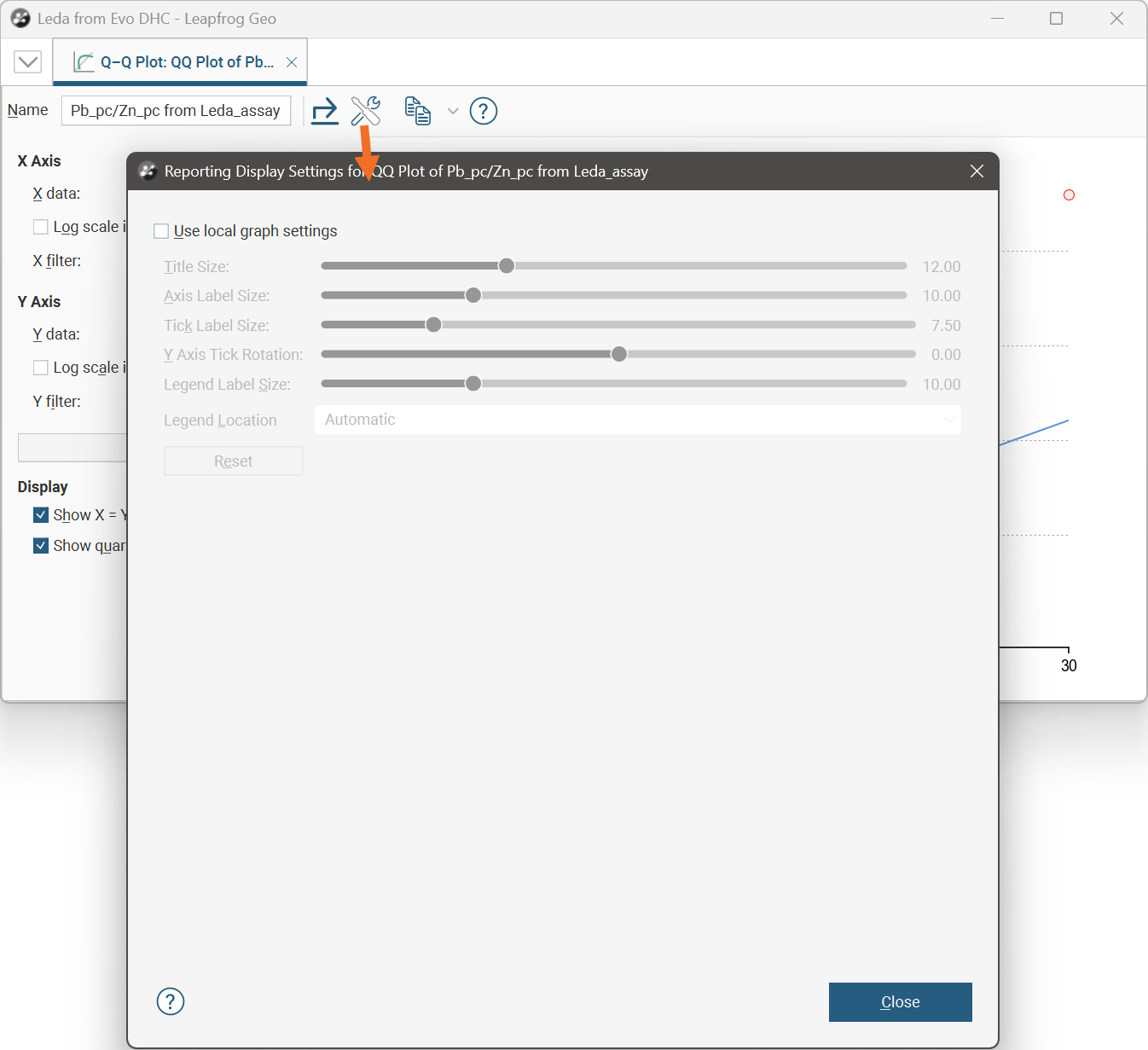
By default, the Q-Q plot will use the global graph settings. For more information, see Graphs Settings.
If you tick the Use local graph settings box, the sliders will adjust the chart features for the Q-Q plot currently open.
Exporting a Q-Q Plot
Q-Q plots can be exported as PDF, SVG and PNG files. Click the Export button (![]() ), then specify a filename and select the file type you prefer.
), then specify a filename and select the file type you prefer.
Alternatively, you can click the Copy button (![]() ) then select Copy Graph Image; an image of the plot will be added to the clipboard. You can then paste the image from the clipboard into another application.
) then select Copy Graph Image; an image of the plot will be added to the clipboard. You can then paste the image from the clipboard into another application.