
Sample Geometries (Declustering Objects)
The features described in this topic are only available if you have the Leapfrog Edge extension.
The declustering object is a tool for calculating local sample density. It can be used to provide confidence in an estimate, a value for determining boundaries, or a declustering weight that can be used to remove sampling bias from a set of values. Common traditional techniques for declustering utilise a grid or polygonal cells.
In Leapfrog Geo, the declustering object is used to calculate declustering weights that are inversely proportional to the data density at each sample point. A declustering object can be used by an inverse distance estimator.
The rest of this topic describes the declustering object. It is divided into:
- Creating a New Declustering Object
- The Declustering Object in the Project Tree
- Applying a Declustering Object
- Upgrading Declustering Objects
- Declustering Statistics
Creating a New Declustering Object
To create a new declustering object, right-click on the Sample Geometry folder for a domained estimation and select New Declustering Object. The New Declustering Object window will appear and an ellipsoid will be added to the scene.
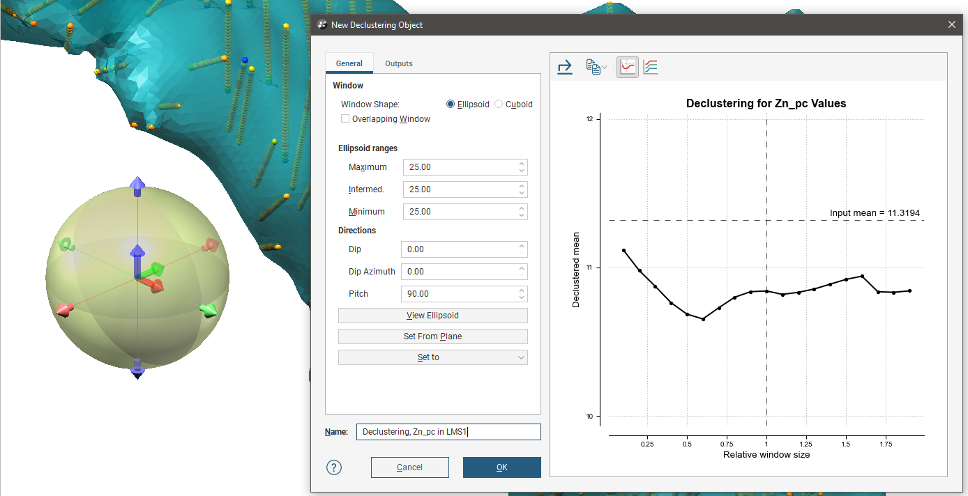
The ellipsoid assists in visualising the declustering window dimensions and direction. It is used for both the EllipsoidWindow Shape and the CuboidWindow Shape. For more information on how to work with the ellipsoid, see The Ellipsoid Widget. If the ellipsoid is removed from the scene it may be restored by clicking the View Ellipsoid button.
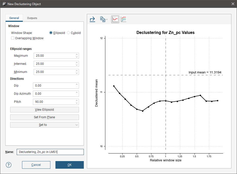
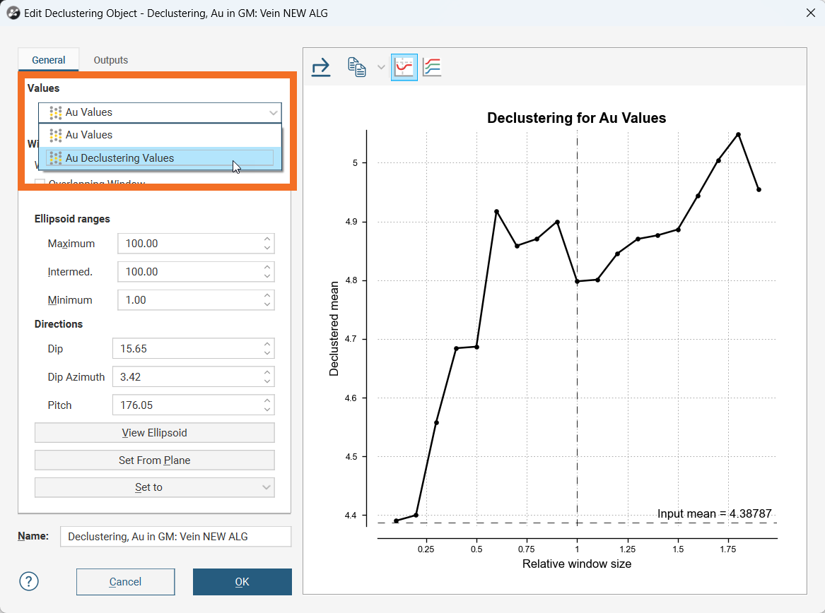
On the right side of the New Declustering Object window is a declustering chart. This is used to guide the selection of settings for the declustering object, particularly the ranges for the search ellipsoid. There are two chart views. The default ratio view, with the Ratio button (![]() ) selected, shows a chart of the declustered mean against relative window size:
) selected, shows a chart of the declustered mean against relative window size:
The range view, with the Range button (![]() ) selected, shows three declustering charts, one for each axis of the search ellipsoid:
) selected, shows three declustering charts, one for each axis of the search ellipsoid:
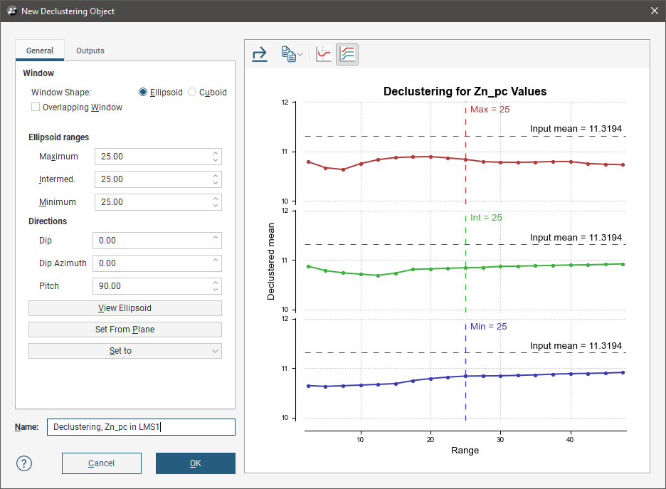
All charts indicate the naïve mean using a dotted horizontal line.
You can interact with the charts by dragging the dotted vertical line to the left or right. In the ratio view, this changes the current ellipsoid range settings by a proportional ratio, as indicated on the x-axis of the chart. In the range view, the selected range setting is updated accordingly. Select a place on the chart that minimises the effect of declustering on the mean of the data, where the range is close to the naïve mean and where there is no significant jump in the data.
Changes made to the declustering options are reflected automatically in the selected chart.
Above the chart are some export options. The Export button (![]() ) saves the declustering chart as either a PDF, SVG or PNG file based on your selection. The Copy button (
) saves the declustering chart as either a PDF, SVG or PNG file based on your selection. The Copy button (![]() ) opens a menu with the option to Copy Graph Image to save an image to the operating system clipboard at the selected resolution. The three resolution options also appear in this menu. You can then paste the image into another application.
) opens a menu with the option to Copy Graph Image to save an image to the operating system clipboard at the selected resolution. The three resolution options also appear in this menu. You can then paste the image into another application.
General Settings
The General tab of the New Declustering Object window is divided into three parts, Window, Ellipsoid Ranges and Directions.
The Window section defines the declustering object’s shape:
- The Window Shape can be Ellipsoid or Cuboid. Select Cuboid to approximate traditional grid declustering. The Ellipsoid option avoids increased density values for sampling oriented away from axes.
- The Overlapping Window option acts similarly to a rolling average by moving the window incrementally in overlapping steps, providing a much smoother result.
- Disabling Overlapping Window approximates a traditional grid behaviour; a single fixed window is used around each evaluation location and the density is simply the count of all input points within the window.
- Enabling Overlapping Window implicitly averages the point count over all possible windows that contain the evaluation location.
The Ellipsoid Ranges settings provide the same anisotropy controls used elsewhere in Leapfrog Geo, determining the relative shape and strength of the ellipsoid in the scene. Including them here provides additional advantages over traditional grid declustering.
- The Maximum value is the range in the direction of the major axis of the ellipsoid.
- The Intermediate value is the range in the direction of the semi-major axis of the ellipsoid.
- The Minimum value is the range in the direction of the minor axis of the ellipsoid.
The Directions settings determine the orientation of the ellipsoid in the scene, where:
- Dip and Dip Azimuth set the orientation of the plane for the major and semi-major axes of the ellipsoid. Dip is the angle off the horizontal of the plane, and Dip Azimuth is the compass direction of the dip.
- Pitch is the angle of the ellipsoid’s major axis on the plane defined by the Dip and Dip Azimuth. When Pitch is 0, the major axis is perpendicular to the Dip Azimuth. As Pitch increases, the major axis points further down the plane towards the Dip Azimuth.
The moving plane can also be useful in setting the anisotropy Directions. Add the moving plane to the scene, and adjust it using its controls. Then click the Set From Plane button to populate the Dip, Dip Azimuth and Pitch settings.
You can also use the Set to list to choose different from the variogram models available in the project.
To approximate grid declustering, set the Window Shape to Cuboid, disable the Moving Window and set the Maximum, Intermed. and Minimum ranges to be equal values.
Outputs
The Outputs tab of the New Declustering Object window features Attributes to calculate. Value and Status will always be calculated, but you can optionally include NS (number of samples), MinD (distance to closest sample) or AvgD (average distance to sample).
Select All and Select None buttons are handy to expedite the selection of most or just a few options.
The Declustering Object in the Project Tree
Enter a name for the declustering object and click OK to create it. It will be added to the project tree in the Sample Geometry folder. Expand it to see its parts, which can be individually added to the scene:
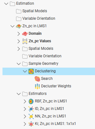
Double-click on the declustering object in the tree to edit it.
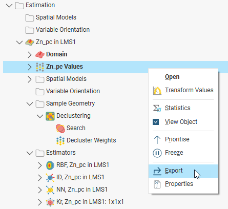
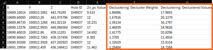
Declustering weights will be exported along with other values; right-click on the values object (![]() ) for the domained estimation in the project tree and selecting Export.
) for the domained estimation in the project tree and selecting Export.
The exported values data will contain the declustered values and declustering weights:
Applying a Declustering Object
Leapfrog Geo supports declustering in the inverse distance estimator. To decluster data, select a declustering object from the Declustering dropdown list:
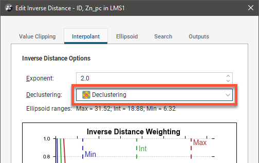
When no declustering object is selected, the inverse distance estimator is the standard inverse distance weighted method.
Upgrading Declustering Objects
An improved declustering algorithm has been introduced in Leapfrog Geo 2024.1. Declustering objects created in earlier versions of Leapfrog Geo will not be upgraded when a project is opened in Leapfrog Geo 2024.1. You may wish to upgrade any older declustering objects, once you have considered the possible effects on other objects in the project. Steps for upgrading declustering objects are described later in this topic.
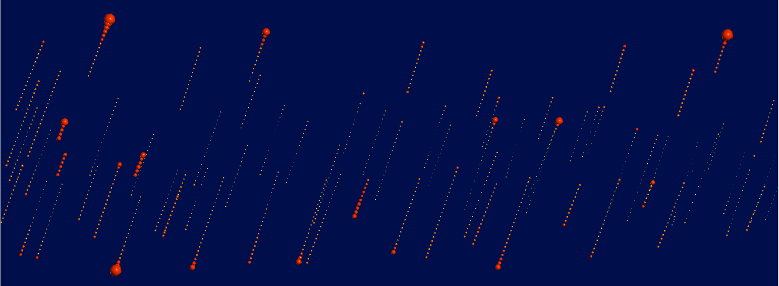
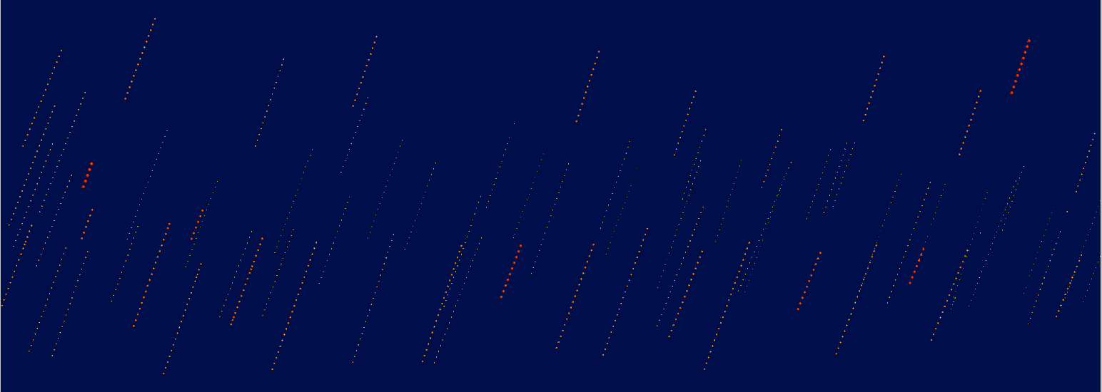
The declustering algorithm introduced in Leapfrog Geo 2024.1 reduces edge effects at the boundaries of the domain. Previously, drilling data beyond the domain was not used when calculating declustering weights, and due to the fewer available samples near the domain boundary, declustering weights would be emphasised at these edges. In the scene below, declustering weights are shown, with the points scaled to the value of the weight of the point. Note that some of the calculated weights swell at the top and bottom of the lines of points, near the domain boundary:
The new algorithm uses samples beyond the domain boundary to a buffer distance of twice the average drillhole spacing. When created from points, 10% of the maximum extent of the axis-oriented bounding box is used as the buffer distance. These values beyond the domain are not employed in subsequent estimations, but when considered for the purposes of calculating declustering weights, results in reducing bias at the boundary of the domain:
When the domained estimator uses values composited Within boundary, only for the purpose of the declustering weights calculation, the drillhole will be composited within the boundary plus the buffer distance of twice the average drillhole spacing.
The edge effect bias of the previous algorithm has led to it being deprecated. New declustering objects cannot be created using the previous algorithm, only the new algorithm will be used.
However, so that existing estimators are not recalculated to produce new values, projects that already have declustering objects will not be forced to upgrade to the new algorithm. Still, the advantages of the new algorithm in producing better and more correct estimates do recommend the option to upgrade.
When considering upgrading estimators to use the new algorithm, follow these steps:
Copy the domained estimation and rename the copy to differentiate it from the original and to indicate that it will use the new algorithm. This ensures that the existing declustering object is preserved as there is no way to revert to the prior algorithm once the new one is selected.
Open the declustering object for the domained estimation that will use the new algorithm.
For the Values field, select the option that includes Declustering Values.
Evaluate IDW estimators that use both the old and new algorithms onto a block model.
You could also use the Calculations functionality to difference the two evaluations to study and analyse the effect of the new algorithm to inform decisions about which declustering object the project will be using for modelling in the future.
Declustering Statistics
If you right-click on the values object in a domained estimation and select Statistics, you can choose from the list of available statistics reports.

Note that this selection dialog changes according to the construction of the domained estimation, so not all the options shown above may be present. The composite data statistics will not be present if the domained estimation does not composite the drilling data using the compositing options in the domained estimation editor. Even if the domained estimator uses composited drilling data as inputs, these statistics will not be available.
If there are no declustering objects created in the domained estimations sample geometries folder, the declustering statistics options will not be present in the selection dialog.
Another way to access the declustering statistics options is to right-click on a declustering object in a domained estimation and select Statistics. Then you can choose from a list of available statistics, all of which are declustering statistics. There is an additional option in this selection dialog, Decluster Values Univariate.

The four declustering statistics charts are:
- Decluster Weights Univariate Graph
- Decluster Weights Comparison Graph
- Declustered Values Univariate Graph
- Declustering Comparison Graph
Graph settings are persisted when you close and reopen the graphs. The settings are persisted on a per graph basis, not per values or weights.
Decluster Weights Univariate Graph
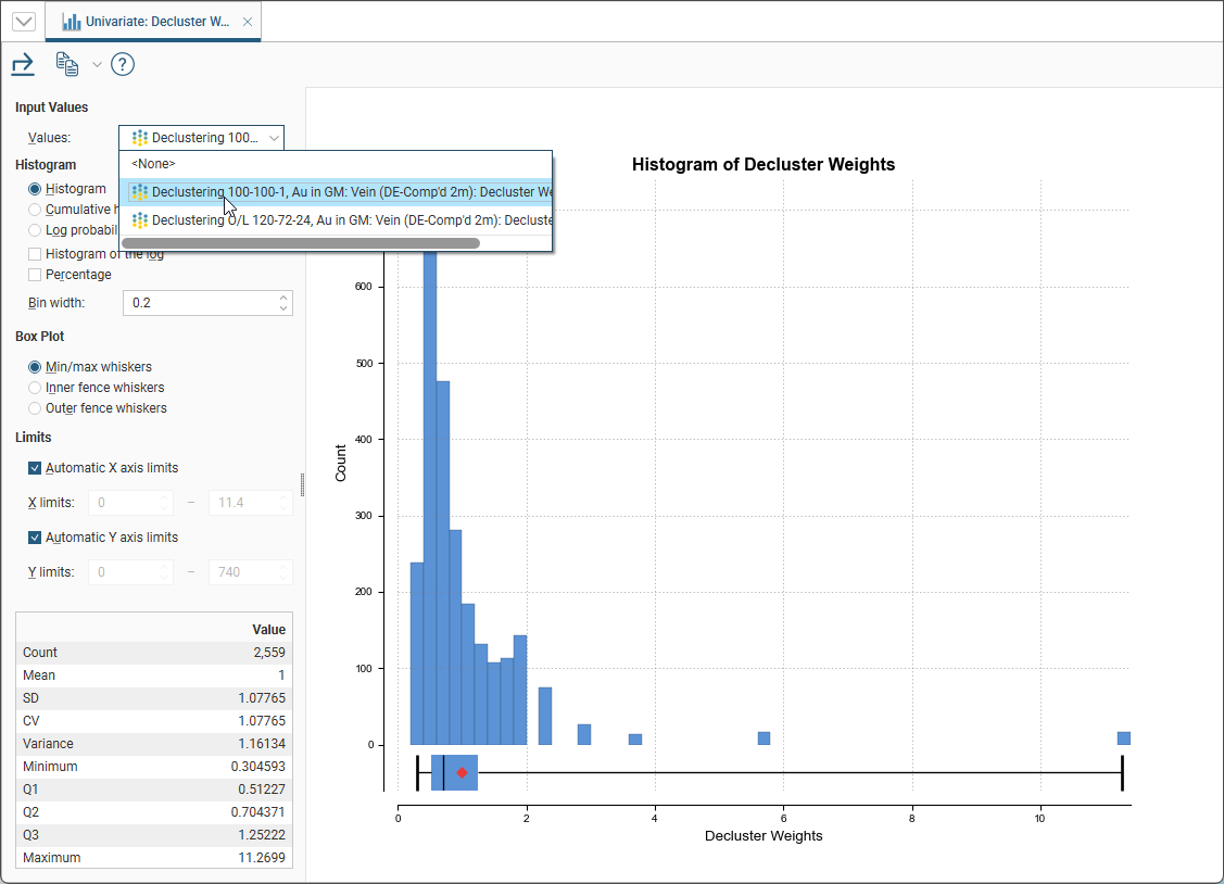
This is a univariate chart with a Values selector. By default the <None> option will be selected, but once a decluster weights selection has been made, the selection will be remembered and used when the graph is next opened.
The decluster weights univariate graph can also be opened directly by right-clicking on the decluster weights under a declustering object and selecting Statistics. In this case the univariate graph will be opened with the decluster weights you clicked on already selected.
There are several different visualisation options. Histogram shows a probability density function for the values, and Cumulative Histogram shows a cumulative distribution function for the values as a line graph.
There are three options that show the charts with a log scale in the X-axis:
- Select Histogram and enable Histogram of the log to see the value distribution with a log scale X-axis.
- Select Cumulative histogram and enable Histogram of the log to see a cumulative distribution function for the values with a log scale X-axis.
- Log probability is a log-log weighted cumulative probability distribution line chart.
Percentage is used to change the Y-axis scale from a length-weighted scale to a percentage scale.
Bin width changes the size of the histogram bins used in the plot.
The Box Plot options control the appearance of the box plot drawn under the primary chart. The whiskers extend out to lines that mark the extents you select, which can be the Min/max whiskers, the Inner fence whiskers or the Outer fence whiskers. Inner and outer values are defined as being 1.5 times the interquartile range and 3 times the interquartile range respectively.
The Limits fields control the ranges for the X-axis and Y-axis. Select Automatic X axis limits and/or Automatic Y axis limits to get the full range required for the chart display. Untick these and manually adjust the X limits and/or Y limits to constrain the chart to a particular region of interest. This can effectively be used to zoom the chart.
The bottom left corner of the chart displays a table with a comprehensive set of statistical measures for the dataset.
Decluster Weights Comparison Graph
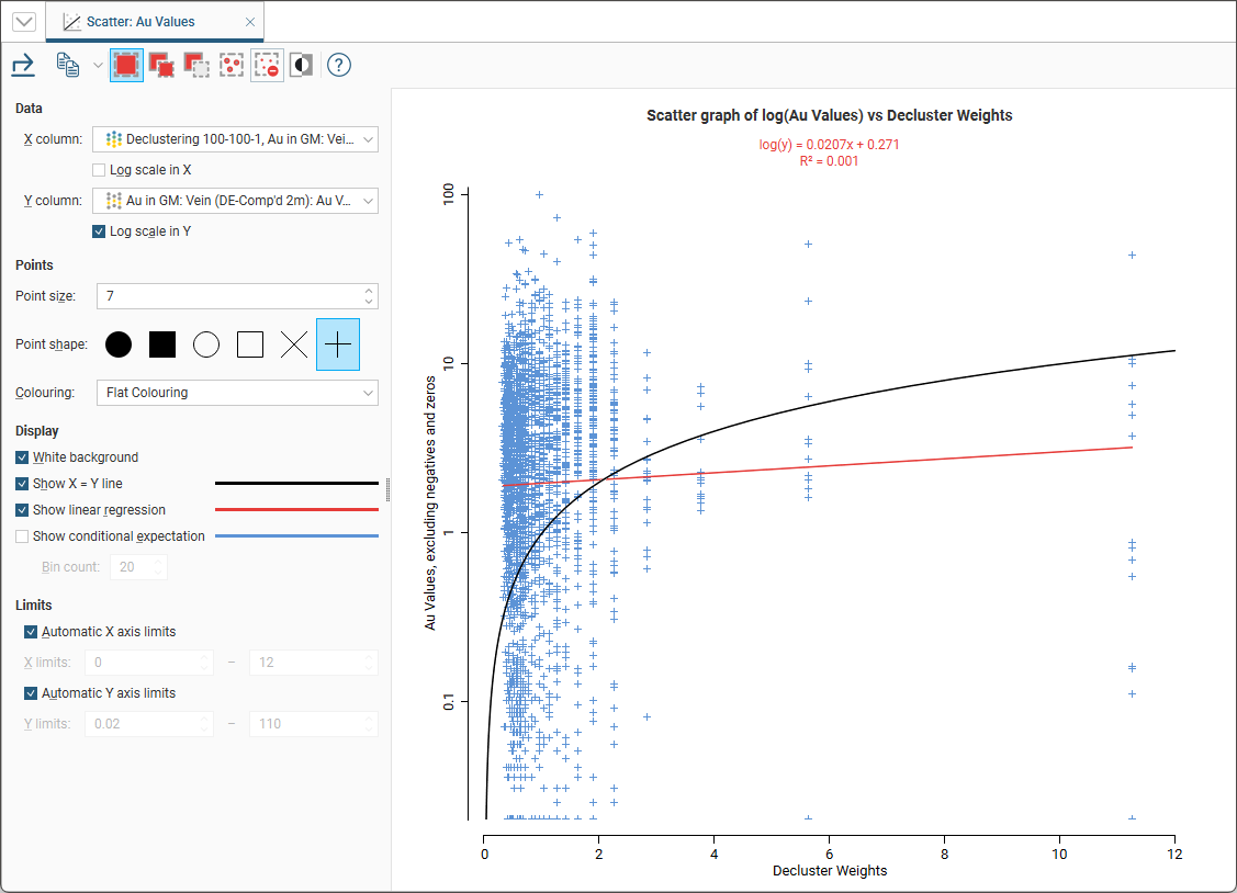
This is a scatter plot that uses a decluster weights selection for the X axis plotted against the input values on the Y axis. You can make either axis a log scale with the Log scale in X and Log scale in Y options.
The appearance of the chart can be modified by adjusting the Point size, Point shape, and White background settings.
The Colouring option can be used to change the plot from flat colouring to using the colour palette of either the input values or a decluster weights option. It is possible to select decluster weights for colouring that are not the decluster weights used for the X axis.
Enable Show X = Y line to aid in assessing how far off equal the distributions are.
When you select Show linear regression, a regression line is added to the chart and a function equation is added below the chart title.
Show conditional expectation plots a line that attempts to find the expected value of one variable given the other. The X axis is divided into a number of bins specified by Bin count, and the data in each bin is used to predict the expected Y value.
By default, the limits of the chart are automatically set to range between zero and the upper limit of the variable data. You can adjust this by turning off Automatic X axis limits and/or Automatic Y axis limits and specifying preferred minimum and maximum values for each axis.
If you add the domained estimation values object to the scene, you can use the selection tools in the Decluster Weights Comparison toolbar to select points in the chart. The values points in the scene will be filtered to show the points selected in the scatter plot. For more information on using the scatter plot selection tools, see Scatter Plots in the Statistics topic.
Declustered Values Univariate Graph
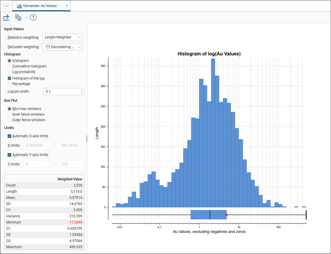
This is a univariate chart with two Input Values selectors. The Statistics weighting can either be <None> or Length-weighted. Decluster weighting provides each of the decluster weight options available and <None> to allow no decluster weighting to be specified.
There are several different visualisation options. Histogram shows a probability density function for the values, and Cumulative Histogram shows a cumulative distribution function for the values as a line graph.
There are three options that show the charts with a log scale in the X-axis:
- Select Histogram and enable Histogram of the log to see the value distribution with a log scale X-axis.
- Select Cumulative histogram and enable Histogram of the log to see a cumulative distribution function for the values with a log scale X-axis.
- Log probability is a log-log weighted cumulative probability distribution line chart.
Percentage is used to change the Y-axis scale from a length-weighted scale to a percentage scale.
Bin width changes the size of the histogram bins used in the plot.
The Box Plot options control the appearance of the box plot drawn under the primary chart. The whiskers extend out to lines that mark the extents you select, which can be the Min/max whiskers, the Inner fence whiskers or the Outer fence whiskers. Inner and outer values are defined as being 1.5 times the interquartile range and 3 times the interquartile range respectively.
The Limits fields control the ranges for the X-axis and Y-axis. Select Automatic X axis limits and/or Automatic Y axis limits to get the full range required for the chart display. Untick these and manually adjust the X limits and/or Y limits to constrain the chart to a particular region of interest. This can effectively be used to zoom the chart.
The bottom left corner of the chart displays a table with a comprehensive set of statistical measures for the dataset.
Declustering Comparison Graph
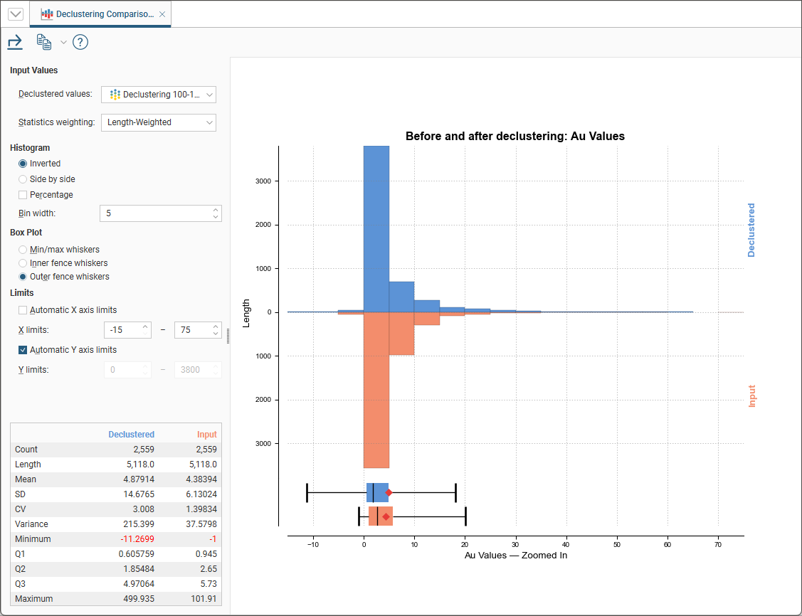
This is a comparison histogram with two Input Values selectors. Declustered values provides each of the declustered values options available. The Statistics weighting can either be <None> or Length-weighted.
The last new graph is the Declustering Comparison Graph The graph also has a drop-down so you can choose which values you want to look at the graph is comparing the input values and the declustered values it also has the option to show the graph side-by-side or inverted
In the Histogram settings, you can choose between Inverted graphs, as shown in the image above, or Side by side graphs where the data for each histogram bin is shown in the traditional histogram style.Bin width changes the size of the histogram bins used in the plot.Percentage is used to change the Y-axis scale from a length-weighted scale to a percentage scale.
The Box Plot options control the appearance of the box plot drawn under the primary chart. The whiskers extend out to lines that mark the extents you select, which can be the Min/max whiskers, the Inner fence whiskers or the Outer fence whiskers. Inner and outer values are defined as being 1.5 times the interquartile range and 3 times the interquartile range respectively.
The Limits fields control the ranges for the X-axis and Y-axis. Select Automatic X axis limits and/or Automatic Y axis limits to get the full range required for the chart display. Untick these and manually adjust the X limits and/or Y limits to constrain the chart to a particular region of interest. This can effectively be used to zoom the chart.
The bottom left corner of the chart displays a table with a comprehensive set of statistical measures for the dataset.