
Comparison Histograms
Comparison histograms are used for compositing and declustering statistics, with the options Compositing Comparison and Declustering Comparison respectively. They feature a double histogram, one displaying the distribution of the raw data and one displaying the distribution of the data after processing. This enables comparison of the two distributions of the same element before and after the data transformation. Impacts on the symmetry of distributions will be evident.
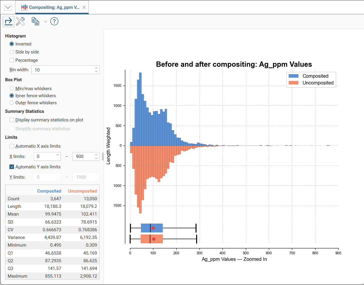
In the Histogram settings, you can choose between Inverted graphs, as shown in the image above, or Side by side graphs where the data for each histogram bin is shown in the traditional histogram style. Bin width changes the size of the histogram bins used in the plot. Percentage is used to change the Y-axis scale from a length-weighted scale to a percentage scale.
The Box Plot options control the appearance of the box plot drawn under the primary chart. The whiskers extend out to lines that mark the extents you select, which can be the Min/max whiskers, the Inner fence whiskers or the Outer fence whiskers. Inner and outer values are defined as being 1.5 times the interquartile range and 3 times the interquartile range respectively.
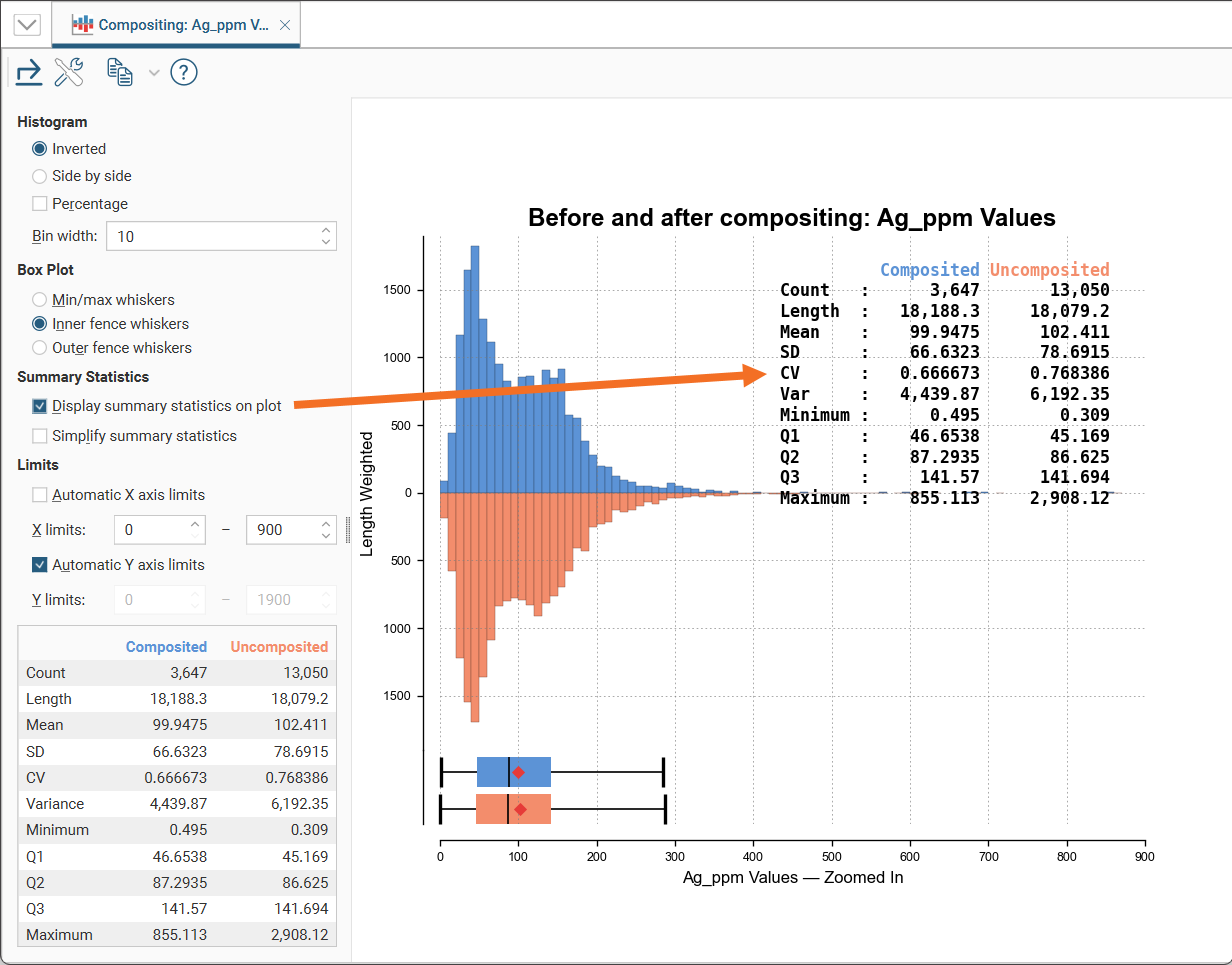
Enabling Display summary statistics on plot will replicate the summary statistics for the dataset as a legend on the plot.
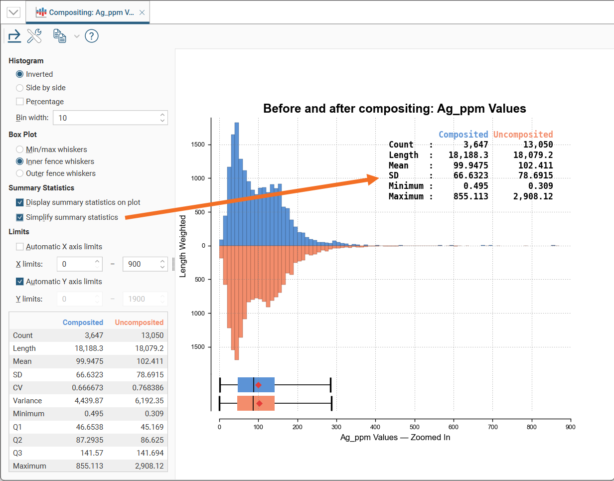
If a more concise legend is preferred with only the key statistics, enable Simplify summary statistics:
The Limits fields control the ranges for the X-axis and Y-axis. Select Automatic X axis limits and/or Automatic Y axis limits to get the full range required for the chart display. Untick these and manually adjust the X limits and/or Y limits to constrain the chart to a particular region of interest. This can effectively be used to zoom the chart.
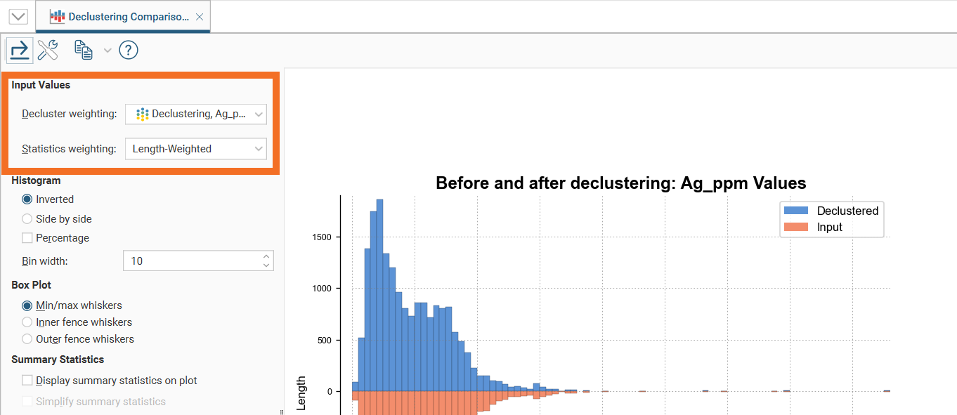
The declustering comparison chart will also have Input Values options where the Declustered values and Statistic weighting options can be selected from the dropdown lists:
The bottom left corner of the chart displays a table with a comprehensive set of statistical measures for the dataset.
Styling Elements in a Comparison Histogram
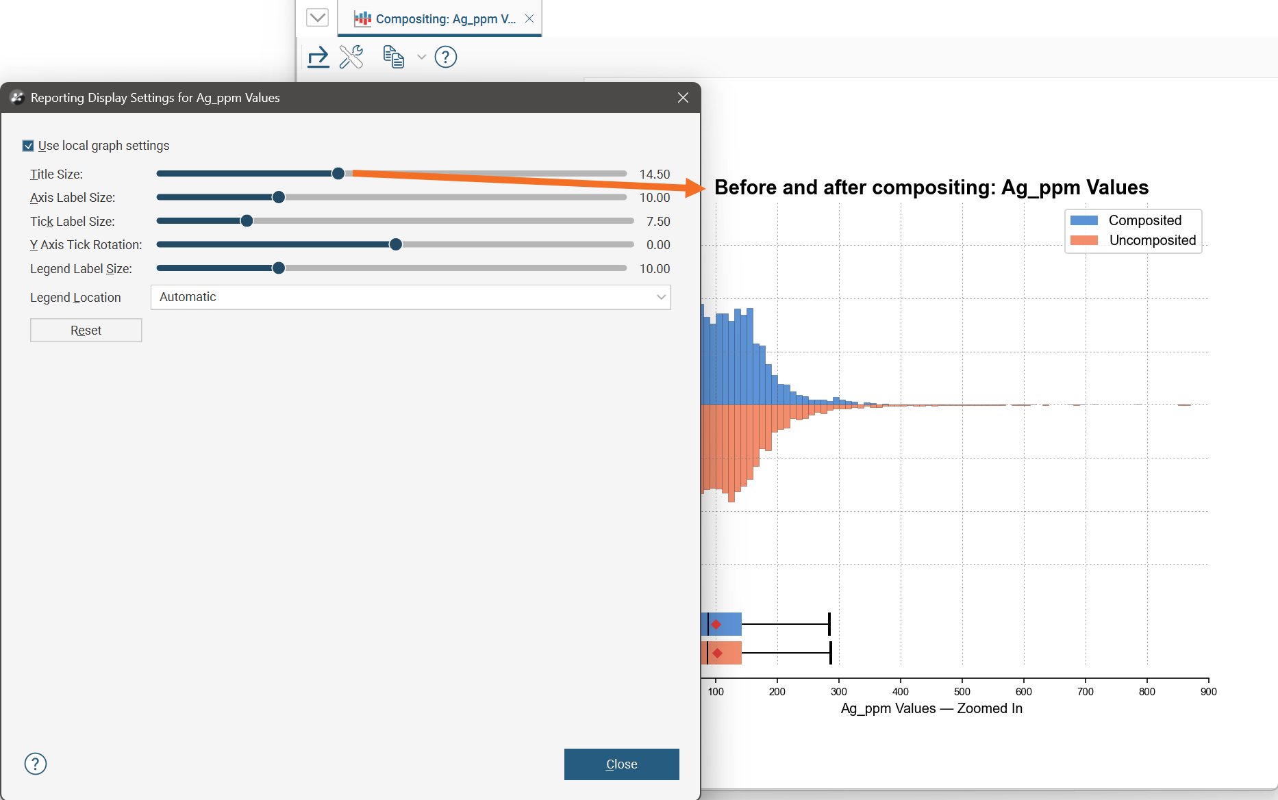
You can change the size of various elements of the comparison histogram, such as the sizes of different labels. To do this, click the Edit reporting display settings button (![]() ):
):
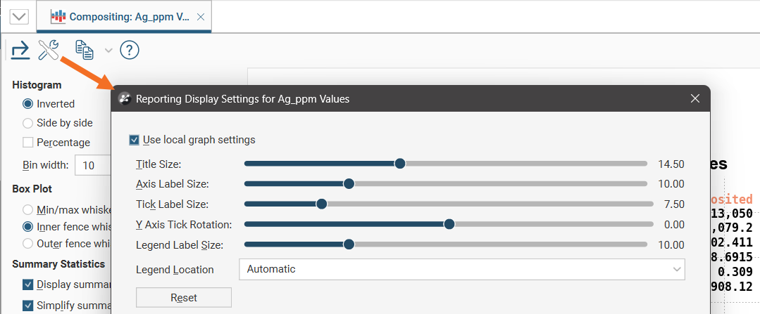
By default, the comparison histogram will use the global graph settings. For more information, see Graphs Settings.
If you tick the Use local graph settings box, the sliders will adjust the chart features for the chart currently open.
Exporting a Comparison Histogram
Comparison histograms can be exported as PDF, SVG and PNG files. Click the Export button (![]() ), then specify a filename and select the file type you prefer.
), then specify a filename and select the file type you prefer.
Alternatively, you can click the Copy button (![]() ) then select Copy Graph Image; an image of the chart will be added to the clipboard. You can then paste the image from the clipboard into another application.
) then select Copy Graph Image; an image of the chart will be added to the clipboard. You can then paste the image from the clipboard into another application.