
Univariate Graphs
Univariate graphs plot a single data series.
This type of chart option will also appear in the Statistics options as Interval Length Statistics, Compositing Interval Lengths, Estimation Values Univariate, Decluster Weights Univariate or Decluster Values Univariate, some with an additional Input Values section.
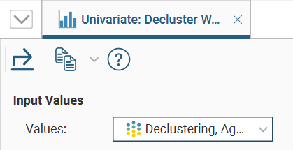
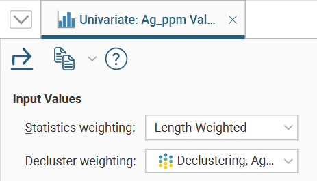
Where a Values dropdown is available, select from the data input values in the dropdown list.
If there is a Statistics weighting field, choose <None> or an available weighting type from the dropdown list.
If there is a Decluster weighting fields, choose <None> or one of the declustering weight options available in the dropdown list.
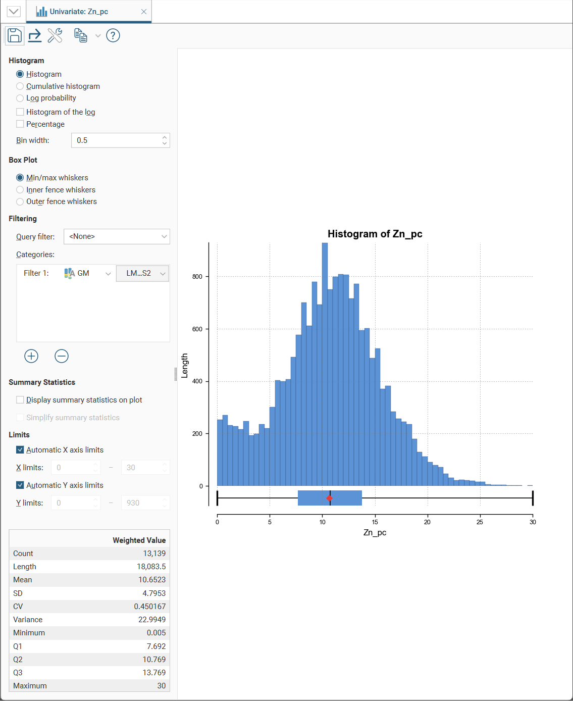
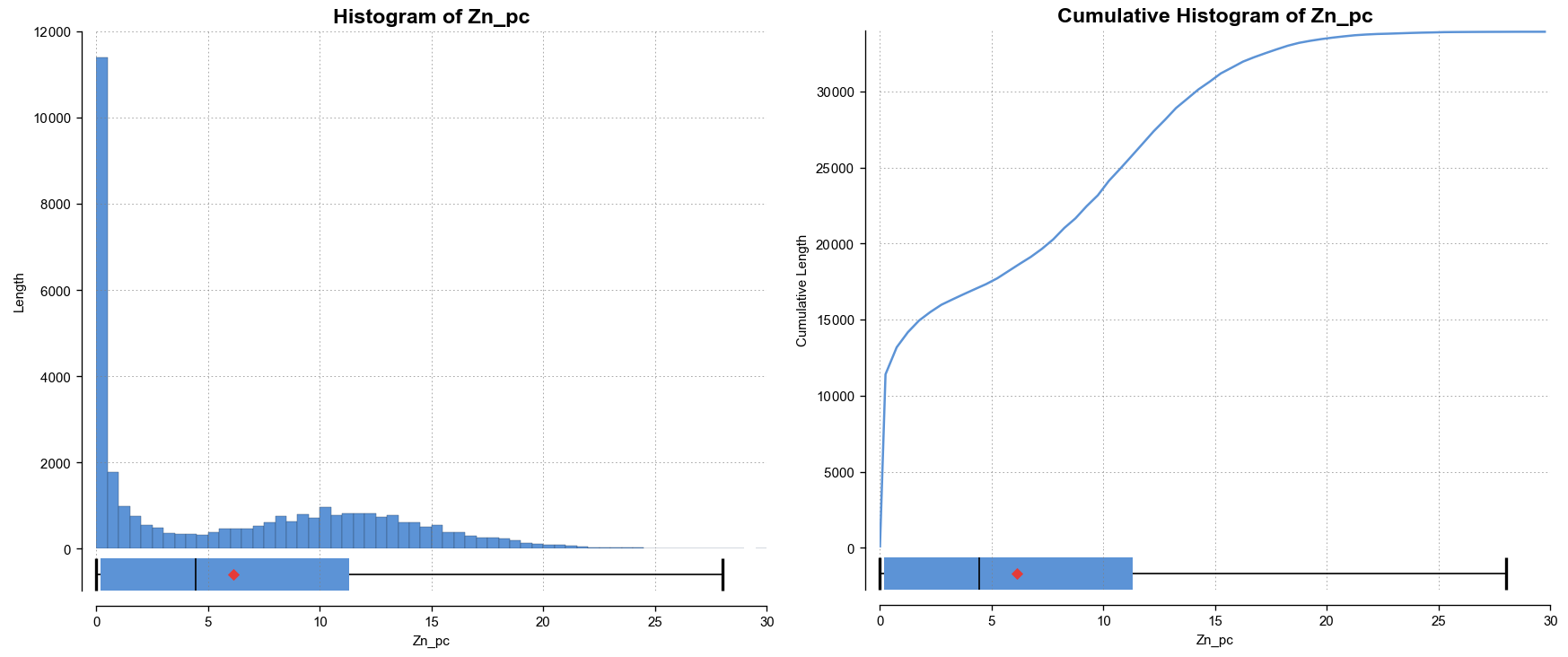
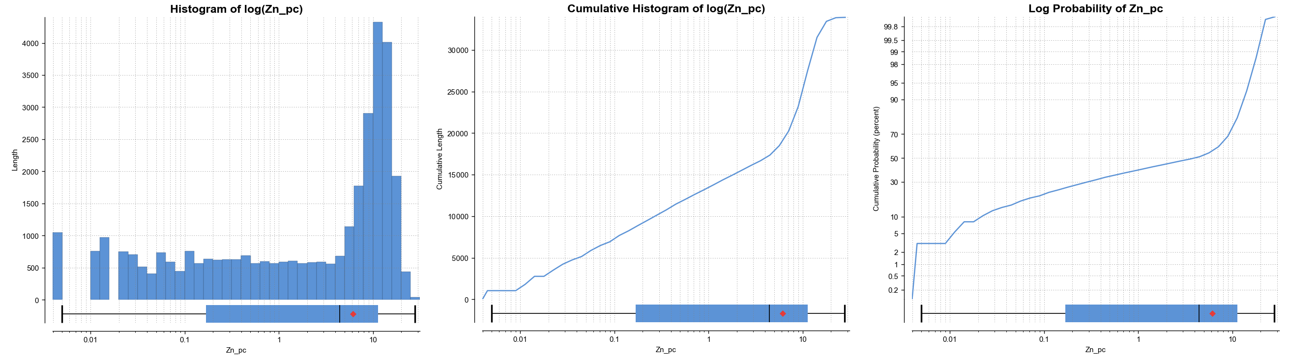
There are several different visualisation options. Histogram shows a probability density function for the values, and Cumulative Histogram shows a cumulative distribution function for the values as a line graph.
There are three options that show the charts with a log scale in the X-axis:
- Select Histogram and enable Histogram of the log to see the value distribution with a log scale X-axis.
- Select Cumulative histogram and enable Histogram of the log to see a cumulative distribution function for the values with a log scale X-axis.
- Log probability is a log-log weighted cumulative probability distribution line chart.
Percentage is used to change the Y-axis scale from a length-weighted scale to a percentage scale.
Bin width changes the size of the histogram bins used in the plot.
The Box Plot options control the appearance of the box plot drawn under the primary chart. The whiskers extend out to lines that mark the extents you select, which can be the Min/max whiskers, the Inner fence whiskers or the Outer fence whiskers. Inner and outer values are defined as being 1.5 times the interquartile range and 3 times the interquartile range respectively.
Some univariate graphs may include a Filtering section. Here is where a Query filter defined for the dataset can be selected.
There may also be a Categories list where category columns can be added by clicking the Add button (![]() ), then selecting a category data column from the left dropdown list, and choosing specific category values from the right dropdown list.
), then selecting a category data column from the left dropdown list, and choosing specific category values from the right dropdown list.
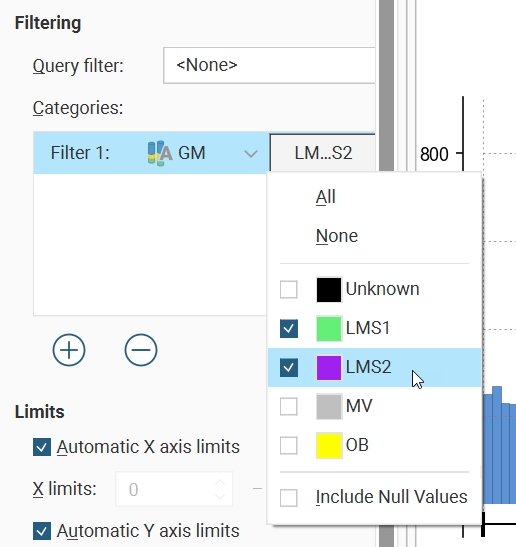
There is also an Include Null Values option, which allows you to include values in a chart even though there are missing values in a certain category data column, instead of filtering the data row out.
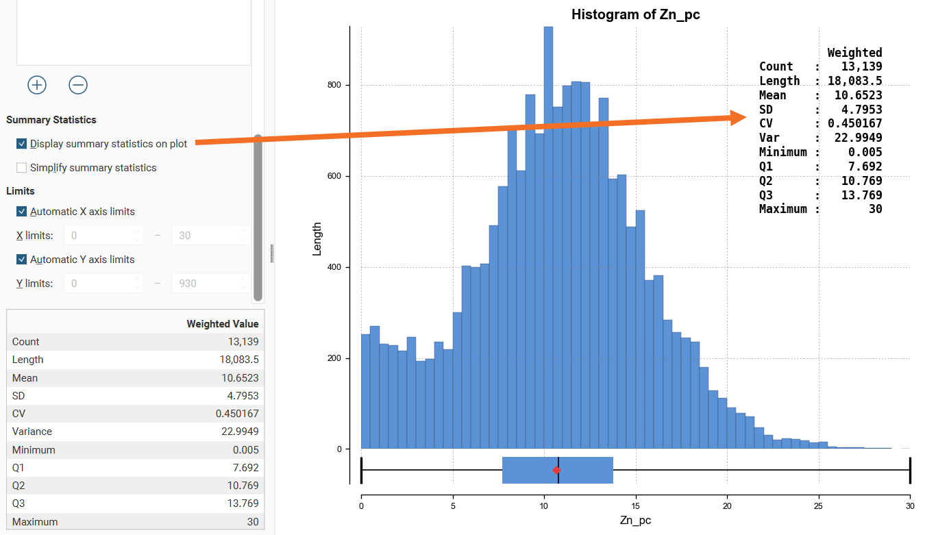
Enabling Display summary statistics on plot will replicate the summary statistics for the dataset as a legend on the plot.
If a more concise legend is preferred with only the key statistics, enable Simplify summary statistics:
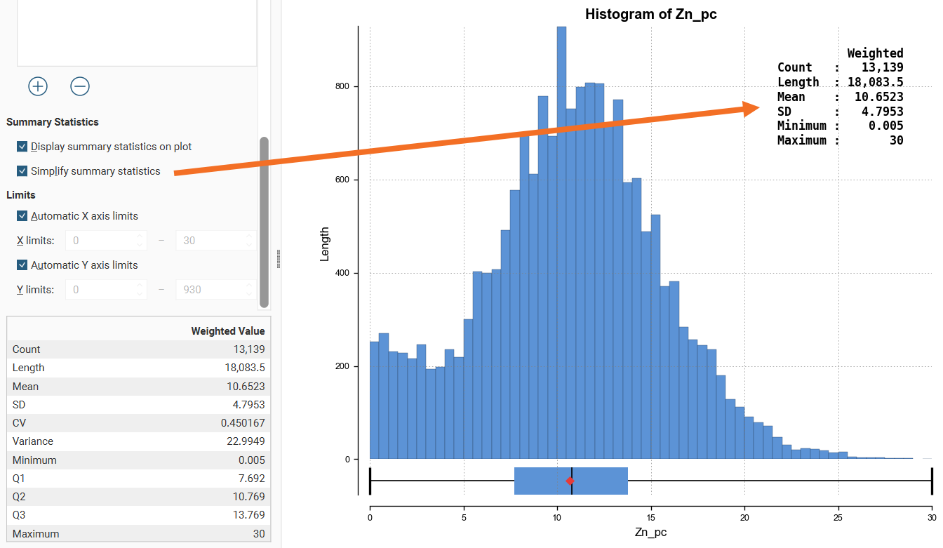
The Limits fields control the ranges for the X-axis and Y-axis. Select Automatic X axis limits and/or Automatic Y axis limits to get the full range required for the chart display. Untick these and manually adjust the X limits and/or Y limits to constrain the chart to a particular region of interest. This can effectively be used to zoom the chart.
The bottom left corner of the chart displays a table with a comprehensive set of statistical measures for the dataset.
Saving a Univariate Chart
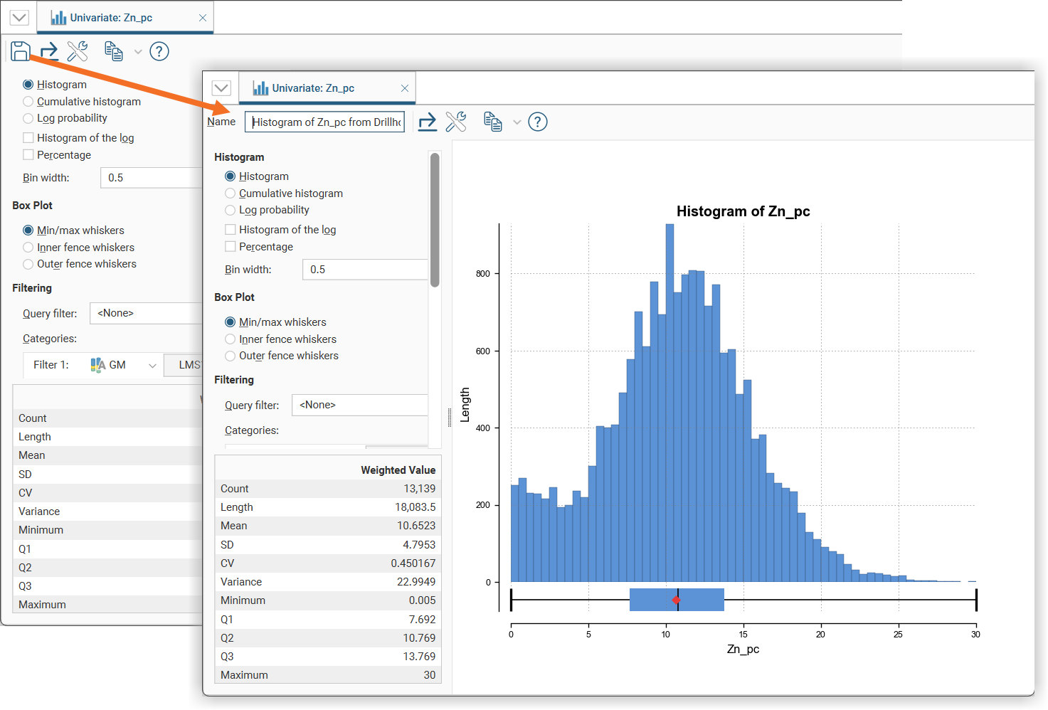
Some univariate charts have a Save icon (![]() ) that adds the chart to the Saved Statistics folder.
) that adds the chart to the Saved Statistics folder.
This will create a copy of the univariate chart with a default name. You can then modify the name of the chart so you can more easily find it in the Saved Statistics folder. You can also switch back to the original univariate chart and make further changes, then save additional versions of the chart to the Saved Statistics folder.
Once saved to the Saved Statistics folder, subsequent changes to the chart are automatically saved.
Styling Elements in a Univariate Chart
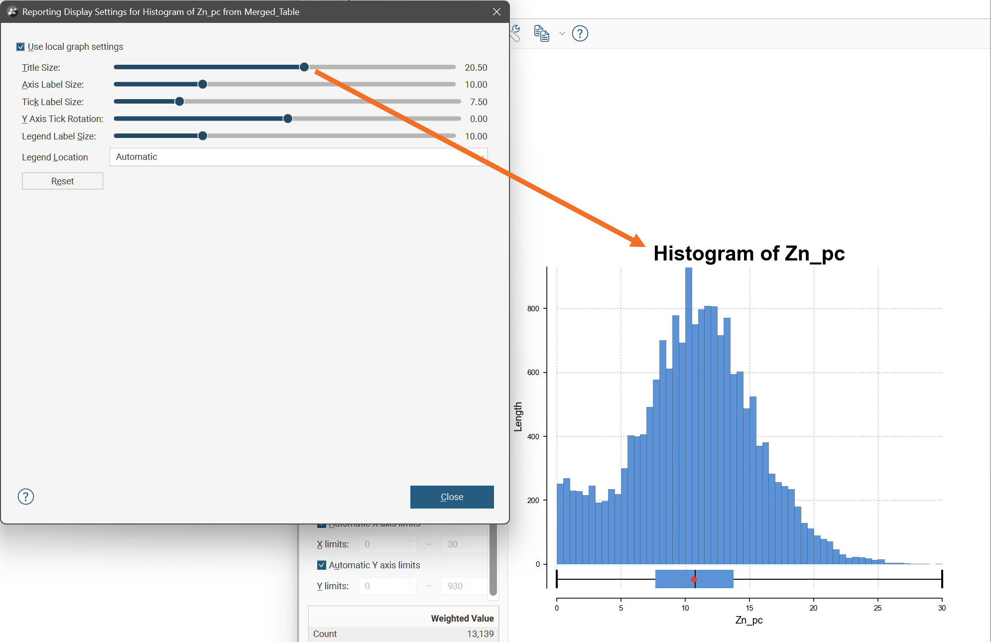
You can change the size of various elements of the univariate chart, such as the sizes of different labels. To do this, click the Edit reporting display settings button (![]() ):
):
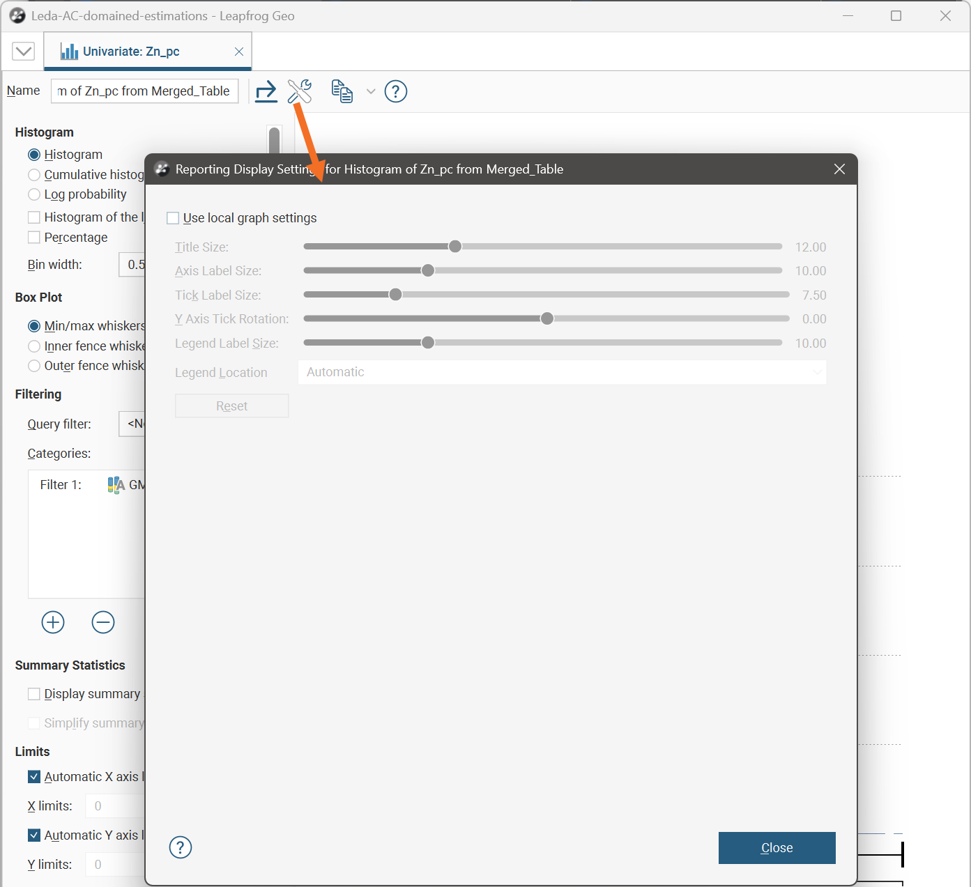
By default, the univariate chart will use the global graph settings. For more information, see Graphs Settings.
If you tick the Use local graph settings box, the sliders will adjust the chart features for the univariate chart currently open.
Exporting a Univariate Chart
Univariate chart can be exported as PDF, SVG and PNG files. Click the Export button (![]() ), then specify a filename and select the file type you prefer.
), then specify a filename and select the file type you prefer.
Alternatively, you can click the Copy button (![]() ) then select Copy Graph Image; an image of the chart will be added to the clipboard. You can then paste the image from the clipboard into another application.
) then select Copy Graph Image; an image of the chart will be added to the clipboard. You can then paste the image from the clipboard into another application.