Visualising Data
Visualising data is an important part of interpreting and refining data and making modelling decisions. This topic describes the tools available for changing how data objects are displayed in the scene. It is divided into:
- Colour Options
- Opacity
- Property Buttons
- Legends
- Slice Mode
- Filtering Data Using Queries
- Filtering Data Using Values and Categories
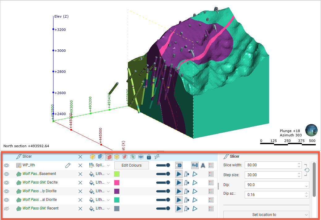
Tools for visualising data are accessed via the shape list and the shape properties panel:
The tools available depend on the type of object being displayed.
Changing how you view objects in the scene window does not change those objects in the project tree.
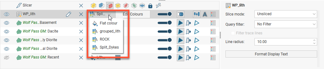
The view list is available for objects that can be displayed in different ways. For example, a lithology data table may contain several columns and the column displayed can be selected from the view list:
Geological and numeric model evaluations are also selected from the view list. See Evaluations.
The shape properties panel adjacent to the shape list provides more detailed control of the appearance of the selected object:
You can select multiple objects in the shape list and change their display properties using the shape properties panel. To do this, hold down the Shift or Ctrl key while clicking each object you wish to change:
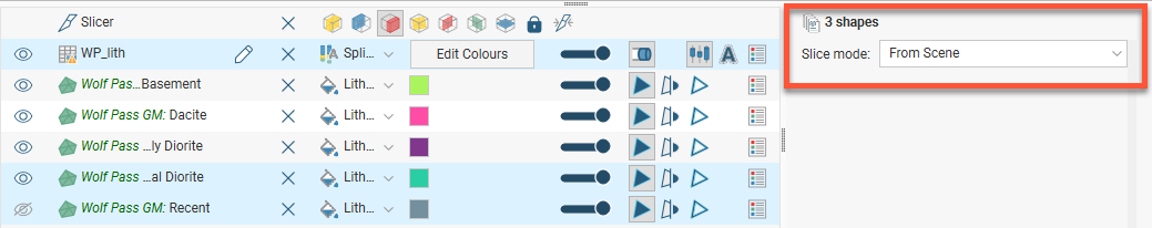
Only controls common to the selected objects are available.
Colour Options
The colour options for an object are changed in the shape list, and the options available depend on the type of object. Three different colour display options are shown below:
- The collar table is displayed using a single colour. Click the colour chip to change the colour. See Single Colour Display.
- The Geology table is displayed according to a colourmap of the categories in the table. These colours can be changed by clicking on the Edit Colours button, then clicking on each colour chip in the Legend window. See Category Colourmaps.
- The Contaminant table uses a colourmap to display the numeric data. Numeric data coloumaps are automatically generated based on the data, and manually changing a colourmap can often help in understanding the data. See Numeric Colourmaps.
If your organisation uses standard colour coding for category and numeric data, you can import colourmaps for these data types. See Importing and Exporting Colourmaps.
Single Colour Display
Many objects viewed in the scene are displayed using a single colour. To change the colour, add the object to the scene window, then click on the colour chip in the shape list. A window will appear in which you can change the colour:
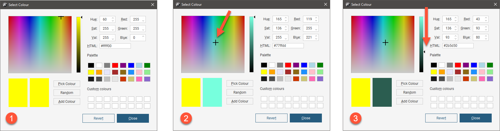
You can:
- Click and drag the crosshair to pick a colour, then select the darkness or lightness of the colour from the triangle (
 and
and  ).
). - Click on the Pick Colour button, then click on something elsewhere on the screen to select the colour of that part of the screen.
- Select a colour chip from the palette.
- Click on the Random button to set a random colour.
- Enter specific values for the colour to use.
Changes made are automatically applied to the scene. The Revert button changes back to the colour assigned when the window was first opened.
Category Colourmaps
Category data colourmaps can be edited by adding the data column to the scene, then clicking on the Edit Colours button in the shape list:
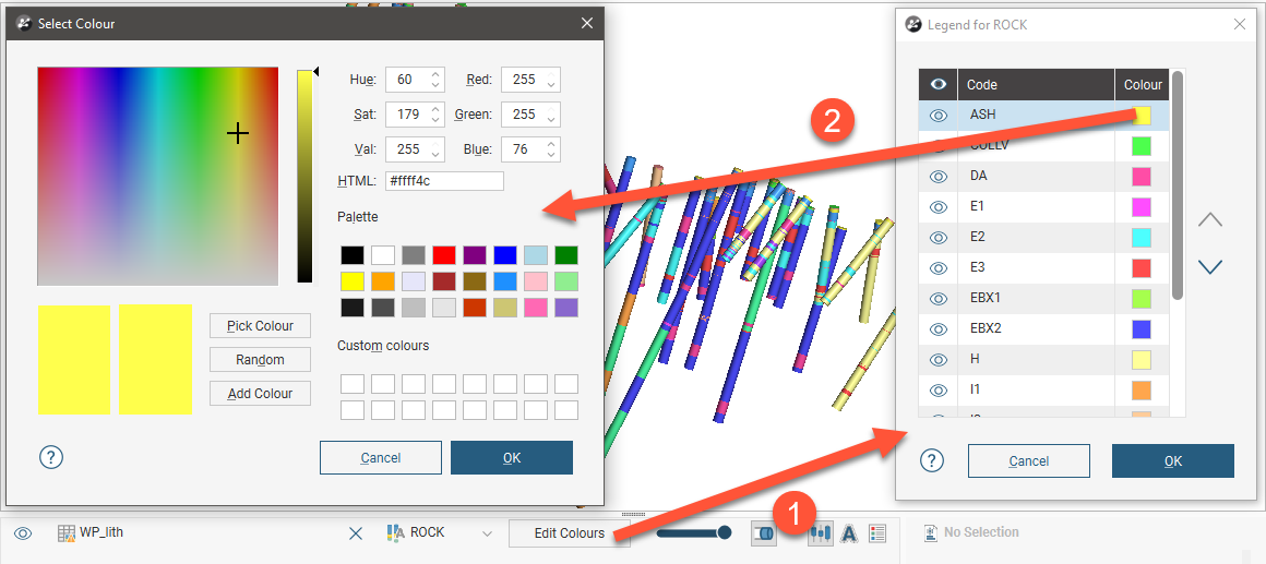
To change the colour used for a category, click on its colour chip in the Legend window.
Category colourmaps can also be imported and exported, as described in Importing and Exporting Colourmaps above.
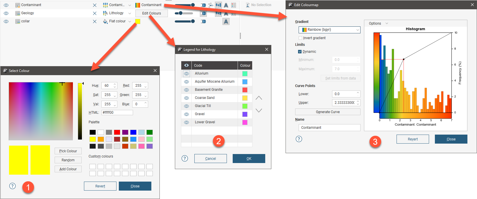
Numeric Colourmaps
There are two types of colourmap used for displaying numeric data:
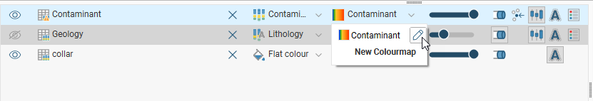
To edit the colourmap for an object, add the object to the scene. Click on the colourmap in the shape list and click the pencil (![]() ).
).
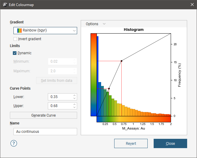
An Edit Colourmap window will display the colourmap that is currently being used to display the data; this window will be different for continuous and discrete colourmaps. Any changes you make in the Edit Colourmap window will be reflected in the scene. To save the currently displayed colourmap, click Close.
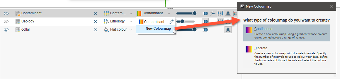
To create a new colourmap, click on a colourmap in the shape list and select New Colourmap. In the window that appears, select whether you wish to create a continuous colourmap or a discrete colourmap:
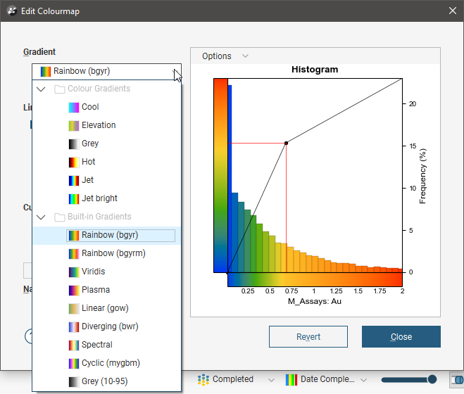
Leapfrog Geo contains a number of preset colour gradients that are used in displaying both continuous and discrete numeric colourmaps. These are:
- Rainbow (bgyr). This is a perceptually uniform rainbow.
- Rainbow (bgyrm). This is similar to Rainbow (bgyr), but follows red with magenta, which is common in geophysics software and RQD (geotech).
- Viridis. This is a good linear gradient.
- Plasma. This is the default colourmap for face dip.
- Linear (gow). This gradient is useful for elevation data.
- Diverging (bwr). This colourmap can be used when you are interested in data at either end of the spectrum.
- Spectral. With this colourmap, the middle is not white, and white is reserved for bins that have no data.
- Cyclic (mygbm). This is a good colourmap for azimuth data. Northern directions are displayed in blue and southern in yellow.
- Grey (10-95). This grey colourmap works well on white and black backgrounds as it doesn’t start or end in white or black.
Additional colour gradients can be imported into a project. See Importing Colour Gradients.
Continuous Colourmaps
A continuous colourmap uses a gradient whose colours are stretched across a range of values. In the Edit Colourmap window, the Gradient list includes all inbuilt gradients and any that have been imported into the Colour Gradients folder.
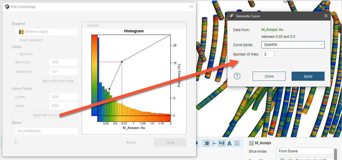
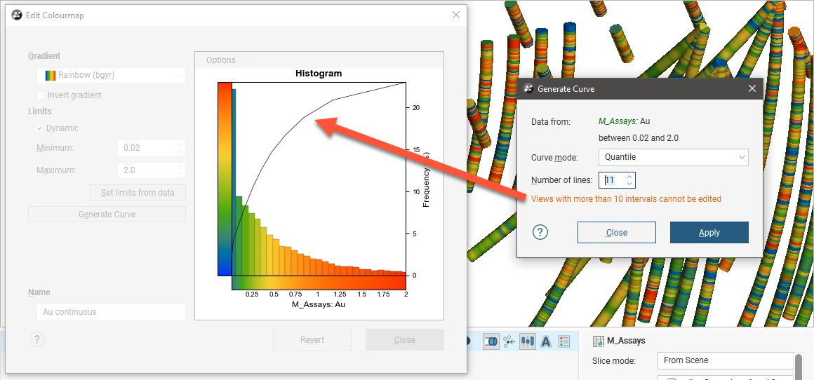
Click the Generate Curve button to change the Curve mode used and the Number of lines on the histogram:
You can limit the range of values used back in the Edit Colourmap window by disabling Dynamic and then setting the minimum and maximum values.
The curve modes all stretch the colourmap so that each line groups the histogram bars by colour. The available curve modes are:
- Quantile. The sum of the histogram bars between each pair of lines is equal.
- Progressive. The sum of the histogram bars between each pair of lines is progressively smaller, covering a smaller percentage of values towards the end of the curve.
- Progressive Double. This is similar to Progressive, but the effect is emphasised by increasing the percentage difference between lines.
- Logarithmic Intervals. This stretches the colours using a logarithmic transform, which may be preferred for data with a wide range of values.
Experiment with the different settings and click Apply to see the effects of changes. To edit the curve points on the histogram, close the Generate Curve window:
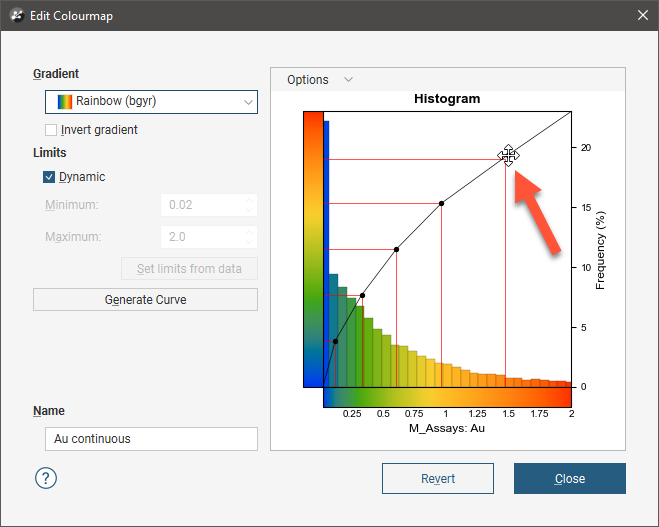
Note that if you use more than 10 lines in generating the curve, you will not be able to edit the curve points on the histogram:
You can change the Bin Width in the Options menu:
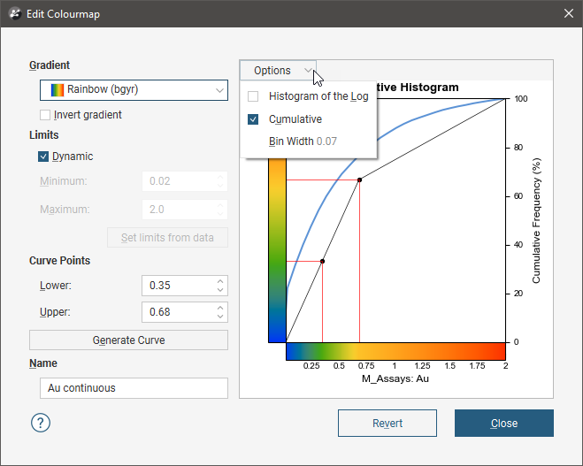
Enable Histogram of the Log to see the value distribution with a log scale X-axis. You can also view a Cumulative distribution function for the values, with or without a log scale X-axis.
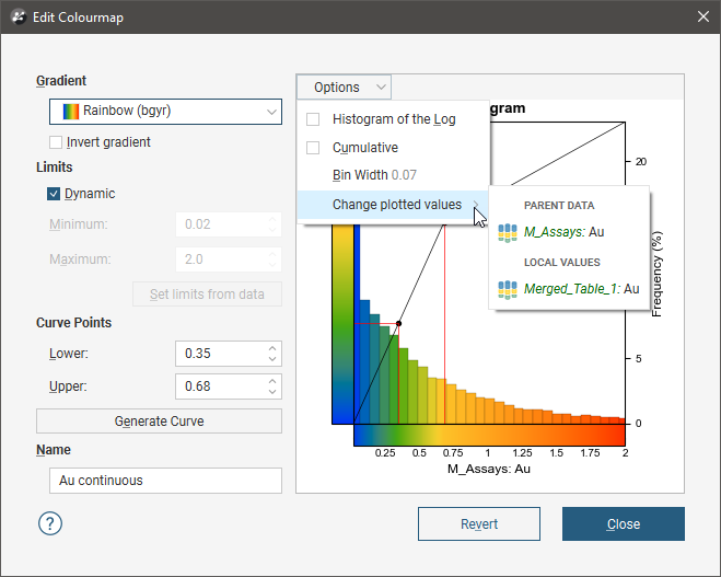
If the numeric data column for which the colourmap is defined has been produced from other data sources in the project, you will be able to select whether to display the Local Values or the values from the Parent Data. For example, for a numeric data column that is part of a merged table, you can display the values from only the merged table or from the parent table:
If the Dynamic option is enabled, the gradient will be updated when the data is updated, such as when drillhole data is appended. If the option is disabled, the values manually set for the Minimum and Maximum limits will control the lower and upper bounds of the colourmap. Reducing the range of the upper and lower bounds is useful if the bulk of the data points have values in a range much smaller than the overall range of the data. This is common in skewed data.
The Set limits from data button automatically adjusts the Minimum and Maximum Limit values so that the colourmap would follow the actual data distribution of the input data. The values that lie outside the Limits are coloured with the last colour at the relevant end of the colourmap.
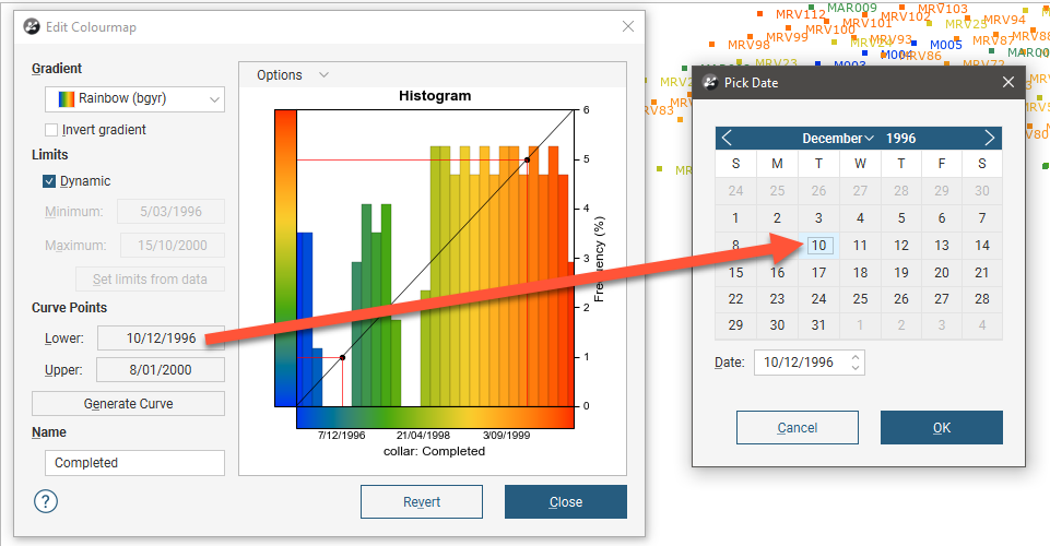
Both continuous and discrete colourmaps can be used to display date information. If a date is displayed using a continuous colourmap, the curve points represent the start and end dates:
When you click Revert, all changes you have made in the window are discarded.
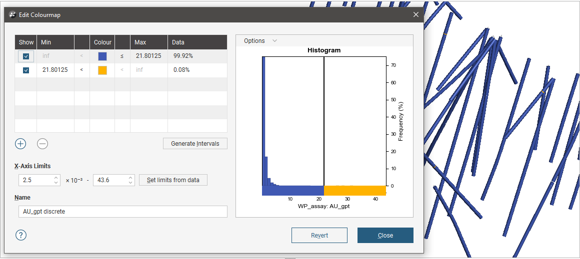
Discrete Colourmaps
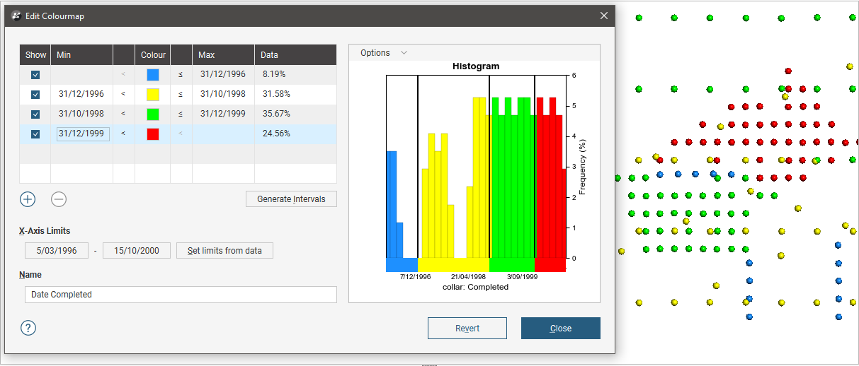
With a discrete colourmap, you can define intervals and select which colours are used to display each interval:
Click the Generate Intervals button to generate intervals based on various statistical methods:
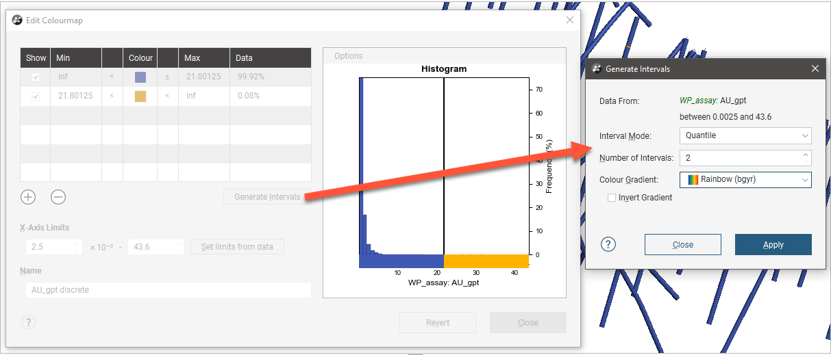
Select an Interval Mode. The options are:
- Quantile. This attempts to create the specified number of intervals so that each interval contains the same number of values.
- Progressive. This attempts to create intervals that enclose progressively smaller percentages of values. For example, 1000 unique values organised into 5 intervals would have the following percentiles: ~33%, ~27%, ~20%, ~13%, ~6%.
- Progressive Double. This is similar to Progressive, but is “steeper”. For example, 1000 values organised into 5 intervals would have the following percentiles: ~50%, ~25%, ~12.5%, ~6.25%, ~3%.
- Equal Intervals. This creates intervals at equal spacing across the range of the values.
- Logarithmic Intervals. This creates intervals at equal spacing, in log-space, across the range of values.
- K Means Clustering. This is an iterative algorithm that sorts values into clusters in which each value belongs to the cluster with the nearest mean. This option can take some time, especially with large datasets and a large number of intervals.
Set the Number of Intervals and the Colour Gradient to be used as the basis for the interval colourings. The first interval is assigned the first colour of the selected Colour Gradient and the last interval is assigned the gradient’s last colour; selecting Invert Gradient swaps this around.
You can change the Bin Width in the Options menu:
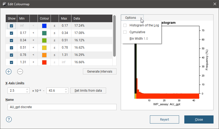
Enable Histogram of the Log to see the value distribution with a log scale X-axis. You can also view a Cumulative distribution function for the values, with or without a log scale X-axis.
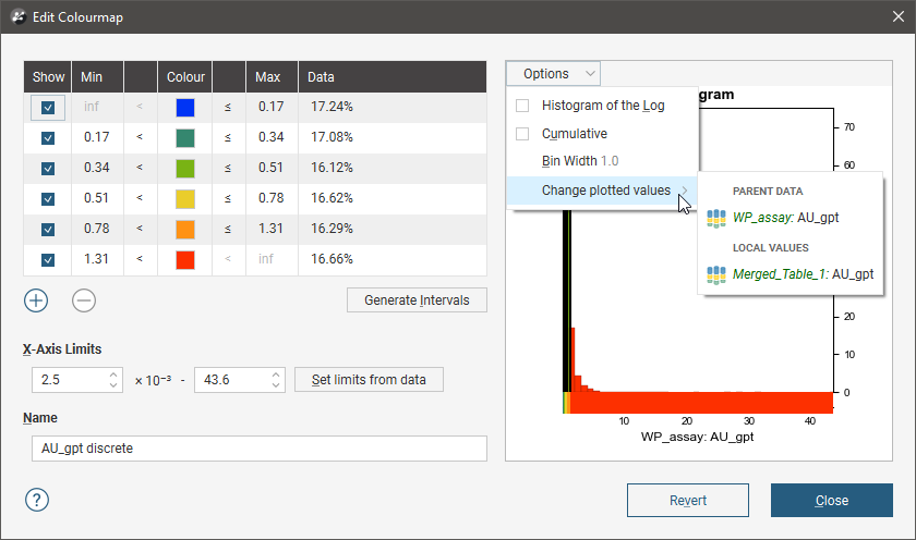
If the numeric data column for which the colourmap is defined has been produced from other data sources in the project, you will be able to select whether to display the Local Values or the values from the Parent Data. For example, for a numeric data column that is part of a merged table, you can display the values from only the merged table or from the parent table:
The Set limits from data button automatically adjusts the X-Axis Limits so that the colourmap would follow the actual data distribution of the input data.
Experiment with the different settings and click Apply to see the effects of changes.
You can also add intervals manually by clicking the Add button. For example, if you create a discrete colourmap to show the different stages of a drilling campaign, the initial colourmap contains only two intervals:
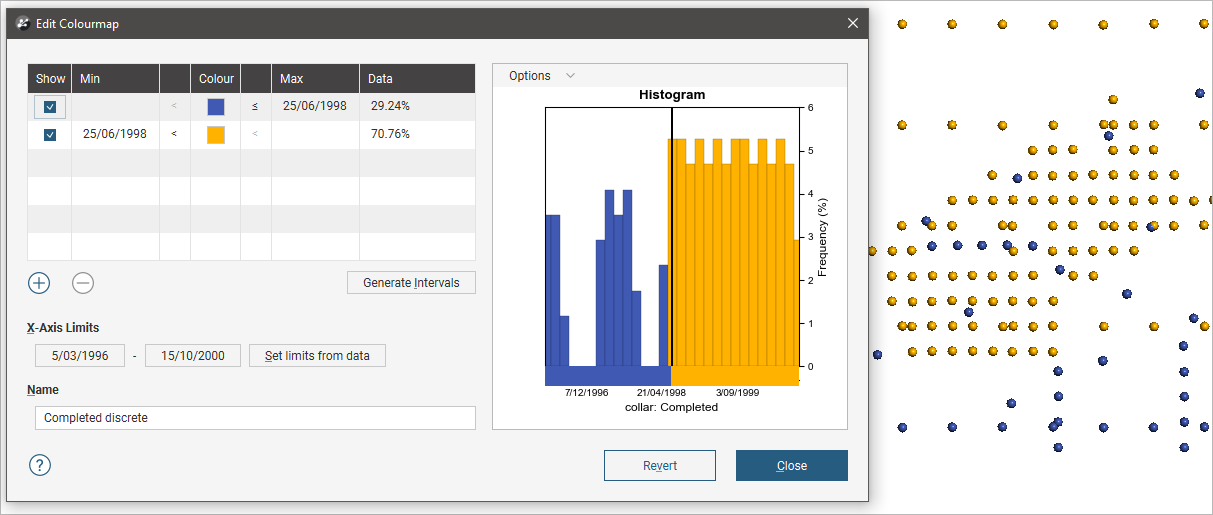
Click the Add button to add new intervals and use the Min and Max entries in the table to set the start and end points of each interval:
When you click Revert, all changes you have made in the window are discarded.
Importing Colour Gradients
Additional colour gradients can be imported into a project in the following formats:
- Geosoft Colour Files (*.tbl)
- ERMapper Lookup Tables (*.lut)
- MapInfo Colour Files (*.clr)
- Leapfrog Colour Files (*.lfc)
Perceptually uniform colourmaps are available at http://peterkovesi.com/projects/colourmaps/, where they can be downloaded in ERMapper (*.lut), Geosoft (*.tbl) and Golden Software Surfer (*.clr) format.
Colourmaps used in earlier versions of Leapfrog Geo can be downloaded from http://downloads.leapfrog3d.com/Colourmaps/older_leapfrog_gradients.zip.
Matplotlib colour gradients can be downloaded from http://downloads.leapfrog3d.com/Colourmaps/matplotlib_colour_gradients.zip.
Imported colour gradients are stored in the project tree in the Colour Gradients folder. To import a colour gradient right-click on the Colour Gradients folder and select Import Gradient. In the window that appears, navigate to the folder containing the gradient file and click Open. The gradient will be added to the Colour Gradients folder and you can then select it from the Gradients list when editing a colourmap:
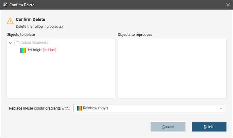
If you delete a colour gradient from the Colour Gradients folder and it is in use in the project, you will need to select a replacement gradient for all colourmaps that use that gradient. Select the replacement colour gradient from those available in the project:
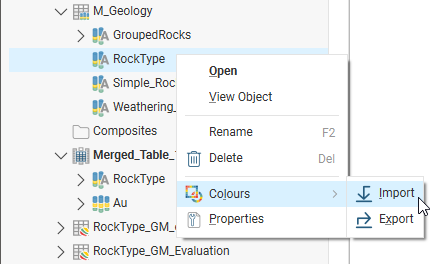
Importing and Exporting Colourmaps
Colourmaps can easily be shared between projects on a column-by-column basis, which is useful if your organisation uses standard colourmaps. To import or export a colourmap, expand the data object in the project tree and right-click on a column. The Import and Export options are available from the Colours menu:
To export a colourmap, right-click on the data object and select Colours > Export. If more than one colourmap is associated with the selected object, you will be prompted to choose from those available. Click Export.
In the window that appears, navigate to the folder where you wish to save the colourmap. Enter a filename and click Save. The colourmap will be saved in *.lfc format.
When you import a colourmap:
- For category colourmaps, the existing colourmap will be overwritten.
- For numeric colourmaps, the imported colourmap will be added to those already defined.
To import a colourmap, right-click on the data object and select Colours > Import. Navigate to the folder containing the colourmap file and click Open.
If the object has more than one colourmap associated with it, you will be prompted to choose which one to overwrite.
If the column you expected is not listed, check to see if you have selected the correct file. The columns displayed are those that correspond to the type of data in the selected file (category or numeric).
Click Import.
Leapfrog Geo will map the information in the file to the information in the selected data column.
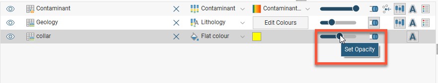
Opacity
The opacity slider in the shape list controls the transparency of objects in the scene:
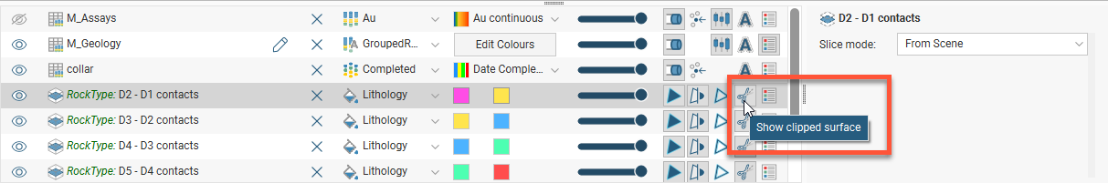
Property Buttons
The property buttons available in the shape list vary according to the type of object selected. For example, property buttons can show or hide the triangles on a mesh, render points as spheres or display a surface clipped to a model boundary. You can always find out what a button does by holding the cursor over the button:
Legends
You can display a legend for many objects, including lithologies. To do this, click the legend button in the shape list:
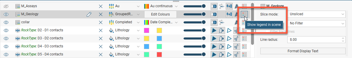
To remove the legend from the scene, either click the legend button again or click the red X in the scene window:
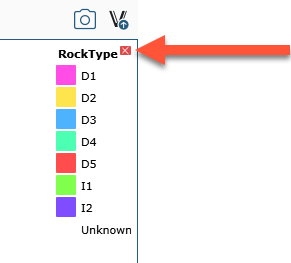
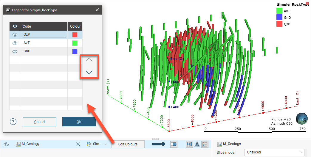
To reorder the legend, click the Edit Colours button in the shape list to open the Legend window. Click on an item in the list, then use the arrows to move it up or down. The legend shown in the scene will be updated when you close the Legend window.
Slice Mode
When an object is selected in the shape list, a Slice mode property is available in the properties panel. See Object Slice Mode for more information.
Filtering Data Using Queries
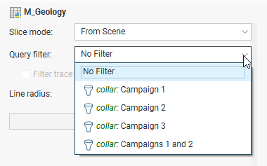
When a data table is selected in the shape list, you can use the controls in the shape properties panel to apply filters to the data in the scene. If query filters are available for the selected object, they will be listed in the Query filter list:
Filtering Data Using Values and Categories
In the shape properties panel, you can also filter the range of values displayed. Tick the Value filter box, then set the upper and lower limits of the range of data displayed:
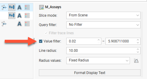
If the data includes date information, you can use the Value filter option to restrict the display to a range of dates.
Got a question? Visit the Seequent forums or Seequent support