
Colour Tool
The resizable Colour Tool enables you to interactively edit the colour display of your data and experiment with different colour configurations. The tool enables you to:
- Modify the current colour distribution and apply it to your data
- Create custom colour configurations and save them as specialized colour scheme files (*.itr, *., *.zon, *.tbl, *.lut)
- Apply saved colour scheme files to any of your image products
Accessing the Colour Tool
You can launch the Colour Tool from several locations:
- Project Explorer: Right-click on a selected grid or voxel and choose the Colour Tool from the context menu.
- Grid Viewer: Click the Colour Tool button on the toolbar of a displayed grid.
- Voxel Viewer: Click the Colour Tool button on the toolbar of a displayed voxel.
- Map Manager: When an aggregate (AGG) group or a colour symbol (CSYMB) group within the map is selected, the Colour Tool button becomes available on the toolbar and in the context menu. You can also double-click the selected item to open the tool.
- 3D Manager: When an AGG, a VOX (data or vector voxel), or a variable-coloured 2D/3D symbols group is selected, the Colour Tool button becomes available on the toolbar and in the context menu. It is also accessible under the Legend tab for AGG and VOX groups.
Applying Colour Settings to Multiple Items
You can set or edit the colour display (e.g., apply a new colour scheme or distribution) for multiple grids, voxels, or data layers (AGGs, CSYMBs, VOX groups, 3D symbols) in a single step.
-
In the Project Explorer, Map Manager, or 3D Manager, select the desired items.
-
Click the Colour Tool button or use the context menu to open the selection dialog.
-
Choose the initial colour properties to apply to all selected files.
-
The Colour Tool opens, allowing you to make further edits to the colour configurations and apply changes simultaneously to all selected data.
You can load any colour scheme from the repository or save your custom colour configurations into new colour scheme files.
Propagation of Changes
If the Colour Tool is launched from the Project Explorer, changes are immediately reflected in any open grid/voxel viewers for the selected items. If the selected grids/voxels are not currently open, the changes will be applied the next time they are opened.
Maps or 3D views containing data layers created from the selected grids/voxels are not affected.
Conversely, if the Colour Tool is launched from the Map Manager or 3D Manager of a map/3D view, changes made to the selected data layers will not affect the underlying grid or voxel datasets.
Colour Tool dialog options
|
Data layer/ |
The name of the selected dataset, data layer, or variable-coloured 2D/3D symbol group. If the selected data layer is a multi-layer aggregate AGG, this field becomes a drop-down list displaying all grid files. This allows you to adjust the color display for individual layers. If the tool was launched with multiple items selected, this field will display "data".
|
|
The tool enables you to interactively modify the colour grid zones. The following colour distribution methods for zoning data are available:
Click the Define Distribution Changing the distribution selection will also open the associated colour distribution dialog. The Define Distribution button is disabled when the 'Custom' user-defined distribution is selected. The dataset/data layer is automatically redisplayed using the new colour distribution. The transform graph is redrawn, and the colour bins are updated accordingly. If the tool was launched with multiple items selected, changes will be applied simultaneously to all selected data. |
|
|
Brightness |
The initial state of the brightness is set at 50% (full colour). Slide the bar to adjust the brightness: 0% generates the darkest image, while 100% generates the brightest image. The slider is disabled when the tool is launched with multiple items.
If the data layer contains multiple layers, you can interactively apply the desired brightness:
Changes are applied interactively to the selected dataset/data layer.
|
|
Transparency |
The initial state of transparency is set at 0% (fully opaque image). To increase the transparency, slide the bar to the right. The slider is disabled when the tool is launched with multiple items.
In maps containing both image and vector layers (e.g., survey paths or symbols), decreasing transparency helps vector layers stand out more clearly. Changes are applied interactively to the selected dataset/data layer.
|
|
Enter a number for the colour breaks (zones). By default, this matches the number of colour zones in the current colour table. If you enter a different number, the colour table is linearly interpolated or decimated to match the new bin count while preserving the overall colour distribution. For example, if the colour table has 255 levels and you set the number of zones to 15, then only the colours at rows 0,17,34,51, etc., will be used. The number of bins is recalculated when a different colour scheme is loaded using the Open button. The dataset/data layer is automatically redisplayed using the updated colour distribution. The transform graph is redrawn, and the colour bins are also updated to reflect the selected changes. If the tool was launched with multiple items selected, changes will be applied simultaneously to all selected data. |
|
Bins Colours & Boundary Values |
|
|
|
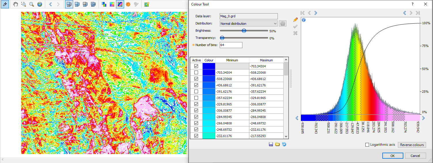
The bins colours and boundary values are displayed in a scrollable window. If the tool was launched through multiple item selection, the data range is determined by aggregating the values from all selected items. For example, if you select a grid with values from -1 to 10 and a voxel with values from 5 to 100, the combined data range will be from -1 to 100. Activating/Deactivating Bins To hide a specific bin from the image display, simply uncheck its Active* checkbox. This will be visually indicated on the Transform graph using a hashed grey pattern (see Application Notes fro details). To toggle multiple adjacent bins:
Changing Bin Colours The colour distribution of the selected layer is shown in the Colour field. To change the colour of a specific bin:
Editing Boundary Values To adjust the colour breaks, enter new values in the Minimum and Maximum fields* for the desired bin. The adjacent boundary values will be automatically updated to maintain consistency. All changes are automatically reflected in the transform window— both the graph and the colour bar below the horizontal axis of the graph will update accordingly. They are also applied to the dataset or data layer in the active document (e.g., map, grid, 3D view, voxel). If the tool was launched with multiple items selected, the changes will be applied simultaneously to all selected data. Ensure the grid image reflects the updates by enabling the Auto Recolour Grid option. |
Transform Window |
|
|
|
The Transform window displays the binned data distribution of the current data layer/symbol group using the selected colour zoning method. If the tool was launched through multiple item selection, the displayed histogram represents an aggregate of all selected items: the data range is obtained by aggregating the values of all selected items. (For example, if a grid ranges from -1 to 10 and a voxel from 5 to 100, the combined data range will span from -1 to 100.) All data values are weighted equally. The grey profile traces the number of points within each bin at a finer resolution. The black profile represents the cumulative number of points as a percentile, annotated along the right vertical axis. When the cursor is inside the transform graph, a set of normal dashed lines indicates the range of the zone at the cursor location (see the Application Notes below). The colour bar below the horizontal axis of the graph is annotated with the absolute values of the bin boundaries. Hovering over the colour bar displays a tooltip with the name of the current colour scheme. This tooltip will not appear after modifications such as changing the distribution, reversing colours, adjusting the number of bins, or resizing colour bins in the colour bar. Resetting the changes (Reset button) will restore the tooltip functionality.
Interactive FeaturesTo visually enhance features of interest, a number of interactive options are provided to scroll, zoom, and modify the number, colour, and size of bins. All changes are automatically applied to the transform window, colour bins, and the data layer/symbol group in the active document and any related image (AGG). However, these changes are not committed to the map until you save the map. If the tool was launched via multiple item selection, changes apply simultaneously to all selected data.
Zoom In/Out Use the arrows at the top of the window to adjust the graph’s horizontal extent:
You can resize individual colour bins to emphasize subtle features; the adjacent bins will adjust accordingly:
If you drag across an adjacent bin, the two bins will merge, reducing the total number of bins.
You can shift the colour of a bin to a different bin. The number of bins (colours) on either side of the moved bin is preserved, and the boundary values of adjacent bins are resized or readjusted to maintain the same total number of bins and colours. To reassign a bin’s colour to a different bin:
Unlike circular scrolling, this feature does not alter the colours assigned to the end bins. However, if a bin is moved too far—causing its size to fall below the minimum allowable interval— its colour is dropped, and the bin boundaries are redistributed accordingly. The image updates in real time, while the numeric table (lower left) updates only after the mouse button is released. If the tool was launched via multiple item selection, changes will be applied simultaneously to all selected data.
When working with a large number of bins, it may be difficult to position the cursor precisely inside a bin rather than on its boundary. For more accurate control in dense colour bars, press and hold the Ctrl key. The cursor will become a 4-way white arrow, indicating "scroll" mode. Then, place the cursor over the desired bin, left-click, and drag the colour to the new location. Hover over the information icon
The standard methods are based on a Gaussian data distribution. However, this may not always be the case. You can customize the colour distribution to emphasize a specific data range while de-emphasizing less relevant regions:
See the Application Notes below for further details. |
|
Logarithmic axis |
Leave this option unchecked if your data follows a Gaussian distribution. Enable the Logarithmic axis option when your data spans several orders of magnitude and a significant portion of values lie near the lower end of the scale. Using a logarithmic scale enhances the visibility of low-value data in the transform graph, revealing finer details. This setting only affects the transform graph (both the graph and profile are redrawn). It does not alter the data bins or the data layer/colour symbol in the active document (e.g., map, grid, 3D view, voxel).
|
|
[Reverse Colours] |
Click this button to invert the colour scheme. Changes are applied automatically to the active document (e.g., map, grid, 3D view, voxel) and the transform window (graph and transform line are redrawn). If the tool was launched for multiple grids or voxels, the changes are reflected across all selected files. This operation does not modify the data—only the colour table is inverted. Bin values remain unchanged.
|
|
[Reset] |
When working interactively with grids or coloured 3D symbols and voxels, you often experiment to determine the optimal colour combination for your data. Click the Reset button ( Changes are automatically applied to the active document (e.g., map, grid, 3D view, voxel) and the transform window (the graph and the transform line are redrawn). If multiple items were selected when launching the tool, all selected data will be updated accordingly. |
|
[Save] |
When experimenting with various colour distributions, it is recommended that you save them to unique colour scheme files. After adjusting the colour distribution, you can save the new colour distribution along with the binning breaks to a file. You can then reset the colour distribution, experiment with another colour combination, and save this combination to another file. Click Save to store the current colour distribution/bin values to one of the file formats (*.ITR, *.AGG, *.ZON, *.TBL and *.LUT) available in the file selection dialog. The file filter is set to "Colour zones (*.zon)", and the file name (editable) defaults to "dataset/data layer/symbol group.zon". You can later reuse these files to apply consistent colour breaks across grids, voxels, or symbols. |
|
[Open] |
To compare or apply a different colour distribution, click Open to launch the Select Colour Scheme tool and load the corresponding colour scheme file. The currently applied scheme to the selected item(s) is automatically highlighted in the list.
Choose from a variety of predefined colour schemes across several categories and formats. Click OK to load the selected colour scheme (e.g., zone file, colour table). Changes are automatically applied to the bins table, transform window (the graph and the transform line are redrawn), and active document (e.g., map, grid, 3D view, voxel). If multiple items were selected when launching the tool, all selected data will be updated accordingly.
Hover over the colour bar below the histogram graph to view a tooltip showing the current colour scheme file. |
|
[OK] |
Click the button to close the Colour Tool dialog and apply all changes to the active document ( map, grid, 3D view, voxel). |
 ) below.
 button (to the right of the Distribution field*) to open the associated colour distribution dialog. You can define custom colour values or accept the intelligent defaults, then click OK to apply.
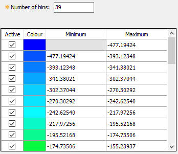


 button.
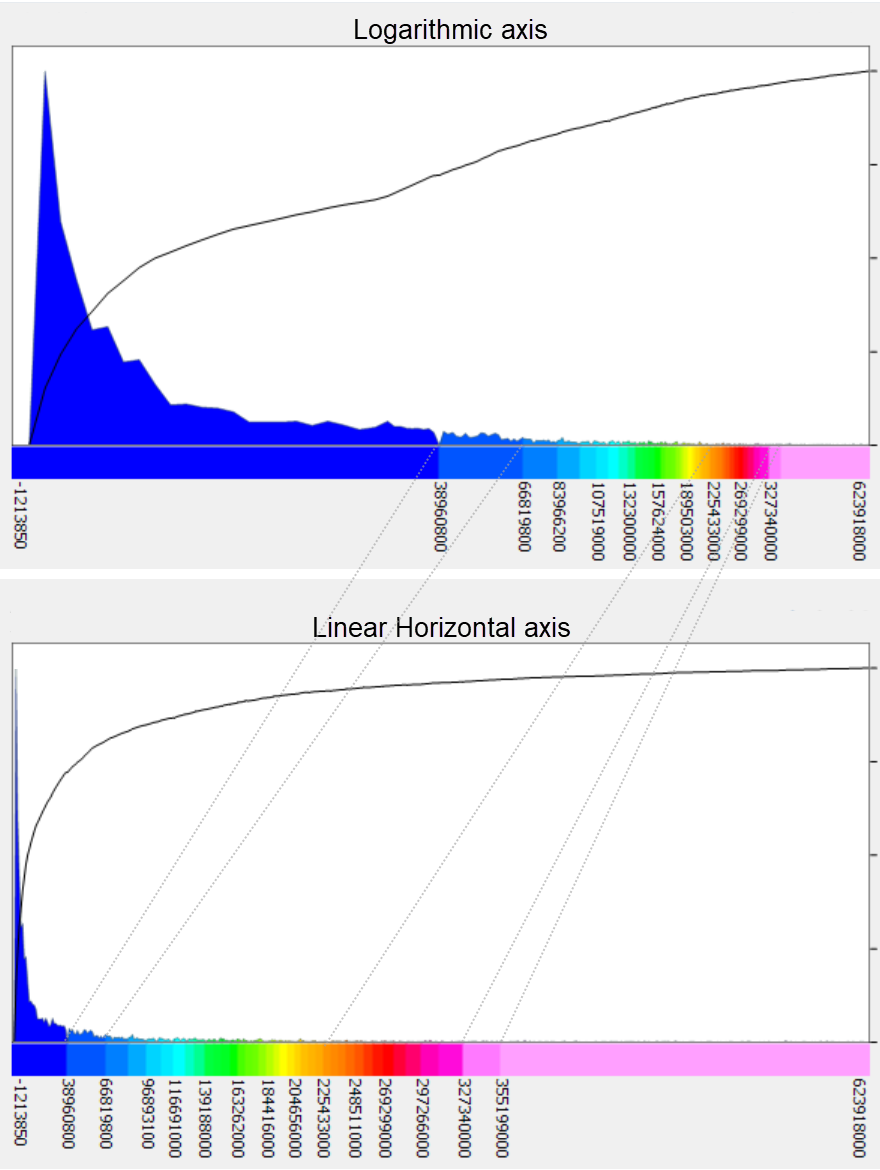
 ) to restore the colour distribution to the initial input configuration (i.e., the last version stored in your data file or symbol group).
Application Notes
When the Colour Tool dialog is closed, if the active map contains a colour legend bar, the bar will automatically update to reflect the current colour distribution of the selected data layer(s).
Transform Graph Annotations
![]()
The cursor’s position within the transform graph window is continuously tracked and annotated to provide real-time feedback. At the cursor location, the following visual cues and data are displayed:
a – The bin under the cursor is outlined with dashed lines, and its edge values are shown in bold.
b – The percentage of total data values contained within the highlighted bin is displayed at the top of the dashed lines.
c – The cumulative percentage of data values up to the highlighted bin is annotated along the right-hand axis.
d – The percentile value corresponding to the exact cursor location is also shown along the right-hand axis.
e – The grid value at the cursor’s horizontal position is annotated along the bottom axis.
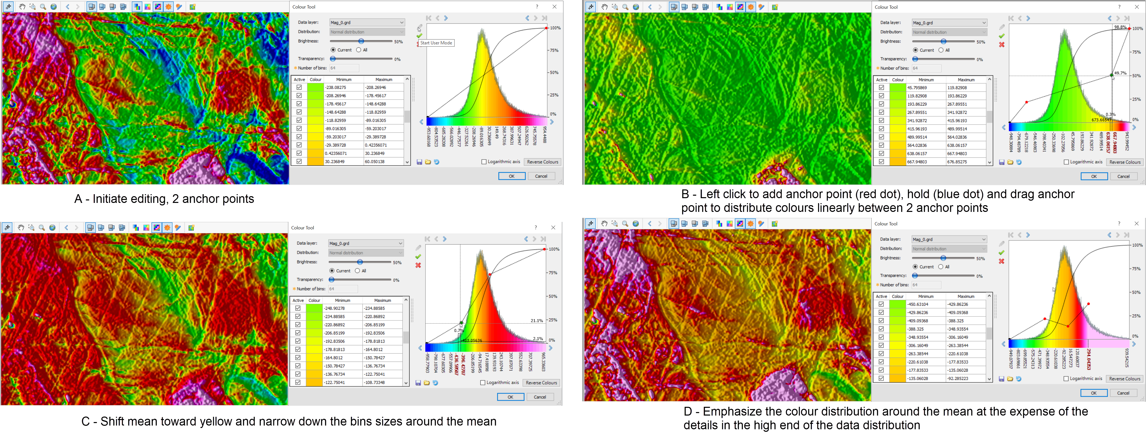
Custom Colour Distribution
When entering User Mode,  , the bins are initially set to span linearly across the entire data set. This is indicated on the transform graph with a straight dashed line with two anchor points (A).
You can add additional anchor points by clicking on the graph (red dot).
-
The horizontal position of the added anchor point selects the bin
-
The vertical position of the cursor controls the colour that will be assigned to the bin.
-
Subsequently, all bins located to the left and right of the cursor location, up to the next anchor point, will be linearly assigned new colours.
To move an anchor point, move the cursor on the anchor point until it changes to a blue dot (B). Then, left-click it and drag it to a new position.
You can augment the size of the final bin by simply grabbing its anchor point and moving it (D).
Once you're satisfied with the colour distribution, click  to apply the new settings (and save the new distribution).
Turn off Select Colour Bins
You can disable specific colour bins to visually emphasize content of interest.
For example:
- If the map contains multiple overlain images, and you want to bring forward confined regions of a lower image, you can turn off the obstructing bins of the uppermost image. This allows the underlying image to show through.
- Data ranges of interest could be visually emphasized by turning off adjacent bins that are of lesser interest. The illustration below shows a striped colour image where alternate bins have been disabled to enhance contrast.
Got a question? Visit the Seequent forums or Seequent support
Copyright (c) 2025 Bentley Systems, Incorporated. All rights reserved.
Privacy | Terms of Use