
Composite Comparison
The composite comparison tool is useful for informing the decision making process when selecting numeric compositing options to rely on.
Composite Comparison takes multiple composite objects and creates a table of statistics and charts to allow comparison of the effects of the various compositing options.
This feature is distinct from the composite comparison graph provided by selecting Statistics from the menu for a composited data column. That shows the global before-and-after statistics in graphical form for a single column. For more information on that chart, see Comparison Histograms.
There is a different Leapfrog Geo statistics feature called compositing comparison, which compares the original uncomposited data with the composited data. For more on this statistics report, see Compositing Comparison.
Create a New Composite Comparison
As a pre-requisite to creating a new composite comparison, you need at least one numeric composite object; two if you wish to compare composites rather than comparing a composite against raw data. For information on creating numeric composites, see Numeric Composites.
It is important that all of the numeric columns on the composite table are sourced from the same input assay table. If you create a composite with numeric columns from across different tables, such as a merged table, you will see an error when you click OK on the New Composite Comparison window, advising that all selected composites must be derived from a single source table.
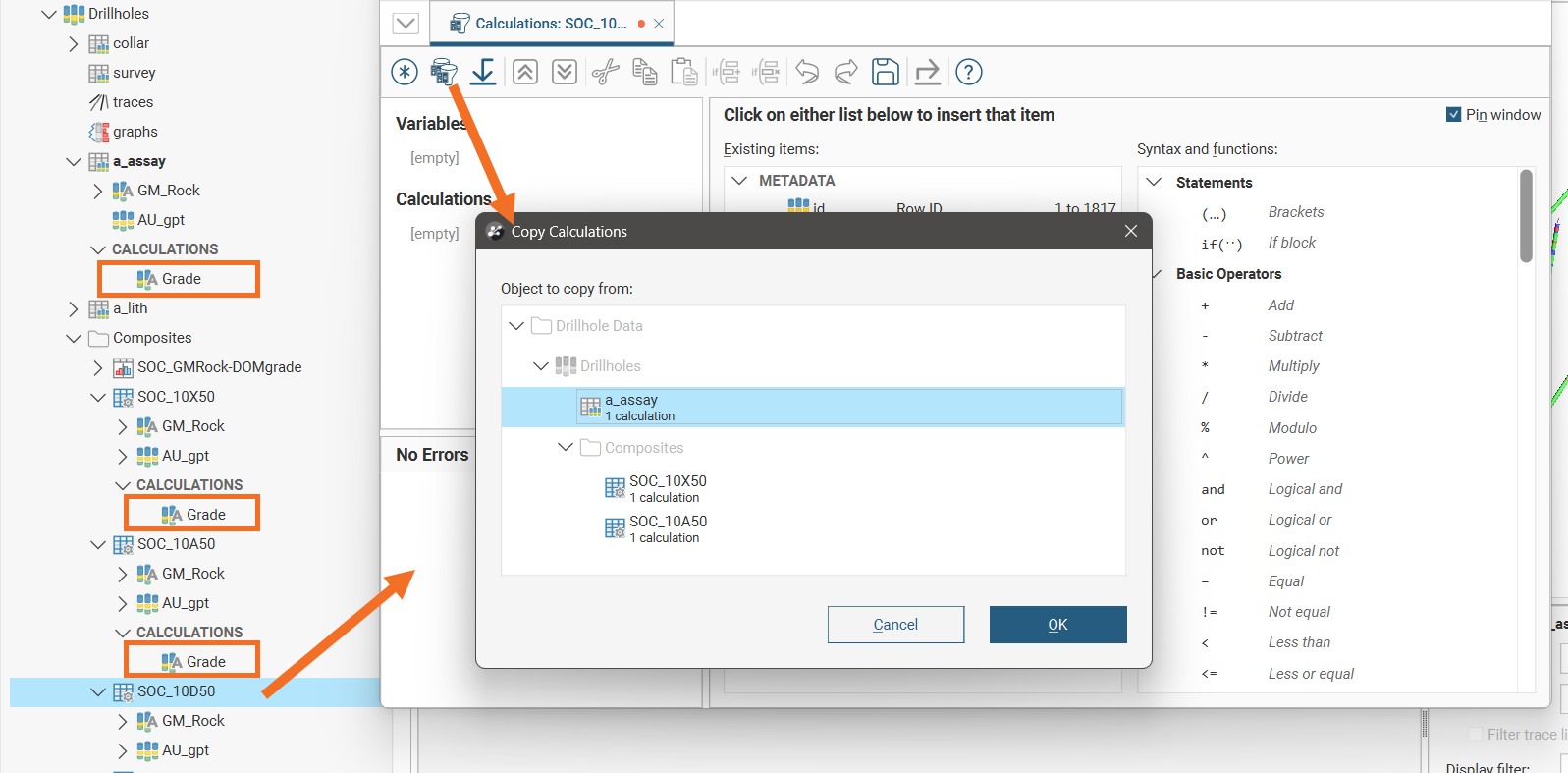
To create a new composite comparison, right-click on the Composites folder or a sub-folder under Composites, and select New Composite Comparison.
In the New Composite Comparison window, the Available inputs list will list all the available numeric composites. Select composites to compare by moving them into the Selected inputs list. All table moved into the Selected inputs list need to be derived from a single source table.
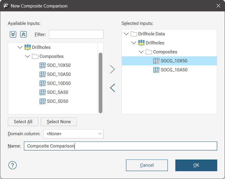
When you click OK on the New Composite Comparison window, the composite comparison will be added to the project tree in the Composites folder, which will include links to the source objects and two new comparison tools:
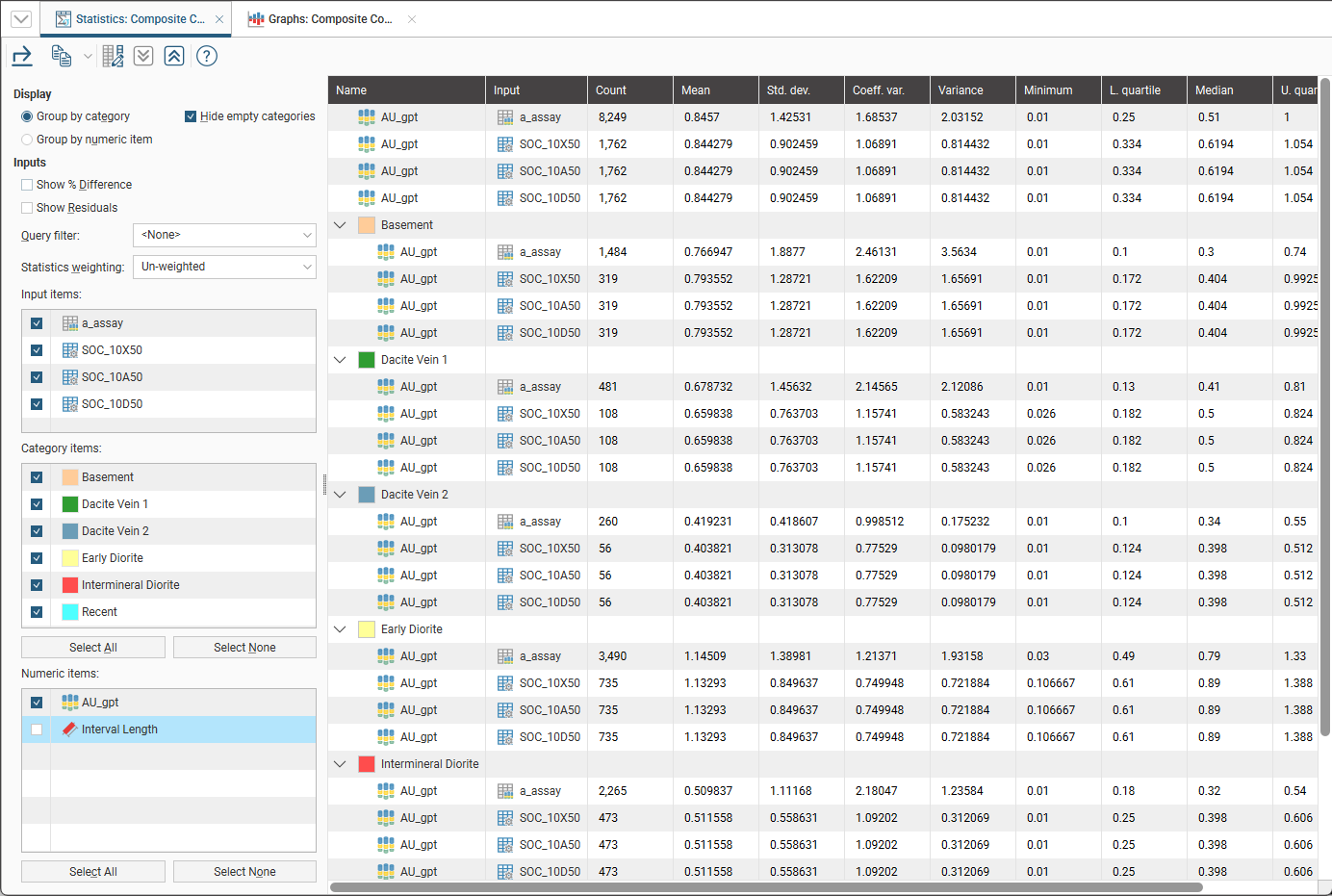
- Comparison Statistics. A table of statistics with multiple inputs using the selected composite tables.
- Comparison Graphs. A closer look at one of the composite tables, with both a table of statistics and associated charts allowing for comparing the before-and-after information for the composite table you select.
Both the Comparison Statistics and Comparison Graphs windows will automatically open.
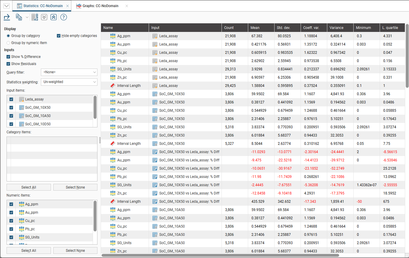
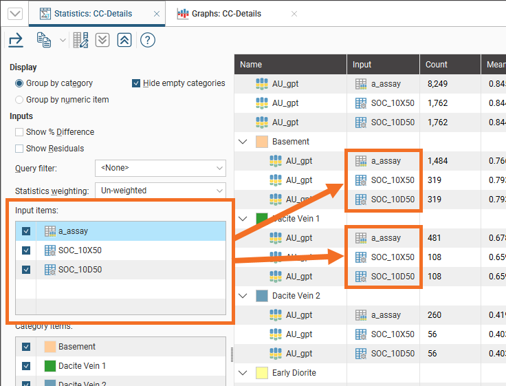
Utilising the Domain Column
When the Domain column is left as <None>, the comparison statistics table allows for comparison of the statistics of interest against the selected composites. Note the empty Category items list:
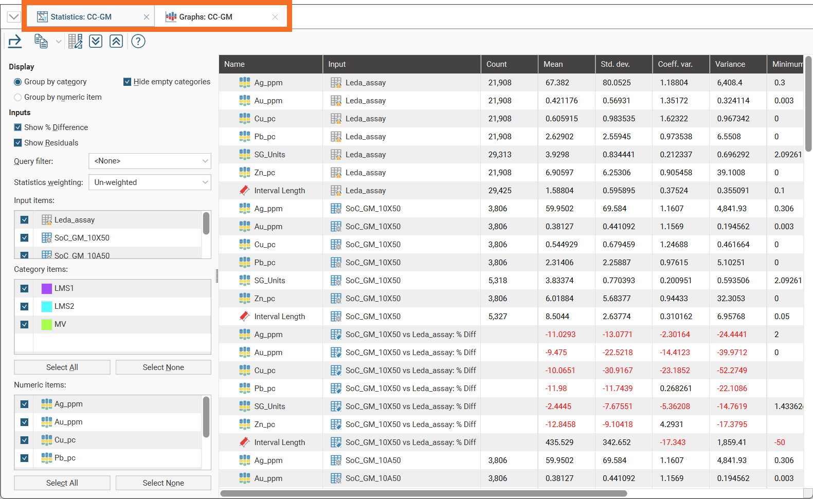
Some additional capability is available when utilising the Domain column when creating a new composite comparison. It allows for the selection of a column that can be used to classify the composite comparison statistics into separate zones of interest.
The category column must be common across the source assay table and all the composite tables selected in order for the categories to appear in the Category items list. If using subset of codes composites, the category column must be on the assay table; this could be a back-flagged evaluated column or a calculation. If using entire drillhole composites, intervals from other tables composites, or subset of codes that uses a category from another table, the categories that will appear in the Category items will be those where the same category column is found on all the tables, either through an evaluated column or a calculation.
Categories created using Category from Numeric on each separate table will not appear in the Category items list.
There are two workflows that can be used to leverage this additional capability:
- Create a geological model, then back-flag the geological model volumes onto the assay table by selecting New Column > Evaluated Column. A new column will be added to the assay table that identifies each interval with a volume from the geological model.
- Create a calculation that creates a category column on the assay table. This category calculation then needs to be copied to each of the composite tables that will be used in the comparison.
These workflows will make options available in the Domain column dropdown list.
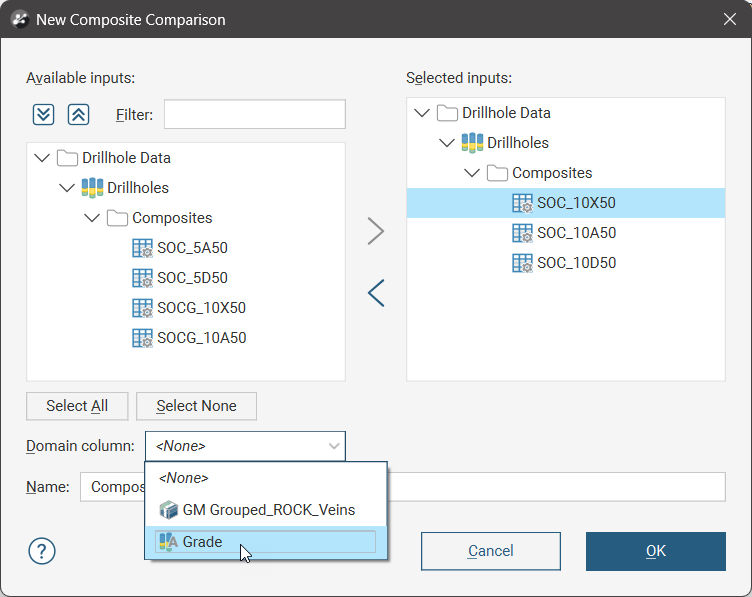
The selected column will be used as a category classifier in the composite comparison table.
In this example, the back-flagged geological model category column was selected as the Domain column, and the geological model volumes appear in the Category items list.
On the other hand, if the calculated category column is selected as the Domain column, the categories created by the calculation will appear in the Category items list.
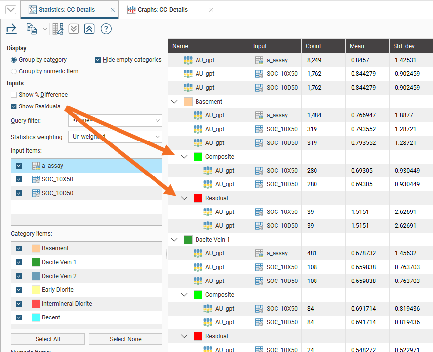
Comparison Statistics
This is one of the two dockable tabs that are opened when a composite comparison object is opened, showing a table of statistics with multiple inputs using the selected composite tables.
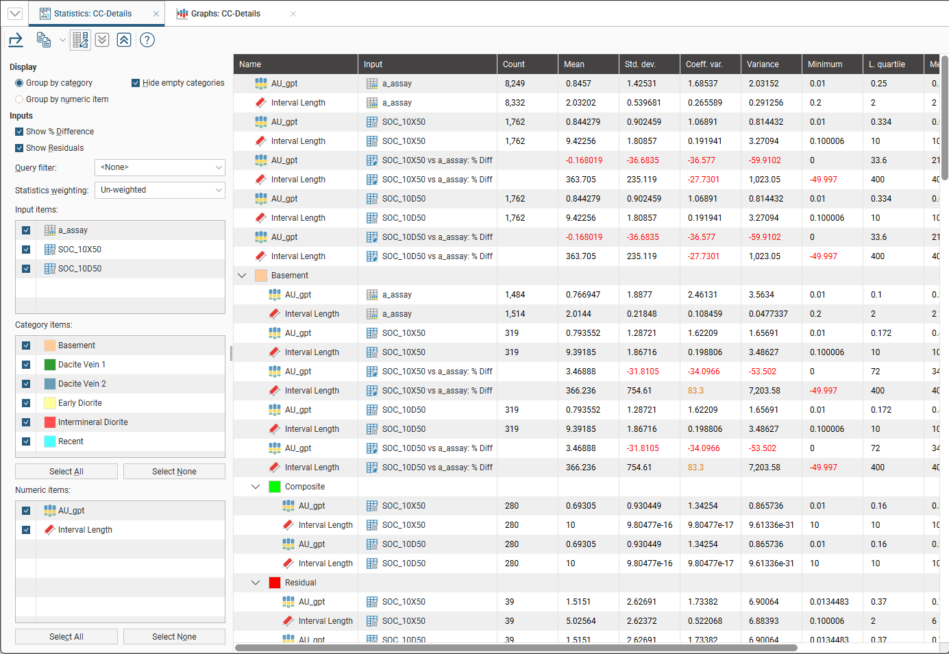
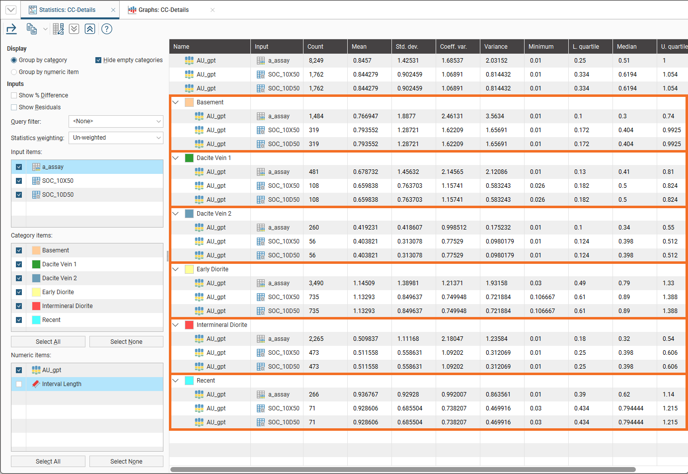
Selecting Group by category will organise the table into sections grouping the numeric items together for each category selected.
Selecting Group by numeric item will organise the table into sections grouping the catgeory items together for each numeric item selected.
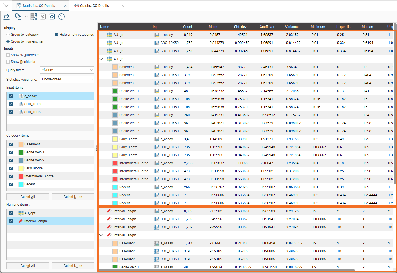
Enabling Hide empty categories will remove categories with zero data.
Global statistics will always appear before category or numeric sections.
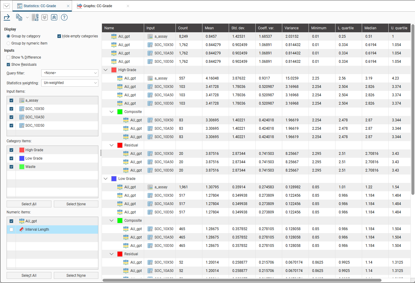
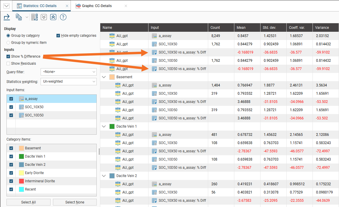
Enabling Show % Difference will add a row below each composite row, with data that identifies the percentage difference relative to the original uncomposited source data.
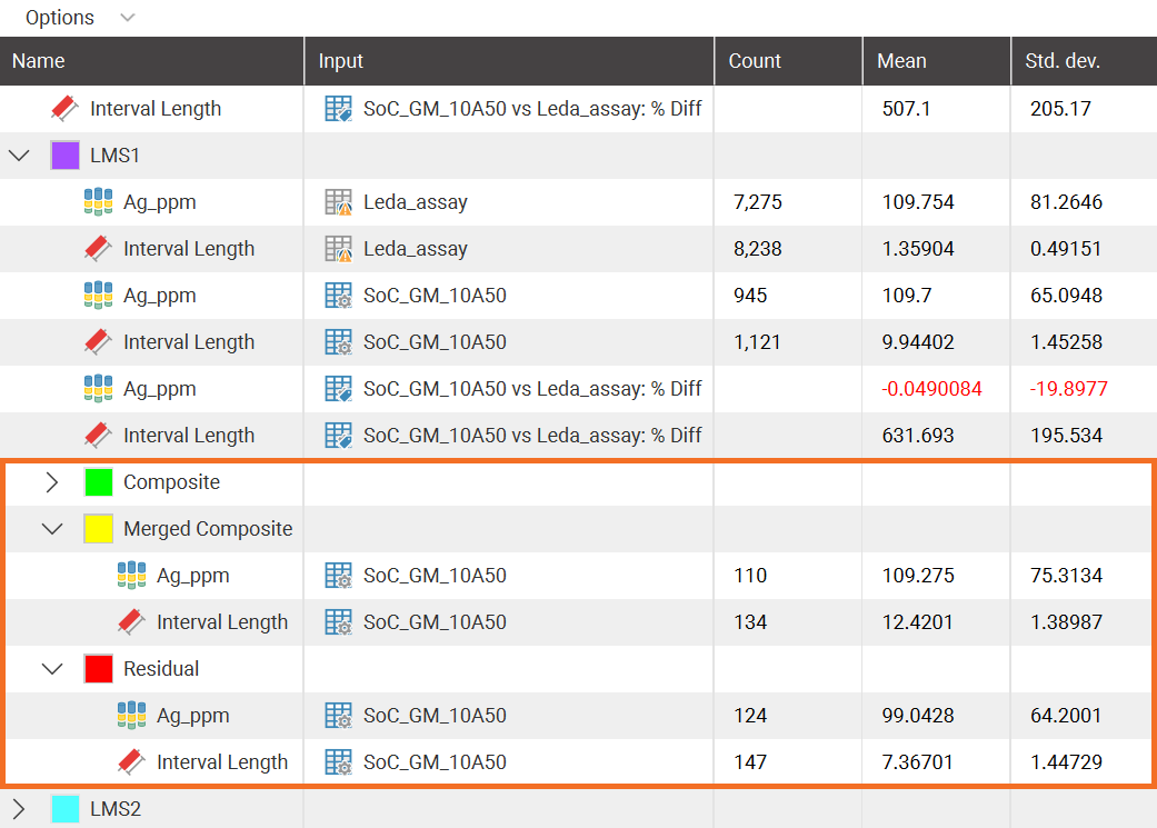
Enabling Show residuals will add Composite, Merged Composite and Residual sections to the table so the impact of the decisions relating to management of compositing residuals can be assessed.
Selecting Show residuals for numeric composites using Intervals from other Table will not result in an additions to the table, as there is no residual data to show when compositing using intervals from another table.
If you have defined a query filter or a volume filter on the collar table, you can use it to filter the values for the domained estimation by selecting it from the Query Filter list.
The Statistics weighting can either be Un-weighted or Length-weighted.
The Input items section lists the raw uncomposited source data and each of the associated composites selected for the composite comparison. Each input item that is enabled will appear as a row in each category/numeric item combination.
The Category items section lists the classification codes for the selected domain. Each category item that is enabled will appear either as a section grouping (if Group by category is selected) or as rows within a numeric item section (if Group by numeric item is selected).
If the Category items list is empty and you would like to use it for categorisation in the table, see Utilising the Domain Column for more information on adding category items to the statistics table.
The Numeric items section lists the numeric data types added as Output Columns when the composite(s) were created. Deselecting numeric items can allow attention to be drawn to certain key details for comparison.
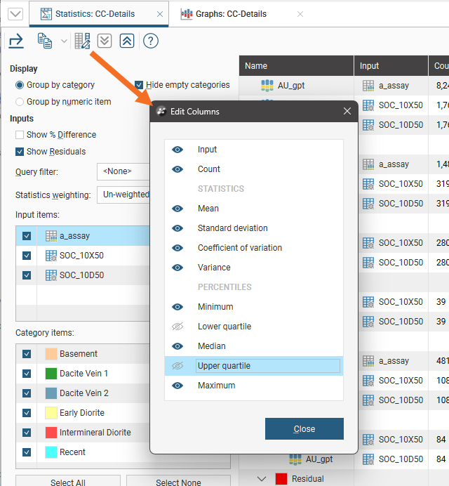
The comparison statistics table can be a large table. You can simplify it by selecting only the columns you want to appear in the table using the Edit table columns button (![]() ):
):
For more on how to use the compositing comparison table, see Table of Statistics as the compositing comparison table shares functional details with the table of statistics.
Exporting a Composite Comparison Table
Composite comparison tables can be exported as CSV files. Click the Export button (![]() ), then specify a filename.
), then specify a filename.
Alternatively, click rows to select them, and select multiple rows by holding down the Shift or Ctrl key while clicking rows. You can then copy rows of data to the clipboard by clicking the Copy button (![]() ), then selecting Copy Selected Rows. There is also a Select All option available. Once a selection has been copied to the clipboard, you can then paste the data into another application.
), then selecting Copy Selected Rows. There is also a Select All option available. Once a selection has been copied to the clipboard, you can then paste the data into another application.
Comparison Graphs
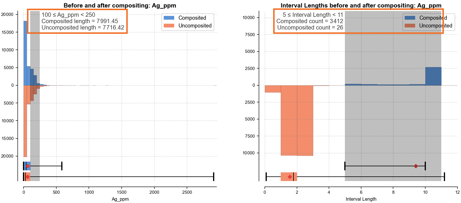
This view comprises a pair of before-and-after compositing comparison charts and an associated table of statistics.
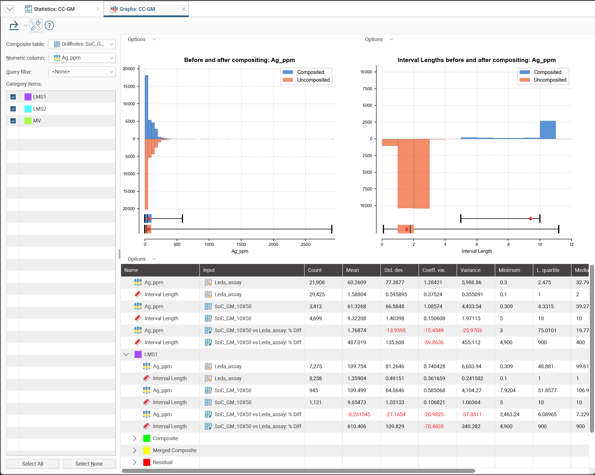
Select from the Composite table and Numeric column options in the compositing comparison to view the specific charts and table for that combination.
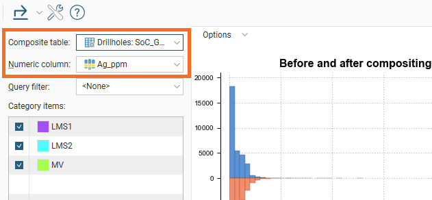
You can also choose to apply a Query filter from the available collar table filters, and select from the domain Category items listed.
Clicking in the histogram charts will add specific information about the selected bin:
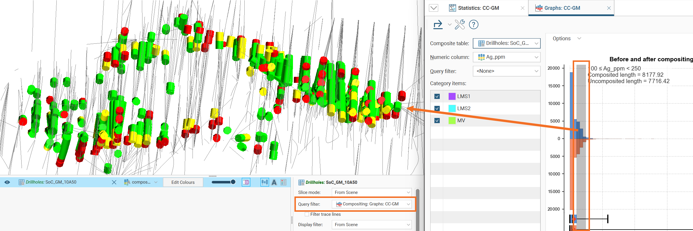
If the composite has been added to the 3D scene and its Query Filter set to Compositing: Graphs: <name of composite comparison>, selections of one or more bins will be reflected in the scene, showing only the selected intervals:
Both the compositing comparison graph and the interval length compositing comparison graph have associated Options:
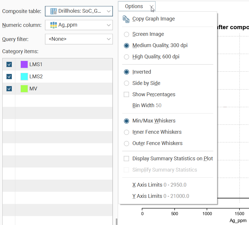
Copy Graph Image will put a bitmap copy of the graph into the clipboard for pasting into another application. You can choose from three settings for the images that are copied to the clipboard:
- Screen Image. A copy of the chart as it appears on the screen, at screen resolution.
- Medium Quality, 300 dpi. A specially rendered version of the chart at 300 dpi is used.
- High Quality, 600 dpi. A specially rendered version of the chart at 600 dpi is used.
The comparison charts can be switched between Inverted and Side by Side alternatives.
Show Percentages, when ticked, will switch the Y axis to use percentage as the scale instead of distance units.
Bin width adjusts the histogram bin size.
The box plot under the comparison histogram can be customised with the choice between Min/Max Whiskers, Inner Fence Whiskers and Outer Fence Whiskers. Outer and inner fence values are defined as being three times the interquartile range and 1.5 times the interquartile range respectively.
Tick Display Summary Statistics on Plot to get a full table of statistics overlaid on the chart, and tick Simple Summary Statistics to restrict that table to the basic statistics only.
Click X Axis Limits or Y Axis Limits to open a window the minimum and maximum range for the axis.
You can change the size of various elements of the charts, such as the sizes of different labels. To do this, click the Edit reporting display settings button (![]() ):
):
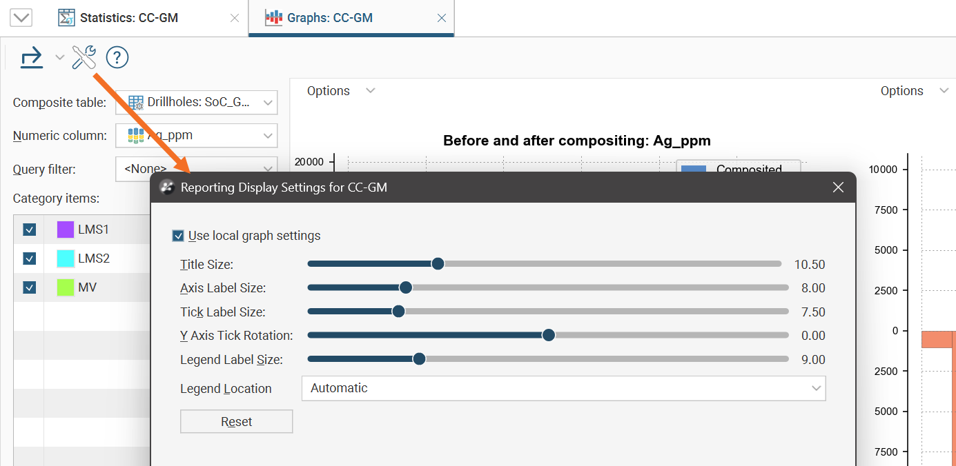
By default, the charts will use the global graph settings. For more information, see Graphs Settings.
If you tick the Use local graph settings box, the sliders will adjust the chart features for the currently displayed charts.
The table of statistics also has an options menu:
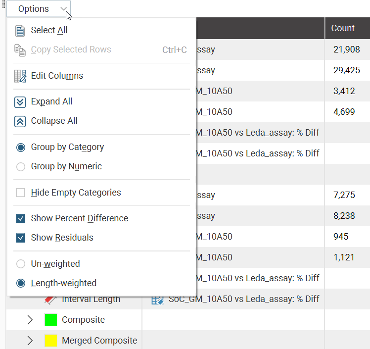
Select All and Copy Selected Rows can be used to copy table data to the clipboard for pasting into other applications.
Edit columns will open a window where column selections can be customised. Click the button to the right of the column name to view (![]() ) or hide (
) or hide (![]() ) the column in the table.
) the column in the table.
Expand All and Collapse All affect the sections in the table. Individual sections can be expanded or collapsed by clicking the chevron buttons next to the section name.
You can choose to switch the table between the Group by Category and Group by Numeric options.
Hide Empty Categories will simplify the table by eliminating categories empty of data that are likely not relevant.
Show Percent Difference will add a row below each composite row, with data that identifies the percentage difference relative to the original uncomposited source data.
Show Residuals adds categories to the table where you can gain insights into the residuals resulting from compositing.
The table of statistics options also allows switching between Un-weighted and Length-weighted statistics.
Exporting Comparison Graphs
The comparison graph window has four exportable items. Click the Export button (![]() ), then select from these options:
), then select from these options:
- Export Compositing Comparison. Creates a PDF, SVG or PNG version of the left chart.
- Export Interval Length Compositing Comparison. Creates a PDF, SVG or PNG version of the right chart.
- Export Table of Statistics. Creates a CSV version of the table at the bottom.
- Export All. Creates a PDF, SVG or PNG version of charts, and a CSV version of the table of statistics. There is an option to bundle all the files together into a ZIP archive.