
Colour Tool
The resizable Colour Tool enables you to interactively edit the colour display of your data and experiment with different colour configurations. The tool enables you to:
- Modify your current colour distribution and apply it to your data.
- Create custom colour configurations and store them in specialized colour scheme files (*.itr, *., *.zon, *.tbl, *.lut).
- Apply the colour scheme files to any of your image products.
The tool can be accessed from the following locations:
- The Grid Viewer toolbar of a displayed grid: clicking on the Colour Tool button will activate the tool.
- The Map Manager toolbar of a displayed map: when an aggregate (AGG_) or a symbol group (CSYMB_) layer within the map is selected, the Colour Tool button becomes available on the toolbar and in the popup menu. The tool is also accessible by double-clicking on the selected grid.
- The 3D Manager toolbar of a displayed 3D View: when a surface grid, a 3D symbol, or a voxel is selected, the Colour Tool button becomes available on the toolbar.
- The Voxel Viewer toolbar of a displayed voxel. Clicking on the Colour Tool button will activate the tool.
Colour Tool dialog options
|
Data layer/ |
The currently selected data layer (AGG_, voxel) file or symbol group (CSYMB_) is listed. If the selected AGG_ (aggregate) layer is composed of multiple grids, all files are listed in the drop-down; this enables you to select another grid for colour manipulation. |
|
Distribution |
The tool enables you to interactively modify the colour grid zones. The following transform methods for zoning data are available:
Click on the Define Distribution The data layer will be redisplayed automatically based on the new colour distribution. The content of the transform graph is redrawn and the colour bins are updated to reflect the selected changes.
The Define Distribution button becomes disabled when the 'Custom' user-defined distribution is selected.
Changing the distribution selection will also open the associated transform dialog.
|
|
Brightness |
The initial state of the brightness is set at 50% (full colour). Slide the bar to adjust the brightness: 0% generates the darkest possible image, while 100% generates the brightest possible image. If the data layer is composed of many layers, you can interactively apply the desired brightness:
The change is interactively applied to the selected layer/all data layers.
|
|
Transparency |
The initial state of the transparency is set at 0% (opaque image). To increase the transparency, slide the bar to the right. If the map contains image and vector (i.e., survey path and/or symbols) layers, decreasing the transparency of the image makes the vector layers stand out better. The change is interactively applied to the selected layer/all data layers.
|
|
Number of bins* |
Enter a number for the colour breaks (zones). By default, the number of bins is set to the number of colour zones in the colour table. If you enter a different number, the colour table is linearly interpolated/decimated to the provided number of bins while maintaining the colour distribution. For example, if the colour table has 255 levels but the number of zones is set to 15, then only the colours of rows 0,17,34,51, etc., will be used. The number of bins is recalculated when a different colour scheme is loaded (the Open button).
|
Bins Colours & Boundary Values |
|
|
|
The bins colours and boundary values are displayed in a scrollable window. To turn off a given bin on the image display, simply uncheck its Active* checkbox. This will be indicated on the Transform graph with a hashed grey pattern (see the Application Notes below). To toggle multiple adjacent bins:
The colour distribution of the selected layer is loaded in the Colour field. To change the colour for a specific bin:
To change any of the colour breaks, simply enter new values in the respective Minimum and Maximum fields*. The adjacent boundary values will be automatically updated. The changes are automatically reflected in the transform window (the graph and the colour bar located below the horizontal axis of the graph will be updated) and on the data layer/symbol group in the active document.
For the grid image to also reflect the changes, ensure that the auto-recolour option is turned on. |
Transform Window |
|
|
|
The Transform window displays the binned data distribution of the current data layer/symbol group using the selected colour zoning method. The grey profile traces the number of points within each bin at a finer resolution. The black profile corresponds to the cumulative number of points as a percentile and is annotated along the right vertical axis. When the cursor is inside the transform graph, a set of normal dashed lines indicate the range of the zone at the cursor location (see the Application Notes below). The colour bar, located below the horizontal axis of the graph, is annotated with the absolute values of the bin boundaries. Hover your mouse pointer over the colour bar until a tooltip appears: the name of the current colour scheme will be displayed. The colour bar tooltip will not appear after making modifications such as changing the distribution, reversing the colours, changing the number of bins, or resizing one of the colour bins in the colour bar. Resetting the changes (Reset button) will restore the tooltip functionality.
In order to visually enhance features of interest, a number of interactive options are provided to scroll through, zoom in, and modify the number, colour and size of bins. All changes are automatically applied to the transform window, the colour bins, and the data layer/symbol group in the active document and any related image (AGG). However, these changes are not committed to the map until you save the map.
Zoom in/out the Transform window Use the arrows at each end along the top of the window to change the graph’s horizontal extents:
Extend a colour bin* You can modify the size of individual colour bins to accentuate specific subtle features; the adjacent bins will adjust accordingly:
Stepping over an adjacent bar will decrease the number of overall bins as the adjacent bin (to the left or right) will be merged.
Shift a colour bin* You can shift the colour of a bin to a different bin; the number of bins (colours) on either side of the moved colour bin are maintained, and the bin boundary values on either side are resized/readjusted to keep the same number of bins and all the colours:r
The difference between this feature and the circular scroll is that colours assigned to the end bins won’t change. However, if the bin is moved too far to one side to the point that the bin sizes become too small (i.e., smaller than the smallest interval), the colour of the bin whose width is too small is dropped and bin boundary values are redistributed. The image is updated in real time, but the numeric table on the lower left of the dialog is updated only when the mouse key is released.
If the image contains a large number of bins, it can become difficult to place the cursor inside a bin, versus on the boundary of the bin. To reach the desired outcome, press and hold the Ctrl key; the cursor changes to a 4-way white arrow indicating that you are in "scroll" mode. Place the cursor over the desired bin to move, left click, and move the colour of the bin to the new location. The information icon
Custom colour distribution* The standard methods are based on a Gaussian data distribution. This is, however, not always the case; you may want to customize the colour distribution to put more emphasis on a data range of interest at the expense of regions of little relevance:
See the Application Notes below for further details. |
|
Logarithmic axis |
Leave this option unchecked when the data distribution is Gaussian by nature. The Logarithmic axis option should be used when the data distribution spans over many orders of magnitude, and a sizable amount of the data resides towards the low values of the data distribution scale. The use of a logarithmic scale will help emphasize the low values on the transform graph and highlight more detail. |
|
[Reverse Colours] |
Click this button to flip the colours around. The changes are automatically applied to the active document (i.e., map, grid, 3D view, voxel) and in the transform window (the graph and the transform line are redrawn). This does not alter the data; it only inverses the colour table and the bin values stay the same.
|
|
[Reset] |
When working interactively with grids or coloured 3D symbols and voxels, you often experiment in order to determine the optimal colour combination for your data. Click the Reset button ( The changes are automatically applied to the active document (i.e., map, grid, 3D view, voxel) and in the transform window (the graph and the transform line are redrawn).
|
|
[Save] |
When experimenting with various colour distributions, it is recommended that you save them to unique colour scheme files. After modifying the colour distribution, you can save the new colour distribution along with the binning breaks to a file. You can then reset the colour distribution, experiment with another colour combination, and save this combination to another file. Click on the Save button to save the current colour distribution/bin values to one of the file formats (*.ITR, *.AGG, *.ZON, *.TBL and *.LUT) available in the file selection dialog. The file filter is set to "Colour zones (*.zon)" and the file name (editable) defaults to "data layer/symbol group.zon". You can later use this file to display grids or symbols with the colour breaks occurring at the values indicated in the selected colour table file. |
|
[Open] |
When you want to compare or apply a previous colour distribution, simply load the corresponding colour scheme file. Click this button to open the Select Colour Scheme tool and select from a variety of predefined colour schemes in several categories and formats. Click [OK] to load the selected colour scheme (e.g., zone file, colour table). The changes are automatically applied to the bins table and transform window (the graph and the transform line are redrawn) and to the active document (i.e., map, grid, 3D view, voxel).
Hover the mouse over the colour bar located below the histogram graph: a tooltip will appear displaying the current colour scheme file. |
|
[OK] |
Press the button to close the Colour Tool dialog and apply the changes made to the active document (i.e., map, grid, 3D view, voxel). |
 ) below.
 button located to the right of the Distribution field* to open the associated transform dialog: define the colour values or keep the intelligent defaults and click OK to close the transform dialog.
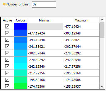


 button.
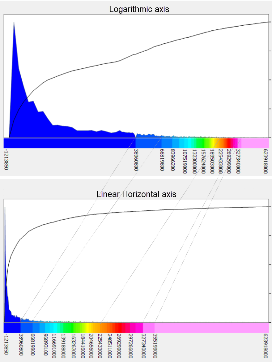
 ) to restore the colour distribution to the initial input settings (i.e. the last version stored in your data file or symbol group).
Application Notes
* Some of the features are not enabled in the free versions of Oasis montaj, i.e., Geosoft Viewer and Oasis montaj Field.
When the Colour Tool dialog is closed, if the active map contains a colour legend bar, the bar will be updated to reflect the current colour distribution of the selected data layer image.
Transform Graph Annotations
![]()
The location of the cursor inside the transform graph window is tracked and annotated. At the cursor location:
a – The bin is highlighted with dashed lines and the edge values of the bin are bolded.
b – The percentage of data values in the highlighted bin is displayed at the top of the dashed lines.
c – The percentile value (cumulative percentage) up to the highlighted bin is annotated along the right axis.
d – The percentile value at the cursor location is also annotated along the right axis.
e – The grid value at the cursor location is annotated along the bottom.
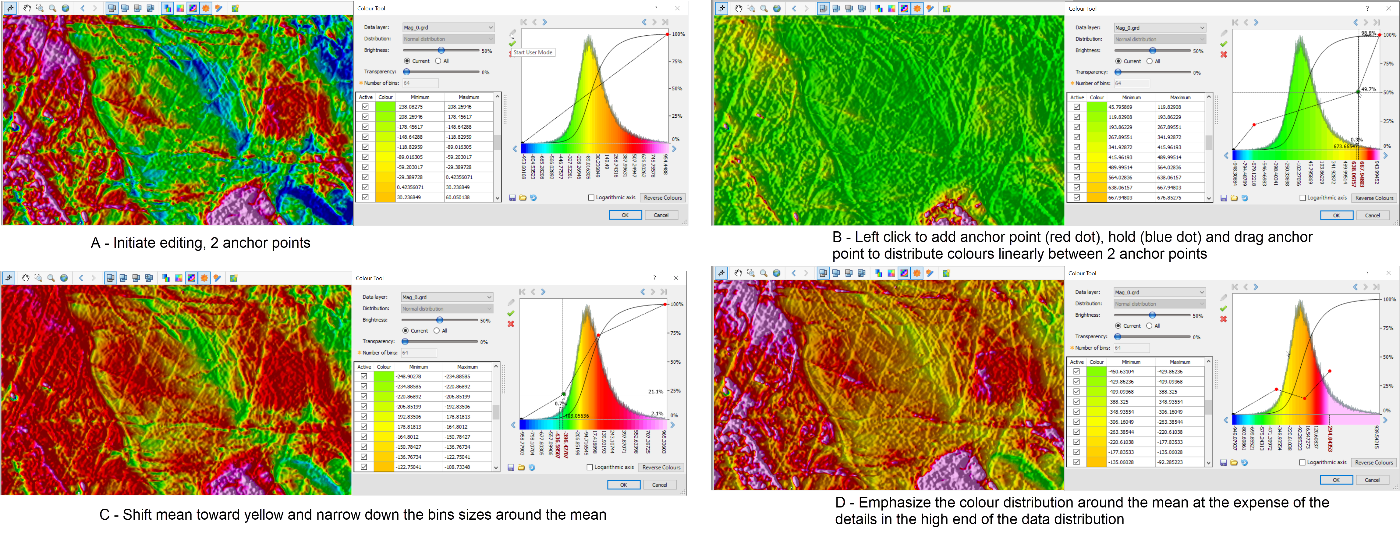
Custom Colour Distribution
When entering the user mode,  , initially the bins are set to span linearly over the entire data set. This is indicated on the transform graph with a straight dashed line with 2 anchor points (A).
You can enter additional anchor points by clicking on the graph (red dot).
The horizontal position of the added anchor point selects the bin, and the vertical position of the cursor controls the colour that will be attributed to the bin. Subsequently, all bins located to the left and right of the cursor location, up to the next anchor point, are linearly attributed new colours.
To move an anchor point, move the cursor on the anchor point until it changes to a blue dot (B). Now you can left click on it and move it.
You could augment the size of the last bin by simply grabbing its anchor point and move it (D).
When you are satisfied with the colour distribution click on  to save the new distribution.
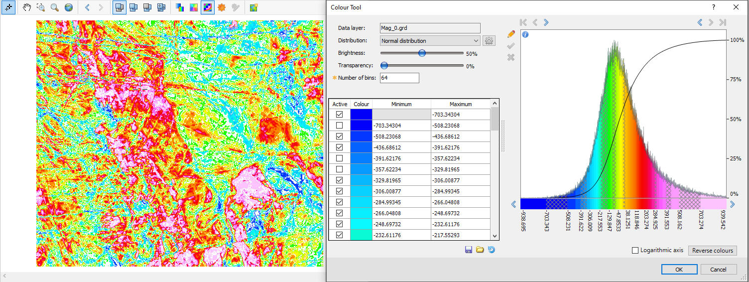
Turn off Select Colour Bins
You can turn off select colour bins to visually highlight content of interest.
For example:
- If the map contains multiple overlain images, and you would like to bring forward confined regions of the underlain image, you can turn off the obstructing bins of the uppermost image to let the lower image come through.
- Data ranges of interest could be visually emphasized by turning off the adjacent bins of lesser interest. The illustration below depicts a striped colour image for which alternate bins have been turned off.
Got a question? Visit the Seequent forums or Seequent support
© 2023 Seequent, The Bentley Subsurface Company
Privacy | Terms of Use