
2D Section Viewer
Use the 2D Section Viewer option (geogxnet.dll(Geosoft.GX.SectionViewer2D.SectionViewer2DTool;Run)*) to visualize and analyze geophysical data (data points, array data) and voxel sections (e.g., from modelling results) in 2D Model and Profile views.
The option is available from the following locations:
-
EM Utilities > Interpretation menu (with the EM Utilities extension)
The option is also available in VOXI Manager as a context menu (Display in 2D Section View) under the Inversions node. The predicted response database will be opened automatically if the option is accessed from the VOXI Viewer context menu, and the inversion model result will be loaded automatically in the Model view.
2D Section Viewer dialog options
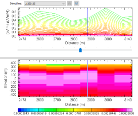
Profile View |
|||||
|
First channel/ |
Select the first channel/second channel to be profiled from your active database. The channel data for the currently selected line in the database is automatically rendered in graphical form in the Profile view using the default colour scheme. The Y-axis (representing amplitudes of the measured data) will be displayed on the left side of the graph for the first channel selected and on the right side of the graph for the second channel selected.
|
||||
|
Colour table |
This field is available when the selected channel is an array channel. The default colour scheme file for rendering the profile colours for your selected channel is "colour.tbl". To modify the selection, click on the Colour table graphic and in the Colour Scheme Tool navigate through the colour scheme categories and types. When you hover your mouse pointer over the graphic, the current colour scheme selection is displayed in a tooltip.
|
||||
|
Colour |
This field is available when the selected channel is a non-array numeric channel. To modify the selection, click on the Colour graphic and in the Colour tool select a new colour or define your own custom colour. |
||||
|
Profile line style |
Customize your profile by selecting a line style. The available options are: standard (default), medium, heavy, dashed, and dotted. |
||||
|
Error channel |
Select the error data channel to be profiled. This will draw and error bar plot in the Profile view for the selected observation data channel (first/second channel) that will allow you to visualize how well your data is fitted. The colour of the bar graph plot is black. The error channel and the source channel (first/second channel) must be of the same type (i.e., array vs. non-array).
|
||||
|
|
|||||
|
Data scaling |
Select the scaling type for your profile. By default, the scaling of the vertical axis is set to 'linear'. Often, however, array data contains data spanning over many orders of magnitude. You can view such data using the logarithmic scale or the log/linear scale:
|
||||
|
Log minimum |
Enter the minimum logarithmic value for the log or log-linear scaling options:
The default value is 1. |
||||
|
Line scaling |
Select the scaling option to configure the Y-axis and the display of the profiles when changing the line selection:
|
||||
|
Channel scaling |
Select the scaling option to configure the Y-axis and the display of the profiles when changing the channel(s) selection:
|
||||
Model View |
|||||
|
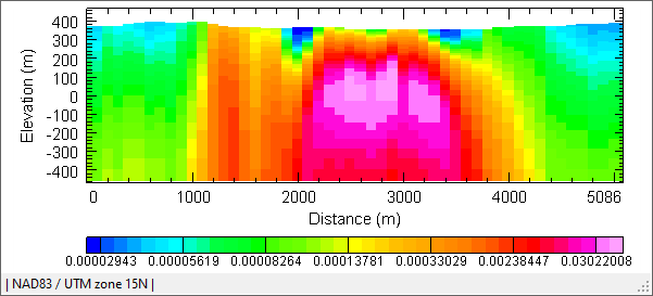
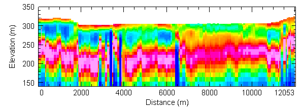
Select a voxel from the drop-down list (these are the voxels added to your current project) or browse to select a different file (*.geosoft_voxel or *.geosoft_vector voxel). A slice of the selected voxel at the particular line specified in the Select line field will be displayed in the Model view. When a vector voxel is selected, the amplitude of the vector voxel will be displayed in the Model view. Lithology voxels are not supported. When launching the 2D Section Viewer dialog from the VOXI Viewer context menu, the inversion model result is loaded automatically in the Model view. The voxel slice will not be rendered if the selected voxel does not share the same coordinate system and extents with your active database profile data.
|
|||||
|
Depth clipping |
The depth range (in the spatial units of the voxel) of the voxel slice is reported by default. You can clip the model to certain depths in order to see the top or lower layers more clearly:
|
||||
Profile and Model Views |
|||||
|
Profile view |
The Profile view displays the data distribution based on your channel(s) selection, scaling options, and current database line selection.
|
||||
|
Model view |
The Model view displays the data distribution based on your voxel file selection, depth clipping options, and current database line selection. |
||||


Technical Notes
Rendering the Voxel Model in the 2D Section Viewer
The Voxel Model View in the 2D Section Viewer displays a vertical slice of the voxel model extracted along the
selected line path:
The following is a technical description of how this image is produced.
The method assumes that the voxel model itself is oriented horizontally in space, that is, the model can be rotated around the Z-axis, but not the X-axis or Y-axis. The voxel does not need to be in the same projection as the database line, and the voxel coordinate system does not even need to share the same units as the database line.
Because the voxel is horizontally oriented, vertical slices through it can be calculated at each (X, Y) location along the line path and assembled to form the final image.
This is a view of the voxel from overhead, showing typical line paths with location symbols. For the purposes of this function, the path between points, and the measured distances as displayed in the section view, are considered as straight line segments, not curves.
In practical terms, we simply need for each pixel location in X to extract the voxel values in the vertical column at that location, convert them to colours using the current colour transform model, and plot them as a multi-coloured vertical line filling the graph window. This is accomplished in the code as follows:
ExtractLinePath(mvpc.LinePath, vvX, vvY);
var res = (rDCx1 - rDCx0) / Width;
var rD0 = mvpc.LinePath.First().Dist;
CMVU.PlotVoxelSlice(Context, view, vox, itr, vvX, vvY, rD0, rDCx0, rDCx1, res);
Here, rDCx0 and rDCx1 are the distances along the line at the left and right side of the plot, and rD0 is the distance along the line at the first line location contained in (vvX, vvY). (No smoothing is assumed in the line path – distances are calculated assuming straight line segments joining all the line locations).
The itr is the colour transform – mapping voxel values to plot colours; "res” is the distance along the line corresponding to a single plot pixel.
The CMVU.PlotVoxelSlice wrapper calls the internal sPlotVoxelSlice_MVU function, found in the geoengine.map solution in the mvu\voxel_slice.cpp code file.
This is the function header with parameter descriptions:
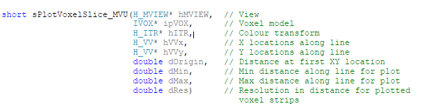

The function works as follows:
- Input locations are converted from the input map view coordinate system to the voxel coordinate system in order to extract the voxel values below that location. This will take care of any difference in both the coordinate system and any rotation in the voxel that might be present.
- Plotting inside a map view must be done as a finite “vertical” rectangle or strip, e.g. with a min and max X; there is no concept of a “pixel” in a map view. “dRes” thus gives the width of each strip, and each strip is plotted centered at the distance “d” (the X-axis value in the map view) corresponding to each line path (X, Y) location.
- It is assumed that each horizontal cell in the voxel has a unique set of values below it, so when proceeding through the list of input (X, Y) locations, those consecutive locations which are found to share the same vertical voxel column are collected together and plotted as a single “wider” rectangle for the sake of efficiency.
- If your input “dRes” value was too small, you would get white space gaps between strips on the map, and if it was too wide, they would overlap and obscure each other. The “dRes” value is chosen to make a filled plot corresponding to single pixels in the resulting 2D section voxel plot window. (Note that in the actual plot there are no black border lines).
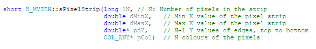
- The MVIEW function was created for this very purpose:
to plot a “PixelStrip”, e.g. a vertical rectangle with a vertical set of different-coloured rectangles:
Application Notes
2D Section Viewer Status Bar
The status bar across the bottom of the Section Viewer captures useful information under the following sections:
- Coordinate system: the coordinate system (CS) of the 2D Section Viewer, which is set from the active database.
The coordinates of the rendered voxel are reprojected into the CS of the active database.
- Current cursor position: the (X,Y) location of the cursor as you move it across the Profile window or the (X,Y,Z) location of the cursor as you move it across the Model window. When the cursor is clicked inside the Profile or Model graph, the vertical blue line indicates the (X,Y) / (X,Y, Z) position at the cursor location.
Logarithmic Axis
The logarithmic option should be used when the data distribution spans over many orders of magnitude, and a sizable amount of the data resides towards the low values of the data distribution scale. The use of a logarithmic scale will help emphasize the low values on the graph (profile) and highlight more detail.
Vizualize Measured and Predicted Data
By default, the predicted database will be used for the profile view. The predicted database resides in the \Results folder for the VOXI Project. It is called "measurements.gdb". There is only one database per inversion results. When launching the 2D Section Viewer tool from the VOXI Viewer context menu, the predicted database is exported with the appropriate time stamp automatically so that this database is stored in the project folder.
*The GX.NET tools are embedded in the geogxnet.dll file located in the "...\Geosoft\Desktop Applications \bin" folder. If running this GX interactively, bypassing the menu, first change the folder to point to the "bin" directory, then supply the GX.NET tool in the specified format. See the topic Run GX for more details on running a GX.NET interactively.
Got a question? Visit the Seequent forums or Seequent support
© 2024 Seequent, The Bentley Subsurface Company
Privacy | Terms of Use